Even before COVID-19 and the ensuing work from home, smartphone interruptions were wreaking havoc on our productivity and peace of mind. However, when we fully migrated into the digital world with the advent of COVID-19, the endless notification barrage became a full-scale tsunami.
The recent Netflix-hit “Social Dilemma”, among other pop culture TV shows (like The Great Hack, etc.), expressively displayed the insidious effects of social media. However, I wanted to shine the spotlight on the havoc smartphone notifications were creating in the context of my academic/professional life and my personal life. In the process, I hope to convey viewers of my visualization about the perils of leaving notifications on.
To that end, I set out collecting a week’s worth of smartphone notification data. But that was only half the picture. To really convey the impact, I had to juxtapose notification data against what activity I was doing at the time. Finally, given the vice grip that smartphones have on our lives, it was also important to get a sense of how much autonomy we as humans still have on our own actions.
If you’ve had a hunch that your smartphone is inexplicably reducing the quality of your life, have a look at my visualization here!
DJing has been a passion of mine since college. As a fervent follower of electronic and hip-hop music, I love the process of discovering new tracks, mixing them into a cohesive DJ set, and, if I’m lucky, connecting with an audience through my musical interpretations.
Throughout the years, I have observed DJ software evolve in terms of features for music manipulation, such as loopers, samplers, beat match, and filters. While all these features were built around how DJs can perform their music, little advancements have been made on providing DJs with insights on what music to play.
A key differentiator of a skilled DJ is their ability to blend different songs together into a cohesive set. By executing seamless transitions between songs, DJs can introduce the audience to new ideas while sustaining the energy and momentum of the dancefloor – i.e., keep the crowd dancing! Because two or more songs are simultaneously playing during a transition, DJs must develop an intuition for rhythmic and harmonic differences between songs to ensure that they blend well together.
Most DJ software compute two variables to help DJs assess these differences: tempo, in terms of beats per minute (BPM) and key, which describes a collection of notes and chord progressions around which a song revolves. While BPM is effective for evaluating rhythmic differences, key is often an unreliable variable for evaluating harmonic differences due to complexities within a song such as sudden key changes or unconventional chord progressions (i.e., songs in the same key are oftentimes not compatible). Furthermore, as key is a categorical variable, it cannot describe the magnitude of harmonic differences between songs.
Figure 1: While modern DJ software have many song manipulation features, they lack tools for assessing harmonic compatibility (Algoriddim djay Pro 2)
Instead of relying on key, DJs could manually test the harmonic compatibility of song pairings prior to a performance. However, it is impractical to experiment with every possible song pair combinations of a substantial music collection. Even my collection of as little as ~150 tracks has over ten thousand possible pairs!
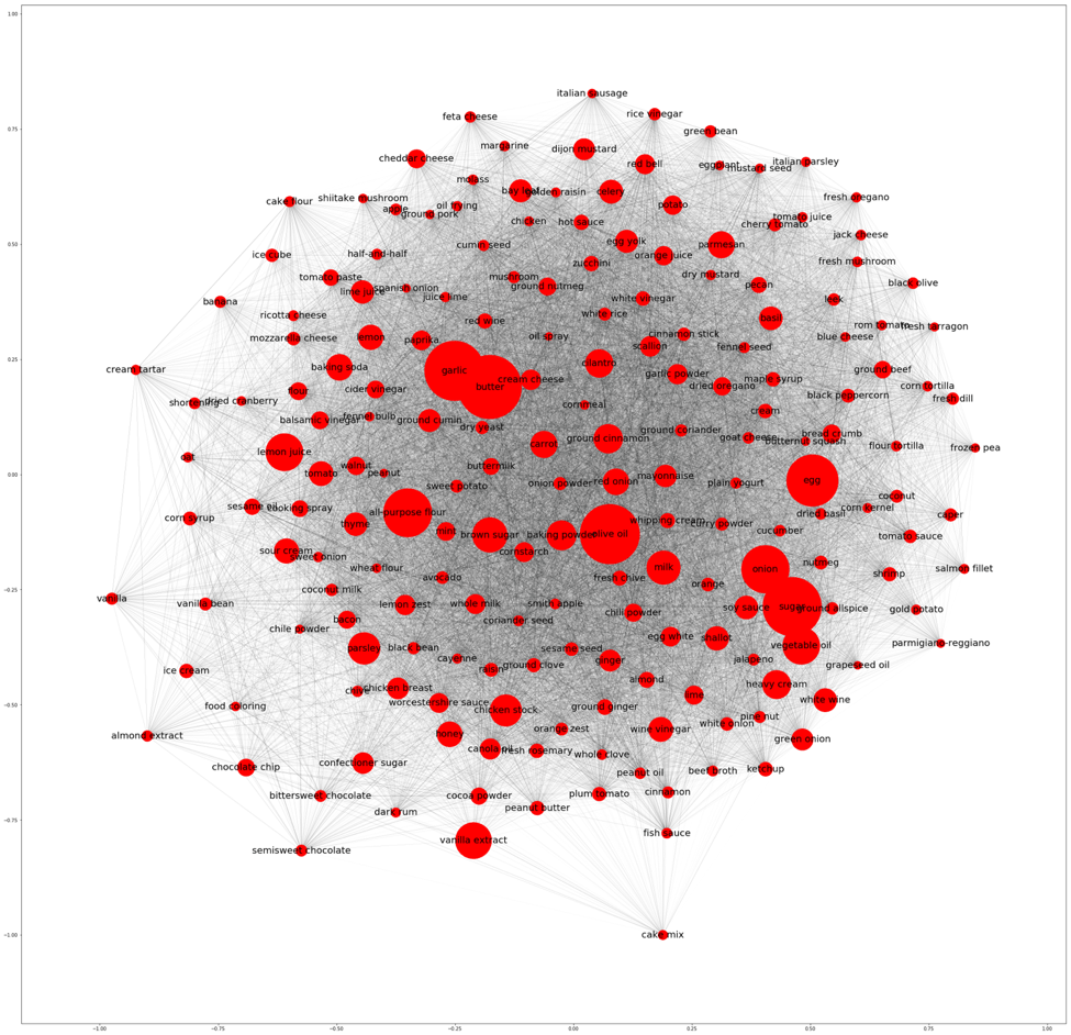
As my music collection continues to grow, I was inspired to develop more systemic and sophisticated approaches for uncovering harmonic connections in my music library. With the LibROSA and NetworkX Python packages and Gephi software, it is now easier than ever to experiment with music information retrieval (MIR) techniques to derive and visualize harmonic connections.
Through my exploration of data-driven DJ solutions, I was able to:
Design a more robust metric (harmonic distance) to assess harmonic compatibility between songs
Develop functionalities inspired by network theory concepts to assist with song selection and tracklist planning
Figure 2: An interactive visualization of my music collection as a network consisting of nodes as song, node size/shade relative to song importance, edges as harmonic connections, and edge thickness relative to harmonic distance between songs
From this analysis, I am convinced that the incorporation of more sophisticated analytical functionalities is the next frontier in DJ software innovation. By applying these data-driven solutions, I spent significantly less time rummaging through my music collection to find harmonically compatible songs and more time developing compelling and creative ways of mixing my music.
In this blog post, I will dive into the steps I have taken to extract and manipulate harmonic data from my audio files, derive and test my “harmonic distance” metric, and apply the metric to network theory concepts.
Designing a more robust metric for evaluating harmonic similarities
There are twelve chroma classes (i.e., pitches) that exist in music: {C, D♭, D, E♭, E , F, G♭, G, A♭, A, B, B♭}. With LibROSA’s chromagram computation function, I can extract the intensity of each pitch over the span of an audio file and calculated the overall distribution of each chroma class. My hypothesis: songs that share similar chroma distributions have a high likelihood of being harmonically compatible for mixing.
I first tested LibROSA functionality on a short audio clip, in which the chroma characteristics are easily discernable. The first 15 seconds of Lane 8’s remix of Ghost Voices by Virtual Self starts with some white noise followed by a string of A’s, then G – F♯ – E – D – G[1].
The chromagram function outputs a list of 12 vectors, each vector representing one of the 12 chroma classes and each values representing the intensity [0, 1] of a pitch per audio sample (by default, LibROSA samples at 22050 Hz, or 22 samples per second).
Using LibROSA’s plotting function, I was able to visually evaluate the audio clip’s chromagram:
Figure 3: LibROSA captured quite a bit of noise (purple) that were irrelevant to the harmonic footprint of the track
LibROSA successfully captured the key distinguishable notes that appeared in the audio clip (yellow bars). However, it also captured quite a bit of noise (purple/orange bars surrounding the yellow bars). To prevent the noise from biasing the actual distribution of chroma classes, I set all intensity values less than 1 to 0.
Figure 4: Filtering out noise to prevent biased calculations of chroma distribution
While some of the white noise from the start of the audio clip were still captured, the noise surrounding the high intensity notes were successfully filtered out.
The chroma distribution of a song is then derived by summing the intensity values of all samples for each of the 12 chroma classes , then divided by the sum of all intensity values:
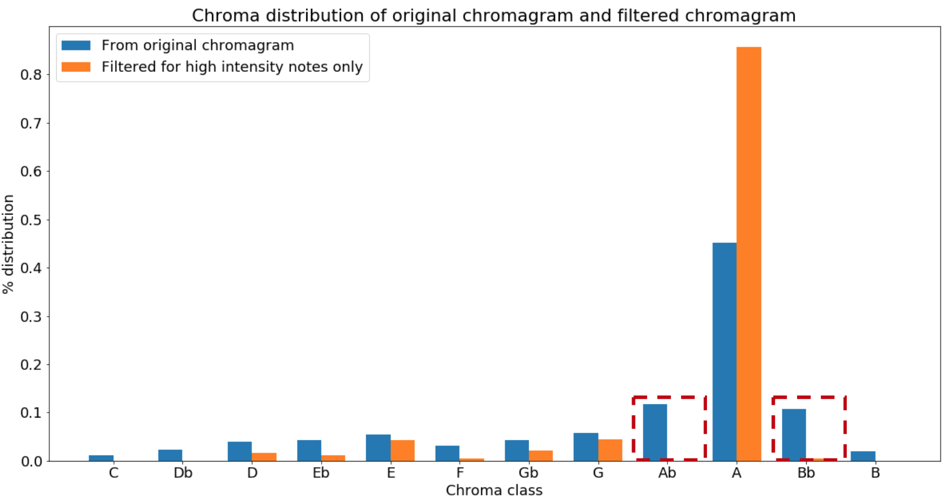
The impact of filtering out intensity values less than 1 was evident when comparing the chroma distributions between the filtered and unfiltered audio sample:
Figure 5: Ab and Bb would have been the second and third most common pitches if the noise were not filtered out
Note that the unfiltered distribution suggested that A♭ and B♭ were the second and third most common pitches from the audio clip, when in fact they were attributed to noise leaking from the string of A’s.
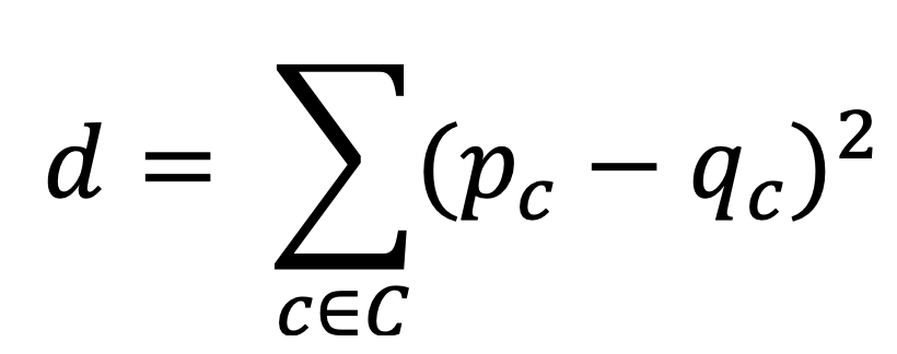
The harmonic distance between two songs can then be derived by calculating the sum of squares between their chroma distributions : By deriving the chroma distributions of all my music files, I can effectively calculate and rank the harmonic distances of all possible song pair combinations in my library and prioritize the exploration of pairs with the smallest harmonic distances.
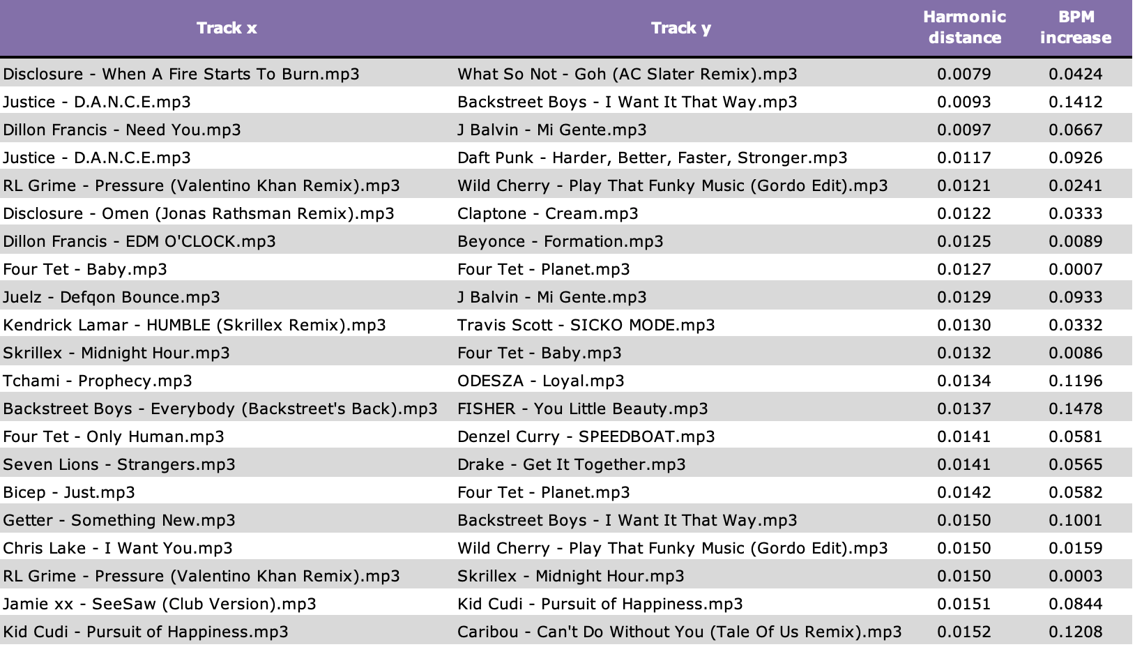
Figure 6: Top 20 song pairs by lowest harmonic distance
One of the more unexpected pairs at the top of the list was I Want It That Way by Backstreet Boys and Flashing Lights by Kanye West. These songs share four of their top five chroma classes and have a harmonic distance of 0.016, which falls in the ~0.5% percentile of ~10k pairs:
Figure 7: I Want It That Way and Flashing Lights share four out of their top five chroma classesFigure 8: Their harmonic distance value falls in the 0.5% percentile of all pair combinations
Despite the fact that these songs have very few commonalities in terms of style, mood, message, etc., they share a striking resemblance in terms of harmonic characteristics. Here is a mashup I made of the two songs:
Testing the performance of the harmonic distance metric
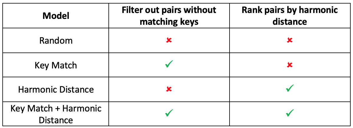
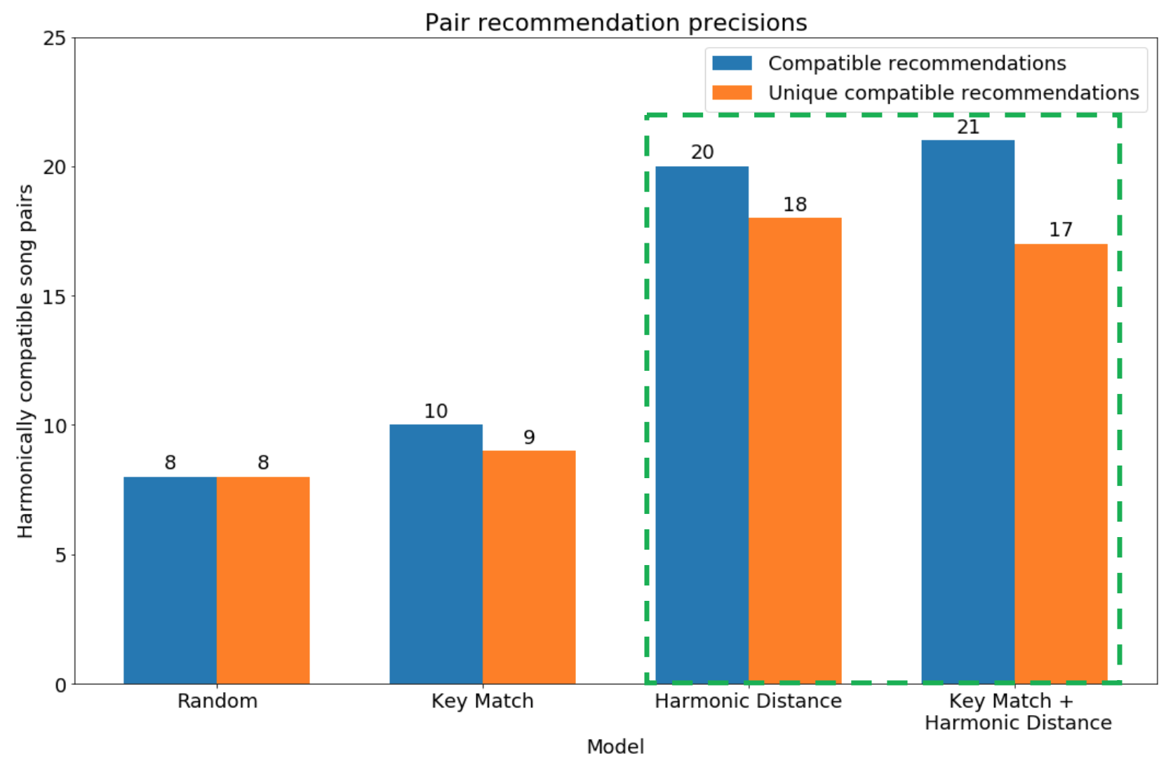
To test the effectiveness of this harmonic distance metric, I evaluated 4 sets of 25 song pair recommendations generated from the following models:
To generate recommendations, I first pulled each song’s BPM and key from the Spotify Web API via the Spotipy library. I then calculated the percent difference in BPM between all song pair combinations and filtered out any pairs with differences greater than 15% to ensure that all recommendations are at least rhythmically compatible[2]. For models with Key Match, I filtered out any pairs that were not in the same key. For models with the ranking feature, the top 25 pairs were selected based on smallest harmonic distance. For models without ranking, 25 pairs were randomly selected after applying filter(s).
In the evaluation of each recommendation, I attempted to create a mashup of the two songs with my DJ software and equipment. If I was able to create a harmonically agreeable mashup, I assigned a compatibility score of 1, else 0.
After scoring all recommendations, I compared the total and unique pairs of compatible songs across each model:
Figure 9: Harmonic Distance and Key Match + Harmonic Distance were most successful at identifying compatible pairs
As expected, Random performed the worst while the full model, Key Match + Harmonic Distance, performed exceptionally at identifying compatible pairs. Harmonic Distance by itself also performed well, generating nearly the same number of compatible pairs as the full model.
Unfortunately, Key Match showed little improvement over Random. While recommendations from Random may have had a higher number of harmonic connections by chance, it is more likely that Spotify’s key detection algorithm generated too many inaccurate predictions. Out of 57 pairs that Spotify metadata predicted were in the same key, my DJ software only believed 25 of which were actually in the same key. While it was unclear which algorithm was more accurate, this highlights the fact that key predictions algorithms tend to have varying degrees of success.
It is important to note that Harmonic Distance and Key Match + Harmonic Distance combined found 39 harmonically compatible pairs out of 48 unique recommendations. Thus, harmonic distance can not only uncover harmonically compatible pairs but also enhance the utilization of key detection algorithms. In analyses of future music libraries, I will certainly evaluate recommendations from both models.
From the Key Match + Harmonic Distance recommendations, my favorite mashup that I made was with Pony by Ginuwine and Exhale by Zhu:
I was pleasantly surprised by not only their harmonic compatibility, but stylistic compatibility as well.
Reimagining my music library as a network
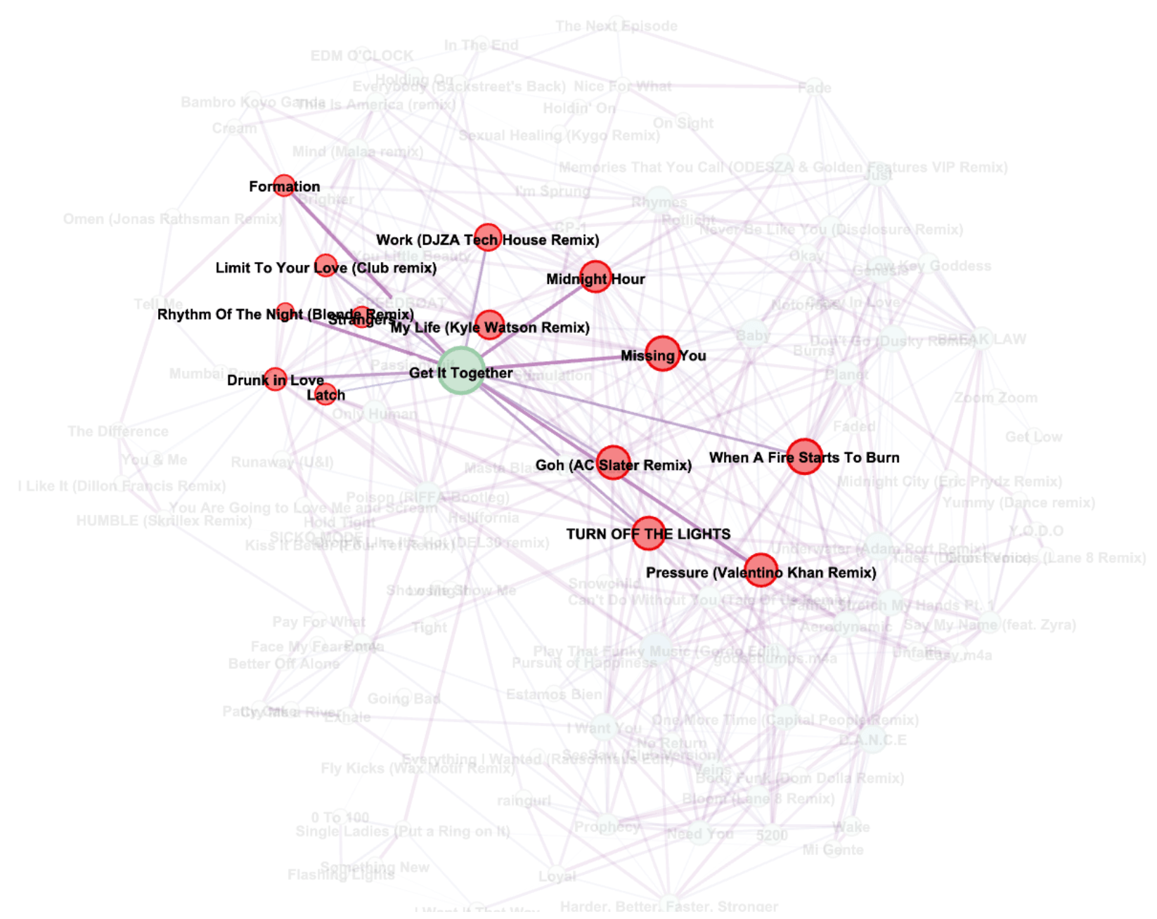
The potential of using harmonic distance for DJing really comes to life when the data is applied to network theory concepts. With the top 5% song pairs by harmonic distance, I used the NetworkX package to construct an undirected network with nodes as songs, edges as harmonic connections between songs, and edge weights as harmonic distances.
In addition, I calculated the eigenvalue centrality score of each node to evaluate the most important songs based on their connection to other songs with high number of harmonic connections.
With the Gephi software, I created an interactive visualization of this network:
Figure 10: Network of 122 songs and 523 harmonic edges
This visualization is formatted such that node size and shade were relative to the eigenvalue centrality score and edge thickness was relative to harmonic distance. Larger and darker nodes represent songs with higher eigenvalue centrality scores. Thicker edges represent greater harmonic distances between songs.
With this visualization, I can make more strategic choices with song selections during a DJ set, as I can evaluate harmonic neighbors of any given track in real-time and be cognizant of “versatile transition tracks”, or tracks that can lead to many transition options.
Figure 11: “Get It Together by Drake” is a versatile transition track, as it can smoothly transition to many other songs that have many transition options
The shortest path concept of network theory is also applicable in the context of DJing. Say I’m currently playing Formation by Beyoncé and want to transition to Say My Name by ODESZA, but the two songs are too harmonically dissimilar for an immediate transition. With Dijkstra’s Shortest Path algorithm, I can find the shortest weighted path to Say My Name, in which each transition would sound harmonically agreeable.
Finally, the shortest path concept can also assist with creating a tracklist for performances. Say I have been tasked to perform a 1-hour set of ~20 songs. With my network, I can algorithmically construct a path of 20 unique songs that minimizes harmonic distance. To solidify my experiments into a creative piece of work, I ran this algorithm a few times, each time starting with a random song. Out of the iterations, I picked the tracklist I found most compelling and mixed the songs into a continuous DJ set. Because all adjacent songs in the tracklist were harmonically compatible, I was able to fully extend my mixing capabilities to create seamless and elaborate transitions between songs. Furthermore, mood, style, or genre were not taken into account when creating the tracklist, so there was a sense of randomness with the song selections that really contributed to the novelty of the set.
Figure 13: My DJ set with tracklist created using a shortest path algorithm, published on Mixcloud
Conclusion
With the lack of song analysis and recommendation capabilities in today’s DJ software, I believe that these features can be key differentiators for next generation DJ platforms:
A more robust metric for evaluating harmonic distances
An interactive visualization to explore harmonic connections
Throughout the development of these features, I have gained a much deeper understanding of my music library, uncovered novel mashup possibilities, and created my most technically advanced DJ set to date – accomplishments that any DJ, professional or enthusiast, would strive for in the advancement of their craft.
The key challenge of this experiment was evaluating the effectiveness of the harmonic distance metric. Firstly, evaluating the accuracy of the recommendations is time consuming, as each recommendation must be tested manually by the DJ. Secondly, the compatibility of the recommended pair may be subjective to DJ’s interpretation and technical ability (e.g., a more experienced DJ can create more nuanced mashups that are harmonically agreeable). It would be ideal to have multiple DJs test my solutions on their respective libraries and provide feedback on their effectiveness.
As there are plenty of future work for this analysis, I look forward to continue refining my features and hopefully bake them into DJ software so that other DJs can incorporate data-driven solutions into their performances.
Future work
Reproduce analysis with a completely different music library
Evaluate computation time and model accuracy from reducing the sampling rate for chroma computation; it currently takes 1.3 hours to compute 2 GB worth of music at 22 samples per second
Derive chroma distribution across different sections of a song (e.g., intro, verse, chorus) to make more granular comparisons
Test alternative metrics for harmonic distance, e.g., a rank-based approach in which a score is generated based on the number of shared chromas between each song’s top 5 most common chroma classes
Build front-end interface to load music files, generate visualizations, and obtain recommendations
[1] F♯ is synonymous to G♭; F♯ is the proper notation in the key of G major
[2] The 15% threshold is based on my prior DJing experience – I find that songs lose their stylistic integrity if their tempo is increased or decreased greater than 15%.
Human beings have accomplished countless milestones of exploring Earth and space. However, our knowledge about the Universe is still like a speck of dust. Have you ever wondered what causes the spectacular northern lights? Have you ever been curious about the invisible electrons and charged particles around us? Have you ever thought about why the earth is the only planet in the Universe known to harbor life? Those things are all related to the Magnetosphere of Earth which shields our home planet from solar and cosmic particle radiation, as well as erosion of the atmosphere by the solar wind. Like a human, the Magnetosphere can get frustrated and become irrational sometimes. When abnormal activities happen in the Magnetosphere, it is known that satellites, aircrafts and space stations undergo interference, but it also directly impacts our life–for example, the telecommunication networks can suffer interruptions. Think about how you deal with your parents or your friends when conflicts arise, you have to know and understand their behavior and temperament well before finding a solution. Similarly, understanding the Magnetosphere and it’s temperament are very crucial for us to deal with anomalies, make predictions for the future, and be prepared when there is disturbance and interference. This project is aimed to utilize data science to get to know the Magnetosphere by exploring the electron number density across space and time. Are there any patterns and trends hiding in the numbers across time? Are there any interesting statistics behind the data? Let’s find out!
Check out our website and dashboard to start your journey of exploring the mysterious Magnetosphere!
The Earth’s magnetosphere (Figure1) is a complex system that is driven by the solar wind – or the continuous flow of charged particles from the Sun. The components of the magnetosphere – ionosphere, plasma waves, and others – interact with one another in subtle and non-obvious ways. Previous work has used a variety of methods for analyzing this behavior using physics-based models and others – with more recent work exploring data-driven approaches (Bortnik et al, 2016).
Figure 1. Earth Magnetosphere (from NASA)
Understanding the dynamical behavior of these various magnetospheric components is important scientifically and socially in that the near Earth space environment can impact human life and technological systems in dramatic ways. The magnetosphere protects the Earth from the charged particles of the solar wind and cosmic rays that would otherwise strip away the upper atmosphere, including the ozone layer that protects the Earth from harmful ultraviolet radiation. If Earth’s magnetosphere disappeared, a larger number of charged solar particles would bombard the planet, putting power grids and satellites on the fritz and increasing human exposure to higher levels of cancer-causing ultraviolet radiation. Additionally, space weather within the magnetosphere can sometimes have adverse effects on space technology as well as communications systems. Better understanding of the science of the magnetosphere helps improve space weather models.
The behavior of the Earth’s magnetosphere could be studied by understanding it’s electron number density. This quantity—derived using data from the Time History of Events and Macroscale Interactions during Substorms (THEMIS) probes—is sampled unevenly in space and time as the spacecraft orbits Earth. NASA ‘s Jet Propulsion Laboratory (JPL), referencing and working with Dr. Jacob Bortnik of the University of California – Los Angeles (UCLA), have used the data collected from these probes to predict the state of the entire magnetosphere (as opposed to uneven spatial sampling from the THEMIS probes) at 5-minute increments using deep neural networks.
There’s a typical pattern of behavior in the plasmasphere that makes itself evident in the electron number density of the magnetosphere—a pattern of fill and spillage of electrons from the magnetosphere. As space weather conditions are calm, the magnetosphere expands in size in terms of the distance in Earth radii. Once space weather conditions heat up, the magnetosphere contracts in size and a “wave” of electrons spills out of the magnetosphere. This is a fairly repetitive behavior and is something we can see visually in the data’s output, but we don’t have a programmatic means of detecting these cycles and labeling the output data for further analysis. There are also interesting patterns outside of this fairly routine cycle that may be of interest to space weather scientists (e.g. novelties or anomalies), but we don’t know a priori what these patterns may be exactly.
The sun’s anomalous magnetic activity can result in widespread technological disturbance and cost huge loss. Since the magnetosphere is formed by the interaction of the solar wind with Earth’s magnetic field, monitoring the space’s mood by detecting the state of the entire magnetosphere (electron number density) can be greatly helpful for to predict future disturbance, prevent telecommunication interruption and guarantee safety for aircrafts and astronauts.
III. Problem Statement
The goal of this project is to analyze the estimations of the magnetosphere in order to explore and characterize both typical and atypical behavior (Figure 2) in the physical system by applying data mining and visualization tools on the predicted electromagnetic density values.
Specifically, we used unsupervised learning methods (K-means) and four anomaly detection algorithms for our analysis. Our major deliverable is a website with an interactive visualization dashboard that helps scientists and students to navigate the magnetosphere activities across time.
Figure 2. The cold plasma of the plume flows to the dayside boundary of the magnetosphere, where it interferes with the reconnection process. (From Science)
IV. Exploratory Data Analysis
Data Description
The data was obtained via an Amazon Web Services (AWS) bucket and contains ~30,000 predicted states with values of the log electron number density and orbital locations. The locations are provided from ρ (rho) values of 1 to 10 – the distance in Earth radii. The predicted state values are also given for the entire cross section of the magnetosphere providing values from 0° to 360°. Angles between 90° and 270° are representative of the “day side”, as 180° corresponds to facing the sun. (Spasojević et al, 2003) The other half represents the “night side” away from the sun. Each of these predicted states are captured in 5-minute timesteps for a total of ~140,000 timesteps.
Initial Observations
1. General Predicted States
In order to get a better understanding of this unique dataset, some preliminary analysis and visualizations were made to understand the electron density variation across time spatially. Several of these preliminary analyses were performed on the first 25,000 timesteps in order to get a grasp on the massive dataset.
In Figure 3, we were able to visually appreciate the amount of data in a single time step and show two variations of looking at the electron density values spatially. At the center is the earth, 180° is the angle pointing towards the sun. The most consistent observation in the data is that the electron density level decreases when moving further away from the earth; it is always the highest as you get closer to the center.
Figure 3. The left image depicts the log electron density values for a particular time step. The right image is the same time step depiction with the log electron density on the z axis.
A sample of 10 predicted states data is shown in Figure 4.
Figure 4: First 10 predicted states of log electron number density in 16605 locations
When the electron density increases in the magnetosphere, there is less variation spatially as seen in Figure 5. In other words, when the electron density increases for the magnetosphere, it tends to increase everywhere. On the other hand, predicted states of lower electron density are met with greater variation. From this view of each time step, we can also identify global outliers where the average log electron log density across the entire magnetosphere is above 9 with pretty low variance spatially. This obvious anomaly is discussed further in the Anomaly Detection section.
Figure 5. Log Electron Density Standard Deviation vs Mean for first 20,000 timesteps
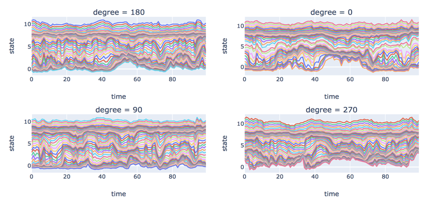
2. Angular Cross Sections
The angle to the sun has an impact on the patterns of electron density. Figure 6 depicts the variation of log electron density over the first 100 timesteps. We see an interesting pattern in degree = 0. Electron density is more volatile than other directions in the outside layers of the magnetosphere where electron density is small. In addition, we notice that electron density number is the steadiest at rho = 2 and 3, where electron density number is approximately constant at 8. It almost stays at the same state no matter how volatile it is at both sides. Electron density number is most volatile at rho = 5 and 6 where log density is between 4 and 5.
Figure 6. Log electron density by angle over time
Figure 7 depicts the standard deviation of log electron density by degree over time. Purple, blue, gold and red lines represent degree = 0, 90, 180 and 270 respectively. Its distribution at degree = 270 is different from other directions. The standard deviation is still relatively high when it’s far away from Earth. There are the same patterns during 0-1,500, but things start to change during 1,500-2,000. The maximum standard deviation at degree = 0 becomes lower and happens closer to Earth.
Figure 7: Log electron density standard deviation vs rho by angle over time
3. Concentric Cross Sections
The dissipation in electron density as you step out further in the magnetosphere away from the earth led to the inspection of concentric cross sections over time. The predicted state values would be pretty similar for points with the same radius away from Earth. We decided to split the data in these concentric cross sections resembling donuts. The magnetosphere was split into 10 “donuts” defined by the rho value (i.e. 1-2, 2-3, 3-4, 4-5, 5-6, 6-7, 7-8, 8-9, 9-10).
In Figure 8, the natural fluctuations of the predicted electron density can be seen pretty clearly at each “donut”. For the most part, it can be seen that the electron density across bands tends to increase gradually with time but when the electron density decreases it is steep and quick. This confirms how the magnetosphere tends to naturally expand with time, but when space weather conditions heat up, the magnetosphere contracts in size and a “wave” of electrons spills out of the magnetosphere. For the first 25,000 time steps, the average electron density seemed to move similarly—the “donuts” closer to Earth’s surface always maintained higher average electron density than the “donuts” further away.
Figure 8. Mean log electron density for each concentric cross section (“donut”) over time
It was interesting that the mean electron density at each donut never crosses any of the other bands across the first 25,000 time steps. In other words, the average electron density value for the donut closest to Earth will be the largest as compared to ones further away. This gave way to scaling the log electron density measures at each rho band in order to gauge what an abnormally high mean electron density reading would look like for that particular band as compared to other bands. In Figure 9, the way that some rho bands intersect each other in time is indicative of potential spatial anomalies, as one particular band can have an abnormally high or low predicted electron density value as compared to the other bands. The fluctuations after scaling also gave way to using clustering algorithms to determine what is normal at each band.
Figure 9. Mean of scaled log electron density for each concentric cross section (“donut”) over time
4. What is normal?
Before we technically define what is normal in our data, we detected broad, state-wide anomalies by looking at the mean log electron number density (END) throughout the time. These anomalies are defined as anomalies which fall outside of the usual distribution, or point anomalies as defined by Chandola et al.
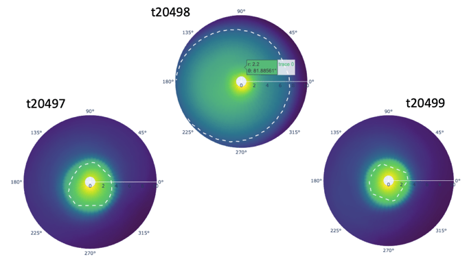
We chose three coordinate locations (loc0:rho=1, degree=90; loc250:rho=5,degree=163.52; loc16605:rho10, degree=-16.48) representing roughly high, median and low electron density, and big jumps at around time step 20,498 were found in all locations (Figure 10). By applying the 3-sigma rule (Grafarend, 2006) (basically any observations that fall outside of three standard deviations from the mean is considered an outlier), it seems to be an outlier (Figure 11).
Figure 10. Log electron number density for three locationsFigure 11. Box plots of Log electron number density for three locations
To further look at details at the time stamp 20,498, we plotted the mean log electron number density across the time step from 20,000 to 28,500, and there is an extremely observant jump at time step 20,498 (Figure 12).
Figure 12. Mean Log electron number density
We have also noticed that there’s a large drop in the mean log electron number density prior to that very high value and if a time series model hadn’t seen that sort of scenario in the training data, it’s possible that the model predictions for this time step could be far off from the truth. Recall that each time step is a 5-minute increment, and although the magnetosphere is dynamic and always changing, we would not expect to see such a magnitude of a change from one time period to the next. In the polar coordinate charts, we saw a drastic change in the boundary of the plasmasphere prior and after the time step 20,498, and thus we are very confident the time step 20,498 is a fluke of the model prediction process (Figure 13). In the Anomaly Detection section, we will be further looking at the anomalies across multiple time steps, and leverage anomaly detection techniques and models to help detect anomalies.
Figure 13. Polar coordinate charts at time step 20497, 20498 and 20499 with the dash circle outlining the boundary of the plasmasphere
V. Clustering Algorithms on Cross Sections
K-means
We applied K-means clustering across 25,000 time steps for each “Donut” (rho band) using all 2166 degrees as features. In order to perform K-means clustering on this data we decided to first reduce the dimensions by performing Principal Component Analysis (PCA) (Altman and Krzywinski, 2015) on the scaled features for each rho band cross section. Once we reduced the dimensions using PCA, we performed K-Means on the resulting principal components.
Take rho 3-4 as an example, we chose three clusters to represent high, median and low density (Figure 14).
Figure 14. K-means clusters for rho 3-4
VI. Anomaly Detection
An anomaly refers to a data instance that is significantly different from other instances in the dataset. Oftentimes they are harmless. These can only be statistical outliers or errors in the data. But sometimes an anomaly in the data may indicate some potentially harmful events that have occurred previously.
For our problem, we are looking at 5,000 time steps within each “Donut” and flagging a time step as an anomaly if and only if it is global or local outlier such that there is a huge variation of log electron density within that state at that time step. We then used Principal component analysis to decompose the information into two principal components for visualization.
1. Isolation Forest
The Isolation Forest algorithm (Liu, 2008) isolates observations by randomly selecting a feature and then randomly selecting a split value between the maximum and minimum values of the selected feature. The logic argument goes: isolating anomaly observations is easier because only a few conditions are needed to separate those cases from the normal observations. On the other hand, isolating normal observations requires more conditions. Therefore, an anomaly score can be calculated as the number of conditions required to separate a given observation.
The way that the algorithm constructs the separation is by first creating isolation trees, or random decision trees. Then, the score is calculated as the path length to isolate the observation. We used 500 trees to make estimations. Figure 15 shows anomalies flagged (in yellow) by Isolation Forest for “Donut” 1. Within the cluster also we see some yellow points, if one views this in 3 dimensions you would see that these points are around a big blue mass.
Figure 15. Anomalies flagged in yellow using Isolation Forest
2. Autoencoders
Autoencoders (Kramer, 1991) are an unsupervised learning technique in which we leverage neural networks for the task of representation learning. Specifically, we designed a neural network architecture such that we impose a bottleneck in the network which forces a compressed knowledge representation of the original input. If the input features were each independent of one another, this compression and subsequent reconstruction would be a very difficult task. However, if some sort of structure exists in the data (ie. correlations between input features), this structure can be learned and consequently leveraged when forcing the input through the network’s bottleneck. Since our data is spatial temporal we see that our timesteps are autocorrelated which makes it perfect to compress information using a non-linear algorithm. Our four-layer autoencoder with two 2 node bottleneck layers performed dimensionality reduction to bring down information to 2 features only. We leveraged python’s outlier detection package(pyOD) to flag anomalies. Figure 16 shows anomalies flagged (in yellow) by Autoencoders for “Donut” 1. We saw that autoencoders behaved very similarly in flagging anomalies within all Donuts. They flagged the least – roughly 10% of the time steps were flagged as anomalies.
Figure 16. Anomalies flagged in yellow using autoencoders
3. One class Support Vector Machine
The Support Vector Method for Novelty Detection by Schölkopf et al. basically separates all the data points from the origin (in feature space F) and maximizes the distance from this hyperplane to the origin. This results in a binary function which captures regions in the input space where the probability density of the data lives. Thus, the function returns +1 in a “small” region (capturing the training data points) and −1 elsewhere.
It sets an upper bound on the fraction of outliers (training examples regarded out-of-class)
It is a lower bound on the number of training examples used as Support Vector.
Due to the importance of this parameter, this approach is often referred to as ν-SVM. Definitely we see that this algorithm is aggressive in flagging anomalies, almost 50% of the time steps are flagged as anomalies (Figure 17).
Figure 17. Anomalies flagged in yellow using one class SVM
4. Ensemble-Voted Detector
This is a simple classifier that looks within every donut if a time step is flagged as an outlier by all three algorithms – Autoencoders, One class SVM and Isolation Forest (Panda and Patra, 2009). This is the most reliable in terms of creating an ensemble of our detection algorithms. See plots in Figure 18 and Figure 19.
Figure 18. Anomalies flagged in yellow using ensembled voting.Figure 19. Variations in number of anomalies detected using different algorithms at different donuts.
VII. Developing application to visualize clustering
Goal
The visualization application is intended to give users an interactive experience of exploring the various aspects of the magnetosphere and the analyses described in the preceding sections. By choosing different algorithms and time ranges and clicking and hovering over the grids, users are able to see the magnetosphere at different granularity levels and focus on the parts they are mostly interested in, including clusters, concentric views, individual coordinates, as well as the anomalies. It will provide inspiration for others to explore this area of study further and perhaps continue research.
Elements of application
Anomaly Detection Algorithm: A dropdown menu to select the anomaly detection algorithm. Anomalies will be marked in dashed grey in both the heatmap and the top left donut.
Time Range: A slider to select the time range (0-500) to present.
Heatmap: shows the cluster at each rho and timestep. Anomalies are marked in grey according to the algorithm chosen. Click on the grids to see the corresponding donut plots and hover over the grids to see the statistics of the donut.
Donuts: Top left: shows the concentric view of the selected timestep. Three clusters/colors (yellow, cyan, blue) representing high, median and low density. Anomalies are marked in texture.
Top right: shows the log electron density of each individual coordinate using randomly sampled data of the entire magnetosphere. Lighter colors indicate greater electron density.
Bottom left: shows the state of individual coordinates at the using random sampling for the selected donut at the selected timestep.
Trend Analysis: The line graph in the bottom right depicts the mean log electron density for the selected donut for the specified time range with the anomalous timesteps highlighted with yellow markers.
The application is embedded in the project website hosted on github.io, and works well on all types of browser and devices.
VIII. Next Steps and Future Use of Application
We have only included 500 timesteps data to demonstrate at the moment due to website latency, however, in the future, the timestamps could be expanded. More datasets could be integrated into the current dataset to explore the relationships between the magnetosphere electron number density with other activities in space. We believe the website will not be limited to this project and it might be a good idea to include other plots, website links, educational videos about the magnetosphere and space. Thus, it will provide a thorough understanding and experience for our audiences who are interested in space and data science.
IX. References
Altman, N., & Krzywinski, M. (2015). Association, correlation and causation. Nature Methods, 12(10), 899-900.
Bortnik, J., Li, W., Thorne, R., & Angelopoulos, V. (2016). A unified approach to inner magnetospheric state prediction. Journal of Geophysical Research: Space Physics,121, 2423– 2430.
Chandola, V., Banerjee, A., & Kumar, V. (2009). Anomaly detection: A survey. ACM Comput. Surv., 41(3), Article 15.
Grafarend, E. W. (2006). Linear and Nonlinear Models: Fixed Effects, Random Effects, and Mixed Models. Berlin, Germany: De Gruyter.
Kramer, M. (1991). Nonlinear principal component analysis using autoassociative neural networks. AIChE Journal: 37(2): 233–243.
Liu, F., Ting, K., Zhou, Z.-H. (2008). Isolation Forest. 2008 Eighth IEEE International Conference on Data Mining: 413–422.
Panda, M., & Patra, M. R. (2009). Ensemble Voting System for Anomaly Based Network Intrusion Detection. International Journal of Recent Trends in Engineering: 2(5). 8-13.
Schölkopf, B., Williamson, R. C., Smola, A. J., Shawe-Taylor, J., & Platt, J. (1999). Support Vector Method for Novelty Detection. Advances in Neural Information Processing Systems: 12, pp. 526-532.
Spasojević, M., Goldstein, J., Carpenter, D., Inan, U., Sandel, B., Moldwin, M., & Reinisch, B. (2003). Global response of the plasmasphere to a geomagnetic disturbance. Journal of Geophysical Research: 108.
Many thanks to Valentino Constantinou for being an amazing mentor and leading the team to finish the project. Special thanks also to Borchuluun Yadamsuren for the copyediting and consistent support.
While my move to Chicago was filled with excitement, it was also met with some caution. As a native Floridian, I was warned of the intense winters, and feared not only being frozen by the cold, but also enduring excessive hours of darkness. According to Psychology Today, an estimated 10 million people suffer from seasonal affective disorder (SAD) every year. Defined as depression that surfaces during the same season each year, SAD is seen in most during the winter months. SAD affects various aspects of life, including appetite, social inclinations, and sleep patterns. As someone unfamiliar with seasonal swings, this got me thinking about how they could affect other aspects of my life beyond what is usually reported by health professionals.
Particularly, it got me wondering how SAD could influence something very close to my heart: music. I began to think about how my music listening habits may be altered by SAD and other seasonal trends. Would I need more variety in my music to cope during the winter months? Would I listen to more angsty music during January and February than I would normally listen to in the summer? While I continue to monitor my own behaviors, I thought it could be interesting to see if I could detect certain seasonal music listening habits on a population level.
For this project, I decided to focus on two particular questions regarding seasonal effects and music listening habits:
(1) Does the quantity of unique songs we listen to differ by season (i.e. do we need more variety in our music depending on the season)?
(2) Do the seasons effect what genre of music we listen to?
Initial Research
While there is limited existing research about the relationship between consumption of music and the seasons, there is plenty of evidence about which times of the year are the most hectic for music events. Most of top 20 music festivals, such as Coachella and Lallapaloosa, are scheduled for Spring or Summer, and none of the top 20 are scheduled Winter. According to MusicConsultant.com, the best time for artists to release new music is between January and February, and between April and October, suggesting that songs released in Winter will not do well because of holiday chaos, and songs released in March will be overshadowed by the famous South by Southwest festival.
As far a research about the relationship between the seasons and music genre, a study conducted by psychologist Terry Pettijohn and collaborators caught my eye. According to their research, there does seem to be some relationship between genre preference and season. Pettijohn built his research on a previous study about daylight savings time, which found that with any environmental threat, such as a change in routine caused by waking up an hour earlier, people prefer to consume more meaningful content, i.e. slower, longer, more comforting and romantic music. Basically, music in trying times are used as coping mechanisms. In his study, Pettijohn primed United States college students in the Northeast and Southeast to report their music preferences in the different seasons. Based on what the students reported, he noticed that all students seem to prefer more relaxed music, such as jazz, folk, and classical, in the fall and winter, but more uplifting music, such as electronic and hip hop, in the summer. I thought this study was very interesting, however, was cautious about the results because of the self-reported nature of the study.
Hypotheses
Based on this initial research, I developed two hypotheses to test my questions.
* First, I expect there to be a greater quantity of unique songs consumed in the Spring and Summer. This is due to not only to festival lineup in these months, but also the recommendation by MusicConsultant.com to avoid releasing music in the winter.
* Second, I expect that there will be a seasonal effect on genre. Particularly, I believe I will see a preference for pop in the Summer and Spring months, and a preference in rock, soul, and angst (emo, punk, grunge) in the Fall and Winter. I believe this, based not only because of the seasonal study by Pettijohn, but also because of the previous research about using music as a coping mechanism.
Data Sets
For this study, I used the following data sets.
The first is Billboard Hot 100, which reports the top 100 hits for every week from August 2, 1958 to June 22, 2019 in the United States. The original data set consists of 317,795 entries with 10 columns of information. The columns provide information on the WeekID (assigned by Billboard), the current rank (1-100) of a particular song during that week, the song name, artist name, songID (a unique indicator of the song consisting of the song and artist name), how many times the song was charted, the song’s rank in the previous week, the peak rank of the song, and how many weeks the song stayed in the top 100. For the purpose of this study, I only used the three columns: WeekID, SongID, and current rank.
The second data set is Million Song, which is contains genre information about artists. The original data set contains a million rows of information about a given song, including information about the song genre, song duration, tempo, time signature, number of beats, energy and much more. While there were originally 46 columns of information, I was only interested in finding a song’s genre, or genres, since this information was not provided by the Billboard Hot 100 dataset. I wanted to be able to add genre information to detect genre popularity within seasons.
Part I: Determining Relationship Between Quantity of Music Variety (Number of Unique Songs) and the Seasons
To determine if there is a relationship between the seasons and music variety, I used only Billboard Hot 100 data set. This data set was aggregated to show the unique number of hits per month (the number of charted songs per month), which I used to represent the variety of songs consumed by the public each month.
From this aggregated data set, I created four plots to graphically assess the number of hits per month by looking at the elements of time series decomposition (Figure 1). The first plot in Figure 1 draws the number of hits over time. We see from this graph that there is certainly a trend over time, with a dip in the number of hits per month in the late 1990s. We also notice from this plot lots of variation in the number of hits, which could indicate the presence of a seasonal trend. I dove deeper with the seasonal trend plot, which showed a consistent wiggle, indicating the possibility of seasonality. The third plot shows the cyclical trend of the number of hits per month. Based on the plot, there does not seem to be a large cyclical presence in the data, except for a dip and rise in the late 1990s. Finally, the last plot in Figure 1 explored the random aspect of the data. We see from the plot that randomness could play a great deal in the temporal relationships of the data. Based on the second plot, I decided to further explore the seasonal effect on number of hits of per month.
Figure 1: Time Series Decomposition of Number of Hits Per Month
I used a bar graph (Figure 2) to compare the average number of hits per month. The bars seem to be at an even height, indicating that the average number of hits per month may not differ by month.
Figure 2: Average Number of Hits Per Month (1958-2019)
Finally, in Figure 3, we look at the average number of hits per month by season (Winter = [December, January, February], Spring = [March, April May], Summer = [June, July, August], Fall = [September, October, November]). From Figure 3, the number of hits does not seem to vary with the seasons because the bars are approximately the same height.
Figure 3: Average Number of Hits Per Season (1958-2019)
To address the conflicting theories from the time series decomposition and bar graphs, I employed Poisson regression to analytically assess the presence (or lack of presence) of a seasonal effect on number of hits per month. My inspiration to use this method came from a student project about determining if there is a seasonal effect in number of suicides.
I used the Poisson model where µ is the Poisson incident rate and where
To represent seasonality as a predictor, I used the following two models:
(1) Using properties of sine and cosine to emulate seasonality
(2) Using the season itself as a factor
Running the first model, we see that while the chi-squared test of overall significance indicates that the model is statistically different than the null model, time itself is the only significant predictor of number of hits. Thus, the sine and cosine variables used to represent season are not significant predictors, and season is not a driving force is predicting the number of hits per month.
I verified this conclusion with model 2, which revealed that none of the seasons are significant predictors of number of hits.
To finalize the results, I compared the Poisson model 2 with a random forest model of the same structure. I used 500 trees, which I verified was appropriate in Figure 4, and sample 3 variables for each split. From Figure 5 we see that season does not appear to be an important variable in predicting number of hits. Finally, from the partial dependence plots in Figures 6.1, 6.2, and 6.3, it is confirmed that season is not influential in predicting the number of hits. These conclusions align with what was found with the Poisson models.
Figure 4: Number of Trees
Figure 5: Variable Importance Plot Determines that Season is Not InfluentialFigure 6.1: Partial Dependence Plot of TimeFigure 6.2: Partial Dependence Plot of MonthFigure 6.3: Partial Dependence Plot of Season
In conclusion, based on the Billboard Hot 100 data, we see from both graphs and the results of the models, that there does not seem to be a seasonal effect driving the number of hits, and thus unique songs consumed, per month. While this does not support my hypothesis, I take these results with caution. The Billboard Hot 100 data set has a bias to only represent people who listen to popular music. In addition, my initial assumption that number of unique hits per month can represent number of unique songs listened to on a population level, may not actually capture this variable.
Part II: Determining Relationship Between Music Genre and the Seasons
To tackle the question of whether or not seasonality affects the genre of music we listen to, I merged the Million Song data set with the Billboard data set to get information about song genre. For the sake of this study I only used Billboard Hot 100 songs with a genre mapped from Million Song (35% of the Billboard set do not have a genre). Note that many songs have more than one genre listed and thus those songs are duplicated on the list for every genre listed.
First, for some initial exploratory data analysis, I determined the top genres in the merged data set (Figure 7). As expected: pop, rock, and soul top the charts.
Figure 7: Top Genres
Next, I wondered if the popularity of the top three genres are affected by season. In Figures 8, 9, and 10, we look at the number of hits per season from 1958-2019, for pop, rock, and soul individually.
Figure 8: Trends in Pop Since 1958Figure 9: Trends in Rock Since 1958Figure 10: Trends in Soul Since 1958
There does seem to be some sort of temporal trend based on the periodic peaks in number of hits, but the trends do not seem related to season. This becomes even more apparent in Figures 11, 12, and 13 when we look at the total number of hits by genre per season. There appears to be virtually no difference between number of hits between seasons. However, this could be due to the scalability of the graphs, so I decided to further investigate with a statistical test.
I ran one-way ANOVA tests on pop, rock, and soul subsets to determine if there is a difference in the observed mean of hits by season and the means expected under the null hypothesis H0 = µ1 = µ2 = µ3 = µ4 and the alternative that at least one of the means is not equal. From the ANOVA tests we see that for pop, rock, and soul there appears to be no seasonal difference. Thus, based on both the plots shown in Figures 11, 12, and 13, and the supporting ANOVA tests, we conclude there to be no seasonal difference in the type of music people consume. The tests for pop, rock, and soul all result in p-values greater than 0.8. Thus, the initial hypothesis that there is a seasonal difference between when pop, rock, and soul are consumed is not supported.
Figure 11: Pop ANOVA TestFigure 12: Rock ANOVA TestFigure 13: Soul ANOVA Test
Lastly, I was curious to see if a seasonal effect is present particularly in “angsty music”, which has a reputation for exploring sadness and depression. I defined “angsty music” to be genres that included the words “emo”, “metal”, “pop punk”, or “grunge”. Following the same procedure as before, I created Figures 17 and 18 of hits over time and hits by season. Again, there appeared to not be much of a difference except for a dip in summer. When I ran the one-way ANOVA test to determine statistical difference between the means of season, again we see that there is no difference between angsty music popularity by season, with a p-value of 0.886.
Figure 14: Trends in Angsty Music Since 1958
Figure 15: Angst ANOVA Test
In summary, contrary to my hypothesis, the ANOVA tests and graphs imply that there does not seem to be a seasonal effect on genre of music.
Conclusions, Final Remarks, and Future Directions
While the results of this analysis are not what I expected, I did learn something valuable from this study: you like what you like when it comes to music and you consume it consistently, no matter the season. It doesn’t matter if it’s summer or winter, if someone loves rock music, they’re going to listen to it consistently throughout the year. Although SAD does not play the role that I hypothesized it would in music listening habits, I find comfort in the fact that our favorite genres of music get us through all the seasons. And that’s exactly how I survived my first Chicago winter.
This study answered many of my questions about how SAD affects music listening habits, but I would be interested in further exploring this topic in the following ways. (1) Studying those actually diagnosed with SAD to determine the true effect of the disorder on music listening habits. (2) Using musical elements (such as chord progression and lyrics), rather than genre, to assess seasonal trends. This could capture more nuanced behavior in how our musical taste changes with the seasons.
Growing up with an avid sports fan as a father, I’ve watched, played, and followed sports for as long as a I remember. In his younger years he worked as a civil engineer. As is often typical of children, I wanted to emulate my father, which led to developing a keen interest in mathematics. It was inevitable that these two childhood passions would get entangled with one another. It began with a simple understanding of the game and then from watching enough NFL games, I began to understand the tendencies of play calls during different parts of the game. Thereafter, I grew into a ‘backseat’ coach, shouting at the TV when a coordinator made what was in my opinion a poor play call.
As a product of being born and raised in Chicago, I am a Bears fan and through most of my time following them, their offense has been run-heavy. This can be particularly frustrating as I’ve witnessed many 4th quarter losses because of conservative offensive playing calling and thereafter relying on the defense to hold the lead. From my perspective, it seemed that everyone knew the Bears would run the ball if it was the 4th quarter and they had any sort of lead. It irritated me that the play-callers wouldn’t take advantage of this by trying to run something more aggressive and unexpected. Over the years I’ve come to realize that I could be biased as I might only be recalling instances where the play calling seemed stale or led to a crushing loss. I couldn’t be certain with just my own observations and this inspired me to want to empirically quantify what play calling tendencies truly look like in the NFL. Furthermore, there has been a rise of analytics in the sports industry through the last decade. Analytics are part of the staple commentary in many sporting events and ESPN uses them liberally in their programs. The widely popular movie Moneyball showcased the use of analytics in baseball to broader public. However, the NFL and the associated teams have significantly lagged baseball or basketball in the use of analytics. With the data that is publicly available as well privately collected data, there are many opportunities to evolve the game using analytics and machine learning to provide valuable insights for the coaching staff and general managers.
Today, with the availability of data and my experience in programming, I no longer have to settle for the anecdotal evidence gained from my years of watching the NFL. In this article I dive into an NFL play by play dataset that I was able to acquire online to showcase tendency analyses, to build a predictive model, and to motivate deeper usage of NFL data to help the game grow and evolve.
Analysis Overview:
Many of the findings from the analyses contained in this report align with what is already known by those that are well versed with American Football and the NFL. However, the analysis provides precision to anecdotal expectations. American football is often dubbed as “a game of inches”, meaning that just a few inches on a given play in the game could be the difference in a win or loss. Therefore, this additional precision provided by analytics can have an enormous impact. Another key intent of this investigation is to serve as motivation and as a framework for use of NFL data to discover novel trends and insights in order to usher the NFL to be on par with other major US sports in terms of analytics.
In this study the analysis begins with empirically quantifying the offensive play calling tendencies of the NFL at both the aggregate and team levels. In particular, the ratio of run vs pass calls and the relative ratios of the play direction are evaluated to provide insight on the tendencies of teams and how they spread the ball across the field. After these descriptive analyses, a predictive approach for play calling is investigated. Namely, a XGBoost model is developed to predict the most basic aspect of a play call: will the possession team call a run or pass at any given instance of time in a football game. This type of model could easily be trained before any given game to reflect the most current data and a real-time prediction could be generated within seconds between plays. Such a model has the potential to provide even more information and benefit to coaches and coordinators than a detailed tendency analysis.
Lastly one more descriptive analysis is performed to motivate the use of this data at the player level. In particular, the offensive impact on the Denver Broncos due to acquiring Peyton Manning is explored. This results and insights from this analysis serve to motivate similar and deeper analysis to be performed to provide insights on salary planning, constructing NFL teams, deploying defensive schemes, and more.
Analysis Outcomes:
The information generated from the tendency analyses as well as the predictive model can provide significant advantage in both offensive and defensive strategies in the NFL. It can help defenses to better prepare and predict their opponents moves while on the flip-side of the token such information can provide visibility to offensives on how they could diversify their play selection. The player analysis segment provides a means to gauge how player acquisitions or trades are paying off for a given team along with the other benefits mentioned above. It can also shed light on what combinations of offensive players being on the field at the same time provides the maximum offensive efficiency for a given team.
The Data:
Prior to discussing the dataset in further detail, a quick run-down of curated football terminology will be useful in interpreting the analysis and discussion.
Each play is broken down into detail containing information on the game situation, play description, play result, etc. For this analysis, the dataset is reduced via filtering and cleaning steps to attain a subset containing information for general play call selection.
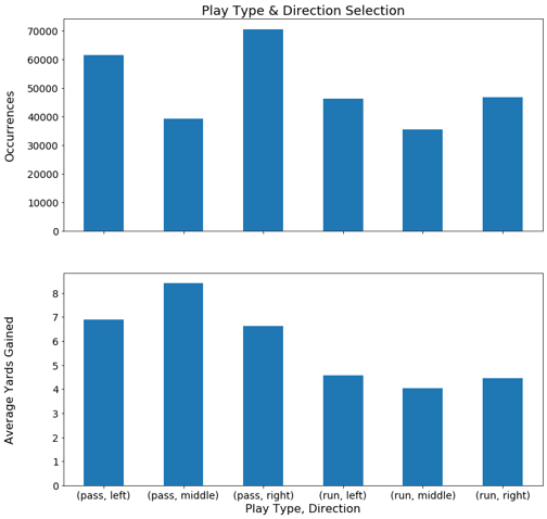
Digging into play call tendency, a look at the number of pass plays vs the number of run plays called, for all teams, through the 2009-2018 NFL seasons shows that there are significantly more pass plays called than run plays.
Figure 1. Pass vs Run Play Selection 2009-2018 NFL Seasons
A natural question that follows is how do the yards gained on pass plays compare to that gained on run plays. From this same dataset, the average yards gained per pass is roughly 6.3 yards versus 4.3 gained per run. Intuitively this makes sense as throwing a ball in the air to a teammate is likely to gain more yards if successful than trying to run the ball through a stream of defenders.
However, it is important to note the rest of the summary statistics. Namely, the median yards gained are 4 per pass vs 3 per run, and the 25th percentile value are 0 and 1 yards gained for pass and run respectively. This is likely because while passing plays have a higher potential to gain a lot of yards, they also can go incomplete, which results in no yards gained. This supports the notion that both aspects of the game and a diversity in play calling are necessary to progress the ball forward towards the opponent’s goal-line.
For someone familiar to the game of football it is tribal knowledge that the play type called is related to the down. For instance, on first down, a run play is often called so that a few yards can be gained making the goal for second down shorter thereby allowing for a more versatile set of playing calling options. Figure 2 below shows the tendencies of type of play called per down.
Figure 2. Pass vs Run Play Selection per Down
Figure 3. Pass vs Run Play Selection Percentages per Down
As the down increases, the number of pass calls in relation to run calls increase significantly (the relative percentages by down are shown in Figure 3). This is somewhat expected behavior as if you are in a 3rd down situation and have a significant number of yards to gain, the best chance to get the yards is through the air. This brings forth the question, how does the play selection relate to the down in combination with the yards left to gain.
Table 2. Pass vs Run Play Selection as a Function of Down & Yards to Gain
This table provides the defensive with empirical evidence for the likelihood of whether a pass or run will be called at a given down and yards to go situation. Much of this is anecdotally known by many who follow the game closely, but empirical data can confirm or deny the assumptions drawn from this anecdotal knowledge and it is much more precise. Furthermore, for a team possessing the ball, it provides areas where one can run an ‘unexpected’ play call to surprise the opposing defense. For instance, let’s consider the example of 3rd down and 4-6 yards to go. About 88% of the time, a pass play is called, meaning a defensive will be playing a pass coverage scheme. Looking at the data for yards gained for each type of play called in this scenario shows that on average a pass play yields approximately 5.46 yards while a run play yields approximately 5.44 yards. Keep in mind that there is a skew between the play types (88% vs 12% for pass and run respectively) that impact these values. The median yards gained are 1 and 4 yards for pass and run respectively, again likely due to the number of passes that go incomplete (0 yards). While this basic analysis does not consider many other game factors, it shows the potential of using tendency analysis to run unconventional play calls to counteract the defense, which is likely playing off expected anecdotal or basic tendency data.
As the game evolves over time it is interesting to study is how the ratio of pass to run plays changes over time. Figure 4 displays this information overlaid with the average number of points scored by team per game, which serves as a proxy for total points scored in that season.
Figure 4. Analysis of Play Selection Over Time
The data shows that there may be a positive relationship between the trend of the ratio of pass plays to points scored. This could be further explored in more granularity, but it is not pursued in this analysis.
Play Direction Tendencies
Diagnosing league and team level tendencies for play direction would also be valuable information for team coordinators. As done previously, a league-wide (all teams) analysis is performed with the results visualized in Figure 5.
Figure 5. Play Direction Tendencies and Yards Gained
Play calls in the middle (laterally) of the field seem to be the least popular selection. Based on my understanding of the game, I would speculate that this is because the defensive is generally stacked highest in the middle thus running would require going through the greatest number of bodies in this direction and with a pass play there is the least amount of open real estate between defenders to throw the ball in the middle of the field. However, successfully completing a pass in the middle also yields the highest average yards gained. A reason for this could be that catching the ball in the middle of the field leaves a receiver with the largest selection of directions to run after catching the ball.
Team Level Tendencies
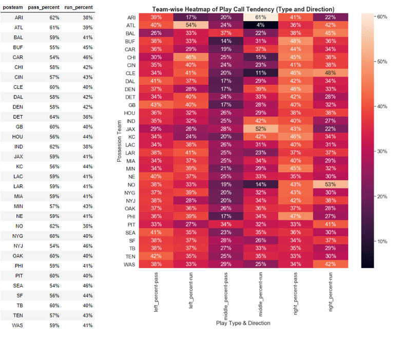
An analysis at the team-level granularity could be very useful for a defensive coordinator in that he/she would possess the tendencies of a given team to play the ball in a specific direction and the tendencies for that team to call a run or pass play. This would allow a coordinator to set-up his defensive in schemes as to counteract these tendencies. Table 3 below outlines the percent of plays that are in a specific direction for each given team during the 2018 season.
Table 3. Team Level Tendencies in 2018 NFL Season
Table 3 and the supporting heatmap can essentially be used as a cheat sheet by both defensive and offensive coordinators. It can be easily updated to account for the latest real-time data. For instance if you are a defensive coordinator and your matchup this week is against the Atlanta Falcons, you can use the table above to understand that they are a pass heavy team (61% pass plays) and they tend to throw the ball to the sides rather than the middle (only 24% of throws in the middle). Furthermore, if you suspect they are going to run on a given play, the table above shows they are highly unlikely to run it down the middle (4% of runs). On the flipside if you are the Atlanta offensive coordinator, you can use this information to more precisely understand how you are spreading the ball and begin to diversify your play call to avoid the traps the defense might be setting up based on your previous tendencies.
Pass vs Run Play Prediction:
Approach
A machine learning application for this dataset is to utilize historical data to try to predict if a specific team is going to call a pass or run play at any given time during a current game. In this case, the problem is formulated to predict pass or run, thus one can attempt to train a binary classification model. After trying a few different approaches ranging from logistic regression to ensemble methods, I settled on a gradient boosted tree model (XGboost) for the final model. In a nutshell, a gradient boosted tree model is chain of decision trees that are trained in a gradual, additive, and sequential manner. Each new tree built tries to improve a bit upon the error propagating from the rest of the chain upstream. There are many resources available online for understanding gradient boosting in more depth and to understand the XGboost package/approach. One such resource is https://towardsdatascience.com/https-medium-com-vishalmorde-xgboost-algorithm-long-she-may-rein-edd9f99be63d.
Model Development & Performance
i) Data subset utilized
To develop this model, data from the 2015-2017 NFL seasons were utilized as the training set while the test set used comprised of the 2018 NFL data. Pre-2015 data was not utilized as rosters, coaching staff, and other evolutions of the team and game occur so frequently that to predict the 2018 season data, it is best to utilize recent season data.
ii) Feature Engineering
The features fed into the model can be found in Figure 7 below. A fair level of data cleaning had to be performed prior to the tendency analysis. Some examples include accounting for team name changes, removing kicking plays, removing extra point plays, removing plays where a penalty occurred, etc. Numerical encoding was performed on categorical features as the XGBoost package utilized does not accept string inputs (but in theory most tree models can accept string inputs). In the feature set, the possession team was label encoded, while the response variable (the “play_type” field) also had to be numerically encoded. Specifically, a 0 represents a run play while a 1 represents a pass play.
iii) Model Tuning
Little model tuning was ultimately performed as a randomized cross-validation grid search showed minimal improvements when testing hyperparameter combinations relative to the defaults in the XGboost python package. Specifically, the random grid search was provided the following parameter ranges:
There are 5 folds fit for 25 different sets of the hyperparameters above resulting 125 total fits. The final model performance is detailed below. Feature importance, for this model is also detailed below. Generally speaking, feature importance provides a score that indicates how useful or valuable each feature was in the construction and predictive capability of the model.
The model achieves a respectable 73% accuracy (with F1 score being in a similar neighborhood) of being able to predict whether a play will be a run or pass play at any given instance of an NFL game. There are some interesting notes from the feature importance plot. The seconds remaining in the half is the strongest parameter followed by the score differential. From domain knowledge, an explanation for this could be that deep field passes are more often seen when the time is running low (in either half) and/or when the possession team is significantly behind in score. Also of interest that the possession team is a strong feature as it supports the notion that studying analytics and tendencies of the opposing team can considerably improve your chances to win by preparing appropriate defensive schemes.
To understand the model’s performance further, the prediction accuracy is further explored by down and yards-to-go combinations. Furthermore a ‘baseline’ prediction accuracy is also provided for comparison. This baseline prediction assumes the more common play type called historically will be called every time in the future for a given combination of down and yards-to-go. E.g. from Table 2, in the case of 1st down and 1-3 yards to go, approximately 70% of the time, a run is called. For the baseline model, when a scenario of 1st down and 1-3 yards to go arises, it will always predict run. This baseline represents the prediction a team would likely make in absence granular statistics like the team-level tendency analysis shown earlier in this document or in absence of advanced analytics such as predictive models.
Figure 8. Model Performance by Down & Yards to Go Groupings
There are many game scenarios where the baseline prediction is as accurate as the model, but this is mostly in obvious scenarios. For example, the two have similar accuracy in 3rd and long scenarios. This situation is a where the possession team needs more than the average yards gained by running to convert a first down, therefore they are very likely to pass the ball. In scenarios such as 2nd or 3rd down and short where the offense has a wider choice of play selection, the model strongly outperforms the baseline. These less obvious scenarios are exactly where it would help a defensive coordinator to have additional predictive capability or information.
Adding this model to a defensive coordinators toolbelt could provide further information to optimize defensive schemes against any given opponent. Of course, the model could be even more useful if it could predict further details such as the specific type of play that might be called such as a screen play, fly route, sweep to the right, etc. Unfortunately, this level of detailed information was not readily available to parse through. However, based on the data already being collected by the NFL, it is possible this may be available elsewhere.
Player Level Analysis:
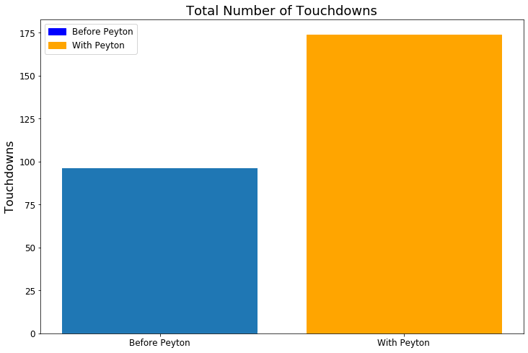
This dataset can also allow for analyzing a given player’s impact on a team or game. A quick study performed here is to show how the Denver Broncos offense dramatically improved when they signed Peyton Manning. The three years prior to Peyton joining the team are compared to the three years that he was the starting QB.
Figure 9. Peyton Manning Impact on Denver Broncos Total Pass YardsFigure 10. Peyton Manning Impact on Denver Broncos Touchdowns
From the above figures, it is clear to see that the Broncos dramatically improved their offensive prowess after adding Peyton Manning to their roster. They gained more yards per game, scored more points per game, and had more possession time per game. This is reflected in their win-loss statistics through these seasons. Namely from 2009-2011 they had 20 wins and 28 losses while from 2012-2014 they had 37 wins and 11 losses.
One might argue that the impact seen is due to numerous factors and not just due to the signing of Peyton Manning. It would be very difficult to separate just his impact to the team’s improved performance, but it is possible to research into some of the potential confounding variables. For instance, a common thought might be that maybe an investment in Peyton also yielded an investment to better the offensive line or wide receivers for the 2012 season.
The O-line remained largely the same between 2011 and 2012, and there was no significant investment into it. However, their performance dramatically changed between the two years. The causal reasoning of this is not explored in detail in this analysis. Something to consider is that the quarterback situation was less defined in 2011 with Tim Tebow and Kyle Orton often splitting the role. Orton is a pocket passer while Tebow rarely stays in the pocket for more than a few seconds. This means the O-line consistently had to adjust its play style. Peyton Manning is a consistent pocket passer and he had sole ownership of the quarterback role in 2012 likely leading to less variability in how the O-line needed to protect the quarterback.
There was also no significant investment in the wide receiver position during Peyton’s first year (additions were made in subsequent years). The most productive wide receivers on the team in 2012 were also on the active roster in 2011 but they were much less productive then. Another consideration is that the coaching staff could have undergone a significant change, however most of the staff including the head coach, the offensive coordinator, and the quarterbacks coach all remained the same between 2011 and 2012.
This analysis shows the potential of utilizing similar and more complex analysis to gauge how player acquisitions/trades are paying off for a given team. More importantly such analyses could dive even deeper to be used to provide insights for salary planning, constructing a team, deploying defensive schemes, and more.
Conclusions:
Performing the analyses contained within this article has served to only deepen my desire to study analytics in the context of the NFL rather than quenching it. The findings from these analyses can provide significant advantage in both offensive and defensive strategies in the NFL. It can help defenses to better prepare and predict their opponents moves while on the flip-side such information can provide visibility to offensives on how they could diversify their play selection. With football being dubbed a ‘game of inches’ the ability to diagnose tendencies with precision or to effectively predict just a few plays could change the course of the entire game. Performing similar analyses with up to date data for a team’s upcoming match would certainty provide a competitive edge that could be the difference in winning or losing. Similar tendency analysis studies extend to baseball, basketball, etc. For example, such analyses are used today to help fine tune defensive shifts in baseball or to determine what aspects of a batters hitting needs to be worked on such that they can counteract such defensive shifts. These types of analytics are being worked on in the field, but it is a relatively new space, especially in the NFL.
The predictive modeling approach and results present a strong use-case in providing more accurate predictions and information to defensive coordinators in difficult game scenarios. The extension of this to the other sports are not as clear as basketball’s more continuous play and baseball’s pitching format do not translate readily into this modeling approach. The player level analysis and use-cases discussed can certainly be extended to almost any other team sport and would likely provide significant value to a general manager and coaching staff.
The analysis performed within this article is just one of many ways to interpret and analyze this type of data. The NFL is acquiring data at a rapid pace and much of this data remains untouched. This document hopes to inspire similar efforts to unlock the potential of this data to help take NFL strategy to the next level.
Continued Work:
There is much more that can be done with the dataset discussed in this article. The model was developed over a very short period and was built with a subset of features manually selected based on domain knowledge. A few suggestions for continued work are:
Use many more features in the predictive modeling, both those that are readily available in the dataset and others generated through feature engineering. Allow a feature selection approach to select what features are most important.
Determine if including recent plays called would improve the prediction capability of a model. E.g. use a time-series prediction method such as LSTM or Markov chain approach to model the data
Collect data on offensive formation (singleback, trips, spread, etc) and perform team level tendency analysis on that as well as adding it as a feature to the predictive model
Perform analyses to determine what types of plays each team has the most difficulties defending against
Using the personnel data, an analysis could be performed at the team level to understand what types of plays are called when certain players are on the field.
Perform a more extensive look into player level analysis to gain insights on optimal building of an NFL team and the associated salary planning
Thanks to Max Horowitz for making the scraped play by play data available on publicly on Kaggle. Special thanks also to Borchuluun Yadamsuren, Joel Shapiro, and Finn Qiao for the copyediting and feedback that helped to forge the analysis and write-up into this finished product.
This paper was written to record our experience as the 2nd place winners and recipients of a $15,000 reward in the 2019 Humana-Mays Healthcare Analytics Case Competition amongst 480 participating teams from across the US.
Left to Right: Heather Cox (Chief Digital Health and Analytics Officer, Humana), Saurabh Annadate, Tanya Tandon, Arvind Mahajan (Associate Dean for graduate program, Mays Business School, Texas A&M University)
COMPETITION DETAILS
The 2019 Humana-Mays Healthcare Analytics Case Competition involved two levels of submissions and three rounds of evaluation. For level one submissions, we were required to develop a predictive model, score a holdout dataset and provide an analysis write-up. For level two, we had to present our findings to a panel comprising of Humana executives and Mays Business School faculty.
Round 1: Top 50 teams were selected amongst 480 participating teams based on the accuracy of the scored dataset
Round 2: Top 5 teams were selected amongst the top 50 teams based on the analysis report
Round 3: The winners were selected amongst the top 5 on the basis of their final presentations which took place in Houston, TX
Figure 1: Competition Timeline
PROBLEM STATEMENT
Humana is a leading healthcare company that offers a wide array of insurance products and health and wellness services. It serves over 15 million members nationwide. The aim of this study was providing Humana a better understanding of Long-Term Opioid Treatment (LTOT). LTOT is a phenomenon where a doctor’s prescription of opioids for pain or other illnesses leads to a long-term usage by the patient which eventually leads to addiction. Our goal was to develop a classification model to predict the likelihood of a patient experiencing LTOT in the future using the data of their prior touchpoints with Humana. In addition to this, we wanted to extract actionable insights and evaluate key indicators aligned to Humana’s business needs.
LTOT is not only a personal havoc for patients which disrupts their lives but also a huge financial burden on Humana. This study’s mission is to develop a solution to mitigate both effects.
WHY SHOULD THIS PROBLEM BE SOLVED?
Prescription opioid abuse is a colossal problem in the United States. A recent study conducted in 2017 [1] reports that 11.1 million prescription opioids were abused in the previous year alone. It is also reported that there were 47,600 opioid overdose related deaths in that year, which accounted for almost two-thirds of all drug overdose deaths. Furthermore, prescription opioid abuse begets a much larger problem – it is reported that 4% – 6% of those who misuse prescription opioids transition to heroin, which is very worrisome.
Looking at the financial aspect of this problem, a 2013 study reports that the total annual burden of prescription opioids abuse on the entire US healthcare ecosystem is $26 billion [2]. Another study based on test and control groups show that the 2-year per person burden for treating opioid dependence on a payer is ~$23,000, which is significant [3].
As it is seen from the above numbers, the problem that we are tackling at hand is massive and the impact of developing a solution for the same will be tremendous. But how can we solve this problem?
CMS reports that as many as 1 in 4 patients receiving long term opioid therapy in a primary care setting will struggle with opioid addiction and dependence. Research also suggests that early opioid prescribing patterns including the frequency of prescriptions as well as the total Morphine Equivalent prescribed are directly associated with long term opioid use and potential for abuse [4]. Lack of enough data on how long and what dosage of opioid is safe to be prescribed to a particular patient at clinicians’ behest is a major deterrent to prevent long term opioid use. Even when the data is available, it is not readily consumable by clinicians who are sole decision makers of prescription decisions.
Hence, it is imperative for proactive identification of individuals who are at a higher risk of getting addicted to opioids for tracking and appropriate servicing and making this information available in an easily digestible way to the decision-making stakeholders. This will not only help improve the well-being of the members but also reduce the cost burden on the individual as well as the payer.
WHAT IS THE SOLUTION?
Figure 2: Proposed Solution
We proposed and built a two-fold solution for this problem (Figure 2):
Early Detection of LTOT: Developing a predictive model by leveraging machine learning to identify at-risk individuals for Long Term Prescription Opioid use
One-click solution: Building a one-click platform for stakeholders such as Doctors and Humana staff to access personalized patient information so that appropriate action can be taken
HOW DOES THE SOLUTION IMPACTS STAKEHOLDERS?
Figure 3: Positive Impact for all stakeholders
As established earlier, Prescription Opioid Abuse is a pertinent problem to tackle. Our developed solution will help Humana identify patients at risk of LTOT and take directed measures to prevent potential future abuse and addiction. Implementing preventive measures will also help Humana save millions of dollars in opioid treatment as well as administration costs. Furthermore, this will enable the providers to make better informed decisions which will drive higher patient satisfaction rates. Lastly, but most importantly, patients will experience better health outcomes and lower healthcare costs as depicted in Figure 3.
METHODOLOGY OF THE ANALYSIS
1. Dataset
To perform this analysis, we were given a 4-years long longitudinal view of events for MAPD members currently enrolled with Humana. The dataset had ~6mn records and 20 columns. Data for 16 different types of events including calls, medical claims, diagnoses, provider, and pharmacy claims with each event having its own set of attributes was provided. The time stamps were relative with the anchor point being the first naive opioid event observed post the first year and having the time stamp as Day 0. A naive opioid event is defined as the patient getting an opioid prescription while not having had opioid on hand for 90 days prior. We had the data for 14,000 deidentified unique patients.
Exploratory Data Analysis was performed to understand the distributions as well as data quality. Several quality issues and nuances like multiple prescriptions on the same day, missing Day 0 records, missing dosage volumes etc. were identified and highlighted.
2. Computing Target
Our aim was to understand whether there is an occurance of an LTOT event post a naive opioid event. As mentioned before, an LTOT event is defined as having opioid on hand for at least 90% of days in the 180 days period post a naive opioid event. A naive opioid event is defined as the first prescription of opioid by a doctor for pain or any other illnesses. There are different ways an LTOT can occur after the naive opioid event (Day 0) has occurred. Figure 4 illustrates the two cases where LTOT was observed. In case 1, an LTOT event is observed for the opioid naive event at Day 0 itself since the patient has opioid on hand for >90% of days within the 180 days period post Day 0. In case 2, LTOT is not observed for the first naive opioid event, however is observed for a naive opioid event occurring at Day 120. For all occurrences of such cases, the target for modelling was set as 1, and rest as 0.
Figure 4: LTOT Definitions
We observed that the incidence of LTOT in the training data was ~46%. Hence, it was a fairly balanced dataset.
3. Feature Engineering
For feature engineering, we explored and extracted features from each of the sixteen types of events – prescription, change of doctors, new disease etc. which could be reflective of the patient’s behavior. The features generated broadly fell under the constructs of cost, recency and frequency. Literature review also indicated that incidence of certain conditions like anxiety, depression, heart disease, etc. were good indicators of future opioid abuse [5]. Hence, on the basis of the presence of certain keywords in the claim descriptions, we extracted disease specific attributes to capture these nuances. A total of 479 features were constructed. For most of the features which included aggregation across time, we defined three different time buckets, and aggregated the features for each of these. The time buckets were:
0 to 180 days prior to Day 0
180 to 360 days prior to Day 0
360+ days prior to Day 0
As shown in Figure 5, all of our features fell into 4 buckets: costs, recency, frequency and disease attributes with an added dimension of time.
Figure 5: 479 engineered features fell in 4 buckets
4. Modeling
After computation of our target and engineered the features, the next step was modelling. In order to quickly iterate through different models and hyperparameter sets, we utilized the open source automated machine learning module of H2O.ai. This module provided an API to automatically fit Random Forests, Extremely Randomized Trees, Logistic Regression and Gradient Boosting trees (both XGBoost and H2O implementation) on our final processed patient level dataset and performed random grid hyperparameter search and 5-fold cross validation to ascertain the best performing model. Since our problem was a binary classification problem, the objective function that was minimized was binary cross-entropy. The top performing model was a XGBoost gradient boosting tree classifier. The modelling workflow is depicted in Figure 6.
Figure 6: Modelling Process
Table 1 shows the performance metrics for the model. All metrics are average 5-fold cross validation metrics. As we can see, the model has an area under the ROC curve of 0.8045 which indicates that the model has a good performance. Furthermore, it also has good overall accuracy, precision, recall and F1-score. We wanted to check how the model would perform if we only take the top 20 variables as identified by the feature importance from the model.
Table 1: Model Performance Metrics
And as we can see, the model performance does not degrade if we consider only the top 20 variables indicating that these variables provide the maximum signal. Furthermore, a look at the probability distributions for the training data as shown in Figure 7 reflect the findings that the model is doing a good job of classifying a particular patient as LTOT probable or not.
Figure 7: Predicted Probability Distribution for Training Data
RESULTS OF THE ANALYSIS
In order to interpret the effects of the different features on the probability of LTOT, we decided to use the SHapley Additive exPlanations (SHAP) plots. Following are the top 20 most impactful features as identified by the algorithm:
Table 2: Top 20 most impactful variables
Shapley Tree plot and individual variable dependence plots were analyzed to study the impact of these variables on the probability of a patient to experience Long Term Opioid Use post initial prescriptions.
INSIGHTS
Following are the key takeaways:
Having a history of pain related pharmacy claims and specially prescription opioid pharmacy claims is an extremely good indicator of future LTOT behavior which aligns with the literature review
Patient activity in Time period 180 days+ prior to Day 0 is the more impactful in determining LTOT than the most recent 6 months
Having Anxiety, Depression, Neuro, Antibiotic or Cardio pharmacy claims in the most recent one month influences future LTOT behavior which aligns with the research findings
If the patient has had surgery in the most recent one month prior to the naive opioid event, it would influence the LTOT probability
ONE CLICK SOLUTION
Now that we had developed our model, we wanted to develop a solution to make the model readily available for utilization by the decision-making stakeholders. For the same, we developed a proof of concept for an application in Python Flask which served as a one-click solution to ingest data, train model, provide predictions and track model performance. We named the application Patient+ and Figure 8 illustrates the home page of the application.
Figure 8: Patient+ home page
We developed three modules of functionality in our application –
Patient Score: This module was the main information retrieval engine of the application which provided the LTOT probability, top 5 most impactful variables and the recommended action on the basis of the patient ID. Figure 9 illustrates the Patient Score user view
Model Details: This Module contained all the model performance metrics and the model interpretability charts
Retrain Model and Batch Predict: This module provided a one-click solution to retrain the model using new data or predict probabilities for new set of patients
Figure 9: Patient+ Patient Score View
FUTURE SCOPE
While the analysis provides a lot of insights and a potential solution to tackle LTOT, we have identified a few steps that could improve our solution:
Inclusion of demographic data: Demographic data like income, ethnicity etc. could be good indicators of potential opioid abuse and should be evaluated for inclusion in the model. A key point to note is to check for biases in the model while working with demographic data
Including full prior history for the patients: Any predictive model benefits with more data. Inclusion of the full prior history of a patient will provide better insights into the patient behavior which may help in improving the model performance
Studying interaction effects of the variables: Further analysis can be conducted on the variable impact on the LTOT probability to evaluate the interaction effects
Generating features at a higher time granularity: Currently, the features are bucketed into three time buckets (as highlighted in the Feature Generation section). Generating features at a higher level of time granularity e.g. at a month level may provide further lift and help gain deeper insights into the variable impacts and patient behaviors
RECOMMENDATIONS FOR IMPLEMENTING Patient+
Model Lifecycle
As time passes and new data is administered, the underlying data relationships can change and the model performance can degrade. To prevent the model from being unusable, the model performance should be tracked and the model retrained using new data if the performance degrades. Figure 10 depicts the model lifecycle.
Figure 10: Lifecycle of a model
Model Validation
The current model is built using the method of cross-validation for model hyperparameter optimization and model selection. Since we need to use past data to predict future, this methodology may not yield a good model to predict on future data. We recommend implementing out-of-time validation to tackle the same wherein the validation set is constituted of future data points. The current format of the data with actual dates masked was not conducive to conduct this. Figure 11 and Figure 12 depict cross validation and out-of-time validation respectively.
Tanya: I thoroughly enjoyed solving the problem and building an end-to-end reproducible and readily deployable ML solution for Opioid addiction. I felt a strong sense of accomplishment, bigger than the spirit of competition to help solve the epidemic of opioid addiction. In addition to this, my curiosity for solving healthcare problems piqued because of the fulfillment it provides. Besides learning more about healthcare and ML, I enjoyed representing Northwestern and meeting brilliant people in Data Science from across the US. I also wanted to give a big shout out to Team Texas A&M and Team Humana for a smooth execution of the competition and supporting the participants throughout. I would encourage any and everyone interested in solving data science problems to participate in this competition, it’s extremely rewarding.
Saurabh: It was an absolutely amazing experience preparing for the case for over a month and being selected to present it to the executive panel. All the steps involved including understanding the problem, conceptualizing the solution, and building something that would be of direct value to Humana added to the experience. Furthermore, it felt very fulfilling to have got the opportunity to create a solution that targets a very pertinent problem and would potentially impacts thousands of lives. A big thank you to Humana and Texas A&M University – Mays Business School for hosting the competition and to the administrative team for the smooth execution. It was a rewarding journey for me, and I am looking forward to more such avenues in the future.
ACKNOWLEDGEMENT
We would like to thank Humana Inc. and Texas A&M Mays Business School for organizing the competition and providing us with the opportunity to work on the problem. A big shout out to the administrative team for the smooth execution and student partners – Samuel Pete, Cory Stockhoff and Ally Mullen for their kind assistance with everything.
Scarpati, L. M., Kirson, N. Y., Jia, Z. B., Wen, J., & Howard, J. (2017). Opioid abuse: A detailed examination of cost drivers over a 24-month follow-up period. Journal of managed care & specialty pharmacy, 23(11), 1110-1115.
Deyo, R. A., Hallvik, S. E., Hildebran, C., Marino, M., Dexter, E., Irvine, J. M., … & Millet, L. M. (2017). Association between initial opioid prescribing patterns and subsequent long-term use among opioid-naïve patients: a statewide retrospective cohort study. Journal of general internal medicine, 32(1), 21-27.
As the end of my master’s program fast approaches, I’m starting to feel the graduate school version of the “Sunday scaries.” These are not, however, caused by capstone projects, the stress of finding a full-time job, or even the threat of another Chicago winter. This, instead, is a fear that haunts 71% of all university graduates nationwide: student loans.
Student loans seem like an idea as old as time itself, but student lending is a rather novel concept. Early in United States history, colleges and universities either did not charge tuition or had very low rates. At that time, the biggest cost of getting an advanced degree was moving and living expenses. Despite the modest expense, the cost of moving away from home was still prohibitive for many working class families. This led to colleges mostly made up of students with generational wealth.
…
While structuring my article, I focused on supplementing information presented in the text with scroll-based triggers that simultaneously activate relevant data visuals. This effect helps to highlight and change parts of the visualizations at the same time the reader is presented with new information.
I wrote my article to be understood by everyone, but the cluster analysis at the end has technical language that would be better understood by tech- and data-literate people. I hope the interactivity of this section helps bridge the technological divide, and clarifies the analysis for everybody.
This study began with a project in our Everything Starts with Data course (MSiA 400) which meant to cover a wide survey of important topics in data science. To gain practical experience, the class was divided into project groups and given some messy, real world data with a business problem to solve. Our team was tasked with analyzing a large collection of data from US job postings. The data will be described in further detail later in this article, but the primary objective was to use the information contained in job postings (keywords, salaries, titles, etc) to define a metric for measuring job demand, and uncover trends and insights in the job market. As this presented a rather large volume of work, the data was further broken into segments by industry. While our group of 5 analysts tackled data from the Information and Technology sector, other groups covered Healthcare, Manufacturing, and Construction. After 6 weeks of work, we focused on integrating our results and insights, and packaging the analysis into a user-friendly application for further exploration.
Please open the application and feel free to explore as you read through this article.
Case Background
Client
Greenwich.HR (https://greenwich.hr/) is a labor market intelligence firm who seeks to connect investment managers, employers, recruiters, and business intelligence teams to valuable, real-time insights pulled from job market data. Their mission is to make it easier to understand what is happening in the job market by providing comprehensible, real-time, accurate, and accessible data. APAC Business Magazine recently recognized Greenwich as the leading global provider of labor market intelligence.
Problem
Demand in the job market can be defined in many different ways; common measures include scarcity, impact, sheer volume, and many others. Because of this, demand metrics are similarly difficult to nail down. Greenwich provided our team at MSiA with a sample of their data in an effort to spur innovation surrounding how demand might be defined and measured. While we wanted to take a creative, open-ended approach, some sample questions included:
How should demand be defined?
What metrics define high demand jobs?
How does demand vary across markets?
How are skills shaping demand?
What are the key skills that are driving the highest demand for selected jobs?
How do these drivers of demand vary across markets?
These open-ended questions gave our team the latitude to explore the data without preconceived notions of what we should be looking for – leading us to several creative solutions.
Novel Solution
Typically, demand is defined and measured as the number of jobs available for a given role over time. In order to elucidate new and interesting results, we decided to take a different route. Rather than viewing demand as a function of availability or time, we analyzed demand as a function of skills. By our definition and custom metric, a job in high demand is characterized by skills that are also required in many other jobs. In essence, we are evaluating demand on the skill-set required within role.
This viewpoint on demand actually puts job roles on a spectrum from generic to specialized. On one end (high demand for skills) you find jobs which are defined by skills that transfer between roles, while on the other end (low demand for skills), you have niche jobs which require specialized skills that aren’t as easily transferable.
This may be considered an untraditional way of characterizing demand, especially by the fact that in our definition, a role with high demand for skills doesn’t mean that there are lots of jobs available in that role, it just means that the skills required for that role are demanded in more roles. Thus, availability of roles is not a consideration. However, an individual working in a high-demand job should be able to easily find work due to the transferability of their characteristic skills.
As we will discuss in the Results section, focusing our view of the job market on required skills brings interesting findings to light that may be valuable to HR consultants, employers, and prospective employees.
Dataset
The data used in this project are part of a proprietary collection of job postings collected by Greenwich.HR to serve their diverse client base. At a high level, the available data describes more than 18 million open job postings across the United States over the course of a year and a half. These data covered over 700 thousand companies in the IT, Healthcare, Manufacturing, and Construction industries and included details such as job posting keywords, date posted, date filled, official title, estimated salary, and company name and location. The completeness of data varied by industry; for example, the Healthcare postings had very robust information on time to fill a posting, while the IT dataset was most rich in its job keyword details (referred to henceforth as “tags”). One issue that presented itself early on in the analysis was industry-ambiguity for certain roles. For instance, a “System Administrator” may be listed under “Healthcare” as many hospitals hire for that role; however, a SysAd is generally seen as IT personnel and thus each job posting was reclassified to the industry in which that job’s title was most common.
Methods
Top Skills For Each Role
First, in order to build a demand metric for roles based on skills, we had to determine which skills were most characteristic of a given role. The problem that we face in the data is each role has many skills that are very generic such as communication, organization, time management, etc. While these skills may be important, they don’t necessarily help set a given role apart from others. To overcome this problem, we utilized TF-IDF (Term Frequency – Inverse Document Frequency) to identify the skills which are most pertinent & unique to each role.
We treated all job postings as a corpus, and the lists of tags (skills) for each role as documents. Doing so allowed us to determine which skills were most frequent within a role (term frequency), but also most infrequent across other roles (inverse document frequency).
The result of the TF-IDF analysis was a list of skills for each role, sorted by the TF-IDF score (more important skills at the top). In an effort to condense the analysis and ensure we were looking at only the most important skills, we only used the top 10 skills for each role. Figure 1 below shows the output as seen in the dashboard:
Figure 1: Top Skills
Roles by Skill-Demand Metric
Now, with skills sorted within a role using TF-IDF, how do we move outwards and sort roles within a vertical by demand? Our custom, skills-based demand metric arose from this question. As a review:
By our definition and custom metric, a job in high demand is characterized by skills that are also required in many other jobs. In essence, we are evaluating demand on the skill-set required within a role.
Using the top 10 skills for each role, weights for each skill were derived by dividing the number of appearances of that skill by the total number of skills (repeats allowed) in the data. In essence, we are weighting each skill by the proportion of times it shows up in the data. The top 10 skill weights are then summed up for each role, leaving us with a final score for each role.
From here, we scale the final scores to a range of (0, 1), with roles closer to 1 being in higher demand (skillset-demand), and roles closer to 0 being in lower demand. The new scale considerably improves interpretability. Figure 2 provides an example of the final output as seen in the dashboard:
Figure 2: Top Roles
Role Nearest Neighbors + Salary Comparison
After evaluating various roles based on skill set relationships, we decided it would be interesting and valuable to uncover what roles are most alike, and how their salaries differ. At this point, we were working with a dataset of 165 roles x 274 skills. We utilized one-hot encoding to mark each role with its top 10 skills, but rather than just using 1’s, we planted the TF-IDF value for each skill in the data. The resulting dataset included a row for every role with a maximum of 10 values in each row corresponding to the TF-IDF score for the top ten skills. However, we can see an immediate problem with this dataset: at this point we have nearly twice as many skills (predictors) than we did roles (observations). In order to perform K-Nearest Neighbors analysis to determine the most similar roles based on skill-set, we needed to first reduce the dimension of our space (fewer skills).
Principal Component Analysis (PCA) is a dimensionality-reduction method that takes potentially correlated variables, and performs a transformation to create a set of fewer uncorrelated variables. In other words, groups of related variables are collapsed down into a single, uncorrelated “principal component”. The goal is to capture as much of the original variation as possible while still reducing the dimension.
We first tested dropping the dimensions of the skills to 150 components via PCA in order to get the dimensions lower than the number of observations. We noticed, however, that the incremental amount of variance explained past ~100 components was marginal, thus we decided to condense the number of components to 100.
Figure 3: PCA Elbow Plot
Now, with the same number of roles (165), and a lower dimension of skills (100 components), we were ready to perform K-Nearest Neighbors to find the roles with the most similar skill-sets for each role.
K-Nearest Neighbors is a non-parametric approach that, for a given observation, finds the nearest “K” observations according to some distance metric across the all dimensions of the data. In determining “K”, we felt like the most important consideration was helpfulness to the end user, so we went with 5. Using the results of the K-NN analysis, we provide the most similar roles, along with a salary comparison of those roles for the end user as seen in Figure 4:
Figure 4: Similar Roles
Role and Skill Counts by Vertical
In an effort to enhance the final deliverables, as well as provide a reference to the end user, we also performed simple counts analysis for both roles and skills within a given vertical as illustrated in Figure 5.
Figure 5: Vertical Summary
These tables are a smaller picture of the traditional way that we view demand, e.g. by sheer quantity hired during a specific time frame.
Each of these methods were directly incorporated in the dashboard.
Results
Deliverables
The key insights from this project were delivered via an interactive dashboard built with R Shiny to facilitate analysis of the job posting data with which Greenwich operates. This dashboard is designed with three specific user archetypes in mind: HR Consultants (Greenwich), Employers (Greenwich clients), and Prospective Employees. We focused our work around answering important questions that each of these user groups may want to ask of the data.
Use Cases
We wanted to facilitate analysis on this rather large and opaque dataset with specific user groups in mind. To help said users get acclimated to the tool and to highlight some of the key features/insights, we prepared several use cases.
HR Consultant:
HR Consultants are charged with the difficult task of understanding a highly mercurial and nebulous job market and drawing out real-time insights for their clients to act on. They must answer the question of “what is going on in the job market today?” The HR Consultant can leverage this tool to gain a better understanding of the job market as a whole. When working with clients or seeking new engagements, it is key to communicate expertise and specific domain knowledge. By studying the most common and most demanded roles highlighted in this application, they will be able to better serve clients.
Top Roles: consultants could use the top roles table (Figure 2), which utilizes the novel skill-demand metric, in order to explore which roles are generic in nature, and which roles are more niche.
Most Common Roles & Skills: tables based purely on counts in the data give a sense of magnitude for each role and skill in the market, which can signal movements in the job market
Similar Roles: viewing similar roles and their attending salaries can aid a consultant in understanding natural cross-role career progressions
Employer:
Employers have to answer the key question of “how should I post this job” in order to attract strong talent in a timely fashion. In today’s increasingly competitive job market, it is more important than ever for employer’s to communicate thoroughly and effectively to potential candidates. The following details may be of particular interest to employers:
Role Title: many companies may be hiring for the same essential role, but using a different title. Because this is typically the number one driver of employee job searches, it’s important to use the right terminology here.
Skills to enumerate: another first stop for potential candidates is the list of keywords associated with a job. Once a company qualitatively describes a job, they must also use the proper keywords and skill tags to drive searches and give the candidate a summary of the required qualifications and skills.
Lastly, employers could use this tool as a means to benchmark their salary offering against the “fair market price” for similar roles.
Prospective Employee:
Job hunters will also be interested in the insights this application has to offer as it can help drive, refine, and inform their job search. Job candidates face the question of “what kind of work is out there for me?” It’s no secret that people today are working shorter terms on average and moving firms more often than workers of previous generations. This tool can help job hunters find not only similar roles to their current job, but also new roles that may be a good fit for their skills, or even to shed light on less similar jobs that they may be interested in. In particular, the following features may be particularly useful for hopeful employees:
Similar Roles: a particular role is defined by a set of skills and qualities and can thus be easily compared to other roles. By this means, an employee can find other jobs which match their current job qualifications.
Key Skills: conversely, if a candidate is interested in working in a particular space or job function, they can easily ascertain what are the key skills needed for that job and then refine their personal development accordingly.
Salaries: lastly, a candidate can periodically reference the salaries and similar roles tool to compare their salary to other workers in the same role across the industry, as well as roles which leverage a similar skillset.
Insights
Job demand is inherently difficult to define and thus quantify from job posting data. Naive measurements may look at raw number of job postings for a role, or even change over time in number of postings. However, this fails to capture the specialized or niche roles which are also highly demanded. Though there are many ways to define demand for a job, we found an interesting definition in the comparison of a job’s required skills relative to other jobs in that industry. Below, we present a few interesting insights that resulted from exploring our own interactive dashboard:
Information Technology
The most highly demanded role in the IT industry is a Security Administrator
In fact, 6 of the 10 most demanded roles in IT are related to security.
Data Scientists take ownership of ML, NLP, Hadoop, Statistics, and other related skills and earn higher average salaries than Data Developers or Data Engineers.
Construction
The most highly demanded roles in the construction industry include painters, electricians, roofers, and plumbers
Even the most highly demanded roles are paid significantly less than those of the IT vertical
Journeyman roles are among the most common in these postings
Electricians are typically the most highly compensated in this industry
Manufacturing
Line Workers, Machine Workers, Warehouse Workers, and Forklift Operators are among the leading jobs in this industry
Assembly Workers can make nearly $10k more upon promotion to Assembly Supervisor and another $10k upon promotion Production Supervisor (all with nearly identical skillset)
Pipeline Managers are considered very niche, but fall high on the earnings scale at around $90k/year
Healthcare
Nurses dominate the demand in this industry (5 of top 6)
We find Reproductive Endocrinologists at the bottom of the list (most niche)
Home Health Nurse is the most demanded role, yet its closest counterpart (Home Health Aid) is ranked 39 in the list, and paid on average $25k less per year
Reflection
For many of us, this project presented our first exposure to “analytics in the wild” and taught us much about working with a client’s needs in mind, centering our analysis on business value, and moving from ambiguous questions to focused objectives. Something we later found upon making refinements to the dashboard application was how defining use cases and seeking to better understand our audience helped to direct and guide our development. Additionally, we learned the importance of defining and documenting your assumptions, goals, and planned work before setting out on any one path. Lastly, this project taught us how to think creatively and look beyond the most common tools in our kit, to explore foreign technologies/methodologies with confidence, and to iterate quickly as we seek to derive business value from large datasets.
Acknowledgements
We would like to thank…
Cary Sparrow, CEO of Greenwich.HR, for special insight and feedback, domain expertise, and being incredibly accommodating as a partner.
Dr. Diego Klabjan for facilitating the project and providing strategic guidance.
Dr. Borchuluun Yadamsuren for coordinating our research efforts, as well as providing review and revisions.
I started practicing yoga five years ago. I was tight from frequent running, living in Ohio and in need of a creative and active outlet. While I was initially drawn to the immediate endorphins from yoga, I stuck around for the variety of movement and continued challenge that it offered. I completed teacher training last summer before moving to Chicago, and I currently teach three classes per week around the city to people of all ages, places, and walks of life. Teaching is challenging in a completely new way; it forces me to think more about the big picture of the class, to create sequences that will make students feel both challenged and successful, and to foster a sense of curiosity and presence that some students may not get elsewhere.
One afternoon in my teacher training, the instructor told us that we would be leading our own practices for the first time. We would be responsible for sequencing an hour on our own, with the added caveat that we could use only beginners’ poses. We accepted this warmly, sequenced our classes, and practiced them in the hot loft studio we used. At the end, we were chastised for the better part of an hour for including poses that were too advanced, such as inversions, complex transitions, and complicated poses. This was not solely our practice anymore; we had to sequence for others, for whoever happened to join the class.
It was an important lesson: We would be responsible for others’ safety and enjoyment of the class. With this check, however, the instructor was careful to give us freedom: “Look at all of the different sequences you all made. If you are creative, it is possible to combine these beginner poses into a huge number of variations.” The challenge became crafting appropriate challenges for a variety of students, and reigning in our impulses to sneak in fancy or unfitting moves.
Pigeon Pose
As teachers we become familiar with this constraint; it can be easy to get in a rut of repeatedly teaching the same poses or sequences. The style of vinyasa yoga is intentionally free-form, eschewing the rigidity of more traditional kinds of yoga. Yet there exist unwritten “rules” in most vinyasa classes: sun salutations must be used as a warm-up, Pigeon Pose signals the end of the “hard part” of class, and open-hip poses need to come after closed-hip poses. Though these rules generally serve some purpose (if only just to keep classes familiar from one studio to the next), I wanted to see if it could be possible to decrease the predictability of my classes and reinvigorate a sense of curiosity, challenge, and freshness, for my students and for myself. I also wanted to create a tool that could be useful to other teachers who may be facing similar challenges.
As an answer to these challenges of teaching, I created a Markov Chain model that “builds” a yoga class based on a few key attributes of successful multilevel classes. It feeds off of data from classes that I and others have written. It is intended to supplement a teacher’s own knowledge as he or she builds a class, serving as inspiration during times of writer’s block and challenging the teacher to think creatively. The data, model, and methodology used for this project will be discussed below.
It is important to note that there are many other challenges of teaching yoga that are not addressed here, including but not limited to first-time students, injured students, students with varying body types and learning styles, and varying student expectations. This method seeks to aid, not replace, the competent, responsive teacher.
The Data
The data set I used to train the Markov Chain (Table1) comprised of 1500+ combinations of about 130 common yoga poses, across 40 classes (about half of which were written by myself over the past year). Each class averages about 48 poses and lasts approximately 60 minutes. Each class is listed down the column.
Table 1. Sample of Data
Though data that I created is easily accessible, one of my goals for the project was to foster creativity, so I wanted some variation to come in the form of classes written and taught by others. Several of the classes in the dataset are copies (or very close replicas) of classes taught by my teachers; for a few years, I have been in the habit of writing down clever sequences when I see them.
The remainder are classes from Yoga Journal, a well-known site that provides advice, sequences, and short classes to other teachers and students. The Yoga Journal sequences introduced quite a bit of randomness into the dataset; they are often unorthodox sequences that, while using poses that are familiar to the average student, do not always use easy transitions. This is good for the generator because it introduces combinations of poses that are unintuitive to me; this gives the generator some unpredictability and creates low-probability options for common poses to lead to less common ones.
Also, a note on vocabulary: I have stripped much Sanskrit text from the pose names in an effort to increase readability. In cases where Sanskrit names are primarily used in my classes or in others, I have included English translations.
Figure 1. Transition Diagram for Top 10 Poses
The Model
During my initial brainstorming, I thought of several types of models that could be used to create this generator. The first was the Long Short-Term Memory (LSTM) model, a deep-learning black-box model that uses the previous character in a word to predict the next. LSTMs are frequently used for text generation; it would be possible to create a sequence generator using an LSTM with poses rather than characters. A similar but more complex model could be created with a bi-directional LSTM, which would be able to comb the sequence both forward and backward to make predictions. However, both of these methods would require a huge amount of data, which I did not have. Therefore, I decided to use a slightly less complex model called a Markov Chain, which creates powerful algorithms (like Google’s PageRank) to create my generator.
Markov Chains contain a discrete set of concrete “states.” States are connected by “edges,” which represent the probability of transitioning from one state to another. In this case, the states are the poses themselves and the edges are the probabilities of transitioning from one pose to another. For example, at the top of the transition diagram (Figure 1), there is a 33% chance of moving to Crescent Pose once in Downward-Facing Dog (downdog), and a 25% chance that, once in Crescent, the next pose would be Chair.
In discrete-time Markov Chains, the probability of moving to the next state depends only on the current state and not on previous states. While this project could also be done using a convolutional neural network such as an LSTM, a Markov Chain achieves the same result, is much more simple to describe, and requires much less data. While the transition diagram for the full set of poses is very complex, the diagram for the top 10 most frequent poses (seen in Figure 1) is a good sample of the process.
The idea here is that each pose can lead to a set of other poses; Downward-Facing Dog can move forward into High Plank, can be used as a transition into standing poses, or can be the last pose before stepping to the top of the mat and standing at the end of a sequence. Each prediction is based only upon the current state of the system. Each of these outcomes gets associated with a probability based on the data the model is fed. Then, based on the current state of the model, the next pose is chosen from the set of other poses the current pose has led to in the past, weighted by the probabilities that the current pose ends in each of its potential followers. In this way, the model is able to create a sequence that is both creative and familiar, unusual and comfortable.
Downward-Facing Dog to High Plank
There are a couple of key attributes to a “successful” yoga class, which I used to measure and improve the model while developing it. A model would be considered a success if it produced a class with the following attributes:
Variety: The class must contain some variety of poses. Assuming a 60-minute class, students will not typically want to engage in too much repetition, especially if repetitive poses are challenging. A successful class will target similar muscle groups in several different ways, crafting a class that is challenging and targeted without being boring or monotonous. Some repetition is acceptable; when developing the model, I looked for sequences that did not use the same pose more than three times in 25 poses.
Challenge: The class must be challenging to a wide variety of students. Students will come in with wide varieties of skill and experience levels; the class should accommodate both experienced and new students, incorporating modifications and options so that students can take as much or as little challenge as they need or want. The most useful model sequences are those that have a mix of safe but challenging poses like Airplane Pose, which can be modified by bending the knee or dropping the lifted leg. To achieve this attribute in the model, I included a reasonable number of poses that are both difficult yet modifiable for beginners or those with physical constraints. I also only included poses in the corpus that will be familiar to most students. Many students do come to yoga classes to relax, so I didn’t want to introduce unusual poses and inadvertently make the class stressful. While the sequence itself should have some variety, the poses included in each class should remain fairly consistent.
Accessibility: The class must be accessible to students with different bodies, abilities, and skill levels. A large amount of fulfilling this requirement falls on the teacher’s ability to offer options to the students in the moment: to put a knee down, or take a backbend with less depth, or to use a block under a hand to bring the ground closer. However, some of this also relies upon the model’s ability to contain poses that are modifiable; for this reason, I omitted poses from the corpus that would be prohibitively difficult for new students or those with injuries. Accessibility lies in balance with challenge; as my teacher taught me, it is important in any class to craft an interesting (and challenging) sequence that is still possible and rewarding for a beginner.
Savasana
Rhythm: The class must have a gradual rise-and-fall shape. This means that difficult poses need some warm-up, cooling poses need to fall after the peak, and Savasana, corpse pose, should always be the final pose. To meet this attribute, I broke the corpus of poses into five classifications and ordered them as such; this process is discussed in more detail below.
Methods
All analysis was completed in Python. Initial analysis primarily involved creating a transition matrix, visualizing results from the transition matrix, and creating a class for the Markov Chain that would retrieve rudimentary class sequences.
The first goal of the project was to create a transition matrix from the data. This required quite a bit of data cleaning and standardization (for example, “open to Warrior 2” had to be changed to “Warrior 2” for consistency). I created a list of all of the states in the original data, representing all of the poses in the set. I then subtracted all of the poses that appeared only once or that were inaccessible to beginners (to help fulfill the “accessibility” goal for the project). This left a set of 132 states used for the project.
Next, I calculated the transition matrix for the states in the data set. This is a 132 x 132 matrix, with a row and column for each pose, representing each transition in the data. When one pose, m, leads to another, n, the index [m, n] in the matrix M is incremented by one. Then, each value in the row is divided by the row total to yield a probability that the current state m results in the next state n. This creates a transition matrix (Figure 2).
Figure 2. Sample of Transition Matrix
A heatmap of the 15 most common poses (Figure 3) shows the wide variety of options for the most widely used poses. This shows that poses like Downward-Facing Dog tend to go one of two ways – toward Crescent Pose or toward Anjaneyasana. Poses like Child’s Pose are much more versatile and thus have a high probability of resulting in one of many poses (Warrior Two, for example, can lead to any of 10 of the most common poses, as well as several of the less common poses).
Downward-Facing Dog (b) can go towards Crescent Pose (a) or toward Anjaneyasana (c).Child’s PoseWarrior 2
Analysis of the 15 most versatile poses (Figure 4) revealed huge variation in which poses may lead to others. While there is some overlap between most common poses and most versatile poses, there are a couple of illuminating differences. For example, it is interesting that Chair Pose appears in the most versatile poses but not in most common; it is frequently used as a strong transition for other poses, but it is difficult for students to hold, so it tends to be used less frequently in public classes (which must be accessible to beginners as well as more advanced students).
Figure 3. Heatmap of Fifteen Most Common PosesFigure 4. Heatmap of Fifteen Most Versatile Poses
On the opposite side of the spectrum, Standing Leg Raise appears strongly in the most commonly used poses but does not appear in most versatile poses. This is likely because, for public classes, Standing Leg Raise can be used primarily as a transition to Tree Pose, Eagle Pose, or Hand To Foot Pose, though in more advanced classes Standing Leg Raise would be a gateway to several arm balances and more advanced standing balances.
Standing Leg Raise leads to… Tree Pose, Hand to Foot, Eagle Pose
After creating the transition matrix, I created a class for the Markov Chain object. The MarkovChain class has functions to generate a single next state and to generate a sequence of n states based on a user-defined or random initial state. The class relies heavily on NumPy’s random choice function, which selects a value “randomly” from a list and allows each candidate value to be weighted, in this case by a probability defined by the transition matrix. This ensures that the generator will choose a next option, after each pose, proportional to the various options given to the current pose in the dataset.
The first several results (Figure 5a) were somewhat nonsensical; though they made sense based on the data, they may not have been possible to teach in an actual class. The first gets stuck in a repetitive loop of starting poses; this happened after I introduced a specific class of starting poses (more on this later), and it resulted in a class that was possibly very simple but probably not very interesting.
The second of the sample initial results (Figure 5b) definitely made more sense but still had several odd transitions. For example, Warrior 2 to Crow Pose happens twice during this sequence, though it happens zero times in the training data; this was because the matrix was being flattened over rows rather than columns. Once I fixed this, and removed accidental preferences for starting classes, sequences began to make remarkably more sense.
Figures 5a and 5b. Initial Results
Model Refining
Once the initial class was built and working, I started to refine the model so that results would make more sense, possibly enough to be taught in a class setting. These fixes primarily involved classifying poses to appear in certain parts of each class and ensuring that a single pose could not appear many times in the same sequence.
The first step to take was separating the corpus of poses into five primary classes: Starting Poses, Centering Poses, Warming Poses, Standing Poses, and Cooling Poses. Examples and quantities of each are seen in Table 2.
Table 2. Sample Pose Classifications
There was also some overlap between the poses. For this reason, they all had to be manually classified. For example, Supine Twists are frequently used both at the beginning and at the end of a class, particularly when the class involves standing twists. Core work (Boat Pose, High Plank) may be used at the beginning of a class to warm up students or toward the end of a class to get a final burn before rest.
Supine Twist, Boat Pose, and High Plank
One of my success metrics was that a class have a flowing rhythm. While creativity in a class is desirable, it should not be distracting or cause confusion or awkwardness. For this reason, I built a structure into the generator. Given N number of poses in a sequence, the generator will provide one starting pose and one centering pose (a breathing exercise or simple stretch) and will fill the remaining space with 25% warming poses, 50% standing poses, and 25% cooling poses. This yields results (Figure 6a and Figure 6b) that are much more reasonable, and which very possibly could be taught to a public class of all levels and meet the criteria of a) variety, b) challenge, c) accessibility, and d) rhythm.
Figures 6a and 6b. Final Results from Sequence Generator
Visualizations
The ideal use case for this application would be for instructors to gain inspiration for sequences to use. Teachers typically engage with this kind of content in clean, clear, grid-based sets of sequences like one would find on Pinterest (Figure 7); they may also share sequences that are either exceptionally clever or visually stunning on their pages or with other teachers. It is easy to create a beautiful image; it is more difficult to deliver a particularly unique sequence that is both aesthetically pleasing and practically effective.
Figure 7. Sample Flow from yogibycandace.com
This type of image could be highly useful to students who practice from home and are tired of seeing the same videos or images over and over; for this audience it is also critical to display this information visually. From the standpoint of possible end users, it is important to have visually appealing designs and sequences.
The first of my grid-based visualizations (Figure 8), created using Python’s Pillow package for images, was plain and lacked both strong design elements and consistency. I didn’t like that the photos (stock photos chosen from an internet search) didn’t match or that the text was simple. I wanted the final product to be clean, clear, and approachable; I wanted it to look like something that would actually be taught.
Figure 8. Subset of Initial Visualization
To remedy this, I took and added my own clean, standardized photos to the same grid-based style of visualization (Figure 9) using Canva and Adobe Lightbox. This version is more likely to be seen and shared because it is clear, consistent, and free from distractions. Because it is more eye-catching, it may be more engaging to the intended audience of teachers and self-taught students, while providing examples of correct alignment in each of the poses.
In the future, the model may be extended to automate design of the final visualization. I took and saved photos of nearly every pose in the corpus; these could be added to a template in a package like Pillow or Matplotlib and retrieved along with the generated sequence list. Future steps and recommendations will be discussed in the next section.
Figure 9. Final Visualization
Conclusion
Completing this project helped me to create material to teach, to visualize my own teaching via heatmaps, and to dive deep into the combination of two things I love, analytics and yoga. I have used several generated sequences in my own classes, and my teacher friends have also expressed interest in seeing generated sequences if this were in the form of a web app. The final results successfully recommend combinations of poses that are surprising, unique, and interesting and that also meet success criteria of being challenging and accessible while having rhythm and variety of poses.
This generator has potentially wide use for teachers who search for new combinations of poses and novel ways to keep classes interesting and engaging. It may also allow for people practicing at home to follow along with a sequence that they have never tried, or seen, before. There are 5.9×1026 combinations of these 132 poses, assuming 25 poses per class, so the possibilities are practically endless. It would also be possible to use the generator for other sequenced classes, such as barre, Pilates, or acro yoga.
While teaching yoga classes and simultaneously developing this model, I was reminded of how much goes into teaching yoga besides the poses themselves: the cues, the tone of voice, the gradual rise and fall of the class like the rise and fall of the breath, the modifications to most poses that must be offered to accommodate students of all body types and comfort levels, and the improvisation that comes with teaching public classes.
In the past few weeks, I have had first-time students, a pregnant student on a day that I had planned twists (this is a big no-no), and a student with bad wrists on a day that I had planned a sequence on hands and knees. These situations require the ability to think on-the-fly and adapt the sequence to the students who show up for the class, as opposed to the “ideal” student. Not every person can do every pose; not every sequence will work for every body. No human, nor any computer, can prepare for every possibility. The real value in the generator is its ability to suggest unorthodox combinations of poses and to inspire creativity in its user.
Future Work
In the future, I would want to improve the generator by making the model more complex, adding a wider variety of poses, the ability to consider specific limitations, and adding the option to choose goals or themes for generated classes.
One goal is to manually define much less of the sequence. This way, the generator would gradually be able to find a rhythmic rise and fall of a class without being specifically directed to do so. I could achieve this by using either a multi-step Markov Chain (an algorithm that would make predictions based on the previous two or three steps) or an LSTM. Because this project focuses on generation of a sequence, an LSTM or bi-directional LSTM would be a great candidate. Either of these models could be made to generate a class pose by pose rather than character by character (as would be the case in a traditional LSTM). A bi-directional LSTM could add visibility into previous poses to help determine the next; widening the number of previous steps considered could prevent repetition and aid in making sequences more novel and interesting.
I also want to allow for more complex sequences and for more difficult postures in the model. One famous teacher, Sri Dharma Mittra, recognized over 1,350 poses; this model contains fewer than 10% of his available options. A generator with more variety may tend to target more advanced students; however, those students may be more comfortable with creativity and uncertainty, and so this could be quite well-received.
Many successful classes work as well toward a specific goal, such as a peak pose or a certain body part to stretch out. I would like to implement this idea into the generator and have it, for example, generate a class that is heavy in backbends or that prepares the student for a more advanced arm balance. This also may come from feeding more data (likely labelled data would work best) and/or from using a more complex model.
Jaiswal, S. (2018, May 1). Markov Chains in Python: Beginner Tutorial. Retrieved May 22, 2019, from https://www.datacamp.com/community/tutorials/markov-chains-python-tutorial
Molina, A. (2018, November 26). Markov Chains with Python. Retrieved May 22, 2019, from https://medium.com/@__amol__/markov-chains-with-python-1109663f3678
Moore, C. (2014, April 14). 8 Yoga Poses for Neck and Shoulders. Retrieved from https://www.yogabycandace.com/blog/yoga-for-neck-shoulders
Rosen, R. (2014, April 14). Sequencing Primer: 9 Ways to Plan a Yoga Class. Retrieved May 22, 2019, from https://www.yogajournal.com/teach/sequences-for-your-teaching
Huge thanks to the teachers at YoYoYogi in Portland, OR and to Carol Murphy of Green Lotus Yoga in Cork, Ireland for teaching trainings and pose inspiration. Thanks also to Borchuluun Yadamsuren and Nancy Rosenberg for copyediting and Finn Qiao for photography.
In 2014, a food truck emblazoned with “IBM Cognitive Cooking” arrived at South by Southwest ready to serve up algorithmically generated street fare. Along with IBM’s Jeopardy AI, they were the early applications that would help ease AI into the public sphere.
Figure 1: IBM Cognitive Cooking at South by Southwest
The recipes from Cognitive Cooking was then codified into the cookbook “Cognitive Cooking with Chef Watson” and a website where users could get recipe inspiration for chosen recipes and cuisines. While the site was active, it helped inspire home chefs all over the world to experiment with unexpected ingredient and flavor combinations. Chef Watson was based on text analysis Bon Appetit recipes and an understanding of chemical flavor compounds.
Figure 2: Example of Cognitive Cooking recipe
Despite being an effective demonstration of what an everyday AI application would look like, the website was discontinued in 2018 due to a lack of traction and commercial use cases. Furthermore, the user interface was unintuitive and needlessly complex, rendering the service a novelty rather than a necessity for home cooks.
While IBM Watson focused on the novelty factor by heavily featuring the intricacies of chemical flavor compounds in their algorithms, such a presentation isn’t necessarily immediately explainable to an everyday home cook. I thus wanted to apply natural language processing techniques and more intuitive metrics such as pairing counts across recipes to present the connections between ingredients in a more intuitive, interactive, and design-forward manner.
Ultimately, the goal of such an analysis and visualization would be to identify clusters of ingredients based on the base metric of ingredient pair counts across recipes. By tweaking the algorithms for this frequency metric to weight rare and common ingredients differently, lesser known connections between ingredients would be useful in thinking about how to pair lesser seen ingredients.
For example, chocolate is often added in stews and moles to thicken up the sauce and add a depth of flavor and bitterness. Fish sauce is often the “secret ingredient” for red meat stews because of how well the umami flavor brings out the flavor of red meat. As a result, chocolate and fish sauce do pair very well together in a certain subset of red meat stew dishes and it would be interesting to parse out such oft-overlooked ingredient pairings.
Figure 3: Ox tail stew made with the above-mentioned chocolate, fish sauce combinationFigure 4: Ox tail stew made with the above-mentioned chocolate, fish sauce combination
With this in mind, I set out to visualize the connections between these ingredients across the most popular recipe sites: Food Network, Allrecipes, and Epicurious. Conveniently, there was already an open source python script to scrape these recipes at https://github.com/rtlee9/recipe-box. A quick scrape returned 124,647 recipes.
Network analysis was chosen as the primary technical approach for this problem as it was the most effective in capturing the prominence of both individual ingredients and ingredient pairs. The strength of each ingredient pair is also captured by the well understood concept of edge weights that will be touched on below.
With the scraped recipe data, NLP analysis was first conducted to clean up the strings and identify ingredients in each entry. A list of all possible ingredient pairings and their counts was then created in order to form the network edge and weights. Network analysis was then performed to generate the visualization and edge weights are defined by a basic count of pairings and a custom Ingredient Frequency – Inverse Recipe Frequency metric.
NLP Analysis on Raw Recipe Data
Before any network visualization can be created, a quick look at recipe descriptions reveal text data that needs to first be cleaned up. An example of such a recipe is as follows:
[‘3 to 4 cups chicken stock, preferably homemade, recipe follows’, ‘1 quart Roasted Winter Vegetables, recipe follows’, ‘Kosher salt and freshly ground black pepper’, ‘3 (5-pound) roasting chickens’, ‘3 large yellow onions, unpeeled, quartered’, ‘6 carrots, unpeeled, halved’, ‘4 celery stalks with leaves, cut in thirds’, ‘4 parsnips, unpeeled, cut in 1/2, optional’, ’20 sprigs fresh parsley’, ’15 sprigs fresh thyme’, ’20 sprigs fresh dill’, ‘1 head garlic, unpeeled, cut in 1/2 crosswise’, ‘2 tablespoons kosher salt’, ‘2 teaspoons whole black peppercorns’, ‘1 pound carrots, peeled’, ‘1 pound parsnips, peeled’, ‘1 large sweet potato, peeled’, ‘1 small butternut squash (about 2 pounds), peeled and seeded’, ‘3 tablespoons good olive oil’, ‘1 1/2 teaspoons kosher salt’, ‘1/2 teaspoon freshly ground black pepper’, ‘2 tablespoons chopped fresh flat-leaf parsley’]
One way to select the main ingredients only from such a list would be to train a recipe tagger like the one found at https://github.com/NYTimes/ingredient-phrase-tagger. As the repository is now archived and I don’t necessarily have the means during spring break to tag millions of ingredients in recipes, I turned to natural language processing.
The goal for this text cleaning is to reduce each ingredient string to 1-2 words that represent the ingredient. For example:
Individual tokenized terms were tagged with nltk.pos_tag to only select adjectives and nouns.
Plural nouns were converted to singular nouns.
If remaining ingredient had more than 2 words, only keep the last two words.
While not entirely perfect on some edge cases, the resulting script returned rather satisfactory results as shown below in figures 5 and 6:
Figure 5: Cleaned ingredients example 1Figure 6: Cleaned ingredients example 2
Network Analysis
To conduct a network analysis on these ingredients across recipes, we need to first create sets of nodes and edges.
It is also important to note that this network graph is undirected, meaning that direction of relation between nodes does not matter. Celery → Bacon and Bacon → Celery represent the same relation.
Nodes represent the objects whose relations is being represented on the network graph. In this case, it would be a list of ingredients.
As most network visualization tools can only show 200 nodes in a dense network without performance issues, only the top 200 ingredients were selected to be represented in the final visualization. There were some examples of ingredients such as “lemon juice” and “juice lemon” that were the same ingredients but worded in another order or very similarly. By combining such overlapping ingredients after a manual inspection of the data, a final list of 196 ingredients was selected. Salt, pepper, and water were ingredients that might not represent interesting relations as they are present in most, if not all, recipes and were dropped.
A node object with its attributes would look like this in figure 7 (with recipes representing the number of recipes this ingredient was present in):
Figure 7: Node object in network
Edges represent the relations between the nodes. In this case, it would be an ingredient pair observed in a recipe.
Whereas the raw ingredient data would have given us 5,839,145 edges, the filtered list of ingredients resulted in a much more manageable 17,833 edges.
Weights are required for edges as well to determine the importance of each edge and how to visualize edges, especially in a network as dense as this. While each node has a weight proportional to the number of recipes each ingredient is present in, there is a parallel weight for edges as well. The edge count metric measures how many recipes contain a particular ingredient pair.
This metric is however heavily biased towards ingredients that are common across all recipes such as butter and olive oil. In order to normalize the metric and add added focus to lesser represented ingredients, the IF-IRF metric was developed.
Ingredient Frequency – Inverse Recipe Frequency (IF-IRF)
Those familiar with natural language processing should be no stranger to the metric of Term Frequency – Inverse Document Frequency (TF-IDF).
The Ingredient Frequency – Inverse Recipe Frequency metric has a similar goal of accentuating the influence of rarer ingredients for edge weights. The metric is weighted such that edges with rarer ingredients such as zucchini and ground coriander would receive a greater edge weight.
wij = weight of edge between ingredient i and ingredient j
Eij = number of recipes an edge appears in, edge count
ni = total number of recipes with ingredient i
nj = total number of recipes with ingredient j
N = total number of recipes
Table 1: Sample of update dataframe with generated metrics of IF-IRF
With the updated metrics in hand, each link object with its attributes looks something like this in figure 8:
Figure 8: Link object in network
The nodes and edges are then fed into the networkx package in python.
As the top ingredients are very likely to appear in at least one recipe together, the degree (number of neighbors) of each node is very high. This can be seen from the incredibly high density of the network at 0.933.
I next visualized the top ingredients using the networkx package as shown in figure 9. The radius of each ingredient represents the number of recipes the ingredient is present in while the edge thicknesses are determined by the IF-IRF score previously defined.
Figure 9: Initial network diagram with all nodes drawn with networkx in python
A fully represented network graph, especially one that is as dense as ours, doesn’t provide that much insight. To generate different network graphs would require filtering the data and reconstructing each graph.
For a more customizable and interactive solution, we turn to D3 force directed graphs.
Figure 10: Initial visualization with all nodes and links in D3 visualization
Compared to the networkx visualizations, the D3 ingredient universe in figure 10 is a lot more interactive and can incorporate much more information and metrics into a single webpage. The sizes of the food icons are defined by the number of recipes an ingredient is present in. Only edges that cross both thresholds in the filters below are drawn.
As shown in figure 11 below, dynamic filtering of the IF-IRF and edge count thresholds can lead to much cleaner clusters of ingredients.
Figure 11: Node clusters upon adjusting threshold sliders
By adjusting the IF-IRF threshold, users are able to gain a much deeper insight into ingredients less commonly seen across recipes.
With an IF-IRF threshold of 80 for example, the following cluster in figure 12 pops up that resembles Thai cuisine on the left side and Japanese cuisine on the right side.
Figure 12: Cluster of Thai cuisine (left) and Japanese cuisine (right)
For a home cook that experiments across multiple cuisines, the two Thai and Japanese ingredient clusters would make intuitive sense and be identified right away. However, for most cooks who haven’t tried these combinations before, these ingredient clusters could be the impetus for discovering new recipes.
By adjusting the different thresholds, identifying ingredient clusters that seem interesting or new, and searching the combinations up is how this tool could help home cooks find recipes to try these ingredient combinations in.
Figure 13: Cluster of popular spice mix and spice alternatives
Another cluster that crosses this IF-IRF threshold in figure 13 are the common spices for spice mixes used across multiple popular cuisines such as Middle-Eastern and Creole.
These resulting clusters are not simply “cuisine clusters” but can be effective in identifying spice mixes and potential ingredient substitutes too.
Figure 14: Cluster of common baking ingredients (top) and base ingredients for chicken stock (bottom)
Users can also choose to focus on the edge weight based on the number of recipes an ingredient pair is present in. By having a high threshold in this filter, users are consciously choosing ingredient pairs that appear in a lot of recipes, thus only very popular ingredients show up.
A very low IF-IRF threshold and a recipe count threshold of 5000 recipes returns this very prevalent cluster of popular ingredients in figure 14. The top half of the cluster heavily leans towards baking ingredients while the bottom half features the common components of a home-made chicken stock.
It can be seen that based on the threshold combination, the resulting clusters can reveal clusters representing cuisine types, spice blends, or just the foundational ingredients for recipe families like pastries or French mother sauces.
IF-IRF and recipe count thresholds can also be adjusted concurrently to find a compromise between ingredient popularity and wanting to use a rarer ingredient. An IF-IRF threshold of 50 and recipe count threshold of 1500 yielded the below “ingredient universe” with three distinct clusters in figure 15.
Figure 15: Three clusters from adjusting threshold sliders
In figure 16, while the left and right clusters are very similar to the “chicken stock” and “baking” clusters, a new cluster that seems to reflect Mexican flavors pops out.
Home cooks can also focus the map on one specific ingredient like basil and adjust different threshold values before ingredients are linked to it to get matching ingredients for a single desired ingredient.
Ultimately, the visual interface is meant to be interactive enough to encourage home cooks to try their hand at creating their mini ingredient clusters to discover connections and be inspired for new recipes.
Improvements/Next Steps
While an interesting visualization exercise to see the degree of information that can be incorporated into a single network graph, there are multiple other techniques and improvements that can be incorporated for later use.
A more involved ingredient selection process initially could have been possible with more time. A concern with including too many ingredients would be the sheer number of connections that would be shown in the D3 visualization which would severely impact loading times. However, this could be solved by limiting the number of edges with more stringent threshold on metrics (minimum recipe appearances for ingredient pairs etc.).
The recipe data was also more representative of ingredients and recipes that everyday home cooks refer to and some interesting unorthodox ingredient pairings are often found in individual blogs or ethnic cuisine. An additional scraping of external blogs that better represent other ethnic cuisines might have led to a broader selection of ingredients and unexpected clusters.
While this is currently a visualization of how different ingredients are connected, a separate interface can be designed on the side to update as the top ingredients are chosen. If tofu, basil, garlic, and sesame appeared in one cluster, the side screen can update to reflect top matching recipes that contain such ingredients to save users the searching process.
If cuisine tags and caloric values could be included in the data for each ingredient node, further analysis could be done for supposed “cuisine clusters” that could be used for public health studies on the prevalence of particular ingredients and how they are correlated to caloric intake and public eating habits. A cluster of American cuisine would include much higher quantities for ingredients like beef, salt, and potatoes. A cluster of Middle Eastern cuisine might weigh heavily on ingredients like olive oil, chickpeas, and eggplant. A comparison of these clusters and weighting of network nodes and edges by portion amounts and caloric contents of different ingredients could be a useful public policy tool in shedding light on eating habits across cuisines in an interactive visualization.