|By Greesham Simon, Rui Ju, Aditya Gudal, and Zach Zhu|
I. Introduction
Human beings have accomplished countless milestones of exploring Earth and space. However, our knowledge about the Universe is still like a speck of dust. Have you ever wondered what causes the spectacular northern lights? Have you ever been curious about the invisible electrons and charged particles around us? Have you ever thought about why the earth is the only planet in the Universe known to harbor life? Those things are all related to the Magnetosphere of Earth which shields our home planet from solar and cosmic particle radiation, as well as erosion of the atmosphere by the solar wind. Like a human, the Magnetosphere can get frustrated and become irrational sometimes. When abnormal activities happen in the Magnetosphere, it is known that satellites, aircrafts and space stations undergo interference, but it also directly impacts our life–for example, the telecommunication networks can suffer interruptions. Think about how you deal with your parents or your friends when conflicts arise, you have to know and understand their behavior and temperament well before finding a solution. Similarly, understanding the Magnetosphere and it’s temperament are very crucial for us to deal with anomalies, make predictions for the future, and be prepared when there is disturbance and interference. This project is aimed to utilize data science to get to know the Magnetosphere by exploring the electron number density across space and time. Are there any patterns and trends hiding in the numbers across time? Are there any interesting statistics behind the data? Let’s find out!
Check out our website and dashboard to start your journey of exploring the mysterious Magnetosphere!
II. Background
The Earth’s magnetosphere (Figure1) is a complex system that is driven by the solar wind – or the continuous flow of charged particles from the Sun. The components of the magnetosphere – ionosphere, plasma waves, and others – interact with one another in subtle and non-obvious ways. Previous work has used a variety of methods for analyzing this behavior using physics-based models and others – with more recent work exploring data-driven approaches (Bortnik et al, 2016).

Understanding the dynamical behavior of these various magnetospheric components is important scientifically and socially in that the near Earth space environment can impact human life and technological systems in dramatic ways. The magnetosphere protects the Earth from the charged particles of the solar wind and cosmic rays that would otherwise strip away the upper atmosphere, including the ozone layer that protects the Earth from harmful ultraviolet radiation. If Earth’s magnetosphere disappeared, a larger number of charged solar particles would bombard the planet, putting power grids and satellites on the fritz and increasing human exposure to higher levels of cancer-causing ultraviolet radiation. Additionally, space weather within the magnetosphere can sometimes have adverse effects on space technology as well as communications systems. Better understanding of the science of the magnetosphere helps improve space weather models.
The behavior of the Earth’s magnetosphere could be studied by understanding it’s electron number density. This quantity—derived using data from the Time History of Events and Macroscale Interactions during Substorms (THEMIS) probes—is sampled unevenly in space and time as the spacecraft orbits Earth. NASA ‘s Jet Propulsion Laboratory (JPL), referencing and working with Dr. Jacob Bortnik of the University of California – Los Angeles (UCLA), have used the data collected from these probes to predict the state of the entire magnetosphere (as opposed to uneven spatial sampling from the THEMIS probes) at 5-minute increments using deep neural networks.
There’s a typical pattern of behavior in the plasmasphere that makes itself evident in the electron number density of the magnetosphere—a pattern of fill and spillage of electrons from the magnetosphere. As space weather conditions are calm, the magnetosphere expands in size in terms of the distance in Earth radii. Once space weather conditions heat up, the magnetosphere contracts in size and a “wave” of electrons spills out of the magnetosphere. This is a fairly repetitive behavior and is something we can see visually in the data’s output, but we don’t have a programmatic means of detecting these cycles and labeling the output data for further analysis. There are also interesting patterns outside of this fairly routine cycle that may be of interest to space weather scientists (e.g. novelties or anomalies), but we don’t know a priori what these patterns may be exactly.
The sun’s anomalous magnetic activity can result in widespread technological disturbance and cost huge loss. Since the magnetosphere is formed by the interaction of the solar wind with Earth’s magnetic field, monitoring the space’s mood by detecting the state of the entire magnetosphere (electron number density) can be greatly helpful for to predict future disturbance, prevent telecommunication interruption and guarantee safety for aircrafts and astronauts.
III. Problem Statement
The goal of this project is to analyze the estimations of the magnetosphere in order to explore and characterize both typical and atypical behavior (Figure 2) in the physical system by applying data mining and visualization tools on the predicted electromagnetic density values.
Specifically, we used unsupervised learning methods (K-means) and four anomaly detection algorithms for our analysis. Our major deliverable is a website with an interactive visualization dashboard that helps scientists and students to navigate the magnetosphere activities across time.

IV. Exploratory Data Analysis
Data Description
The data was obtained via an Amazon Web Services (AWS) bucket and contains ~30,000 predicted states with values of the log electron number density and orbital locations. The locations are provided from ρ (rho) values of 1 to 10 – the distance in Earth radii. The predicted state values are also given for the entire cross section of the magnetosphere providing values from 0° to 360°. Angles between 90° and 270° are representative of the “day side”, as 180° corresponds to facing the sun. (Spasojević et al, 2003) The other half represents the “night side” away from the sun. Each of these predicted states are captured in 5-minute timesteps for a total of ~140,000 timesteps.
Initial Observations
1. General Predicted States
In order to get a better understanding of this unique dataset, some preliminary analysis and visualizations were made to understand the electron density variation across time spatially. Several of these preliminary analyses were performed on the first 25,000 timesteps in order to get a grasp on the massive dataset.
In Figure 3, we were able to visually appreciate the amount of data in a single time step and show two variations of looking at the electron density values spatially. At the center is the earth, 180° is the angle pointing towards the sun. The most consistent observation in the data is that the electron density level decreases when moving further away from the earth; it is always the highest as you get closer to the center.

A sample of 10 predicted states data is shown in Figure 4.

When the electron density increases in the magnetosphere, there is less variation spatially as seen in Figure 5. In other words, when the electron density increases for the magnetosphere, it tends to increase everywhere. On the other hand, predicted states of lower electron density are met with greater variation. From this view of each time step, we can also identify global outliers where the average log electron log density across the entire magnetosphere is above 9 with pretty low variance spatially. This obvious anomaly is discussed further in the Anomaly Detection section.

2. Angular Cross Sections
The angle to the sun has an impact on the patterns of electron density. Figure 6 depicts the variation of log electron density over the first 100 timesteps. We see an interesting pattern in degree = 0. Electron density is more volatile than other directions in the outside layers of the magnetosphere where electron density is small. In addition, we notice that electron density number is the steadiest at rho = 2 and 3, where electron density number is approximately constant at 8. It almost stays at the same state no matter how volatile it is at both sides. Electron density number is most volatile at rho = 5 and 6 where log density is between 4 and 5.
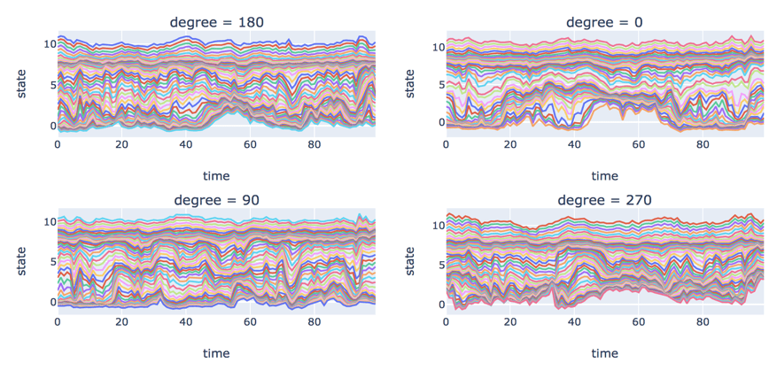
Figure 7 depicts the standard deviation of log electron density by degree over time. Purple, blue, gold and red lines represent degree = 0, 90, 180 and 270 respectively. Its distribution at degree = 270 is different from other directions. The standard deviation is still relatively high when it’s far away from Earth. There are the same patterns during 0-1,500, but things start to change during 1,500-2,000. The maximum standard deviation at degree = 0 becomes lower and happens closer to Earth.

3. Concentric Cross Sections
The dissipation in electron density as you step out further in the magnetosphere away from the earth led to the inspection of concentric cross sections over time. The predicted state values would be pretty similar for points with the same radius away from Earth. We decided to split the data in these concentric cross sections resembling donuts. The magnetosphere was split into 10 “donuts” defined by the rho value (i.e. 1-2, 2-3, 3-4, 4-5, 5-6, 6-7, 7-8, 8-9, 9-10).
In Figure 8, the natural fluctuations of the predicted electron density can be seen pretty clearly at each “donut”. For the most part, it can be seen that the electron density across bands tends to increase gradually with time but when the electron density decreases it is steep and quick. This confirms how the magnetosphere tends to naturally expand with time, but when space weather conditions heat up, the magnetosphere contracts in size and a “wave” of electrons spills out of the magnetosphere. For the first 25,000 time steps, the average electron density seemed to move similarly—the “donuts” closer to Earth’s surface always maintained higher average electron density than the “donuts” further away.

It was interesting that the mean electron density at each donut never crosses any of the other bands across the first 25,000 time steps. In other words, the average electron density value for the donut closest to Earth will be the largest as compared to ones further away. This gave way to scaling the log electron density measures at each rho band in order to gauge what an abnormally high mean electron density reading would look like for that particular band as compared to other bands. In Figure 9, the way that some rho bands intersect each other in time is indicative of potential spatial anomalies, as one particular band can have an abnormally high or low predicted electron density value as compared to the other bands. The fluctuations after scaling also gave way to using clustering algorithms to determine what is normal at each band.

4. What is normal?
Before we technically define what is normal in our data, we detected broad, state-wide anomalies by looking at the mean log electron number density (END) throughout the time. These anomalies are defined as anomalies which fall outside of the usual distribution, or point anomalies as defined by Chandola et al.
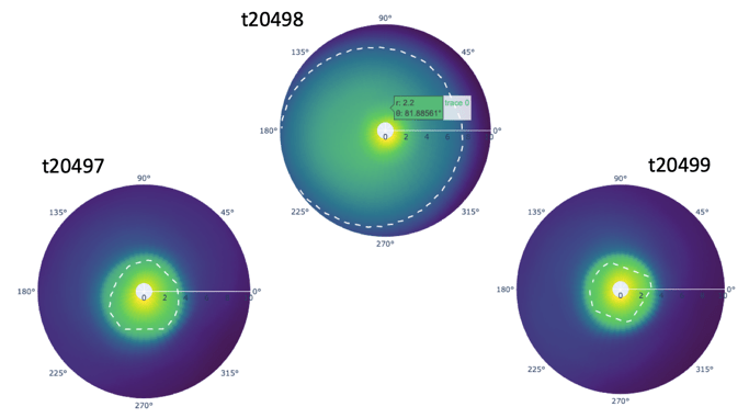
We chose three coordinate locations (loc0:rho=1, degree=90; loc250:rho=5,degree=163.52; loc16605:rho10, degree=-16.48) representing roughly high, median and low electron density, and big jumps at around time step 20,498 were found in all locations (Figure 10). By applying the 3-sigma rule (Grafarend, 2006) (basically any observations that fall outside of three standard deviations from the mean is considered an outlier), it seems to be an outlier (Figure 11).


To further look at details at the time stamp 20,498, we plotted the mean log electron number density across the time step from 20,000 to 28,500, and there is an extremely observant jump at time step 20,498 (Figure 12).

We have also noticed that there’s a large drop in the mean log electron number density prior to that very high value and if a time series model hadn’t seen that sort of scenario in the training data, it’s possible that the model predictions for this time step could be far off from the truth. Recall that each time step is a 5-minute increment, and although the magnetosphere is dynamic and always changing, we would not expect to see such a magnitude of a change from one time period to the next. In the polar coordinate charts, we saw a drastic change in the boundary of the plasmasphere prior and after the time step 20,498, and thus we are very confident the time step 20,498 is a fluke of the model prediction process (Figure 13). In the Anomaly Detection section, we will be further looking at the anomalies across multiple time steps, and leverage anomaly detection techniques and models to help detect anomalies.
V. Clustering Algorithms on Cross Sections
K-means
We applied K-means clustering across 25,000 time steps for each “Donut” (rho band) using all 2166 degrees as features. In order to perform K-means clustering on this data we decided to first reduce the dimensions by performing Principal Component Analysis (PCA) (Altman and Krzywinski, 2015) on the scaled features for each rho band cross section. Once we reduced the dimensions using PCA, we performed K-Means on the resulting principal components.
Take rho 3-4 as an example, we chose three clusters to represent high, median and low density (Figure 14).

VI. Anomaly Detection
An anomaly refers to a data instance that is significantly different from other instances in the dataset. Oftentimes they are harmless. These can only be statistical outliers or errors in the data. But sometimes an anomaly in the data may indicate some potentially harmful events that have occurred previously.
For our problem, we are looking at 5,000 time steps within each “Donut” and flagging a time step as an anomaly if and only if it is global or local outlier such that there is a huge variation of log electron density within that state at that time step. We then used Principal component analysis to decompose the information into two principal components for visualization.
1. Isolation Forest
The Isolation Forest algorithm (Liu, 2008) isolates observations by randomly selecting a feature and then randomly selecting a split value between the maximum and minimum values of the selected feature. The logic argument goes: isolating anomaly observations is easier because only a few conditions are needed to separate those cases from the normal observations. On the other hand, isolating normal observations requires more conditions. Therefore, an anomaly score can be calculated as the number of conditions required to separate a given observation.
The way that the algorithm constructs the separation is by first creating isolation trees, or random decision trees. Then, the score is calculated as the path length to isolate the observation. We used 500 trees to make estimations. Figure 15 shows anomalies flagged (in yellow) by Isolation Forest for “Donut” 1. Within the cluster also we see some yellow points, if one views this in 3 dimensions you would see that these points are around a big blue mass.

2. Autoencoders
Autoencoders (Kramer, 1991) are an unsupervised learning technique in which we leverage neural networks for the task of representation learning. Specifically, we designed a neural network architecture such that we impose a bottleneck in the network which forces a compressed knowledge representation of the original input. If the input features were each independent of one another, this compression and subsequent reconstruction would be a very difficult task. However, if some sort of structure exists in the data (ie. correlations between input features), this structure can be learned and consequently leveraged when forcing the input through the network’s bottleneck. Since our data is spatial temporal we see that our timesteps are autocorrelated which makes it perfect to compress information using a non-linear algorithm. Our four-layer autoencoder with two 2 node bottleneck layers performed dimensionality reduction to bring down information to 2 features only. We leveraged python’s outlier detection package(pyOD) to flag anomalies. Figure 16 shows anomalies flagged (in yellow) by Autoencoders for “Donut” 1. We saw that autoencoders behaved very similarly in flagging anomalies within all Donuts. They flagged the least – roughly 10% of the time steps were flagged as anomalies.

3. One class Support Vector Machine
The Support Vector Method for Novelty Detection by Schölkopf et al. basically separates all the data points from the origin (in feature space F) and maximizes the distance from this hyperplane to the origin. This results in a binary function which captures regions in the input space where the probability density of the data lives. Thus, the function returns +1 in a “small” region (capturing the training data points) and −1 elsewhere.
- It sets an upper bound on the fraction of outliers (training examples regarded out-of-class)
- It is a lower bound on the number of training examples used as Support Vector.
Due to the importance of this parameter, this approach is often referred to as ν-SVM. Definitely we see that this algorithm is aggressive in flagging anomalies, almost 50% of the time steps are flagged as anomalies (Figure 17).

4. Ensemble-Voted Detector
This is a simple classifier that looks within every donut if a time step is flagged as an outlier by all three algorithms – Autoencoders, One class SVM and Isolation Forest (Panda and Patra, 2009). This is the most reliable in terms of creating an ensemble of our detection algorithms. See plots in Figure 18 and Figure 19.


VII. Developing application to visualize clustering
Goal
The visualization application is intended to give users an interactive experience of exploring the various aspects of the magnetosphere and the analyses described in the preceding sections. By choosing different algorithms and time ranges and clicking and hovering over the grids, users are able to see the magnetosphere at different granularity levels and focus on the parts they are mostly interested in, including clusters, concentric views, individual coordinates, as well as the anomalies. It will provide inspiration for others to explore this area of study further and perhaps continue research.
Elements of application
Anomaly Detection Algorithm: A dropdown menu to select the anomaly detection algorithm. Anomalies will be marked in dashed grey in both the heatmap and the top left donut.
Time Range: A slider to select the time range (0-500) to present.
Heatmap: shows the cluster at each rho and timestep. Anomalies are marked in grey according to the algorithm chosen. Click on the grids to see the corresponding donut plots and hover over the grids to see the statistics of the donut.
Donuts:
Top left: shows the concentric view of the selected timestep. Three clusters/colors (yellow, cyan, blue) representing high, median and low density. Anomalies are marked in texture.
Top right: shows the log electron density of each individual coordinate using randomly sampled data of the entire magnetosphere. Lighter colors indicate greater electron density.
Bottom left: shows the state of individual coordinates at the using random sampling for the selected donut at the selected timestep.
Trend Analysis: The line graph in the bottom right depicts the mean log electron density for the selected donut for the specified time range with the anomalous timesteps highlighted with yellow markers.
The application is embedded in the project website hosted on github.io, and works well on all types of browser and devices.
VIII. Next Steps and Future Use of Application
We have only included 500 timesteps data to demonstrate at the moment due to website latency, however, in the future, the timestamps could be expanded. More datasets could be integrated into the current dataset to explore the relationships between the magnetosphere electron number density with other activities in space. We believe the website will not be limited to this project and it might be a good idea to include other plots, website links, educational videos about the magnetosphere and space. Thus, it will provide a thorough understanding and experience for our audiences who are interested in space and data science.
IX. References
Altman, N., & Krzywinski, M. (2015). Association, correlation and causation. Nature Methods, 12(10), 899-900.
Bortnik, J., Li, W., Thorne, R., & Angelopoulos, V. (2016). A unified approach to inner magnetospheric state prediction. Journal of Geophysical Research: Space Physics,121, 2423– 2430.
Chandola, V., Banerjee, A., & Kumar, V. (2009). Anomaly detection: A survey. ACM Comput. Surv., 41(3), Article 15.
Grafarend, E. W. (2006). Linear and Nonlinear Models: Fixed Effects, Random Effects, and Mixed Models. Berlin, Germany: De Gruyter.
Kramer, M. (1991). Nonlinear principal component analysis using autoassociative neural networks. AIChE Journal: 37(2): 233–243.
Liu, F., Ting, K., Zhou, Z.-H. (2008). Isolation Forest. 2008 Eighth IEEE International Conference on Data Mining: 413–422.
Panda, M., & Patra, M. R. (2009). Ensemble Voting System for Anomaly Based Network Intrusion Detection. International Journal of Recent Trends in Engineering: 2(5). 8-13.
Schölkopf, B., Williamson, R. C., Smola, A. J., Shawe-Taylor, J., & Platt, J. (1999). Support Vector Method for Novelty Detection. Advances in Neural Information Processing Systems: 12, pp. 526-532.
Spasojević, M., Goldstein, J., Carpenter, D., Inan, U., Sandel, B., Moldwin, M., & Reinisch, B. (2003). Global response of the plasmasphere to a geomagnetic disturbance. Journal of Geophysical Research: 108.
GitHub repository containing scripts for analysis: https://github.com/vc1492a/msia_jpl_magnetosphere_states
Many thanks to Valentino Constantinou for being an amazing mentor and leading the team to finish the project. Special thanks also to Borchuluun Yadamsuren for the copyediting and consistent support.