|By Finn Qiao|
Accompany visualization found at https://finnqiao.github.io/recipe_universe_d3/
Introduction
In 2014, a food truck emblazoned with “IBM Cognitive Cooking” arrived at South by Southwest ready to serve up algorithmically generated street fare. Along with IBM’s Jeopardy AI, they were the early applications that would help ease AI into the public sphere.

The recipes from Cognitive Cooking was then codified into the cookbook “Cognitive Cooking with Chef Watson” and a website where users could get recipe inspiration for chosen recipes and cuisines. While the site was active, it helped inspire home chefs all over the world to experiment with unexpected ingredient and flavor combinations. Chef Watson was based on text analysis Bon Appetit recipes and an understanding of chemical flavor compounds.
Despite being an effective demonstration of what an everyday AI application would look like, the website was discontinued in 2018 due to a lack of traction and commercial use cases. Furthermore, the user interface was unintuitive and needlessly complex, rendering the service a novelty rather than a necessity for home cooks.
While IBM Watson focused on the novelty factor by heavily featuring the intricacies of chemical flavor compounds in their algorithms, such a presentation isn’t necessarily immediately explainable to an everyday home cook. I thus wanted to apply natural language processing techniques and more intuitive metrics such as pairing counts across recipes to present the connections between ingredients in a more intuitive, interactive, and design-forward manner.
Ultimately, the goal of such an analysis and visualization would be to identify clusters of ingredients based on the base metric of ingredient pair counts across recipes. By tweaking the algorithms for this frequency metric to weight rare and common ingredients differently, lesser known connections between ingredients would be useful in thinking about how to pair lesser seen ingredients.
For example, chocolate is often added in stews and moles to thicken up the sauce and add a depth of flavor and bitterness. Fish sauce is often the “secret ingredient” for red meat stews because of how well the umami flavor brings out the flavor of red meat. As a result, chocolate and fish sauce do pair very well together in a certain subset of red meat stew dishes and it would be interesting to parse out such oft-overlooked ingredient pairings.
With this in mind, I set out to visualize the connections between these ingredients across the most popular recipe sites: Food Network, Allrecipes, and Epicurious. Conveniently, there was already an open source python script to scrape these recipes at https://github.com/rtlee9/recipe-box. A quick scrape returned 124,647 recipes.
Network analysis was chosen as the primary technical approach for this problem as it was the most effective in capturing the prominence of both individual ingredients and ingredient pairs. The strength of each ingredient pair is also captured by the well understood concept of edge weights that will be touched on below.
With the scraped recipe data, NLP analysis was first conducted to clean up the strings and identify ingredients in each entry. A list of all possible ingredient pairings and their counts was then created in order to form the network edge and weights. Network analysis was then performed to generate the visualization and edge weights are defined by a basic count of pairings and a custom Ingredient Frequency – Inverse Recipe Frequency metric.
NLP Analysis on Raw Recipe Data
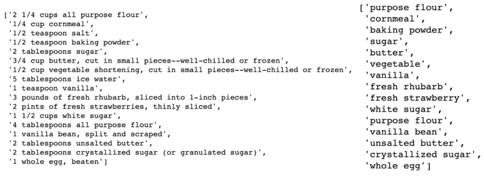
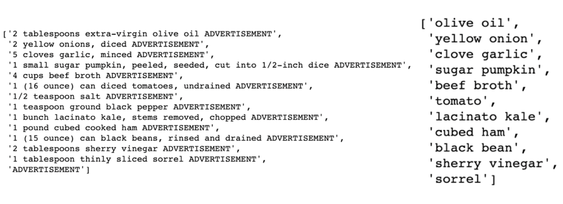
Before any network visualization can be created, a quick look at recipe descriptions reveal text data that needs to first be cleaned up. An example of such a recipe is as follows:
[‘3 to 4 cups chicken stock, preferably homemade, recipe follows’,
‘1 quart Roasted Winter Vegetables, recipe follows’,
‘Kosher salt and freshly ground black pepper’,
‘3 (5-pound) roasting chickens’,
‘3 large yellow onions, unpeeled, quartered’,
‘6 carrots, unpeeled, halved’,
‘4 celery stalks with leaves, cut in thirds’,
‘4 parsnips, unpeeled, cut in 1/2, optional’,
’20 sprigs fresh parsley’,
’15 sprigs fresh thyme’,
’20 sprigs fresh dill’,
‘1 head garlic, unpeeled, cut in 1/2 crosswise’,
‘2 tablespoons kosher salt’,
‘2 teaspoons whole black peppercorns’,
‘1 pound carrots, peeled’,
‘1 pound parsnips, peeled’,
‘1 large sweet potato, peeled’,
‘1 small butternut squash (about 2 pounds), peeled and seeded’,
‘3 tablespoons good olive oil’,
‘1 1/2 teaspoons kosher salt’,
‘1/2 teaspoon freshly ground black pepper’,
‘2 tablespoons chopped fresh flat-leaf parsley’]
One way to select the main ingredients only from such a list would be to train a recipe tagger like the one found at https://github.com/NYTimes/ingredient-phrase-tagger. As the repository is now archived and I don’t necessarily have the means during spring break to tag millions of ingredients in recipes, I turned to natural language processing.
The goal for this text cleaning is to reduce each ingredient string to 1-2 words that represent the ingredient. For example:
‘3 to 4 cups chicken stock, preferably homemade, recipe follows’ -> ‘chicken stock’
Text cleaning is all about patterns. For long-winded recipe descriptions, we see some clear ones:
- The main ingredient is almost always before the first comma.
- Most start with numbers representing quantities.
- Most have a unit of measurement like “pound” or “sprig” or “tablespoon”.
- The main ingredient is almost always represented by a maximum of two words.
- Words that represent the main ingredient are either adjectives, singular nouns, or plural nouns.
Using the above observations, the following steps were taken using the nltk package and regex in python:
- Only text before a comma (if any) were filtered using regex.
- A corpus of measurement terms were scraped from sites like https://www.enchantedlearning.com/wordlist/measurement.shtml and used to filter out measurement terms.
- Individual tokenized terms were tagged with nltk.pos_tag to only select adjectives and nouns.
- Plural nouns were converted to singular nouns.
- If remaining ingredient had more than 2 words, only keep the last two words.
While not entirely perfect on some edge cases, the resulting script returned rather satisfactory results as shown below in figures 5 and 6:
Network Analysis
To conduct a network analysis on these ingredients across recipes, we need to first create sets of nodes and edges.
It is also important to note that this network graph is undirected, meaning that direction of relation between nodes does not matter. Celery → Bacon and Bacon → Celery represent the same relation.
Nodes represent the objects whose relations is being represented on the network graph. In this case, it would be a list of ingredients.
As most network visualization tools can only show 200 nodes in a dense network without performance issues, only the top 200 ingredients were selected to be represented in the final visualization. There were some examples of ingredients such as “lemon juice” and “juice lemon” that were the same ingredients but worded in another order or very similarly. By combining such overlapping ingredients after a manual inspection of the data, a final list of 196 ingredients was selected. Salt, pepper, and water were ingredients that might not represent interesting relations as they are present in most, if not all, recipes and were dropped.
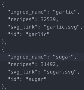
A node object with its attributes would look like this in figure 7 (with recipes representing the number of recipes this ingredient was present in):
Edges represent the relations between the nodes. In this case, it would be an ingredient pair observed in a recipe.
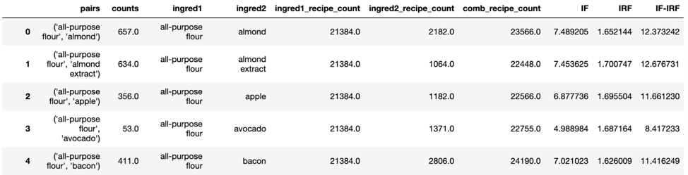
Whereas the raw ingredient data would have given us 5,839,145 edges, the filtered list of ingredients resulted in a much more manageable 17,833 edges.
Weights are required for edges as well to determine the importance of each edge and how to visualize edges, especially in a network as dense as this. While each node has a weight proportional to the number of recipes each ingredient is present in, there is a parallel weight for edges as well. The edge count metric measures how many recipes contain a particular ingredient pair.
This metric is however heavily biased towards ingredients that are common across all recipes such as butter and olive oil. In order to normalize the metric and add added focus to lesser represented ingredients, the IF-IRF metric was developed.
Ingredient Frequency – Inverse Recipe Frequency (IF-IRF)
Those familiar with natural language processing should be no stranger to the metric of Term Frequency – Inverse Document Frequency (TF-IDF).
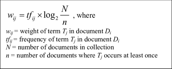 The Ingredient Frequency – Inverse Recipe Frequency metric has a similar goal of accentuating the influence of rarer ingredients for edge weights. The metric is weighted such that edges with rarer ingredients such as zucchini and ground coriander would receive a greater edge weight.
wij = weight of edge between ingredient i and ingredient j
Eij = number of recipes an edge appears in, edge count
ni = total number of recipes with ingredient i
nj = total number of recipes with ingredient j
N = total number of recipes
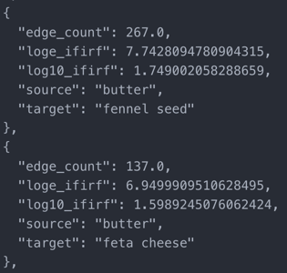
With the updated metrics in hand, each link object with its attributes looks something like this in figure 8:
The nodes and edges are then fed into the networkx package in python.
As the top ingredients are very likely to appear in at least one recipe together, the degree (number of neighbors) of each node is very high. This can be seen from the incredibly high density of the network at 0.933.
I next visualized the top ingredients using the networkx package as shown in figure 9. The radius of each ingredient represents the number of recipes the ingredient is present in while the edge thicknesses are determined by the IF-IRF score previously defined.
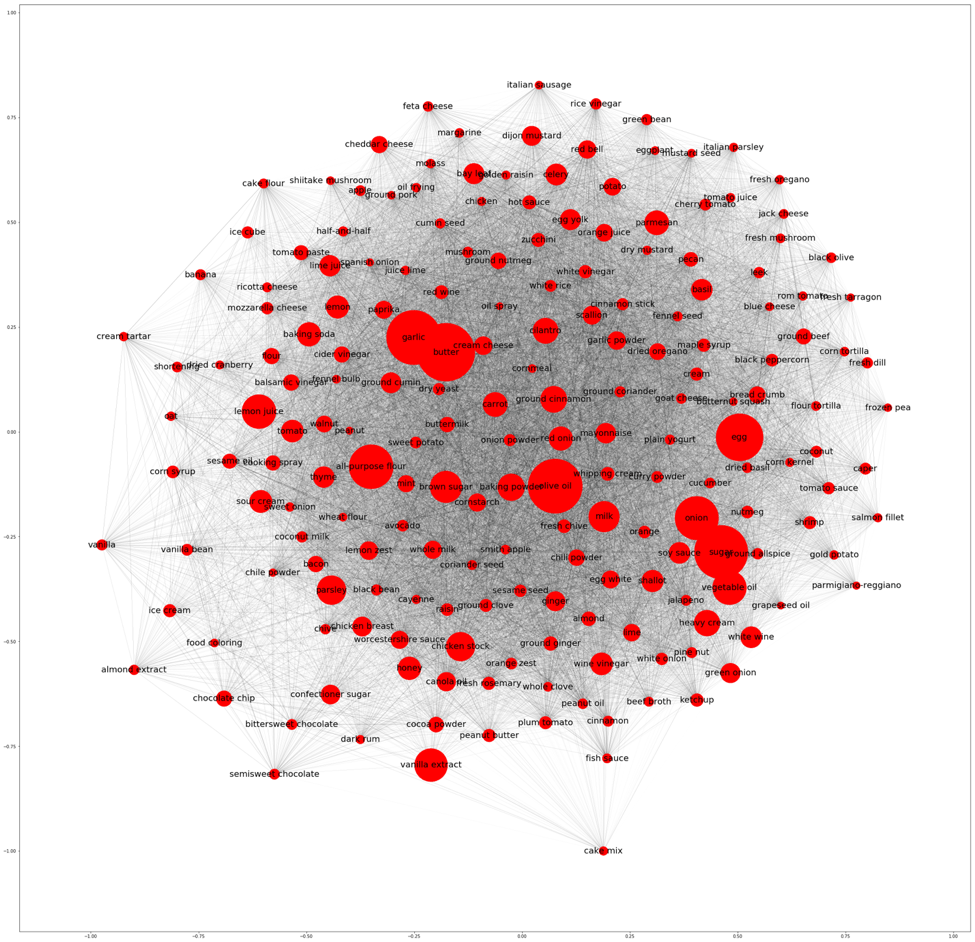
A fully represented network graph, especially one that is as dense as ours, doesn’t provide that much insight. To generate different network graphs would require filtering the data and reconstructing each graph.
For a more customizable and interactive solution, we turn to D3 force directed graphs.
D3 Force-Directed Graphs
Due to performance and design considerations, the entire D3 visualization is located on a separate site at https://finnqiao.github.io/recipe_universe_d3/.
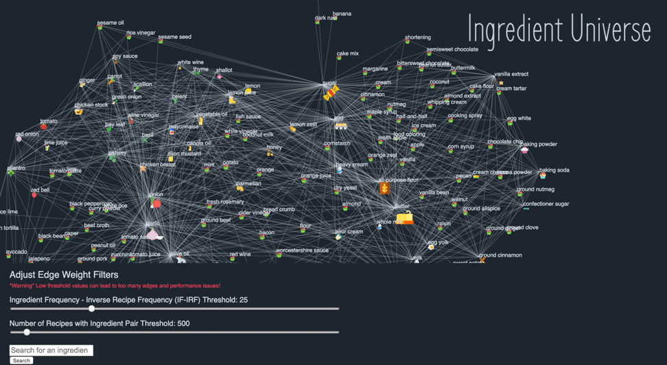
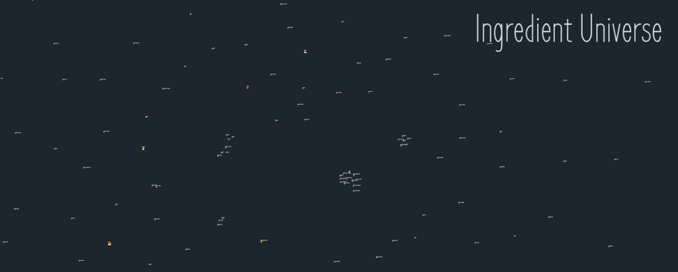
Compared to the networkx visualizations, the D3 ingredient universe in figure 10 is a lot more interactive and can incorporate much more information and metrics into a single webpage. The sizes of the food icons are defined by the number of recipes an ingredient is present in. Only edges that cross both thresholds in the filters below are drawn.
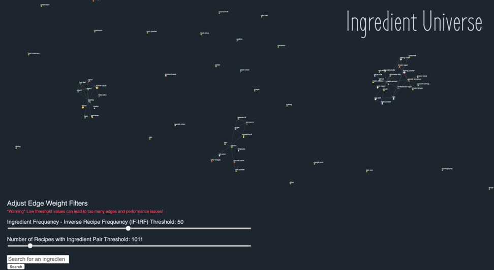
As shown in figure 11 below, dynamic filtering of the IF-IRF and edge count thresholds can lead to much cleaner clusters of ingredients.
By adjusting the IF-IRF threshold, users are able to gain a much deeper insight into ingredients less commonly seen across recipes.
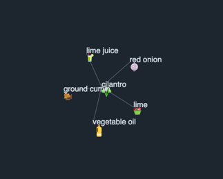
With an IF-IRF threshold of 80 for example, the following cluster in figure 12 pops up that resembles Thai cuisine on the left side and Japanese cuisine on the right side.

For a home cook that experiments across multiple cuisines, the two Thai and Japanese ingredient clusters would make intuitive sense and be identified right away. However, for most cooks who haven’t tried these combinations before, these ingredient clusters could be the impetus for discovering new recipes.
By adjusting the different thresholds, identifying ingredient clusters that seem interesting or new, and searching the combinations up is how this tool could help home cooks find recipes to try these ingredient combinations in.
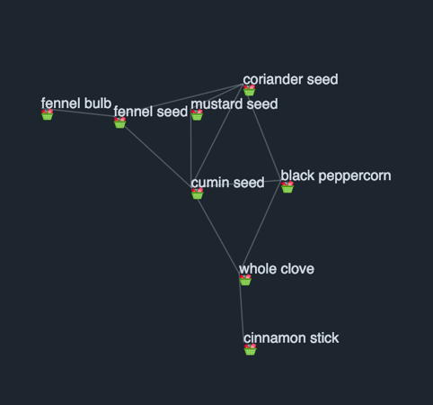
Another cluster that crosses this IF-IRF threshold in figure 13 are the common spices for spice mixes used across multiple popular cuisines such as Middle-Eastern and Creole.
These resulting clusters are not simply “cuisine clusters” but can be effective in identifying spice mixes and potential ingredient substitutes too.
Users can also choose to focus on the edge weight based on the number of recipes an ingredient pair is present in. By having a high threshold in this filter, users are consciously choosing ingredient pairs that appear in a lot of recipes, thus only very popular ingredients show up.
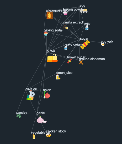
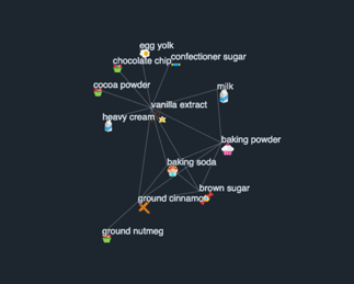
A very low IF-IRF threshold and a recipe count threshold of 5000 recipes returns this very prevalent cluster of popular ingredients in figure 14. The top half of the cluster heavily leans towards baking ingredients while the bottom half features the common components of a home-made chicken stock.
It can be seen that based on the threshold combination, the resulting clusters can reveal clusters representing cuisine types, spice blends, or just the foundational ingredients for recipe families like pastries or French mother sauces.
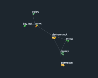
IF-IRF and recipe count thresholds can also be adjusted concurrently to find a compromise between ingredient popularity and wanting to use a rarer ingredient. An IF-IRF threshold of 50 and recipe count threshold of 1500 yielded the below “ingredient universe” with three distinct clusters in figure 15.
In figure 16, while the left and right clusters are very similar to the “chicken stock” and “baking” clusters, a new cluster that seems to reflect Mexican flavors pops out.
Home cooks can also focus the map on one specific ingredient like basil and adjust different threshold values before ingredients are linked to it to get matching ingredients for a single desired ingredient.
Ultimately, the visual interface is meant to be interactive enough to encourage home cooks to try their hand at creating their mini ingredient clusters to discover connections and be inspired for new recipes.
Improvements/Next Steps
While an interesting visualization exercise to see the degree of information that can be incorporated into a single network graph, there are multiple other techniques and improvements that can be incorporated for later use.
A more involved ingredient selection process initially could have been possible with more time. A concern with including too many ingredients would be the sheer number of connections that would be shown in the D3 visualization which would severely impact loading times. However, this could be solved by limiting the number of edges with more stringent threshold on metrics (minimum recipe appearances for ingredient pairs etc.).
The recipe data was also more representative of ingredients and recipes that everyday home cooks refer to and some interesting unorthodox ingredient pairings are often found in individual blogs or ethnic cuisine. An additional scraping of external blogs that better represent other ethnic cuisines might have led to a broader selection of ingredients and unexpected clusters.
While this is currently a visualization of how different ingredients are connected, a separate interface can be designed on the side to update as the top ingredients are chosen. If tofu, basil, garlic, and sesame appeared in one cluster, the side screen can update to reflect top matching recipes that contain such ingredients to save users the searching process.
If cuisine tags and caloric values could be included in the data for each ingredient node, further analysis could be done for supposed “cuisine clusters” that could be used for public health studies on the prevalence of particular ingredients and how they are correlated to caloric intake and public eating habits. A cluster of American cuisine would include much higher quantities for ingredients like beef, salt, and potatoes. A cluster of Middle Eastern cuisine might weigh heavily on ingredients like olive oil, chickpeas, and eggplant. A comparison of these clusters and weighting of network nodes and edges by portion amounts and caloric contents of different ingredients could be a useful public policy tool in shedding light on eating habits across cuisines in an interactive visualization.
Code can be found at: https://github.com/finnqiao/recipe_network