Personalized Restaurant Recommender System Using A Hybrid Approach

|By Lingjun (Ivan) Chen and Nuo (Nora) Xu|

Problem Statement

Nowadays, personalized recommendation systems are implemented by many online businesses, which try to identify user’s specific tastes then provide them with relevant products to enhance user’s experience. Users, in turn, would be able to enjoy the convenience of exploring what they potentially like with ease and are often surprised by how good the recommended results are. However, mainstream restaurant recommendation apps have not adopted personalized restaurants recommenders generally. Therefore, finding an ideal restaurant is always a struggle for newcomers and sometimes even for local people, who are looking for places new and exciting to go. Inspired by such a challenge, we aim to build a personalized restaurant recommender system prototype that not only considers the interactions (visits) between customers and restaurants, but also incorporates metadata (side information) that expresses both the customer’s personal tastes and restaurants’ features. Such approach can increase each user’s experience of exploring and finding restaurants that are closer to their tastes. We used datasets provided by Yelp and a package named LightFM, which is a python library for recommendation engines to build our own restaurant recommender.

Here is an introductory article to refresh on some of the basic ideas and jargon on recommender systems before proceeding.

Github repository of LightFM: https://github.com/lyst/lightfm

Github repository for our model: https://github.com/Ivanclj/Yelp-Recommender

Figure 1: Yelp’s home page for a new user in Chicago

Background

When implementing recommender systems, researchers generally adopt two methods: Content-Based Filtering (CBF) and Collaborative Filtering (CF). CBF models users’ tastes based upon their past behaviors, but does not benefit from data on other users. On the contrary, CF looks at user/item interactions (visits) and tries to find similarities among users or items to do the recommender job. However, both methods have their limitations. A CBF-based system is limited by novelty in recommended results. Because it only looks at user’s past history, it never jumps to other areas that users might like but have not interacted with before. Additionally, if the quality of content does not contain enough information to discriminate the items precisely, CBF will perform poorly. On the other hand, CF suffers from sparse interaction matrix between users and items, where many users have very few interactions or even no interactions at all. This is also known as the cold start problem, which would be a huge problem especially for newcomers to certain areas to find suitable restaurants. To tackle this problem, we aim to develop a hybrid approach, which leverages both the collaborative information between users and items and user/item metadata to complete the recommendation job.

Dataset

We used three datasets in this project: business.json, review.json, and user.json. Dataset business contains geographical information about 192,609 businesses, categories and attributes, such as average star rating, hours, whether they offer parking and etc. Dataset review includes 6,685,900 review texts and ratings users write to businesses. Dataset user includes information like how long ago the user has joined Yelp, the number of reviews he/she has written, the number of specific compliments received, and his/her friend mapping on Yelp about 1,637,138 users. The three datasets can be merged by unique keys user_id and business_id. More detailed explanation of the data can be found in Yelp documentation (Source: https://www.yelp.com/dataset).

Data Cleaning & Feature Engineering

To build a hybrid recommender system, we would need an interaction matrix between users and items, metadata of restaurants that summarize their characteristics, and metadata associated with customers that indicate their taste preference.

Business dataset includes businesses of all categories from over 100 cities. For the reason that items (restaurants) in different cities have few interactions with each other, we filtered the dataset to keep only the city with the highest number of restaurants — Toronto (10,093 restaurants). Then we moved forward, exploring restaurant attributes that would potentially be useful in recommenders. Most features have many missing values across restaurants so we picked number of stars the restaurant was rated (0-5 scale), review counts of the restaurants, and the categories of the restaurants as item features. Usually each item (restaurant) has an average of 10 categories/tags assigned by Yelp, and there are 436 tags in total across all restaurants, such as seafood, vegetarian, breakfast & brunch, bars and so on. We decided to select top 60 tags with highest popularities since including some tags that only appear a few times out of more than 10k restaurants would add more noise in the recommender. Furthermore, we calculated TF-IDF (term frequency-inverse document frequency) values for each tag (Figure 2), which would be used as weights in model fitting later. We applied TF-IDF instead of binary value for the purpose of promoting core tags over incidental ones, and giving higher weight to tags that appear less frequently.

Figure 2: TF-IDF Formula

In review dataset, we found that there were cases where a unique user would rate one restaurant several times throughout his/her history. For such case, we only kept the most recent review since it reflected the user’s latest preference.

In order to remove user bias from subjective rating (some users rated a high score for every restaurant), we centered those users’ rating by subtracting their mean rating, and converted the results to 1 if positive and -1 if negative. The unrated items were kept as 0. The reasoning for this transformation is that we want to focus more on ranking the user liked restaurants and disliked restaurants in the correct order, rather than predicting user ratings on each restaurant, which would result in high variance over time.

The final step of data cleaning was to select out characteristics of users. We heuristically chose four features that are not sparse, which are number of reviews wrote, number of times reviews are regarded as useful, whether the user is active/elite in Yelp and most importantly, user’s favorite restaurant category from past interactions.
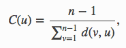
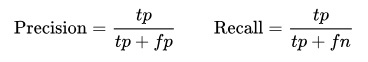
Evaluation Metric

In terms of the evaluation of recommenders, we decided to choose AUC (area under the curve) over RMSE (Root Mean Square Error) that was the most frequently used metric for measuring explicit recommendation system performance. RMSE emphasizes accuracy of rating prediction, which is how much customers like or dislike each recommended item. On the other hand, AUC is a decision-support metric that cares only whether customers like the item or not. In our case, figuring out customer preference in general is more important and practical than predicting their rating for each restaurant; therefore AUC is used in results evaluation below.

To explain the concept briefly, AUC is the area under the curve of ROC (receiver operating characteristic) that plots true positive rate against false positive rate with the increasing of recommendation set size. True positive rate (TPR) is the ratio of recommended items that users like to the total number of favored items, while false positive rate (FPR) is the ratio of recommended items that users dislike to the total number of unfavored items, as shown in Figure 3.

Figure 3: TPR & FPR Formula

Additionally, we calculated precision at k scores for each user in the test set. Precision at k score measures the fraction of known positives in the first k positions of the recommended list. A perfect score is 1.0. We chose k = 5 in our setting but k could be any arbitrary number depends on how many items need to be shown at a time.

Methodology

1. Baseline Model

First off, we started with a baseline method. The underlying algorithm is to recommend items (restaurants) that are either popular or have high rating scores, regardless of features of items or feedback from the users. This method is useful for cold start (new customers) scenarios where limited information of the user or item is known. To implement the baseline model in Yelp data, we sorted restaurants by number of reviews and ratings in descending order, and then treated top k as a recommended list indiscriminately for all customers.

Figure 4: Receiver Operating Characteristic curve (ROC) plot of baseline method.

Figure 4 illustrates that AUC value of the plot above is very close to 0.5. This results infers that given a recommended restaurant, a random user has a 50% chance of liking it. Unsurprisingly, the baseline method performed poorly and therefore, a more sophisticated model is needed.

2. LightFM Model:

a. Matrix Factorization

LightFM incorporates matrix factorization model, which decomposes the interaction matrix into two matrices (user and item), such that when you multiply them you retain the original interaction matrix. Figure 5 illustrates this notion graphically. The factorized matrices are known as user and item embeddings,  which have the same number or rows (latent vector dimension) but different number of columns depending on the size of the users or items.

Figure 5: Illustration of Matrix Factorization

The latent embeddings could capture latent features about attributes of users and items, which represent their tastes. For example, people who like Asian restaurants would have similar embeddings with those that prefer Chinese restaurants but are probably further away from those that are fond of Mexican food in the vector space. An embedding is estimated for every feature, and embeddings across all features sum up to arrive at representations for users and items. Figure 6 shows the formula of how features are summed.

Figure 6: Formula for user and item latent vectors

b. Loss Function

LightFM implements four loss functions for different scenarios. They are logistic loss, BPR (Bayesian Personalized Ranking pairwise loss), WARP (Weighted Approximate-Rank pairwise loss) and k-OS WARP, which are all well documented in the LightFM package.

BPR and WARP are special loss functions that belong to a method named Learning to Rank and are originated from information retrieval theory. The main idea of BPR is sampling positive and negative items, then running pairwise comparisons. It first selects a user and then a random item which user u views as positive. Then it randomly selects an item j which user u views as negative. After it has both samples, it calculates the predicted score for both items by calculating the dot product of the user and item factorized matrices. Next, it calculates the difference between two predicted scores and then passes this difference through a sigmoid function and uses it as a weighting to update all of the model parameters via stochastic gradient descent. In this way, we completely disregarded how well we predict the rating for each user-item pair and focused only on the relative ranking between items for a user instead.

WARP works in similar fashion as it deals with triplet loss (user, positive item, negative item) like BPR. However, unlike BPR that updates parameters for every iteration, WARP only updates parameters when the model predicts the negative item has a higher score than the positive item. If not, WARP keeps on drawing negative samples until it finds a rank violation or hits some threshold for trying. Besides, WARP makes a larger gradient update if a violating negative example is found at the first try, which indicates that many negative items are ranked higher than positives items given the current state of the model. Or WARP makes a smaller update if it takes many sampling to find a violating example, which infers the model is likely to be close to the optimum and should be updated at a low rate.

Generally, WARP performs a lot better than BPR. However, WARP takes more time to train since if the rank is not violated, it keeps on sampling negative samples until a violation happens. Moreover, as more epochs (iterations) are trained, WARP becomes slower as we can seen in Figure 7. This phenomenon is because a violation becomes more difficult to find. Thus, setting a cutoff value for searching is essential for training with WARP loss.

Figure 7: WARP training epochs vs duration (sec)

We compared models across logistic, BRR and WARP to find the best loss for our models.

c. Model Establishment

i. Pure Collaborative Filtering

Pure CF model is achieved by LightFM if only passes in the interaction matrix to fit the model. This ensures that the model has access only to the interaction information but no other metadata information. We split the data into train and test, with 20% interactions (82,127) in test and 80% (328,507) interactions in train and checked that the two sets were fully disjointed. Next, we initialized random parameters to fit the model using three different losses (logistic, BPR, WARP). However, since our parameters are randomly chosen, it was necessary to perform hyperparameters search to obtain the best model. To do that, we utilized the scikit-optimizer package to search through a range of values for different hyperparameters and evaluated them on mean AUC score. Outputs are shown in Figure 8 and Figure 9.

Figure 8: Pure CF model with WARP by different Epochs
Figure 9: Hyperparameter Tuning using scikit-optimizer

ii. Hybrid Matrix Factorization

At this stage, we were fitting the hybrid model that not only takes in interaction matrix, but also item features and user features as well.

Item features is a matrix with dimension 10093 x 10156, which is the number of items times number of item features. The number of item features equals to 10156 for the reason that LightFM internally creates a unique feature for each item in addition to other features. So 10156 = 10093 (unique feature) + restaurant stars + review count + 61 tags. Since LightFM normalizes each row in the item features to have its sum to 1, some of the features such as review count, which have very large values, could potentially dominate the weight assigned. To account for that, we normalized some features with large values by taking the log value and then dividing by their max. The same procedure was applied to build the user features matrix (92,381 x 92,420). We also added user alpha and item alpha into the model as regularization parameters to control overfitting. Hyperparameter search for the hybrid model was then performed. Outputs are shown in Figure 10 and Figure 11.

Figure 10: Hybrid model with WARP by different Epochs
Figure 11: Hyperparameter Tuning using scikit-optimizer

Result

1. Model Evaluation

a. AUC score

Figure 12 shows the results of mean AUC score across all users in a test set of the models with different losses and trials. These results are based upon optimal hyperparameters for each model through scikit-optimizer library, which performs cross-validation to find the best set of parameters. Multiple trials were run to account for random noises.

Figure 12: Mean AUC score across all users in test set by different models and loss functions

As we can see, WARP performs best both in a pure CF setting as well as a hybrid setting. Logistic loss seems to perform worse when metadata is included while all learning to rank method performs better in a hybrid setting. BPR seems to fit the training set very well but performs poorly when generalized to the test set, indicating a problem with overfitting even after tuning for optimal parameters.

b. Precision at 5

Figure 13 shows the results of mean precision at 5 score across all users in the test set of the models with different losses and trials right after calculating AUC so they are from the same model within each setting. Precision at 5 score has similar results with AUC where WARP performs best out of three losses. The number are relatively low since most users in the test set has a few interactions (cold start users), so most top 5 recommended items by the model are the ones that they have not interacted with, which resulted in very low precision overall. Since our goal was to optimize AUC, we focused on making sure positive items were placed before negative but the order of positive items with interactions were not necessarily placed in front. So we should only compare the relative difference between these scores instead of their magnitude.

Figure 13: Mean Precision at 5 score across all users in test set by different models and loss functions

2. Recommendation Demo

Figure 14 and Figure 15 are demos for recommendation on random users. “Known positives” are restaurants that the specific user went to and had positive interactions with. “Recommended” are the top k (k = 5 in this case) restaurants recommended for this user.

Figure 14 demonstrates a classical cold start case where user 66 has only one positive interaction but we are trying to recommend 5 to him/her. So precision would be low but we can see Japanese and Thai restaurants are recommended as it is close to the known positive, which this user had interaction with. There are also Ice cream and Brunch places recommended, which we suspect is either from the collaborative information or other metadata such as stars and review counts of the restaurant. For user 74, out of 5 recommended results, the user had positive interaction with 2 of them so the precision at 5 = ⅖ = 0.4, as shown in Figure 15.

Figure 14: Sample Recommendation 1
Figure 15: Sample Recommendation 2

The sample recommendation function is a particularly useful tool because it lets you do some eye tests on the recommendation results. In this case, we printed out the categories of restaurants to compare, but one can also print out restaurant stars or review counts to see if it makes more sense.
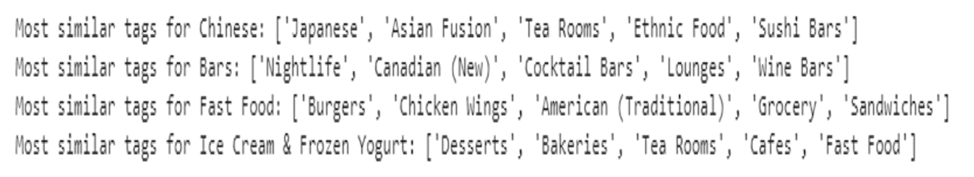
3. Tag Similarity

Another great feature from LightFM is that the estimated item embeddings can actually capture the semantic characteristics of the tags. Instead of driving by textual corpus coincidence statistics like word2vec does, the way LightFM finds similar tags is purely based on interaction data. These features are useful in terms of applying collaborative tagging for new restaurants, group tags into bigger categories, and providing justification for the recommender system. From Figure 16, we can see that most tags recommended share semantic similarity with target tags indeed.

Figure 16: Sample Tag Similarity Results

Conclusion & Next Step

In this paper, we explored the potentials of adopting a hybrid approach to build a personalized restaurant recommender system using Yelp’s dataset and LightFM package. We also compared its performance with a pure collaborative filtering model and with different loss functions implemented in the packages. In addition to just basic interaction information between items and users in pure collaborative filtering, the hybrid recommendation system also utilizes item & user metadata, which makes it perform better in the learning-to-rank setting (as shown above) and more robust to cold-start problems.

As for next step, it will be easy to quickly expand the scope of our project to include more cities into the recommender system. For now our recommender aims only at users in Toronto, but it could be applied to all locations if needed as long as information on users and items are available. Considering further optimizing of the system, we suggest including more features, such as demographic data of users and geohash of restaurants, with the hope that more variation could be explained. In addition, manipulating the tags of items for higher inclusiveness and lower overlapping could be useful in terms of both matching customers with similar tastes and dealing with computational cost.


  1. Agrawal, A. (2018, June 13). Solving business usecases by recommender system using lightFM. Retrieved from https://towardsdatascience.com/solving-business-usecases-by-recommender-system-using-lightfm-4ba7b3ac8e62
  2. Kula, M. (2015). Metadata embeddings for user and item cold-start recommendations. arXiv preprint arXiv:1507.08439.
  3. Rendle, S., Freudenthaler, C., Gantner, Z., & Schmidt-Thieme, L. (2009, June). BPR: Bayesian personalized ranking from implicit feedback. In Proceedings of the twenty-fifth conference on uncertainty in artificial intelligence (pp. 452-461). AUAI Press.
  4. Rosenthal, E. (2016, November 7). Learning to rank Sketchfab models with LightFM. Retrieved from https://www.ethanrosenthal.com/2016/11/07/implicit-mf-part-2/
  5. Schröder, G., Thiele, M., & Lehner, W. (2011, October). Setting goals and choosing metrics for recommender system evaluations. In CEUR Workshop Proc (Vol. 811, pp. 78-85).
  6. Weston, J., Bengio, S., & Usunier, N. (2011, June). Wsabie: Scaling up to large vocabulary image annotation. In Twenty-Second International Joint Conference on Artificial Intelligence.

Introducing a new rating system for World Rugby Union based on the ELO Rating System: The ELOR (ELO-Rugby)

|By Marcus Thuillier|

ELOR Rating System

Introduction

Ever since I was little, rugby has been my favorite sport. Rugby is still a developing sport in the USA, but the national team has been in every World Cup, but one and is now solidly entrenched as a top 15 team in the world. Rugby rules and scoring are similar to American Football’s, and some players even switch between the two (Nate Ebner, for example, was both an NFL player for the Patriots and a rugby player for the USA Rugby 7’s team). Something I was always fascinated with was how much of an NFL game was quantifiable with stats. You could get favorites, pre-game odds, in-game odds, etc. World Rugby rankings could not do that (except for giving you the ranking from 0 to 100 before the game), and it left me wanting for a more comprehensive ranking system that could be used in more dynamic ways. For example, on October 6th, 2018, New Zealand (the number one team in the world) came back from 17 points down to beat South Africa in just 20 minutes of playing time. In the world of Rugby Union, this kind of result is rare. I was eager for a way to quantify just how surprising this result was. Since the world rugby ranking system has never been used in order to do this, I settled on the ELO rating system, which allows, amongst other things, for in-game win probability adjustments and would be good to evaluate how daunting this comeback really was. Let’s dive right into it.

Background

Dr. Arpad Elo developed ELO in the 1950s to rank chess players. Since then, ELO has most notably been adapted to the National Basketball Association and National Football League by the journalists of the website FiveThirtyEight. A version for world soccer also exists on eloratings.net. I will be looking to develop an ELO Rating for Rugby (ELO-Rugby, or ELOR) and will use NFL ELO Ratings as a reference, for a couple of reasons: a) Rugby Union and American football scoring is relatively similar: seven points for a touchdown / converted try, three points for a field goal / penalty kick (this makes it easier when building the model to look at margin of victory for example and helps in determining a conversion between points and ELO score) and b) NFL teams play between 16 and 19 (if they go all the way to the Super Bowl) games per season, and most major rugby union teams participate in between 10 and 15 games per season. The similarities make the NFL ELO system a good starting point, but some tweaks and changes need to be implemented.

The ELOR Rating: Theory

The ELOR rating will take into account all game results since the year 1890 for rugby, available via the website stats.espnscrum.com. This start date was selected because that is the earliest for which we have game results with modern point scoring. Once all these games are accounted for, the ELOR Rating will be calculated as follows:

Figure 1: ELOR Rating calculation

R’ is the new Rating

Rold is the old Rating

ELOold and  ELOaway are the home and away ELOR ratings.

corrcoeff is the “auto correlation adjustment multiplier” used to deal with autocorrelation.

margincoeff is the margin coefficient. If only the margin were used, games between the top team New Zealand and a team like Portugal would weigh way too heavily into the rating. With this coefficient, those big blowouts are capped in their weight based on a logarithmic scale.

Those two coefficients could use some tinkering when developing the model further. For now, though, the two coefficients will be the same as those used by FiveThirtyEight for their NFL model. Those values are:

Figure 2: Correlation coefficient and Margin coefficient calculations

W is 1 for a home win, .5 for a draw and 0 for a home loss. Those values are used in most ELO models, and they allow you to compare the actual result with the predicted result, which is a probability between 0 and 1.

In W*, the Win Expectancy, the diff is calculated by the difference in rating plus a home field advantage constant.

The Brier Score is commonly used to measure the accuracy of binary probabilistic forecasts, in fields like meteorology and recently in sports analytics. I used the Brier Score to optimize the model and determine the K factor and home-field advantage. The Brier Score is calculated as follows:

Figure 3: Brier Score Equation for N forecasting instances

The lower the Brier Score, the better the accuracy of the ELOR model.

The Home Field advantage (x-axis) has been optimized for the model, in conjunction with the K-Factor (five different colors for 10, 20, 30, 40 and 50) in the following two graphs. The Brier Score is on the y-axis. After finding that values around K=40 had the lowest Brier Score across the board (Figure 4), I focused on just those values in Figure 5.

Figure 4: Home Advantage vs. Brier Score, for different K factors
Figure 5: Figure 5: Home Advantage vs. Brier Score, for K = 40

Following these tests, I chose to go with a home advantage of 75 ELO points and a relatively high K coefficient value of 40 (which gave the lowest Brier Score), leading to a quicker response from the model to the new game result.

Limitations of my ELOR

Several limitations I noticed or notes I made when building my ELOR model:

1. The top 10 teams in the world, the so-called Tier I teams, have ruled World Rugby since it turned professional in 1995: they have better infrastructures, more regular matches, compete in the two Tier I tournaments each year and are present in almost all semi-finals and quarterfinals of World Cups. Those teams are in no specific order: New Zealand, Australia, and South Africa in the Southern Hemisphere (the founding members of the Tri-Nations in 1996), France, England, Scotland, Wales, Ireland in the Northern Hemisphere (who disputed the Five Nations up until 1999). Argentina and Italy were added, as they regularly play these teams in the now Rugby Championship (which followed the Tri-Nations) and Six Nations (which followed the Five Nations). It is hard to compensate for the fact that there is little to no interaction between teams in Tier I and all the other teams outside of World Cups. In further iterations of the models, a way to account for some of the model’s overestimation of highly successful Tier II teams (any of Georgia, Portugal, Romania, Russia, Spain, Canada, USA, Uruguay, Namibia, Japan, Fiji, Samoa and Tonga) that barely play against Tier I teams could be implemented. An option I am considering for a further iteration of the model that I want to develop before next year’s World Cup is to weigh down the rankings of Tier II nations when they play Tier I nations, but for now, it will not be changed.

2. Some teams do not play much, especially before the 2000s. For the Tier I teams, they usually play 4 or 6 games in the Six Nations (Northern Hemisphere), and Rugby Championship (Southern Hemisphere), 3 or 4 games in the June international matches and 3 or 4 matches in the November matches. Most teams play less than that or play games at less than full strength (due to conflicting club schedules for teams like Fiji and Tonga for example). This means that some teams will have high volatility in their rankings, something the ELOR has issues with as it is perfected with increased sample size. That is a significant difference with the models for the NBA and NFL, where each team plays the same amount of games each season (excepting playoffs) and have all their players available during the season (barring injuries). This is further aggravated by the fact that some data for some games appear to be missing from the dataset and is difficult to account for.

3. Teams like Argentina sometimes field a B team to their national team. For Argentina, that team is Argentina A or Argentina XV, and they mostly compete against teams in the Americas Rugby Championship and Nations Cup. The Argentina A team is made up mostly of players from the local club league (as opposed to pro players in the Argentina team who play in the Super Rugby, the club championship for the Southern Hemisphere teams) and is still written as “Argentina” in the dataset, which would help teams like Uruguay, the USA or Georgia in case of victory against that “Tier I” team. It could be considered in future iterations of the model to differentiate A and B teams, but it is difficult to check team compositions for each match to determine that.

Those three issues will come up in the ELOR ranking. The ELOR could be updated in further iterations to correct for those three issues. I have tried to address them in the way I calculated the ELOR, like with the balancing of missing games in the dataset by higher K-factor, but especially for volatility with Tier II teams and Tier III teams (all others), it is just a factor that is inherent to world rugby that has to be kept in mind when looking at the rankings.

Implementing ELOR

The ELOR is established in a series of python codes, with visualizations done in both R and Tableau. The Python code first scraps the data from the ESPN website using BeautifulSoup. The ELOR then is initialized, 1500 for all teams. A following code is then used to update the ELOR based on each game result and according to the original ELO formula mentioned above. Finally, a final code is used to analyze the results of the ELOR predictions.

Results

For comparisons, here are the top 25 teams in World Rugby rankings and ELOR ratings as of November 26, 2018.

Figure 6: Top 25 in the World Rugby Ranking and the ELOR Ranking
(teams highlighted in red are qualified for the 2019 Rugby World Cup, teams with a star show a difference in the ELOR Ranking)

A few observations: Fiji, after beating tier I team France during November’s international
matches, jumps to eighth both in the world ranking and the ELOR rankings. The first surprise comes from the USA’s place at number 10 in the ELOR ranking (12th per Rugby World), but it has to be considered that they had an excellent 2018 year, losing only against Ireland and the Maori All Blacks, and beating Scotland and Argentina XV (which counts as “Argentina” in the dataset) this season. The second surprise is that Italy, despite a convincing victory over Georgia in the November international matches, barely appears in ELOR’s top 15 after consistently playing and losing to better Tier I teams (notably not winning any games in the Six Nations in the past three years). This is however in line with World Rugby Rankings.

Otherwise, the rankings are fairly consistent (although past position fifteen, most teams have a star indicating a difference between the two rankings, but they are mostly within one or two positions of difference). The ELOR was also an improvement over world rugby rankings as it had all 20 teams qualified for next year’s World Cup in its top 21 teams (highlighted in red), the other team being Romania (who originally qualified but got sanctioned for fielding ineligible players) at 19. Canada, the last team to qualify for the World Cup, shows up at 21 in the ELOR ranking. World rugby’s ranking has the last qualified team for the World Cup, Namibia, at 22 in its ranking.

The ELOR Ranking provides another significant improvement over the World Rugby Ranking. Where the World Rugby Rankings published its first edition in September of 2003, in time for the 2003 Rugby World Cup, the ELOR Ranking is updated since the first game played in 1890. Now, the ELOR needs teams to play many games to improve accuracy and so the earliest ratings will probably not be too accurate. However, one can expect the ELOR to be a reliable ranking system for teams as soon as they reach upwards of 20 to 30 international test matches played. The ranking will always be more accurate in recent years, as teams play more matches and have over 100 years of history that is taken into account, but ELOR realistically allows for Rugby Rankings to be calculated as far back as the early 20th century, which is a sizeable improvement over the World Rugby Rankings that has only been in place for the past 15 years. This is implemented in an R code that demands user input for a date and outputs the ELOR ranking at that date in time, all the way back to 1890.

On top of creating rankings, ELORs huge advantage is that it allows for pregame and in-game predictions. The pregame win probability is based on the probability formula mentioned in the “The ELOR Rating: Theory” part (calculation of Win Expectancy). The in-game prediction is calculated as follows:

Figure 7: In-Game win probability calculations1

After running ELOR, the following tables for pregame predictions were output:

Figure 8: ELOR Rating difference (Best team ELOR rating pregame – Worst team ELOR rating pregame) vs. win percentage prediction (from Win expectancy formula, the worst team will be 1-Win expectancy)

As I inched closer to the conclusion of this project, I only needed one thing to determine in-game probabilities. I needed bookmaker odds for the games. However, gambling on international rugby is not very widespread, so I lacked in sample size. I used some of the lines I could find and matched them up with the pregame ELO rating difference between the teams. I then fit a quadratic equation for best fit, but it is a very loose estimate. Interpret the point-spread predictions as a simple estimate of winning margin, that loosely fits bookmaker odds. It can be used to determine in-game probabilities for now and will be refined further when I can find more odds or with the help of historical data. In the next iteration of the ELOR model, I will look at historical results and margins of victories to determine a better equation to find game odds. For now, however, the results are interpreted based on the following equation:

Figure 9: Equation to find game odds

75 ELO points, which corresponds to the home field advantage, procures about a 5.75-points boost based on historical data (average margin of victory for home teams since 1890) and is added as another data point to find the best-fit equation.

Figure 10: ELOR Rating difference vs. point differential prediction (margin in points)

Now that I have all the elements, I can circle back to the question that prompted the development of ELOR in the first place: How clutch had the All Blacks been in that game against South Africa? In the aforementioned game, they were down 30-13, away from home in South Africa, with 18 minutes to go. We can find the pregame probabilities from the above table.

New Zealand came in as an 88.2% favorite (about 430 points difference between their ELOR and South Africa’s ELOR), according to the ELOR. We can also estimate the initial margin (about 15.5 points) and calculate in-game probabilities. This is what happened:

Figure 11: Visualization of in-game with probabilities for the South Africa vs. New Zealand game.

With 19 minutes to go, South Africa was about a 75% favorite to win the game. Jumping to 5 minutes remaining, up 30-18, South Africa was an overwhelming favorite at 96.8%. This means that if this game was played 1,000 times and the score was 30-18 at the 75th minute, South Africa would win 968 of those games and New Zealand only 32. And this was one of those 32 games. With 5 minutes left, New Zealand’s odds were only of 31.25/1.

Coming back to the original question: Was that New Zealand team clutch in that game? And the answer is pretty straightforward. New Zealand was very clutch, coming back from 1000/32 odds to win the game. And in the end, the game ended as predicted by ELOR, with a New Zealand victory.

To test the ELOR, I used November’s 22 international matches. I once again used the Brier
Score to evaluate the skill of ELOR’s forecasting. I chose to compare the ELOR with the ranking system from rugbypass.com over the course of the November test matches. RugbyPass developed a Rugby Index (RI), which they use to rank individual players based on their action in games and is updated after each game. This allows them to compute the player’s shape in both club and international rugby. It is based on an adaptation of the ELO model and has been modified with human input and other algorithms. After computing the players’ score, a team score is established, which they then use to determine win probabilities.

Those are the probabilities I will test my model against. A couple of things on the Rugby Index: the Rugby Index for a team depends on the lineup, so it will take into account injuries, which my ELOR does not. If, say, a middling team misses their best player, the Rugby Index will probably be better equipped to adjust the Win % odds than my ELOR. The second element however is that since it tracks players in the top rugby leagues around the world on the club level to develop its rating, the Rugby Index only has 18 international team (with players who play in top club leagues) in its repertoire. My ELOR Rating, on the other hand, has tracked every team that has played at least one game since 1890. Where the ELOR rating lacks in predicting unusual events (a top player being injured for example), it has more depth than the Rugby Index at the international level (ratings for more teams past Canada).

The following table and the Brier Scores were computed for 22 games in November (winner in Bold):

Figure 12: ELOR and RI Brier Scores and predictions for 22 international matches in November

Over 22 games, ELOR predicted 18 out of 22 games correctly (over 80%), while the Rugby Index predicted just one more correctly. The four games ELOR missed were:

1. Italy v Georgia, a Tier 1 / Tier 2 matchup. Georgia was a favorite, but Italy held on for a comfortable victory.

2. Scotland v South Africa. Favorite Scotland lost at home to underdog South Africa. The RI also predicted that one wrong.

3. Ireland v New Zealand. The first matchup between number 1 and number 2 in the world in a long time, New Zealand had a scare the week before against England and Ireland thoroughly dominated.

4. France v Fiji, another Tier 1 / Tier 2 matchup. Favorite France lost the game and its place in the top 8 of world rugby against the elite Tier 2 nation, Fiji. The RI also predicted that one wrong.

After all those games, ELOR was able to react and adjust, as Italy and Ireland closed the gap on Georgia and New Zealand and South Africa, and Fiji leaped Scotland and France respectively.

The ELOR model achieved a Brier Score of .113, and the Rugby Index achieved a Brier Score of .104.

The Rugby Index performed a little bit better, which is to be expected seeing as they have more “up-to-date” ratings that consider player forms and injuries. However, the ELOR rating still predicted almost 82% of the games correctly, up from 70% on the entire dataset and up from 71% for games where at least one Tier I team plays in the entire dataset.

The Brier Score also showed an improvement with .113, down from 0.19 on the entire dataset and down from 0.136 for games where at least one Tier I team plays in the entire dataset. Finally, although the Rugby Index might be slightly more accurate when it comes to the top teams, the ELOR rating I created provides information on many more teams and many more matches than the Rugby Index. The Rugby Index, for example, has no information on Namibia, one of 20 teams in next year’s World Cup. The ELOR rating has that information and could be used to calculate World Cup odds (see Appendix I).

1 http://www.footballperspective.com/the-biggest-quarter-by-quarter-comebacks-since-1978/

Conclusion

I was delighted by this first iteration of the ELOR. It is able to answer questions about in-game probabilities like “down 13 points with 15 minutes to go, what are New Zealand’s chances to win a game against Australia?”. ELOR holds its own in prediction capabilities and ability to quickly adjust its ratings and rankings based on recent results, providing a viable alternative to the World Rugby Ranking. It also allows establishing rankings for the earlier times of rugby, when the World Rugby Ranking did not exist. Furthermore, it is a tremendous tool when it comes to predicting tournaments, where it can be used in a Monte Carlo simulation (see Appendix I). It even performs better than forecasting models in other sports like basketball (see Appendix II). There are improvements to be made, however. I can look at developing an “autocorrelation adjustment multiplier” and margin coefficient myself, instead of using the ones FiveThirtyEight developed for the NFL. I could also look at weighing Tier I vs. Tier II matchups differently, which would probably help a team like Italy, who wins almost all their games against Tier II teams but loses almost all against Tier I teams, in the rankings. Another step would be to look for a complete dataset, or weigh World Cup games differently as they give us a rare opportunity to see Tier I and Tier II nations playing each other. For now, the first edition of the ELOR has performed better than I could have expected at the beginning of this project, and its accuracy will continue to improve as more games are added to the database. It will also be used to forecast next year’s Six Nations, hopefully improving on November’s 80% accuracy performance. ELOR is a viable, flexible and complete rating system for Rugby Union, one that has shown it is already up to par with other rugby union rankings systems and will only be ameliorated in future iterations.

Appendix

I. Forecasting the 2019 World Cup with a Monte Carlo simulation

I used a Monte Carlo simulation to simulate 10,000 World Cup results, and these are the results (Teams in the World Cup get a bonus point for scoring 4+ tries or losing by less than 7 points, but this simulation only accounted for wins and losses). I have used the ELOR ratings as of November 27, 2018.

Average wins for teams in a group will add up to 10 (with some rounding error) and the percentage chance of qualifying for the quarterfinal will add up to 200% since there are two spots for each group (top two teams). Thus:

Figure 13: Equation to find percentage chance of advancing to QF of World Cup
Figure 14: Group A simulation (probabilities)

With the Monte Carlo with 10,000 simulations, Ireland got 3.83 wins on average, Scotland 2.77, Japan 1.95, Russia .77 and Samoa .68.

Figure 15: Group B simulation (probabilities)

With the Monte Carlo with 10,000 simulations, New Zealand got 3.9 wins on average, South Africa 3, Italy 1.43, Namibia .92 and Canada .75.

Figure 16: Group C simulation (probabilities)

With the Monte Carlo with 10,000 simulations, England got 3.67 wins on average, France 1.93, Argentina 1.52, USA 1.68 and Tonga 1.2.

Figure 17: Group D simulation (probabilities)

With the Monte Carlo with 10,000 simulations, Australia got 2.65 wins on average, Wales 3.61, Georgia 1.22, Fiji 2 and Uruguay .52.

Figure 18: Knockout Stage simulation (all percentages)

As expected from their ELOR ratings, New Zealand and Ireland are the two overwhelming favorites for the World Cup. Only six teams, Wales, England, Scotland and Australia on top of the two mentioned before have over a 1% chance of winning the World Cup according to the model (with South Africa having a .99% chance). The likely semifinals are Ireland-Wales and New Zealand-England, a dramatic shift from four years ago when all four Southern teams (New Zealand, Australia, South Africa and Argentina) were the semi-finalists. Things can and will change, especially after the Six Nations of 2019 and some of the preparation games over the summer, but ten months away from the World Cup, the ELOR predicts a New Zealand win over Ireland, with the previously mentioned semi-finals in play. Finally, the most likely quarter-finals would be Ireland-South Africa, New Zealand-Scotland, England-Australia and Wales-France, leaving traditional heavyweight Argentina and underdog Fiji (who has the highest odds of advancing to the quarter-finals of any Tier II nation, close to 30%) watching from home.

II. Performance of the model vs. models in other sports

In evaluating the performance of my model, I looked for the performance of forecasting models in different sports. Once again using the Brier Score as a comparator, I found a blog post on “inpredictable2 ”, comparing their predictive model with ESPN’s NBA model, which came up with the following result:

Figure 19: Average Brier Scores for inpredictable and ESPN models throughout games for the 2017-18 season

At the beginning of the game, when the model forecasts win probabilities for teams, Inpredictable obtained a Brier Score of .215 and ESPN had a score of .197. The ELOR rating I have worked on and developed achieves a Brier Score of 0.19 at the beginning of the game, which is better than both the aforementioned models. This was a good indication of the performance of the ELOR model for world rugby, as evidenced by the lower Brier Score value obtained when predicting match winners compared to forecasting methods in other sports.

2 http://www.inpredictable.com/2018/01/judging-win-probability-models.html#more

Acknowledgments

I wanted to acknowledge Eta Cohort classmate Ted Carlson’s help in directing me towards the Brier Score as a valuable estimate of my forecasting model’s accuracy. I also wanted to thank my parents who share my love of rugby and advised and supported me in the building and testing of this model.

AMI (Heart Attack) Likelihood Prediction Analysis

|By Jamie Chen, Johnny Chiu, and Junxiong Liu |

This paper was written to record our experience as one of the top 5 finalists of the the 2018 Humana-Mays Healthcare Analytics Case Competition

Introduction

Hackathons and case competitions are great ways to test our knowledge by applying it to real-world problems, and this fall, our team (J-crew) participated in the 2018 Humana-Mays Healthcare Analytics Case competition that was open to all students pursuing Master’s degrees in the US. We were ecstatic when we were notified that our report was selected among the top five finalists from a pool of 246 teams from 42 major universities and that we were invited to the final presentation in Texas. We have extracted insights and designed modeling methods that closely aligned with business needs, built healthcare domain knowledge along the way, and learned from other finalists on creative problem-solving.

Case background

Heart disease remains the No.1 cause of deaths in the US. In 2016, heart disease cost America $555 billion, and this number is forecasted to reach $1.1 trillion by year 20351. The goal of the analysis was to help Humana better understand members’ likelihood of Acute Myocardial Infarction (AMI), also known as heart attack, through predictive modeling and establishing key indicators to inform Humana’s business decisions.

To come up with insights that are closely tailored to Humana’s business needs, we first spent time researching on Humana’s business and studied the company’s 2017 Annual Report. As a leading provider of Medicare Advantage plans, Humana received more than 90% of annual revenue from members’ premiums. More than half of Humana’s members enrolled in medical benefit plans and the remaining enrolled in specialty products. Given the high cost of AMI treatment, the ability to identify members with high risks of being diagnosed with AMI will help inform Humana’s pricing decision and allow Humana to provide preventative treatments in advance to target members, thus increasing premium revenue and reducing benefits expenses.

Source 1: American Heart Association Heart Disease and Stroke Statistics 2017 Report


Figure 1. Objectives of helping Humana better understand AMI

Dataset and Preprocessing

To perform this analysis, we were given a dataset with 100,000 records, with each record corresponding to a member that continued their enrollment in Humana’s Medicare Advantage plan in 2016 and with no indication of AMI. Each member had 448 features, which contained information about member characteristics, product characteristics, quality of medication and utilization of plan. The response variable was AMI_flag, indicating whether the member was diagnosed with AMI in the first quarter of 2017.

Figure 2. Quick view of dataset

Our general approach to this problem began with data preparation, followed by model fitting, insights, and predictions. Data preparation encompassed data cleansing, missing value imputation, feature inspection as well as additional feature creation. During feature inspection, we removed features that were highly sparse or had extremely low variance (< 0.5%), checked on multicollinearity, and recomputed missing values.

One key finding during exploratory data analysis allowed us to reduce the number of features from 448 to 226 while having features that yielded stronger signals to the response variable. Specifically, we noticed that variables for member disease history (visits related to different conditions and Place of Service features) included a feature for each of the four quarters in 2016 and some of these quarterly visits were 0. Therefore, we decided to sum up the four quarterly visits for the same visit condition or place of services to consolidate information and help with mode fitting. As shown in the figure below, annual visits to the emergency room showed a clear increasing trend for members with AMI after we aggregated the quarterly visits. This transformation proved to be a success during model fitting as it reduced model training time and improved model performance and interpretability.

Figure 3. Number of annual emergency room visits

Modeling approach

Model fitting consisted of developing classification models which predicted a member’s likelihood of AMI diagnosis. We experimented a variety of models and performed model diagnostics and validation procedures to determine which models best fit our data and met business goals. One challenge in predicting AMI likelihood was the extremely unbalanced dataset. Of the 100k members, less than 3% of them were diagnosed with AMI as of quarter one in 2017 and these were the people that we especially want our model to learn from.

We designed a “Round-Robin” approach to learn from this minority class and help Humana identify existing members with a high likelihood of developing AMI in the future. A simplified version is demonstrated in the figure below: the majority (non-AMI) class can be divided into four folds, and at each time, we will combine AMI class with each of the non-AMI fold to train the model, and predict on the remaining three non-AMI folds. In the end, each member in each non-AMI fold receives three different predictions and the final prediction will be selected from a majority vote of the three predictions.

Figure 4. Demonstration of round-robin approach to deal with class imbalance

During actual implementation, we divided non-AMI members to 10 equal folds instead of four as shown in the demo to better address the class imbalance. In terms of the actual machine learning algorithm, we found that Logistic Regression was proved to be the best performing model with the highest AUC (0.603), in comparison to XGBoost and Random Forest. During the prediction phase, we labeled the top ~2500 members with the highest predicted AMI probability as AMI positive, and as a result, we were able to identify 2.6% of the current non-AMI members as high risks.

Figure 5. Predicted members with high AMI risks

To further understand our predicted members with high AMI risks, we conducted descriptive analytics and compared among the three groups: non-AMI members, non-AMI members with high risks identified by the model, and members already diagnosed with AMI. As we see from the table of the key features identified by the model below, the predicted high AMI risk members consistently showed traits that were indicative of AMI risks such as highest in age and CMS medical risk score, the most number of antidiabetics prescriptions and emergency room visits, and 90% of them has been diagnosed with coronary artery disease before. These results further provided confidence in our Round-Robin method, which was robust and can generate predictions for every non-AMI member. In addition, It is also flexible as it can be customized based on data quality and business needs (i.e. changing from 4 folds to 10 folds, experimenting with different machine learning algorithms).

Figure 6. Comparison on key AMI indicators

Insights and application

For the identified non-AMI members with high AMI risks, we recommended Humana to take preventative actions and utilize their existing health and wellness services. For example, Humana can assign a case manager to a small group of these members and enroll them in specially designed care program to make sure they participate in additional screenings and activities to help lower their AMI risks.

Besides stratifying members with high risks, we provided key features shared among different prediction models along with their thresholds from exploring the probability distributions within the two classes. The figure below showed the 12 most important features shared among the different classification models we applied. For each of these features, we conducted additional analyses to identify a risk threshold. Take CMS Medical risk score for example, after plotting the distribution for AMI + and AMI – classes, we saw that the maximum separation of the two classes occurred after passing the score of 2.2, where a higher percentage of members with AMI can be identified compared to members without AMI. Therefore, during Humana’s initial screening of new customers’ product enrollment eligibility, Humana can collect information specifically related to these 12 factors and provide an initial product recommendation after comparing the collected data to their thresholds.

Figure 7. Key factors and example of identified risk threshold for CMS medical risk score

Reflection on experience

This experience has helped us grow not only as data scientists but also taught us how to think as strategists and communicate to top executives in the healthcare insurance industry. During the onsite presentation, we met with other finalists and learned a lot from watching their presentations. One important lesson we learned was that while we dedicated most of our presentation on modeling and results, we lacked tangible recommendations on detailed advice of what Humana could do with the stratified high-risk people because of our limited domain knowledge. We could have told a fuller story by planning out the recommendations in different phases and provide a more detailed outlook. Training machine learning models is an iterative process where the models improve little by little after each iteration, we believe iterating through experiences like these also helps us develop a better understanding of how our skills could be applied and we looked forward to taking on the next challenge together!

Figure 8. J-crew after final presentation at the Mays Business School on Nov 14th, 2018
(From left to right: Jamie Chen, Junxiong Liu, Johnny Chiu )

Special thanks to Humana and Texas A&M University – Mays Business School for hosting the annual competition that stimulated our interest in healthcare analytics! Thank you to the judges for evaluating our presentation and giving feedback.

Semantic Network Analysis of Ideological Communities on Twitter

| By Logan Wilson |

Introduction

One of the primary contributions of Twitter to modern media is the notion of the “hashtag” – a single word or phrase that captures an idea, concept, or movement. As more and more people see and share the hashtag, the movement grows and evolves, giving way to new ideas and forming new hashtags. By applying modern analytical techniques of network analysis and natural language processing, paired with the huge troves of available Twitter data, we can examine these hashtags and their relationships to better capture the underlying ideas.

On October 6th, 2018, Brett Kavanaugh was sworn into the Supreme Court after several weeks of fierce debates and accusations regarding Kavanaugh’s alleged sexual misconduct. Throughout the entire period, Twitter served as a platform for humans (and bots) all around the world to voice their opinions and advocate for ideas via their usage of hashtags. Three days later (which is conveniently when I was able to get my Twitter API access sorted out), Twitter was still awash with memes and emotions surrounding the event. The idea was simple – design a network of related hashtags, identify the internal communities, and semantically analyze the tweets associated with each community.

Data Collection

The first problem involved first obtaining the data. The search functionality of the Twitter API is fairly robust, but determining what to search for proved an interesting puzzle. Many ideas and perspectives on Twitter can be related to a subject without referring to it explicitly. For example, consider the tweet in Figure 1 that was retweeted over 126,000 times.

Fig. 1: Tweet by @LynzyLab

It’s clearly referring to a social perspective connected to the allegations against Kavanaugh. Yet, if we only searched for tweets explicitly referencing Kavanaugh, we would miss tweets like this altogether.

My solution requires a little bit of creativity, and a lot of patience. I started by scraping 1,000 tweets containing the hashtag “#kavanaugh.” I then extracted all of the hashtags from these tweets (roughly 500). Then for each of those hashtags, I scraped another 1000 tweets. So in the first 1,000 tweets directly referencing #kavanaugh we’d likely find at least one tweet referencing #TheResistance, which would then allow us to scrape Lynzy’s tweet above. The Twitter API limits you to a max of 18,000 tweets every 15 minutes, so this can take quite a while. Additionally, a lot of the results returned are retweets, so after we remove all the duplicates we end up with around 130,000 tweets. While this is certainly not reflective of the entire universe of related tweets, it’s a good place to get started.

Building the Network

After a little bit of processing (okay, a lot – Twitter data is ugly), we can start building our hashtag network. We’ve got way too many hashtags (around 95,000), so we first eliminate all hashtags occurring less than 100 times, since hashtags used by only a few people won’t be able to tell us much. We create links in our network using the Jaccard index formula in Figure 2.

Fig. 2: Jaccard Index Formula

Specifically, we define an undirected edge to exist between two nodes if their Jaccard index is greater than 0.1. This means that hashtags #A and #B are connected if at least 10% of tweets containing either #A or #B contain both #A and #B. We can build and visualize the network with the Python library NetworkX, as shown in Figure 3.

Fig. 3: Initial Hashtag Network

While the Pollock-esqe splatter may inspire some artistic stirrings, it isn’t terribly informative. Looking closely, we see 2 fairly large components and a lot of small, isolated components. Note that if we set our threshold for the Jaccard index to much lower, the network would be much more connected. It would also be much more difficult to distinguish the communities, not to mention the computational expense of plotting thousands of connections.

If we prune these isolated components, our network starts to look a little more coherent, as we see in Figure 4.

Fig. 4: Primary Components

Examining the hashtags associated with the nodes in the larger component on the top of the graph, we find several fairly irrelevant topics, like #FoxNews, #EU, and #FederalReserve. While each of these reached the occurrence threshold of 100 tweets and can certainly be politically charged, they likely won’t tell us much about attitudes surrounding Kavanaugh’s confirmation, so we can remove this component as well. In the lower component, which includes hashtags like #InnocentUntilProvenGuilty and #MerrickGarland, the relevant topics are starting to become clearer.

Community Detection

We can use a partitioning algorithm to automatically identify communities based on the structure. I used a fast and intuitive algorithm known as the Louvain Method. This algorithm effectively aims to maximize modularity, a measure of how connected nodes within each community are to each other relative to nodes from other communities. Initially, each node is assigned to its own community. These communities are then combined one at a time in an agglomerative manner until modularity is maximized.

We can visualize the network again with community indicated by color, as we see in Figure 5.

Fig. 5: Partitioned Network

Network Evaluation

The partitioning of these communities certainly make sense – but what’s in them? To get a better sense, we can apply some basic network analysis. Within each community, we compute the closeness centrality of each node (i.e. hashtag) u according to the formula:

Fig. 6: Closeness Centrality Formula

where d(v,u) is the shortest (i.e. geodesic) distance between nodes u  and v, and n is the number of nodes in the community. This is effectively a measure of how close each hashtag is to all other hashtags in the community. After applying the formula, we can examine the hashtags in each community with the highest centrality (Figure 7). We can consider these to be the most representative of the community.

Fig. 7: Hashtags with highest closeness centrality by community

Labelling the most central hashtag for each community (i.e. column 0 above), the communities start to make sense, as we see in Figure 8.

Fig. 8: Network labelled by hashtags with highest closeness centrality by community

To examine how these communities are connected, we can compute the betweenness centrality for each node v relative to the entire network according to the formula:

Fig. 9: Betweenness Centrality Formula

where σ(s, t) is the number of shortest paths between nodes s and t and σ(s, t|v) is the number of shortest paths between nodes s and t passing through node v. This effectively allows us to measure how important each node is in connecting communities. Labelling the hashtags with the highest betweenness (Figure 10), we can start to see the relationships between these communities.

Fig. 10: Network labelled by hashtags with overall highest betweenness centrality

We note that there is some overlap in the most central hashtags within each community to the hashtags with high betweenness – this makes sense, as the most central node in a community would likely be used to connect communities.

Now that we are able to better visualize the content of the network, we see that as we move from left to right along the u-shape (determined by the Fruchterman-Reingold force-directed algorithm), hashtags tend (roughly) towards conservative extremism. On the left we have the more anti-Trump and anti-Kavanaugh communities 5 and 7 (light-green and red), centered around #MuellerTime and #KavanaughAccuser. These connect to the pro-Kavanaugh and pro-Trump communities 3 and 4 (teal and dark-green), connected via the ubiquitous #MAGA (Trump’s 2016 campaign slogan). These communities branch off into various right-wing fringe ideologies, like #DeepState and #QAnon.

We can view the entire labelled network in Figure 11 (click to zoom in and read the labels).

Fig. 11: Labelled Network

Semantic Analysis

These ideological communities provide a clear means of identifying the latent topics discussed in tweets related to Kavanaugh’s confirmation. But how does the language of the tweets themselves relate to the content of these communities?

To answer this question, we can apply some basic principles of natural language processing to build a text classification model. We first use the hashtags comprising the network to map each tweet to one or more communities. Several tweets are associated with more than one community – this is equivalent to a tweet that spans more than one topic, which is not unexpected. We can perform some basic pre-processing to the corpus of tweets with the Python NLP library spaCy, removing stop words (very common and generally useless words) and lemmatizing (this is the process of converting each word to its “base form,” such that “studies” becomes “study” and “operational” becomes “operate”). We also remove hashtags used to map tweets to a community (since these would obviously be the most important words).

We can then apply a simple tf-idf weighting at the community level, treating all tweets associated with a given community as an entire document, such that words that appear in multiple tweets within a single community of tweets are weighted higher, and words that appear in multiple communities are weighted lower. From these weights, we can rank each word in a given community, such that the most important (i.e. unique and prevalent) words in each community are ranked highest. The top 5 words for each community are listed in Figure 12.

Fig. 12: Top words for each community, ranked by tf-idf

We observe many of the same trends we found purely from the hashtag network – communities 2 and 6 lean conservative while community 7 leans liberal. We see some overlap in communities 3 and 5. This is not surprising, as both of these communities refer explicitly to Kavanaugh’s confirmation. The Korean characters in community 4 is surprising. A quick Google search reveals this to be South Korean band “The Boyz,” featuring a singer named “Q” – an unfortunate association with the “QAnon” conspiracy theory.

Clearly, without the hashtags used to form these communities, the groups become much more difficult to define linguistically. To effectively evaluate their linguistic coherence, we can build a simple classification model to predict the communities associated with each tweet according to their semantic content.

Classification Modeling

To build our classification model, we perform our tf-idf weighting at the tweet level, treating each tweet as a separate document, such that words appearing multiple times within a single tweet are weighted higher (noting that this is rare, since tweets are short) and words appearing in a large number of tweets are weighted lower.

Since several tweets are associated with multiple communities due to their hashtags and the inherent ideological overlap of the hashtag communities, we cannot apply an out-of-the-box multinomial classification algorithm. Instead we apply a multi-label classification approach, training a unique binary classifier for each possible community. We note that this makes our sample sizes highly unbalanced, since only a small proportion of tweets are associated with each community. Because of this, we evaluate with precision and recall, defined by:

Fig. 13: Precision and Recall Formula

For computational speed and interpretability, we implement a simple logistic regression. Holding out a third of the tweets as a test set, we achieve the results shown in Figure 14.

Fig. 14: Classification Metrics

We see the best performance with Community 1 and the worst performance with Community 3. This is unsurprising, as Community 3 is large and overlaps with several communities while Community 1 is small and well-defined. Taking a weighted average, we find a mean precision score of 0.83 and a mean recall score of 0.56. We can interpret these results as an indication that each of our classifiers is too “picky,” generally only classifying a tweet as belonging to a given community when its confidence is fairly high. For our application, this is not an undesirable result – most tweets in the Twitter universe don’t belong to any of these communities, so a selective classifier is appropriate.

While a more sophisticated algorithm (such as an LSTM neural network) might be able to achieve higher performance, our simple logistic regressions have the additional benefit of producing easily interpretable coefficients for every word. For each classifier, we can interpret the words with the largest coefficients as being the best indicators that a tweet belongs to the associated community. The top 5 words by coefficient for each classifier are shown in Figure 15.

Fig. 15: Top words for each community, ranked by logistic regression coefficients

The distinction between communities is now much clearer, especially in communities 3 and 5 explicitly referencing Kavanaugh with positive and negative sentiment, respectively.

We note that many of the important words for each community are hashtags that were not included in our focal network. This is an unavoidable side-effect of our tweet corpus consisting entirely of tweets containing at least 1 hashtag. Indeed, a large proportion of tweets in our corpus consist almost entirely of several hashtags chained together – this is a common tactic employed by bots to try to get a topic to “trend,” as we see in the tweet in Figure 16 (classified as a propaganda bot by the tool botcheck.me).

Fig. 16: Tweet by Twitter bot @KairosKaris

Thus far we have operated on the assumption that our tweets were generated by real humans and are therefore representative of an authentic spectrum of social and political views. While this assumption is clearly false (in this study and nearly every other study involving tweet analysis), we can validate the robustness of our classifier by testing it with tweets outside of our original data set (Figure 17).

Fig. 17: Tweets by @SenKamalaHarris and @R2017Girl to validate classification model

While both of the above tweets are predicted to be associated with Community 3 (due to their explicit reference to Kavanaugh), the tweet on the left is predicted to also be associated with Community 5 (the anti-Kavanaugh community) while the tweet on the right is predicted to be associated with Community 4 (the pro-Trump community).

A more sophisticated evaluation at a larger scale would involve applying our classifiers to a new corpus of tweets and manually validating their results, possibly incorporating some form of bot detection to filter out obvious fake tweets. However, for our purpose of understanding the semantic distinctions between the communities, our (admittedly naive) evaluation metrics are sufficient.

Next Steps

At this point, there are many directions we could go. We could leverage our NLP toolkit to identify the most representative tweets in each community. We could apply word2vec to compute semantic similarities across networks, or build a neural network to improve classification metrics. We could even go back to the beginning and apply the same methodology to a new corpus of tweets related to an entirely new topic.

Regardless of the future direction of this project, we’ve clearly demonstrated the effectiveness of a framework combining both network analysis and natural language processing to identify and semantically characterize ideological communities. Results from similar analyses could potentially have major ramifications on social media strategies, both personal and corporate. Next time you tweet with whatever hashtag is trending, consider the implications – what ideological community are you reinforcing?


Real-Time Human Activity Classification in Videos

| By Daniel Lütolf-Carroll and Rishabh Joshi |

Problem Statement

Deep Learning has been applauded for its versatility and applicability on many use-cases across industries. We set out to explore and familiarize ourselves with DL on a problem that was relatable to most: video streaming. Our project aimed to enhance the user viewing experience by improving advertisement allocation to videos through activity classification of segments within a video. The underlying assumption is that users viewing a video centered around a human-relatable activity are often interested in the context, information, or even industry pertaining to the activity and would be receptive to advertisements associated with the activity.

The focus of our classification was therefore on isolated activities within a video. Our approach involved classifying images at a frame level, while also exploring ways of incorporating temporal information from the frames, so that advertisement can be fine-tuned even for videos with complex activities or a variety of themes that evolve over time. We developed deep learning models following different strategies to see what works best for identifying activities in videos.

Dataset

The dataset used is the UCF101 (​crcv.ucf.edu/data/UCF101.php​) from University of Central Florida Center of Research in Computer Vision. The dataset is composed of 13,320 videos labeled in 101 action categories of 5 types: Human-Object Interaction, Body-Motion Only, Human-Human Interaction, Playing Musical Instruments, and Sports. Figure 1 shows the classes of activities.

Figure 1. Classes of UCF-101 data

Most videos are between 4-10 seconds long and present an ideal training set to generate models that can capture individual actions. Although the videos vary in terms of quality, background, lighting and other contextual variations, the labeled activity category they belong to is well defined. After examining the dataset closely, our group decided that the UCF101 contains the ideal balance between strong features for activity classification of a video with enough noise and variation to be generalizable to other YouTube or online streaming videos. Videos are about 320×240 in resolution with 25fps (total bitrate ~340kbps) and are representative of the low quality frequently found online. However, in terms of visual information from the perspective of a human, there is little difference between a 1080p or 240p video for the sake of recognizing the contained activity, so the resolution was considered adequate for the project’s scope.

For each activity category there are 25 groups of videos, each representing a set of videos spliced from an original. Therefore, videos in the same group will have similar contextual variations (e.g. same background, actor, angle, lighting). Figure 2 shows examples of fencing and drumming images extracted from the training set.

Figure 2. Examples of frame images for Fencing and Drumming

Overall, our team was strongly satisfied with the dataset, given its diverse set of actions taken from daily unconstrained environments. Each action in the dataset is taken from different angles, giving us more power to correctly predict movements and actions in a realistic setting. This allowed us to evaluate the model using videos we recorded personally.

Technical Approach
Model training

Videos are sequences of static frames. To classify a video, it was important to analyze the frames in the videos. We extracted images from the videos using the ffmpeg codec. We generated images at around 30 Hz for each video. The next major steps were to represent these frames using some visual features and finally, classify the video based on the features generated for multiple frames in the video. We explored four major approaches by following different strategies for these steps, namely, Multi-layer Perceptron (MLP), Recurrent Neural Network with Long Short Term Memory units (LSTM), Long-term Recurrent Convolutional Networks (LRCN), and a 3D Convolutional Neural Network (Conv3D), as shown in Figure 3.

Figure 3. Technical Approach Overview

The first step was to split the videos into train and test sets, keeping in mind that videos from one group must not be present in both train and test sets, since that would result in overfitting. Fortunately, UCF offers lists of varying ratios to facilitate the data splits into train and test sets. After that we extracted frames from each of the videos at 30 frames/second, but downsampled to 40 frames per video at uniform intervals, irrespective of the duration of the video.

Next each of the 40 frames are fed into a convolutional neural network (InceptionV3, with the first half of the layers frozen, and the latter half fine-tuned) and treating the output of the convolutional layers as the feature representation of the frames. The InceptionV3 was fine-tuned by classifying the frames independently with the same labels as the videos themselves. This is referred to as the CNN model in Figure 3.

These 40 list of features are then concatenated and passed to a fully connected network (the MLP model) for classification. The 40 list of features could also be treated as a sequence and passed to an LSTM model for classification. This would incorporate the temporal flow of information in a video, resulting in better classification results. The disadvantage of these two approaches is that it trains the Inception network independent of the MLP and the LSTM model.

To overcome this, we tried training the convolutional part and the LSTM part of the neural network together from scratch (making the training process extremely long and slow). This model is called a Long-term Recurrent Convolutional Networks (LRCN). Since, we are using LSTM units in the model, we had to use Keras’ time-distributed 2D convolutional layers before the LSTM layers so that we can apply the same convolutional layers to all the 40 frames. This makes the 2D convolutional layers behave like RNN layers. We followed a VGG-like structure to build the time-distributed 2D convolutional base.

The final approach we tried was to use a 3D convolutional neural network (Conv3D) instead of a 2D one, by adding time as the third dimension. This would allow us to feed all the 40 frames of a video at the same time to the network. This approach, same as LRCN, required high computational resources since there are many more parameters to tune. The architecture of this model was also similar to that of the VGG network.

For our optimizer in all the above models, we found Adam to work most efficiently, which is what we ended up using. Alternatively, RMSProp yielded results coming in as a close second. We also ensured to make use of dropout layers wherever necessary with 0.5 dropout.

Model application on new videos

New videos to classify are first processed to frames at 30fps. To generate a real-time classification score, instead of downsampling to 40 frames per video, all frames from the test video are kept. Next, the frame features are generated by feeding the video frames to the fine-tuned InceptionV3 network. For every one second of the video, we send the latest consecutive 40 frames to the final model and get the classification scores. Namely, we generate the classification scores on each video clip of length 1.33 seconds, and the score was updated every one second.

As a product demo, we used OpenCV library in Python to add the real-time scores to test videos. Top five classes and their corresponding probabilities are shown (as the screenshot in Figure 4).

Figure 4. Product demo screenshot
Results

The CNN model, driven purely by visual features, performed with 60% accuracy (top 1 class), which is significantly higher than random guessing at 0.9% accuracy. By incorporating temporal aspect of frames to classify the video category, the model accuracy was increased to around 70% for both LSTM and MLP. Adding temporal features yielded improvement; however, comparing our models highlights how visual features played the most important role when gaining quick improvement at low cost of complexity. The LRCN and the Conv3D models performed surprisingly poor, which might be due to lack of computing resources and time. These results are presented in Figure 5.

Within each approach, we trained the model until there was no change in the training loss for 5 consecutive epochs or when we saw an overfitting trend based on train and test loss curve. After getting the best model for each approach, we used top 1 and the top 5 accuracies to choose the overall best model. The top k accuracy is defined as the proportion of test cases where the actual class was present in the top k most probable classes predicted by the model. The LSTM model is better in terms of top 5 accuracy and the MLP is better in terms of the top 1 accuracy.

Figure 5. Model Result Comparison
Analysis of Results

Based on the performance of our models, we tried to find the classes which were the easiest and hardest to classify for the models. Figure 6 shows some easy (Writing on the board), medium (Brushing Teeth) and hard (Tai Chi) examples to classify. This is primarily due to the first being the only activity where a human reaches out to a wall with their hands, while the latter two containing movements that aren’t very distinct relative to other classes. Brushing teeth involves the acting agent using their hands in the facial area, which overlaps with activities like Applying Makeup or Lipstick. In the case of Tai Chi, it is arguably hard even for a human to classify without context.

Figure 6. (from left to right) Writing on Board, Brushing Teeth, Tai Chi

When we tried to combine two classes, for example, doing Tai Chi but near a tennis court (we got one of our team members to try this out), our model failed to classify the correct class (Figure 7).

Figure 7. Performing Tai Chi on a tennis court

In this example, we ideally wanted the model to label the video as Tai Chi, but it instead labeled it as a Tennis Swing. We saw that the filters picked up the tennis court in the background (Figure 8) which might have misled the model.

Figure 8. Heatmap of performing Tai Chi on a tennis court

Additionally, we took a few videos of ourselves doing Tai Chi indoor and the model did not predict the correct class. The main reason why we think this happened was that we saw most of the videos in the Tai Chi category were taken in a park with a lawn in the background. Our model may have focused more on the background instead of the movement and gesture for this specific class. Overall caution should be placed when attempting to model large varieties of activities, because while increasing the number of activity classes will ensure more versatility of said model, it will also inevitably reduce the distinctness between each activity class.

Concluding remarks and future work

The trade-off between a parsimonious model with high levels of transparency but low performance, versus a complex model with high accuracy but lack of transparency is a topic of constant debate. If a model is designed to help generate inferences that can be further explored for business values then the priority should be shifted towards the former, but if performance is mostly of concern, the latter should be deployed, as long as the assumptions pertaining to model structure and process are transparent enough to be validated. In our project we found that some classes performed incredibly well, because the model was picking up features that weren’t necessarily connected to the activity, but an artifact of data dependency or poor training variations (e.g. background grass on all our Tai-Chi videos). If data selection, treatment, and training are performed rigorously, then even if the exact nature of the features isn’t perfectly understood the results should still be trusted on the basis of sound methodology and model robustness.

Our original intent going into the project was to develop a proof of concept (PoC) that could later be extended for commercial use. Although we believe our methodology, data preparation, and model architecture are well suited for a final product, the biggest bottleneck is the limited amount of classes and variations within each class that we used for training. Our final revised model can be deployed (with a few more optimizations) with the understanding that it’s limited to only a small subset of specific activities. This might not be a limitation for advertising purposes that involve products that fall within our categories, but for general purpose use the model would have to be extended drastically. The UCF101 dataset primarily contains human-centric sports activities that make it interesting to model as a PoC, but that restricts its use to advertisements that revolve around sports or physical activities. Extending the dataset further would help address the business value of the model, but would also bring into question the validity or results of our approach: it is hard to speculate how well our model would perform given 1000+ classes.

A more realistic alternative would be to develop parallel models on different classes and run them in tandem. Having each model try to find or classify different categories of activities would deliver greater business value. Another idea would be to develop one model that categorizes the type of video (human, non-human, out-doors, in-doors, etc.) and then have type-specific models be selected depending on the need. Either way by working on the problem we are certain that a Deep Learning approach outperforms more traditional methods in this area; currently many streaming services label videos according to an uploader’s self-reported categories or through naive algorithms that look for visual or auditory cues (often associated with the background music).

To extend our project to a finalized product performance, class flexibility, high accuracy, and training speed would all be factors to improve on. The rate of constant new content being uploaded to streaming services is high, so converting raw footage for prediction purposes in a timely manner would certainly be highly desired. Additionally, new types of activities would arise at a constant rate (social or media trends) that would have to be included in training or dealt with in an appropriate manner. Exploring the use of parallel tandem models, or the use of stacking/ensembles of models would be our best suggestion to extend the project further.


References

[1] Khurram Soomro, Amir Roshan Zamir and Mubarak Shah, UCF101: A Dataset of 101 Human Action Classes From Videos in The Wild., CRCV-TR-12-01, November, 2012.

[2] Five video classification methods implemented in Keras and TensorFlow from Matt Harvey

[3] http://www.deeplearningitalia.com/wp-content/uploads/2017/12/Dropbox_Chollet.pdf


Acknowledgments

The project was related to our deep learning course work and carried out by Shih-Chuan Johnny Chiu, Yifei Michael Gao, Rishabh Joshi, Junxiong Liu, Daniel Lütolf-Carroll and Hao Xiao. We’d like to especially thank Dr. Ellick Chan for the support and guidance during the project, as well as all the other people that contributed with insights and feedback.

Chicago Botanic Garden: Members Relationship Management Project

| By Ethel Shiqi Zhang |

As students in the Master of Science in Analytics (MSiA) Program, we are given a plethora of opportunities to engage with clients to apply our newly-minted analytics skills by tackling real-world problems.

This year, a group of four students paired up with IBM Analytics to carry out a project with Chicago Botanic Garden (the Garden). As the spring quarter ended, we also wrapped up this five-month long project with the Garden. The project really had it all — there was laughter, confusion, challenges, and midnight munchies. Here is a recap of this wonderful project with the Garden from my perspective. I hope it will help you gain some insights into the student life at MSiA and how we practice Data Science in real life to make impacts.

To guide your journey through this memoir, I’ve broken it down into four parts.

  1. Client Overview
  2. Project Mission
  3. Data Analytics in Practice
  4. Lessons Learned & Next Steps

Now that you are equipped with the map to this journey, let’s get started!

I. Client Overview

The Chicago Botanic Garden (the Garden) came into existence more than 40 years ago (1965), and it aims to be Urbs in Horto, meaning “city in a garden”.  In 2017, more than one million people visited the Garden’s 27 gardens and four natural areas.

The Garden has around 50,000 members as of 2017, making its membership base one of the largest of any U.S. botanic garden. Members of various ages, interests, and background participate in programs, take classes, and stroll the grounds year-round. At times, these members make donations to assist the Garden with achieving its mission.

II. Project Mission

With such a large membership base, the Garden is interested in leveraging a systematic analytical approach to derive some effective ways to engage its members and reinforce their connections with the garden.

With this goal in mind, the project team divided the project into two phases. Phase I focuses on exploratory data analysis which allows the Garden to understand the overall portfolio of its members. Phase II focuses on discovering the natural groupings of the members in order to target efforts towards donors who donate in different patterns.

Figure 1. Project Timeline

III. Data Analytics in Practice

Phase I: Exploratory Data Analysis

The exploratory data analysis phase is when a lot of the data cleaning and Tableau charting happened. As we got more familiar with the data, we found some interesting insights which guided us in our feature selection for the next phase.

One of the thought-provoking insights in the first phase was the manifestation of the 80/20 rule. We discovered that less than 10% of the members donated over 80% of total donation to the Garden.

Figure 2. 80/20 rule manifested in the Garden’s membership base

As a result, when studying donation behavior, we were really looking at a small sample size and searching among the 50k members for the ones who were most likely to donate.

Phase II: Clustering

To systematically identify the members who felt strong connections with the Garden (manifested in donations in this case), we carried out a clustering exercise. The methodology of our clustering can be broken down into this 6-step process and summarized in this beautiful graph made by one of my teammates:

  1. Feature Selection
  2. Data Preprocessing
  3. Dimension Reduction (Principal Component Analysis)
  4. Multiple methods clustering
  5. Clustering results evaluation
  6. Clusters formation & interpretation
Figure 3. Clustering process flowchart

Following these steps, we identified 6 clusters for the 50k members of the Garden. The distribution of the clusters mirrors the distribution of the donation amount that we have seen earlier: only a small percentage of the members are identified as high potential donors.

Figure 4. Clustering result: sizes of the clusters

Once we finalized the clusters, we performed more exploratory data analysis to profile the clusters:

To understand what makes each cluster different, we studied the underlying differences between clusters. Several attributes out of the 70+ attributes we selected explained the differences the most. Some of these attributes include distance to park and historical park events attendance.

To understand why people in the same cluster still have diverging donation behaviors, we studied the difference within clusters between donors and non-donors.  Several attributes seems to contribute most to the within clusters differences. One of such attributes is event attendance. In most cases, the donors participate more in park events than the non-donors.

Figure 5. Divergence in event attendance within clusters

Data Driven Recommendations

Discoveries like this gave us the foundation to design a targeted relationship management strategy for the Garden. For example, in the case of event engagement, a reasonable strategy is to engage the Park Lovers who have not been donating (Park Lovers non-donors) to attend more featured and seasonal events in the hope of bringing their engagement with the park to the level of their fellow Park Loving donors.

With analysis like this, we were able to advise the Garden to customize its engagement strategy in a more effective fashion.

P.S. If you are wondering what a featured / seasonal event is like, here is a picture from the Orchid Show at the Garden, a seasonal event hosted in March 2018.

Figure 6. The Orchid Show @ the Garden

IV. Lesson Learned & Next Steps

It has been a great journey working with the Garden and IBM. I was excited to apply the data science skills I learned in school to real life problems and hopefully make an impact.

I have learned so much working with this brilliant team. In terms of my biggest take-away, instead of repeating the cliché that data is messy and arguing for what the best clustering model is (the answer by the way is almost always “it depends”), I want to focus on one message that I took home from this project: your model only matters when it can make an impact.

No matter how good your model is on paper (e.g. low BIC score or high silhouette score), it doesn’t matter until it can make an impact. That can mean that your clustering result should be interpretable or that it is actionable. Even the definition of impact will differ from case to case. The point is, as much as you should let your data guide you to discoveries, you should also not lose sight of why you came to the data in the first place.

So, I’m interested to see how our recommendations for the Garden will work out in the near future.

Before then, I hope that the memoir of my journey on the Garden’s project make an impact on demystifying the application of data science in real-world business problems.

Figure 7. The Garden team on the day of final presentation

Acknowledgements: This project has been carried out by four MSiA students and is supported by both the Garden and IBM. The project team in figure 7: (left to right) Gwen Vanderburg (Garden), Jamie Chen (MSiA), Michael Gao (MSiA), Ethel Zhang (MSiA), Ahsan Rehman (IBM, MSiA alumnus), Andrew Warzecha (IBM), Jane Chu (IBM), and Carolynn Kotlarski (Garden).