Movie Recommender System Based on Natural Language Processing

| By Kehan (Eric) Pan |

Introduction

Natural Language Processing (NLP) is rarely used in recommender systems, let alone in movie recommendations. The most relevant research on this topic is based on movie synopses and Latent Semantic Analysis (LSA) .However, the prediction power is far from satisfactory due to the relatively small average size of a recommendation. When applying Word to Vector (word2ec) methods on movie reviews, we witnessed a huge boost inperformance, and the results are mostly consistent with those of the Internet Movie Database (IMDB).

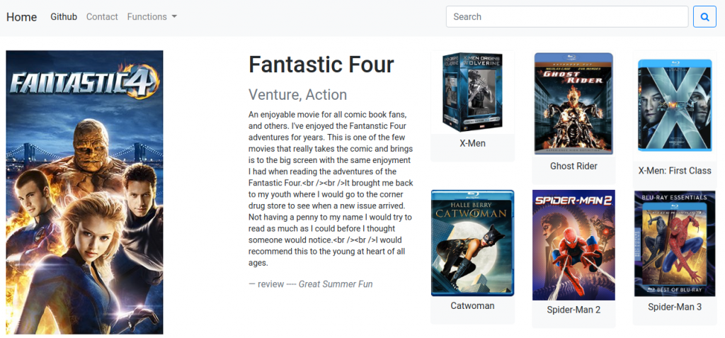
This article focuses on building a movie recommendation system (now deployed as web application). The following is a general view of the front end interface.

The website is now accessible through address is http://movienet.us-west-2.elasticbeanstalk.com/.

For the scope of the blog, we will be focusing primarily on the modeling aspect. For detailed code of the whole project refer to the Github folders, which includes code, documentation, and addendum instructions (additional tools for website building are available as well).

Github repository for website: https://github.com/pankh13/movienet

For model: https://github.com/pankh13/NLP_movie_recommender

Why NLP and Content-Based Filtering?

  1. First, let’s explore the reasons behind using content-based filtering.

Most of the Content-Based Filtering (CBF) methods are being outperformed byCollaborative Filtering (CF) due to the lack of meaningful information extracted from items (meta-information). We can think of the matrix generated by the meta information to represent the characteristics associated with the item in question (genre, tropes, tastes). Therefore, the robustness of the system is highly dependent on the granularity of the available meta-information.

For example, when running CBF on movies, the data we used to reconstruct this movie’s content is often limited to directors, actors, actresses and genres. This may work well in some cases, especially in a series of movies, but for a general use case, performance is not adequate. The movie is not a linear combination of those characteristics.

An alternative source of characteristics can be found in the form of audience reviews, who may have thousands of different opinions on a single movie., yet include some commonality that we may label as a ‘theme’.

It would represent a missed opportunity to not explore reviews as a possible data source.

We now introduce Natural Language Processing as a valid, new approach to reconstruct a movie’s unique fingerprint; i.e. find the hidden ‘theme’ inside movie reviews.

  1. Next we assess the effectiveness of NLP as a powerful and helpful tool for this goal.

The usefulness of natural language processing has arguably been due to the simple reason that it cannot be as precise as human being. It’s debatable how useful natural language processing can be due to the limitations of achieving human being levels of precision. However NLP finds utility  when we process a large set of text data that it’s not financially feasible or impossible to be processed by a human. NLP allows us to extend our ability to structure intangible reviews into cognitively digestible information.

This is the case within movie data.

Human understanding outperforms algorithmic approaches when we know precisely a review’s meaning by connecting it with our own experience. However, machine learning approaches gain ground when processing tens of thousands of movies, since no human has enough time to watch them all.

Building a NLP CBF model for a recommendation system has other advantages, including:

  1. The marginal increase of space complexity is not significant. Although the initial model training will introduce a huge vocabulary set into the model, this increase slows down when the model reaches a certain size, which includes most of the frequently used words. This approach works well with those cases where the number of user is far more than that of products, e.g. movies, shopping websites.
  2. This model is applicable to products in different categories. For example, a well trained word2vec model can do the following calculation:
    This is of particular interest when we want to do cross-category recommendations.

Paragraph Vector

We now introduce the algorithm used—Word2vec. When constructing semantic correlation models in NLP, we generally use so-called word embedding: mapping words or phrases to numeric vectors. Those vectors represent the ‘meaning’ of the words through a mathematical representation. Among those word embedding methods, Word2vec is best for this case. Research has shown that Word2vec has a steep learning curve, outperforming other word-embedding techniques (e.g. LSA), when it is trained with medium to large corpus size (more than 10 million words)[2]. To note though that the best parameter setting depends on the task and the training corpus.

Word2vec is not really one model, it is a group of related models that are used to produce word embeddings. They are two-layer neural networks that take in text corpus for training, and use neighboring words to predict each other. Through training, a set of vectors are generated each representing a word [1].

Based on word2vec, doc2vec (Paragraph Vector) was designed in 2014. This model further develops word2vec by considering the feature of each document in the text corpus. The model takes in the tags (multiple, either unique or duplicate) in the input text corpus and generates a vector representing those tags as well.

comparison of word2vec and doc2vec

In a doc2vec model, we are going to use the movie reviews as the text corpus fed into the model and use the movie names as the ‘tag’, so that we can have a representation of the movie contents.

Data Collection & Data Cleansing

Special mention will now be made about data collection and data cleansing due to the rarity of available movie review data. The primary reason that most of the movie databases prevent web spider or API from accessing movie review data is for protection of the users’ privacy. The best dataset we could can find was Web data: Amazon movie reviews[2] published by J. Leskovec, which has ~8 million movie reviews up to October 2012. Reviews include product and user information, ratings, and a plaintext review. For further analysis, we had to use Amazon Advertising API to scrape down the movie names (and posters of course for building the website).

The unzipped file containing the data is more than 9 GB large.  For reproducibility a database storage is strongly recommended due to the further steps required.

The first step was to dump data into a database and perform the initial EDA. To guarantee the precision of the model, only those products were selected with more than 175 reviews, cutting down the number of rows to ~4 million.

Second step was to scrap down movie name and movie poster data from Amazon. This required usage of Amazon Advertising API, which involves a standalone application request. To note is the API’s limit of 1 access/second, so special care should be taken in doing the grouping by ID first to save time and adding a time.sleep() when accessing it. Amazon does not specify whether this API is robot friendly. We leave further considerations to the reader.

The third step was to write those reviews and movie names needed back into file, since IO is faster than database access and saves a lot of time during training. This shortcut is easily applied, but order preservation is important. Filtering out those reviews that either too long or too short is also a necessary step. A final data adjustment step was needed on each review and will be discussed in the next section.

Model Training

Before training, there’re two things that require particular attention:

  1. Loading all the data into RAM should be avoided. It’s slow and even impossible for most PCs.
  2. Further formatting is needed on review texts.
    • Get rid of stopwords. Stopwords are the set of words that don’t contain contextual meaning in a certain language, e.g. for English words like ‘the’, ‘a’, ‘and’.
    • Remove special character.
    • Convert to all lower case. (it is better since we are not distinguishing different terminologies here)

Then we can prepare our text data for model training. Use an enumerator to iterate over the data and create a ‘Labeled Sentence’ object to feed into doc2vec.

The actual training is straightforward compared to other work. In the newest version (different syntax might be found on other web tutorials, but this is for the latest version) you only need one line of code here. To make the training result reproducible, we need not only set the random seed but also fix the number of workers to 1, since the OS threading may introduce extra randomness.

Note that, if you don’t need your result to be reproducible you can use (import first) multiprocessing. This may save several hours depending on the processors and disk type of the machine.

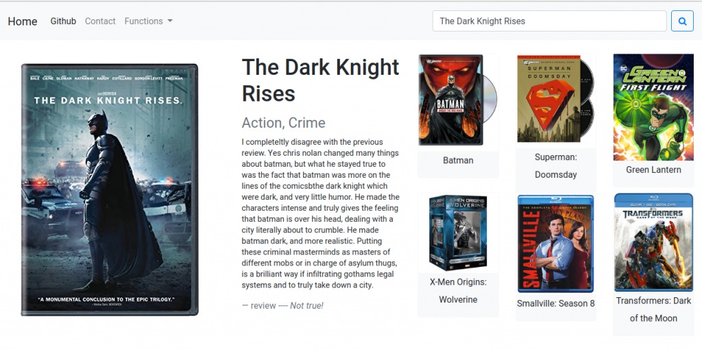
After hours of waiting we will finally have the trained model. Load the model in and run queries. Similar to other neural network models, tuning the parameters is very important. During several iterations I found out that the number of epochs should be more than 10 for a stable performance, yet that other parameters didn’t have much of an influence. Below are some of the test results. (These were unfiltered so they include duplicate movies with different product names on Amazon)

The website has received positive feedback from my classmates. However, there is still room for improvement, e.g. the movie names are those being used in Amazon’s movie product catalog, which still remains messy despite the work I did; compare CBOW and skip-gram algorithm, etc.

Other Interesting Results

Once we finish building this model, we get several other topics to test on.

Predicting the movie described in a review: this is easy to understand; get the vectorized representation of a review and calculate the movie tag most similar to it. Take this review for ‘Star Wars Episode V’ for example:

This feature works well and the longer the review the better it performs.

Prediction of movie genre:
The idea is to calculate the ‘cosine distance’ between the movie vector and the genre vector. Get a list of genres and calculate which movie is closest to (working on this feature for improvements.)

Getting similar words:
This is one of the most important functions of the original word2vec model. However, in this model where only movie-related data is used, such kind of model could be biased. There’s also a test function (model.accuracy) built inside doc2vec (test dataset available from https://github.com/nicholas-leonard/word2vec). If a more precise model is necessary, we can always use this for optimization. (This variation of the model built by CBOW is terrible for this test, indicating it is not good enough for generalized usage.)


Reference:

[1] Mikolov, Tomas, et al. “Efficient estimation of word representations in vector space.” arXiv preprint arXiv:1301.3781 (2013).

[2] Altszyler, E.; Ribeiro, S.; Sigman, M.; Fernández Slezak, D. “Comparative study of LSA vs Word2vec embeddings in small corpora: a case study in dreams database”.

[3] J. McAuley and J. Leskovec. From amateurs to connoisseurs: modeling the evolution of user expertise through online reviews. WWW, 2013.
 

DJ Random Forest: Song Recommendations through Machine Learning

| By Logan Wilson |

Where do you find new music?

If you’re listening to post-grunge on your Sony Walkman, congratulations, you’re still in 1999! You discover new music primarily through the radio, at the mercy of disk jockeys playing actual disks, or by wandering aimlessly around record stores, hoping to be inspired by some bangin’ album artwork.

Fig. 1 – You can already tell that this will be a great album. – billboard.com

However, if you’ve listened to music at any point since then, you probably discover new music online – Pandora, YouTube and Spotify seem to know your musical tastes better than DJ Dave on 92.1 FM ever could.

How do these digital DJs know what you like? Modern music recommendation systems can generally be classified as content-based systems, collaborative filtering systems, or a hybrid of the two. Content-based systems make recommendations based on attributes of the sound of the music – is the song happy? Does it have a strong beat? On the contrary, collaborative filtering systems are based on user behavior – you and Bill both liked Red Hot Chili Peppers, and Bill also liked blink-182, so you’ll probably like blink-182 as well. Companies like Spotify and Pandora generally utilize a combination of the two with a strong focus on collaborative filtering – individual musical tastes are fickle, but given a large enough sample size, humans are pretty predictable.

I wanted to see if I could build my own music recommendation system similar to Spotify’s “Discover Weekly” playlists by applying some basic machine learning techniques – namely, the random forest algorithm. Lacking Spotify’s massive ocean of user data, DJ Random Forest recommends music by implementing a content-based algorithm in which recommendations are based entirely on personal ratings, using only genre and audio features. Audio features encompass 10 qualitative attributes (such as danceability, energy, acousticness, etc.) evaluated quantitatively by the music intelligence platform Echo Nest, acquired by Spotify in 2014. These audio features, along with other identifying track information such as track name, artist, album, and genre were obtained via the Spotify Web API.

In order to build a comprehensive data set, I wanted music that would appeal to most modern tastes, but with enough relatively unknown artists or songs that ratings wouldn’t be muddied by familiar tunes. If the user’s primary goal is to to find new songs or artists to enjoy, the model should be trained on new songs based on whether the user likes its sound, rather than whether the user has a preconceived opinion of the artist. In order to generate such a dataset, I extracted the names of 427 unique artists from the Billboard Year-End Hot 100 charts for 2005 through 2015 scraped from Wikipedia (https://github.com/walkerkq/musiclyrics). After querying each artist’s name to obtain their Spotify-assigned Artist ID, I used Spotify’s “related artists” API method to get 20 related artists for each artist. I repeated this to get 20 related artists for each of these artists, until I had a list of over 8500 unique artists. I then used Spotify’s “top tracks” and “audio features” API methods to get the top 10 tracks and their associated audio features for each of these artists. Every artist also has an associated list of sub-genres, which I parsed into a single parent genre classification. The end result of this was a single data frame containing exhaustive data and metadata for 80,600 tracks on which a machine learning model could be trained.

I wanted the process of getting song recommendations from DJ Random Forest to be fun and easy. The console-based user experience is fairly straightforward and guided by helpful prompts along the way. Initially, the user is prompted to listen to 30-second previews of several songs and rate them on a scale of 1-10, with a minimum of 10 recommended (obviously, the more samples the better). The ratings are converted into binomial responses, with ratings greater than 5 classified as “like”, and ratings less than or equal to 5 classified as “dislike.” Weights are assigned to each response depending on the magnitude of the rating (a rating of 1 or 10 are weighted higher than a rating of 2 or 9, and so on).

A random forest classification model is then trained on the rated songs. Though scikit-learn is generally the library of choice for machine learning in Python, I implemented the H2O machine learning platform for its advanced support for categorical data (scikit-learn’s random forest classifier can only make numerical splits on variables for its decision trees and would require one-hot encoding of the categorical data in the genre variable, but H2O can perform categorical splits within its decision trees).

For each of the remaining songs in the dataset, the model predicts the probability that a song will receive a positive response (i.e. rating > 5). The 10 songs with the highest probabilities are shown to the user, who can choose to either see the next top 10 songs or rate more songs. The user can choose to either rate their top songs or new, random songs. After this second round of training, the user is presented with the top 10 songs recommended by the improved model (trained on 20 songs rather than 10, for instance). This continues until the user is satisfied and quits the program.

Choosing a metric to evaluate our model poses an interesting problem – since we are not interested in observing classifications for the entire test set of 80,000 songs (most users will only view the top 10 songs in the test set), high accuracy is unnecessary. Any songs close to the threshold between “like” and “dislike” will likely never be seen, so their classification is inconsequential. We must also account for users who might like or dislike a large proportion of the songs in the training data – for example, if the user likes 9 out of 10 songs, accuracy will be high if the model classifies every song as “like.” AUC, which measures the likelihood that a “like” song will be ranked higher than a “dislike” song, is therefore the preferred metric for this model.

A model built on a small training dataset like ours can certainly be prone to overfitting, though the random forest algorithm should alleviate this to a certain extent through the process of bagging on both sample and predictor selection. To further mitigate this, we can tune parameters min_rows and ntrees, where min_rows specifies the minimum number of observations for a leaf in order to split and ntrees specifies the number of trees to build. Ideally we would also tune the maximum depth to which a tree could be built, but during testing we found that setting a low maximum depth would result in too many short trees with few leaf nodes due to the small training dataset. This would cause “like” probabilities to be bucketed into several discrete values and prevent a definitive ranking from which we would determine the top 10 songs. By allowing trees to grow to their full extent (i.e. no maximum depth), we can obtain granularized probabilities for ranking without sacrificing significant predictive power.

We can select the right combination of min_rows and ntrees through cross-validation, employing the “leave-one-out” method and averaging AUC over all of the resultant models for a given combination of parameters. For the purpose of tuning, I had my roommate complete the initial stage of the program, rating 10 random songs to create a training dataset. I used this training data to build 90 different models using different combinations of min_rows and ntrees, then grouped by min_rows and ntrees and averaged AUC values.

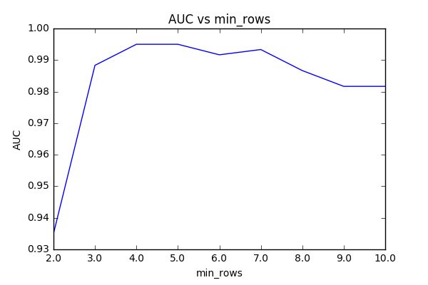
Fig. 2 – Parameter Tuning – min_rows
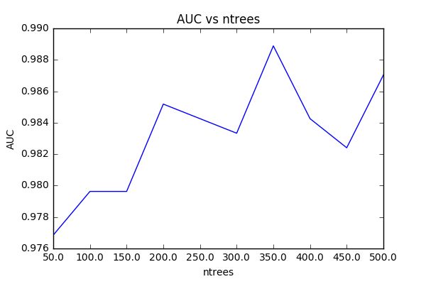
Fig. 3 – Parameter Tuning – ntrees

In Figure 2, we see that AUC stays fairly consistent for min_rows >2. In Figure 3, we observe that AUC rises fairly linearly with ntrees (notwithstanding a few spikes), which follows from our intuition that more trees should provide better performance (but worse speed). We will select min_rows=3 and ntrees=350 for our model. One should note that the AUC for all of these models is very close to 1 within a very small range, indicating strong predictive power regardless of tuning. That said, all of these models were built from the same individualized dataset. Ideal parameters will likely vary depending on the variety of songs sampled for training and the rating behavior of the user.

Once we are satisfied with the tuning of the model, we can begin actually making predictions. After setting these new parameters, I had my roommate complete 4 rounds of the second stage of the program, rating the top 10 songs recommended by each iteration of the model. We can observe how the model improves over each iteration through a few different metrics.

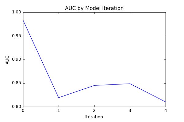
Fig. 4 – Model Metrics – AUC
Fig. 5 – Model Metrics – Like Probability
Fig. 6 – Model Metrics – Song Rating

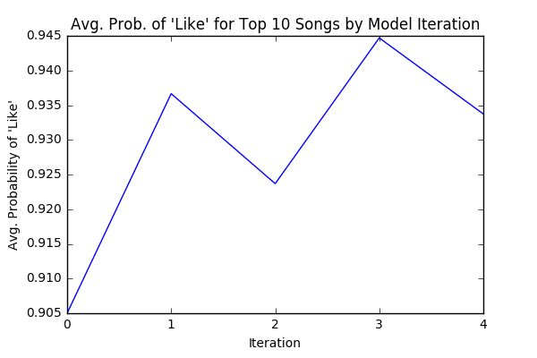
First, we can measure AUC for each iteration of the model, calculated from the training data on which the model was fitted. We see in Figure 4 that AUC drops to a fairly stable range after the initial training model (iteration 0) – this is likely due to some overfitting in the initial iteration when the sample size is small, which corrects itself when sample size is sufficiently large. We can also average the probability of a “like” response for the top 10 recommended songs for each iteration. The plot in Figure 5 follows a roughly linear trend, indicating that the model is growing more certain about its predictions as it improves. Of course, the metric that ultimately matters is whether the user likes the recommendations. Averaging ratings for each set of recommended songs, the plot in Figure 6 indicates that on average, the user’s ratings increase after each iteration of the model.

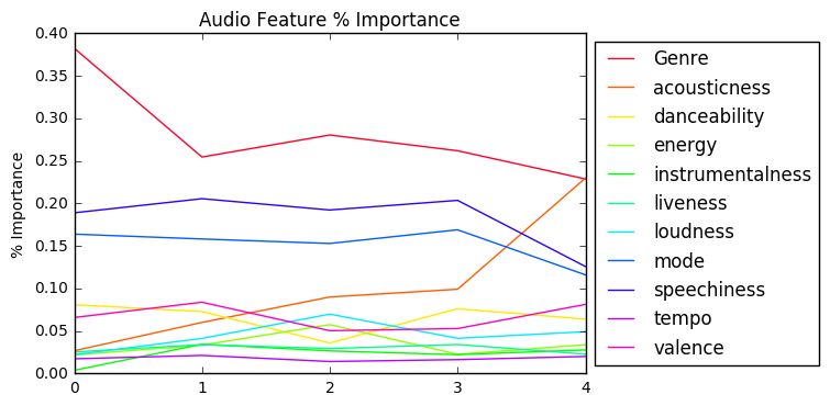
We can also utilize the model’s ranking of variable importance (Figure 7) to draw some conclusions about the user’s musical tastes. This user ranks music primarily by genre, but also considers speechiness (a measure of the presence of spoken words on a track), mode (either major or minor scale), and acousticness. A full description of all audio features is available in the documentation for the Spotify Web API.

Fig 7. Audio Feature Importance

Of course, all of these results are highly individualized to my roommate’s preferences, so we can’t yet draw definitive conclusions about the effectiveness of the model. The next stage for DJ Random Forest would be beta-testing – allowing others to test the program and recording their results. With more data, we could not only study and improve the performance of the algorithm via further tuning, but also begin modelling musical tastes over different demographics. What makes a popular song popular? Do millennials prioritize tempo and loudness while single moms prioritize danceability? DJ Random Forest may one day find out.

DJ Random Forest is available for download via Github: https://github.com/lwilson18/DJ-RandomForest.

A Hybrid Recommender System for Destiny and eSports

| By Kevin Zhai |

For the full paper, click here.

Introduction

While the obvious applications of data science are domains like healthcare and financial services, the world of video games is ripe for advanced analytics. Gaming is a large industry, with $101 billion worldwide revenue in 2016 [1]. Compare this with the $38 billion global revenue for movies in 2016 [2] and it’s clear just how massive gaming has become as a source of entertainment. Digging deeper, we can examine the rise of eSports. Short for electronic sports, eSports encompasses the competitive gaming world where professional gamers train and compete to become the best. This industry forms a rapidly growing segment of the games market, with revenues projected to double to $1.5bn by 2020 [3]. Over 320m people worldwide watched or played esports in 2016 – a number expected to exceed 580m in 2020. With such high growth, it’s clear that this space will be primed for innovation. The question remains: how can data science fundamentally affect eSports and video games in general?

The fact is, gaming analytics represents a unique domain through which to apply machine learning. In the big data context, gaming data is high frequency and longitudinal. A game server may carefully track every single action of a player in their lifetime. Having interned for EA games this summer, I had an inside look into exactly how much game studios are collecting and processing. All games, from large AAA games to mobile games, track every single metric you can think of, from exactly how many steps your character moved across the map to every single second you spend in each game mode. This can be contrasted with web analytics. A company like Amazon collects a ton of data about its users through the marketing funnel and product purchases, but the number of touchpoints is dramatically decreased when compared with games. While most web analytics deals with optimizing for conversion metrics, gaming data must be used to optimize for user experience in order keep players around. As a result, developers and researchers can do fascinating things with gaming data in order to better understand the players.

The Problem

After looking through the research that has been done on gaming, one area seemed to be lacking in our eyes: recommender systems. What is a recommender system exactly? If you use any kind of subscription service, you’ll be very familiar with it. At its core, a recommender system is a machine learning algorithm built to predict if a user will like a certain product. There are a variety of ways to implement these systems. Netflix uses collaborative filtering, looking only at what other users are doing similar to you, to recommend movies when you are chilling. Amazon utilizes content based approaches to recommend items, such as suggesting a certain fantasy book because you liked Lord of the Rings.

We set out to build a hybrid recommender system for Destiny. In this context, hybrid means a system that utilizes multiple approaches to build recommendations. Destiny is a Massively Multiplayer Online (MMOG) first person shooter developed by Bungie, the same team behind the hallowed Halo series. In Destiny, players control a character that has access to hundreds of guns and special skills in order to defeat monsters and other players. For our analysis, we focused solely on the player vs. player (PvP) game mode. Fig. 1 shows the types of weapons that are preferred in PvP, giving a sense of the number of options a player has.

Recommender systems for gaming is a unique challenge. I am not talking about recommending which games to play; rather, recommending certain behaviors to increase performance in a game. MMOGs like Destiny are complex and require so much decision making that players often don’t even know how to improve. Should I use this skill tree or equip this weapon? The obvious answer to improve is to play more. Someone who has played 10,000 hours will be significantly better than someone who has played 10. Still, there must be a way to systematically help players improve through data. The thing that makes recommenders hard for gaming is that that different players will have different preferences over how they play a game. We wouldn’t want to suggest to a shotgun player that they should use a sniper rifle.

Figure 1: Distribution of Kills

Methodology

Data Preprocessing

The data was extracted through the Bungie API using a random sample of 10,000 players which provided comprehensive information about player behavior. This included PvP matches of the players, providing performance data such as number of kills with each weapon, average kill distance, deaths, etc. Additionally, the data covers the core character information about each of the players, giving us a look into what kind of stat allocations they used. There were two classes of stats that we cared about: battle stats and cooldown stats. Battle stats (agility, armor, recovery) affect the movement, health, and regeneration of a character. Cooldown stats (intellect, discipline, and strength) affect the cooldown of various special abilities. After dropping irrelevant columns, we converted some features into proportions (since number of games played or level discrepancies could skew the features) and standardized the data set.

Clustering

In order to make recommendations to players, we needed to find similar players to recommend against. Since playstyle is hard to quantify through one dimension, we developed 3 separate profiles through clustering for each character to capture the main pieces that factor into determining a player’s playstyle.

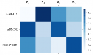
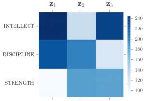
The first two profiles were created using k-means clustering on battle stats and cooldown stats, shown in Fig. 2 and 3. The heatmaps depict the feature means for each cluster. We chose 4 clusters for battle stats and 3 clusters for cooldown stats, based on interpretability and domain knowledge (many of the authors of this paper were avid Destiny players). We can see that players have different preferences for how they allocate these stats.
The third profile was created using archetypal analysis, shown in Fig. 4. Archetypal analysis is an unsupervised learning algorithm used to determine extreme entities, the archetypes, within the dataset. As such, we end up with unique profiles relative to centroid based methods like k-means. Most of the archetypes refer to players with specific weapon preferences, such as cluster 1 representing players who use auto rifles and 5 which are players who use shotguns. Other archetypes represent a general playstyle, such as 2 being a player who relies on timing their super ability to score massive amounts of points.

After this multi-profiling step, there were a total of 72 unique combinations (4 x 3 x 6). Every player falls into one of these combinations.

Figure 2: Battle Stat Clusters
Figure 3: Cooldown Stat Clusters
Figure 4: Playstyle archetypes

Recommender Framework

To make our recommendations, we consider the intersections of each profile, visually depicted in Fig. 5. Each intersection of the profiles represents the available pool of players that can then be recommended against. For ease of explanation, we use the scenario of Player X looking for a recommendation with our system.

Intersection 1 represents all of the players like Player X — it is the pool of players who have the same combination of profiles as X. In other words, if Player X is in cluster 1 for battle stats, 2 for cooldown stats, and 5 for weapon playstyle, then intersection 1 for Player X is all players who are in those same profiles. Within that pool of players, we can then find players who have a higher KDA or higher combat rating (Bungie’s ranking system for PvP performance) and suggest to Player X to try out the weapons of those players. This approach allows us to use a collaborative filtering approach while still respecting the unique playstyle of the individual.

The benefit of our framework comes when Player X decides that they want recommendations that don’t consider players exactly like themselves. Let’s say that they want recommendations on cooldown stats. If we were to simply use intersection 1, the players we would consider would have the same distribution of cooldown stats as X, which would not be useful. Instead, we can look at intersection 2, where there is no restriction on the cooldown stats. Therefore, the players we now consider will have variability in cooldown stats, so we can show Player X others who are like them in playstyle and base stats, but varied in cooldown. The same process can be applied to other intersections.

In principle, our multi-profile framework can be generalized to n number of profiles, based on different behavioral aspects of any game. Our belief is that such a framework provides a flexible way to incorporate different gameplay aspects and takes into account what players are willing to change.

Figure 5: Recommender Intersections

Evaluation on Reddit

To validate our recommender system, we had a couple of options. The best way to do so was to conduct longitudinal experimentation on a set of players and track if their combat rating actually improved due to our recommendations and not merely due to spending more time with the game. However, we had limited time and such a study would require a willing player population and more resources. We decided to do a qualitative evaluation to get some insight about the effectiveness of our results.

In order to survey players, first we needed to find them. Reddit was a natural source for this. The r/destinythegame subreddit is an active community of players that all play the game. We put out a post on the forum and asked players if they were interested in participating in a survey, incentivizing them by offering a free copy of Destiny 2 (what better way to incentive gamers than free games). After receiving about 50 responses, we collected in-game usernames and pulled their data directly from the public API. With their data, we ran our recommendation system on their data and created individualized reports, shown in Fig. 6.

Figure 6: Final Individualized Recommendations

The feedback we received was generally positive, with some reservations from a couple of players. Out of the players who responded, 80% of players found our recommendation helpful and would act on the recommendation. Most of the positive comments we received involved players enjoying learning both about other players like them and our suggestions on which guns to try. However, we did receive feedback stating that some of the recommendations were not very helpful since players all have different preferences. This brings us back to the problem of player personality — some players simply want to get better through practice and not through weapon recommendations. Despite this, the main takeaway here is that players are hungry to know about which specific areas of the game they can improve on. Our framework represents one such way to do so, but it may only appeal to newcomers and not veterans of the game who know every detail already.

Conclusion

In our research, we set out to build a recommender system to help Destiny players improve at the game by suggesting different weapon loadouts and stat allocations. The key here is that we try to suggest actions that are still true to the player’s preferences. To do this, we first cluster the players based on their unique playstyle and stat preferences. Our hybrid recommender system involves taking different intersections of profiles and then recommending players that are similar, but with a higher combat rating. Our online evaluation on Reddit showed that the results were of great interest to players and that they would act on the recommendations if the system was a live service. Future work for our framework includes longitudinal experimentation to track metrics and validate if our players realize better performance. The recent release of Destiny 2 seems like a natural application of this.

It is clear that analytical systems designed to help players improve will have a huge impact on eSports in the future, potentially representing a huge business. Companies like Mobalytics are doing just this. Having already raised almost $3 million in seed funding [4], the company allows players to receive personal feedback about how to improve at some of the biggest eSports today, such as League of Legends. This service is driven by the public data in APIs and proprietary machine learning algorithms. The impact of data and analytics is pervasive in gaming, and as lifelong gamers, we are excited to see where it goes in the future.

NER Wars: Evaluating Named Entity Recognition Methods on the Star Wars Original Trilogy

| By Macon McLean ’16 |

Like all people with good taste[1], I have long been a fan of the Star Wars film series.  Ever since witnessing the theatrical re-release of the holy triptych when I was a kid, I have marveled at the way George Lucas invented a living, breathing universe for viewers to enjoy.

Part of making such a universe feel fully-realized is developing a unique vocabulary for its characters to use, and the Star Wars movies pass this test with flying colors.  The evidence is that nearly everybody who’s witnessed one of these adventures from a galaxy far, far away remembers the names of “Luke Skywalker” and “Darth Vader”, and can describe a “Jedi” or “the Force” with ease.  These four examples are some of the Star Wars universe’s named entities, words or phrases that clearly describe certain concepts in a way that differentiates them from other concepts with similar attributes.

Named entities are used to inform the process of named entity recognition (NER), the process of automatically identifying and classifying these entities in a given corpus.  This process can be used in creative and meaningful ways, like examining locations in nineteenth-century American fiction[2] for an analysis of named locations in literature[3].  It is often used as part of relation extraction, in which computers pore through large volumes of unstructured text information to identify possible relationships and record them in a standardized, tabular form.  NER classifiers are computational models trained to support these efforts, minimizing the need for manual tagging by humans and preparing the data for inference.  Consider the following sample sentence:

“Steve Spurrier played golf with Darius Rucker at Kiawah Island in May.”

Using just a few simple classes (PERSON, LOCATION, DATE) we can examine each word in the sentence and tag the named entities as follows (commas inserted):

“PERSON, PERSON, O, O, O, PERSON, PERSON, O, LOCATION, LOCATION, O, DATE.”

Tagged sentences like this one can then be used to train an NER classifier, helping it learn when and how to apply those three types of tags.

The downside of NER is that classifiers trained on the vocabulary of one domain do not generalize well to others.  This makes sense, as the conditional random field[4] (CRF) at the heart of the classifier is a context-based method.  The contexts surrounding named entities of chemistry differ significantly from those of named entities in economics, or Chinese literature, or Star Wars, so the CRF will train differently for each domain.

After learning all this, I began to imagine other uses for NER classifiers.  One idea was to use it as a means by which to compare the vocabulary of a specific text with similar works, as a very specific kind of lexical similarity measure.  Since these classifiers are so brittle, it would work only within a specific domain, and could only make very fine distinctions.  After an exhaustive[5] search of the top journals, I did not find any examinations of a Star Wars-specific NER classifier.  So obviously it became my mandate to train an NER classifier for the very necessary task of Star Wars named entity recognition via Stanford’s CoreNLP suite.

To train such a classifier requires a significant amount of legwork on the front end.  You must create a training corpus with each word tagged as part of a class.  For this research, I used the full scripts from Star Wars, The Empire Strikes Back, and Return of the Jedi.  My corpus was tagged with eleven classes:  other, person, location, duration, misc, date, number, organization, ordinal, time, and percent.

The procedure was fairly simple (albeit time-consuming).  I first created a Python script that augmented the out-of-the-box NER classifier in the Stanford CoreNLP suite with user-input dictionaries.  Ten of the above classes are standard, and I added the misc class to cover anything Star Wars-related that did not fit adequately in the pre-existing set of classes (e.g. vehicles, alien race names).  Then I manually inspected each script and developed a few rules to keep tagging consistent across the three scripts[6].  After some final formatting, the training files were ready to go.

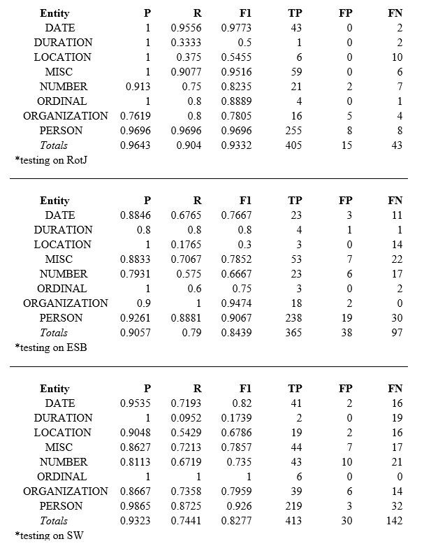
Using the CoreNLP training commands, I fitted a classifier to the text from both the original Star Wars (SW) and the Empire Strikes Back (ESB) for testing on Return of the Jedi (RotJ), then did this two more times for the other two possible configurations.  I also ran the standard classifier on each script as a baseline for comparison.  It turns out that in this case (perhaps due to small sample size), the out-of-the-box standard classifier only tagged my corpus three classes (location, person, organization), so I have broken those results out below.  Each classifier is identified by the film it is tested on:


As expected, the trained classifier outperformed the standard one in each case.  I have omitted the full table because the trained classifier was also better in each subcategory in each case.  The average increase in precision was 18.84%, recall was 63.77%, and F1 was 55.32%[7].

Now let’s compare the performances of each of the three trained classifiers to one another.  First, here’s the full breakdown:

And now a graphical comparison of overall performance:

Finally, the same chart as above, but only using the four most domain-specific categories:

The model trained on Eps. IV and V and tested on Return of the Jedi leads the pack in precision, recall, and F-score both across all categories and on the subset of domain-specific terms.  In fact, recall and F1 increase as we move forward in time with regard to the movie we test on (precision is actually second-highest for the model trained on V and VI).  Precision is very good, with all but two figures higher than 80% (a decent helping of ones on the best model) and above 90% in the subset.  Recall is also fairly impressive (except in location and duration, and only in the few cases where the number of relevant words was less than twenty), and above 80% across the board in the subset.

As good as they were, the preliminary results did have me somewhat concerned, so I decided to do some further investigation.  I wanted to make sure that the model wasn’t simply regurgitating different words it had learned during training and just missing the ones that weren’t there.  I needed to make sure that this model actually learned.

So I manually inspected the corpus again.  According to my tags, Return of the Jedi has exactly thirteen instances of unique person-class words not seen in Empire or Star Wars.  If it was just tagging previously learned words and missing the new, heretofore unseen terms, we would expect the total number of false negatives (missed words) to be at least thirteen in number.  However, there are only eight, so we have good evidence that the model is really learning – at least five of the thirteen new words are being picked up by the trained classifier.

Repeating this analysis, there are thirty-one unique person-word instances in ESB and forty-one in Star Wars, so no pure regurgitation here either given the false negatives.  However, when I looked at location and duration, the two fields that actually suffer from high precision and low recall, I saw that there is a chance it is simply repeating learned words – though false negatives are less than or equal to unique instances in most, there are more false negatives than my tabulated number of unique location-words by one for Empire and by two for unique duration-words in Return (though these suffer from notably low sample size).

The bottom line?  Star Wars stands out as the film with the named entities least recognizable by a classifier trained on its two sequels, according to F1-score.  Empire is pretty close behind, and Return’s named entities are most easily classifiable by a longshot.  This is true both across all categories and the four-class subset.

But why?  One hypothesis is that Star Wars has significantly more named entities than the other two, which results in more chances for misclassification.  However, this fails to account for the similar performance of Empire.  Another (and in my opinion the more likely) explanation is that it is an artifact of the order of the films.  When the classifier has trained on Star Wars and Empire, it can refer to any context learned in those films when studying Return; this is ostensibly far more useful for classification than when the converse model refers to temporally subsequent contexts to classify terms in Star Wars.  Of course, there could very well be a third explanation I’m missing entirely.

One way to help decide this is to expand this analysis to the prequel trilogy.  Unfortunately, I’m not sure I can spend the requisite hours tagging the script for Episode II without losing my mind[8].  Until I can, I’ll just have to try to tap into the Force to figure it out.


[1] Though this is the subject of some debate, let’s just treat it as fact for this exercise.

[2] A pseudo-tutorial by the textual geographies people:  https://blogs.nd.edu/wilkens-group/2013/10/15/training-the-stanford-ner-classifier-to-study-nineteenth-century-american-fiction/

[3] The greater textual geographies project:  http://txtgeo.net/

[4] For a solid introduction to conditional random fields, check out this blog post by Edwin Chen:  http://blog.echen.me/2012/01/03/introduction-to-conditional-random-fields/

[5] The search was admittedly less than exhaustive.  But I doubt there’s anything else out there.

[6] I found myself thinking I could write a whole paper about this task alone.  Whenever possible I tried to use common sense.  This is a nuanced task and instituting different rules might well have yielded somewhat different results.

[7] For an explanation/refresher on the differences between precision, recall, and F1 score, it’s hard to beat the Wikipedia page:  https://en.wikipedia.org/wiki/Precision_and_recall

[8] Episode II is the weakest link.  Search your feelings, you know it to be true!

Learning to Fight: Deep Learning Applied to Video Games

| By Dr. Ellick Chan |

Artificial Intelligence (AI) is commonly used in video games to control non-human “computer” players. The AI used in video games often relies only on simple logic and heuristics, so “computer” players do not always have human-like playstyles. This is unfortunate because games that feature human-like AI could be very popular amongst both recreational and competitive gamers. AI trained to play like specific humans could be particularly appealing. Imagine the headlines to market such games: “Play Grand Theft Auto cooperatively with AI trained by celebrity Snoop Dogg” or “Fight against AI trained by World Champion Player Mew2King”.

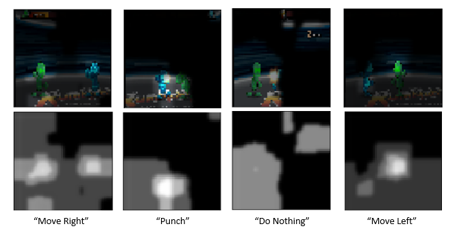
Inspired by the work of Stanford PhD students Chen and Yi [1], MSiA students Dustin Fontaine ’17, Dylan Fontaine ’17, Annie Didier ’17, and Michael Cho ’17 set out to use Deep Learning to create a human-like video game AI. Their approach relied on image-classification instead of reinforcement learning which is more commonly used with video games. The team started by recording a player (Dustin) playing the game “Rumblah: Flash Fighting Engine”, a simple fighting game where two players move around the screen and hit each other until one gets knocked out. The team recorded approximately 1 hour of gameplay, capturing 10 screenshots per second and labelling screenshots according to which key Dustin was pressing while the screenshot was taken. The four possible labels for screenshots were “Move Left”, “Move Right”, “Punch”, and “Do Nothing” (if Dustin was not pressing any keys). Some example screenshots are shown below. Dustin was controlling the green character.

The next step towards creating the AI involved fitting a neural network to the collected screenshots. If the team could build a model that could accurately label new screenshots according to what key Dustin would press in that scenario, it could be used to control an AI that plays the game like Dustin. They started by fitting a sequential neural network to screenshots and then fitting a more robust convolutional neural network. The convolutional model performed better than the sequential model, achieving nearly 60% accuracy and 80% top-2 class accuracy. This may seem low, but it is not bad when you consider the randomness of human behavior and the fact that Dustin may does not always press the same keys every time in a given situation.

In order to understand why the neural network made the classifications that it did and what parts of each screenshot the model was focusing on, the team used a visualization technique involving heatmaps. The white pixels in each heatmap were given large weight by the model when it was making its classification and the black pixels were given little (or no) weight. See the example heatmaps below. It is interesting to see that the models focused on the same parts of the screen that a human does when playing. In the screenshot classified as “Move Right”, the focus is on the head of each player. This makes sense, because a player considers the relative positions of their character and the opponent when deciding to move left or right – if the opponent is out of attack range then the player will move towards them. In the screenshot classified as “Punch”, the focus is again on the heads of both players and also the flash from a previous punch. Since the opponent is within the green character’s attack range, the model makes the correct decision to throw a punch.  Most of the time the model focused on the heads of each player, but sometimes other information was considered. In the screenshot classified as “Do Nothing” you can see that the combo meter at the top-right of the screen was given some weight by the model.

A human player considers more information than just the current screenshot when deciding which button to press, so shouldn’t a model trying to imitate human behavior do the same? After fitting the sequential and convolutional models to single images, the team decided to fit the same models to “filmstrips” of four consecutive images. “Filmstrips” capture information from the last few moments of gameplay instead of just the current moment. This technique was successful and the filmstrip models performed slightly better than the original models.

The heatmaps produced by the filmstrip models make a lot of sense. More weight was given to pixels on the screenshot representing the current moment (bottom-right) and less weight was given to pixels on the screenshots taken prior to the current moment.

Finally, after fitting various neural networks to recordings of Dustin’s gameplay, the team needed to operationalize their models to control an AI in the game. The AI would be controlled by a script that records screenshots of live gameplay, scales the screenshots to the appropriate size, plugs them into a neural network, then takes the output from the model (which key to press) and emulates keystrokes on a keyboard. The diagram below represents this process.

The team was worried that a script of this sort would not be fast enough to keep up with live gameplay. However, speed turned out to not be an issue. The Python script was able to execute in real time on a standard personal laptop processing screenshots and emulating keystrokes in a fraction of a second.

A video of the team’s AI in action is shown below. The blue player is controlled by a human and the green player is controlled by the team’s AI. You can see that the AI plays well, chasing the blue player around the screen and punching him repeatedly when he is within attack range. Although the AI does not perfectly copy Dustin’s playstyle, this demo serves as a good proof-of-concept for using image classification models to train video game AI. More training data, further tuning, and providing more information as inputs to the model (such as the time series of previous keys pressed) could make the model more accurate. The same framework could be applied to any action game that does not involve complex strategy, so it would be interesting to see how the model performs in other settings.

[1] https://arxiv.org/pdf/1702.05663.pdf

Explaining the inner workings of Deep Learning

| By Dr. Ellick Chan |

MSiA students are helping lead the way toward building more reliable deep learning AI models by making them explainable. This Spring, 9 student groups developed ways to “peek into” models built for their projects. In previous years, students were able to do impressive work in their projects, but they were often left wondering why a model behaved the way that it does. The lack of explainability or interpretability raised some deep questions about the inner workings of their models, and that poses a barrier to adoption in safety-critical industries such as automotive, medical or legal.


This year, the students utilized several methods to show the “visual attention” of their models. Through this process, they were able to better understand how the model arrived at its prediction and as a result gained extra confidence in the model’s thinking process. This work parallels early studies in human attention performed by Yarbus, et al whom showed that human eyes fixated in different areas depending on tasks. The students found that machines can also behave similarly when classifying images, and students were able to leverage this insight to better understand how the machine was perceiving images to build more robust models that perceive the world more like how humans do.


We believe that this work is a helpful first step in making model interpretability and understanding a core component of deep learning analytics education. Machine learning today is very much a black-box art, and in order to gain wider acceptable in society and trust in the model, we must emphasize the need to peek into such models to see how they operate and what the limitations of the model may be.


For more information on our efforts to understand deep learning models, please view an overview presentation here. Course slides are available here.


Yarbus study of human gaze in a scene – (Left) original painting, (Middle) estimate the age of people in the room, (Right) remember clothing worn by people. Note how the gaze patterns depend on the task at hand.

Machine attention maps of ballet positions. Top row shows the attention map with white denoting areas of interest. Bottom shows a masked version of image. Note how PenchPonce is characterized by one leg up in the air. The machine attention map agrees with what a human observer would look for to classify this move.

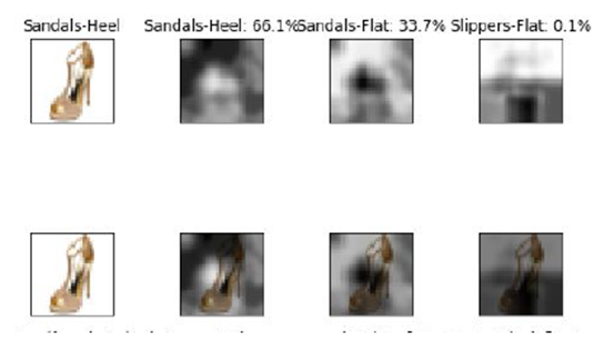
Machine attention map for shoes. Note how the heel class is characterized by the higher heel and loop.

A Demonstration of “Popout”

| By Dylan Fontaine |

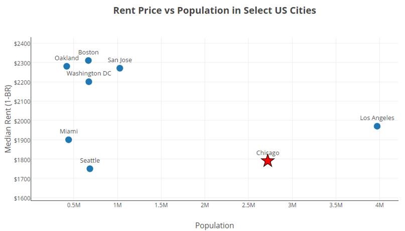
When creating a data visualization, it is often necessary to emphasize certain points so that they stand out from their surroundings. Doing so can help the author communicate their intended message to the viewer quickly and clearly. For example, I made the point for Chicago a red star on the scatterplot below to highlight Chicago’s relatively low rent prices and large population compared to other major US cities.

In my data visualization class, I learned that the emphasis placed on certain points of a graph is called “popout”. Popout is a fitting name, because emphasized points do just that… they “popout” to the viewer. A variety of visual channels can be used to make points popout from their surroundings. They can be colored more brightly, given a unique shape, increased in size, etc. Sometimes a combination of visual channels is used to make points popout.

The method that a chart designer uses to make points popout is very important. The human eye responds much more quickly to some cues than others, so a viewer may quickly see points emphasized with an effective method of popout, while taking longer to see points emphasized with a less effective method of popout. Speed is not everything when it comes to making a good data visualization, as the entire design and impression made on the viewer must also be considered, but I wanted to investigate and quantify the speed at which a viewer can react to various visual channels.

I created a web-application using D3.js to help with my investigation. The application, which you can interact with below, presents the user with a 10 by 10 grid of points. After clicking start, the points are shuffled and the user must count (as fast as they can) the number of points that are emphasized according to the criteria described below the plot window. A timer runs as the user counts the points and it is only stopped when the user inputs the correct number into the textbox and clicks the Submit button. There are three modes on the app that use different visual channels to emphasize points: “Color”, “Shape”, and “Both”. Try each mode below and see how your times compare.

See the Pen V8 by Dylan Fontaine (@dyfontaine) on CodePen.

If you would like to see the HTML, CSS, and JavaScript code I used to create this app, click on the tabs at the top of the embedded CodePen.

Does color, shape, or a combination of the two “popout” fastest?

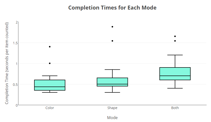
In order to investigate which visual channel makes points popout to viewers the fastest, I had 10 friends test the app. I had them each complete 5 trials on each mode and I recorded their completion times. While my study was not completely scientific, I did take some steps to ensure that the results were not biased. I gave each user the same set of instructions and I let them all practice a few runs beforehand to get comfortable with the user interface. I made the same selection in the dropdown lists for each trial (red for color and/or circle for shape). Also, I randomly assigned each user an order to complete the 3 levels in. (For example, some users completed the “Shape” level, then the “Both” level, then the “Color” level). I compiled the results and plotted the completion times for each level.

The results show that participants generally recognized points that popout due to “Color” the quickest, followed by “Shape” and then “Both”.  It is worth noting that each user had a relatively low variance among their 3 completion times (i.e. a user who was quick on one level was typically quick on the other 2 levels).  The outliers on the high end arose from participants miscounting on their first try, then recounting the emphasized points from scratch while the clock was still running.

It makes sense that the “Both” category was the most challenging for the participants, given that it requires points to be identified using two criteria instead of one.  This illustrates an important tenet of data visualization—keep things as simple as possible.  While adding multiple visual channels to a chart can allow you to show more information at once, only do so when it is a necessary component of the story you are trying to share with your audience.

Which color pops out the fastest?

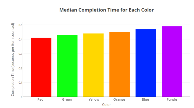
While the above result was somewhat predictable (at least according to my intuition before completing the experiment), I did not have a strong feeling about which color would popout to viewers the fastest. I completed a similar experiment to the one described above, but this time only used the color mode on the app. I had each participant complete 5 trials with each color setting and recorded their completion times. See the results below.  It is important to note that HSL colors were used on the app — each color had the same saturation and lightness value, just different hue values. This ensured that only the color (hue), and not brightness, would affect popout speed.

As you can see, red and green points were counted the fastest, purple points were counted the slowest. However, the difference between the fastest and slowest colors was not very large. I did some research to see if my results aligned with any academic studies and was pleased with my findings. While none of the studies I found tested the exact set of colors that I did, Psychologists in India [1] found that red and green stimuli prompted faster reaction times than yellow stimuli and researchers in Japan [2] found that red stimuli prompted faster reaction times than blue stimuli.

Which shape pops out the fastest?

The goal of the last experiment I conducted was to determine which shape pops out to users the fastest. The procedure for this experiment was identical to the color experiment, except the shape mode on the app was used. Participants had to count points emphasized with a different shape rather than a different color. I was not sure before completing the experiment how times for each shape (circles, crosses, diamonds, stars, and triangles) would compare. See the results below.

Stars were counted the fastest and circles were the counted the slowest. After seeing this result, I thought about why this could be. I realized that since the control points (the points not counted) were all squares, the shapes that look very different than squares should stand out the most. The 5-pointed stars look very different than squares, but the circles can easily be mistaken for squares at a quick glance. Thus, the stars popout more than circles do when amongst an array of squares.

Conclusion

When creating data visualizations, many may choose colors and shapes based on personal preference and attitudes.  In some use cases, such as advertising, speed and ease of understanding are crucial. One should consider this when designing a visualization and be aware of how the colors and shapes they use can affect interpretation speed. I hope this study has given you a new perspective on some simple but often overlooked components of great visualization.


[1] G. Balakrishnan, G. Uppinakudru, G. G. Singh, S. Bangera, A. D. Raghavendra, and D. Thangavel.  “A Comparative Study on Visual Choice Reaction Time for Different Colors in Females”.  Neurology Research International.  2014.

[2] M. Shibasaki and N. Masataka.  “The color red distorts time perception for men, but not for women” Scientific Reports 4, Article number: 5899.  2014.

Computers can compose music…but can they write scripture?

| By Jeff Parker |

I was so impressed to learn from a peer that computer programs have been written to compose music. Music is widely considered an art that takes innately human abilities to craft pleasing sounds. Computers are dull and inanimate while music is alive and human. I do not have a musical background, but after investigating this “artificial” music, I realized that the programs analyze sounds and patterns to piece together new compositions.

So if computers can compose music, something so deeply personal and human, I thought, what else deeply personal can they do? An idea sparked when I asked my wife late at night to tell me her favorite scripture verse in lieu of reading a chapter as is our nightly custom. My wife was too sleepy to read, in her drowsy voice gabbled what sounded like a random assortment of the most common biblical words, “For behold, thus sayeth the Lord, verily I say unto thee, that…” It was hilarious, but to the untrained ear, could have passed as a legitimate passage.

The English language, much like music, follows certain patterns – any English major would agree. There are subjects and predicates instead of tunes; nouns and verbs instead of notes. The language of the ancient Jewish, Greek and Roman authors as translated by English monks certainly follows a very distinct pattern. Many bible scholars and linguistic experts have written much on this. I thought I might try my hand at using a computer to “artificially” write scripture.

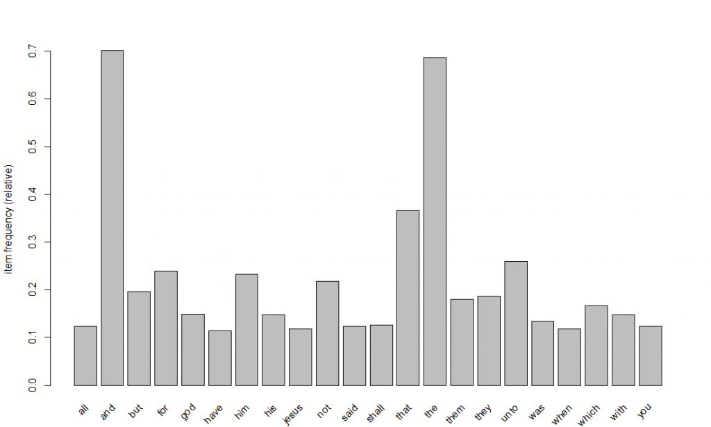
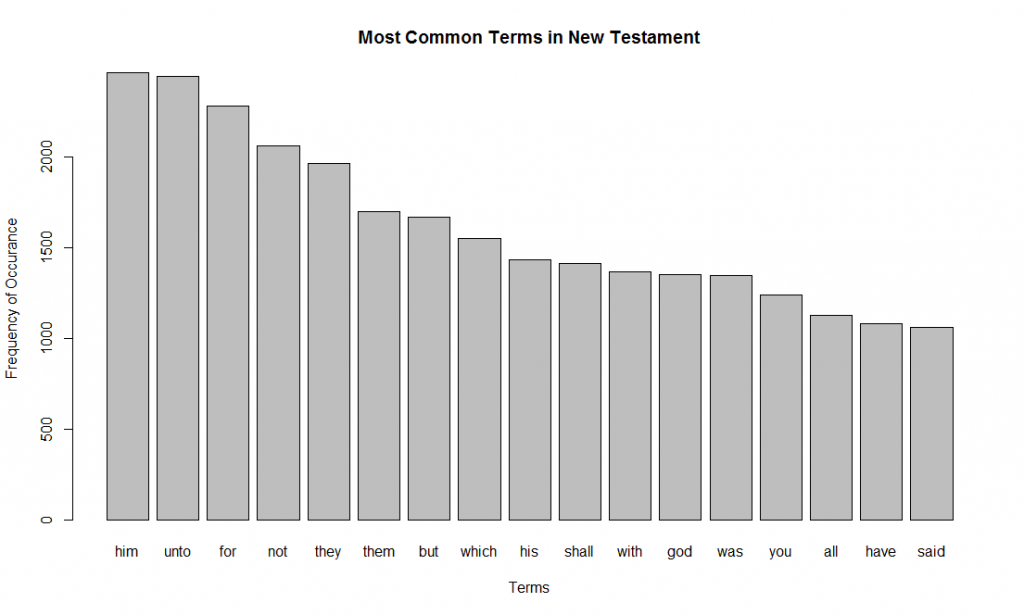
I should note that the Bible is something that is deeply personal and intimate for many people (as is music). For others, it is a very divisive subject. My humble attempts here are not to make a mockery of the Bible or to advocate it, but rather just to explore linguistic patterns using a scientific process. Wherever you fall on a religious spectrum, I think much can be learned from this type of text analysis. For instance, there are 5,975 unique words in 7,958 verses in the King James Version of the New Testament. I decided to focus solely on the New Testament, because 1) it is more recent, 2) it takes place over a shorter period of time than the Old Testament and 3) it is both shorter for computing purposes and easier to understand. All my R code can be found here. Below are the most common terms in the New Testament (“the”, “and”, and “that” are excluded):

Just using the most common words, I can manually piece together something that sounds like a scripture verse:

Approach 1 – Subsequent Terms

I decided on three approaches to craft my “artificial” scripture. The first is to pick a first word (a seed word) and calculate which word is most likely to follow that. Then the word most likely to follow that word. And so on till something makes sense.

Using the second most common starting term “FOR” I started down a path till I got the following: “FOR THE LORD JESUS CHRIST…” At this point, the most common word following CHRIST is JESUS which would put the verse into an infinite loop. So I choose the second most common word following Jesus. I had to do this a few times. Here is my final verse:

Not too bad. It is fun to see how the verse wanders down different paths. However, the biggest problem with this method is that the next word is solely dependent on the previous word. The subsequent words have no memory of previous words. If I was to add a bit of memory to my algorithm to account for phrases, our verse would have wandered down a different path. This memory could be added by using the preceding two words instead of just one. The word following “THAT THEY” is “SHOULD” and would have taken the verse in a different direction. It would be fun to write an algorithm to look at the two preceding words (the two nearest neighbors from K-NN techniques). I would also like to try a decaying weight on the preceding words (similar to kernel weighting regression).

Approach 2 – Market Basket

This idea is to use rule associations used in market basket analysis to find words that commonly appear in the same verse. Again after picking a seed word, I will find the word that is mostly likely to appear in the same verse. Then take the second word and find the word most likely to appear with that word. So on and so till I have a good collection of words. Then I will manually arrange them into something that looks like a verse.

The first step to this is to convert my data into transactions and look at some rules. This graph looks at the words that appear in 10% or more of the verses, or in market basket parlance, support greater than 10%.

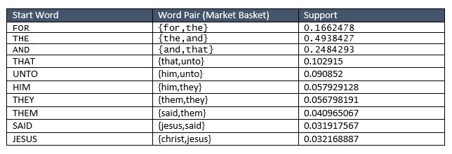
Market basket analysis looks at sets, so we if we expand the sets to several words, we get some great conglomerates of words that occur often together in a verse. I looked at sets of words with high support, here are few that stuck out to me:

My next step is to pick a seed topic and find words around that topic. Using the same seed word as in approach 1, I started with “FOR”. The word pair with the highest support with “FOR” is “THE”… No surprises there. I hit an infinite loop when I got to the word “THAT” so I skipped to the next highest support. In fact, {and,that,the} have very high support. Below you can see my chaining:

Now manually putting my words together:

Honestly, I was a little disappointed with this method. I tried this pattern using other seed words as well. A major drawback to the association rules is that sentences are sequenced while market baskets are not. The market basket calculates the most commonly used words in a sentence, whether the word came before or after, it does not discriminate. So this method does not capture the natural pattern of speech.

Approach 3 – Deep Learning

My last approach is to use deep learning techniques to generate the text. I have much to learn about deep learning, but fortunately, my professor, Dr. Ellick Chan, pointed me to some code on GitHub that students had used previously to generate song lyrics. I did not write any of the code, I just used it straight out of the box, but using the same New Testament as the corpus. Just for fun, I started run epochs before my wife and I went to church, and then I checked it when we got home. Here are some of the best results using the seed “not into the judgment hall, lest they s” which was randomly generated as part of the code:

I am really excited to learn more about deep learning and start playing with the code. The code actually generates based on individual characters. It is pretty remarkable that it generates actual words. However, I would like to change it so it uses words instead.

Conclusion

My intuition going into this exercise was that my approaches would get progressively better. I thought Approach 3 (Deep Learning) would do better than Approach 2 (Market Basket) which would do better than Approach 1 (Subsequent Terms). As a human reader you can be the judge, but personally, I think Approach 1 did the best. This is because this method captured the sequenced patterns of sentences (a noun is followed by a connector which is followed by an adverb, etc.). It think with some tuning the Deep Learning approach could also return some more interesting results.

Ultimately, after this exercise, I learned a lot about text analytics and a little about the New Testament as well. It was very entertaining for me to read and generate the scriptures. I am excited to see what other deeply human concepts computers can mimic in addition to writing scripture and composing music.

Special Session: US Senators on Twitter

| By Dustin Fontaine |

Social media plays a huge role in modern day politics. Through social media, politicians can instantly share their ideas and opinions with millions of people around the world. Social media posts do not have to pass through a middleman (i.e. a journalist or news-anchor…potential sources of bias), before reaching their intended audience, so many politicians use social media as one of their main platforms for communication. We all know that President Donald Trump uses Twitter heavily. What about US Senators?

It turns out that all 100 current US Senators are active on Twitter. I wanted to investigate and compare each Senator’s tweeting behavior, so I used some analytics tools, Python and Tableau, to do so. Check out my findings in the dashboard below.


This Tableau dashboard can also be viewed here.

The sections below describe how I completed this project. It is not a step by step guide, but can serve as a basic roadmap for someone wanting to complete similar work.

Gathering Tweets

The first, most tedious step was to identify the twitter handles of all 100 senators.  This link provided a great start, but to ensure accuracy I manually inspected each twitter page.  For senators that had multiple accounts, I decided to use the account that appeared the most “official” and the least personal.

Twitter has a nifty REST API that allows programmatic reading and writing of Twitter data.  Getting an API key was simple.  All I had to do was head to apps.twitter.com, sign into my Twitter account, and click the “Create New App” button.  After filling out a form, checking a few boxes, and judiciously reading the Developer Agreement, I was granted credentials for accessing the API.

Twitter API calls are relatively simple to handle in Python.  One can piece together each GET request, use the urllib2 package to send the request, and then unpack the JSON that it returns.  However, like any lazy efficient developer, I wanted an easier way to gather tweets.  Fortunately, the Twython package provided me with an easy-to-use Python wrapper for the Twitter API.  Twython simplified each request, and returned the results I requested as native Python objects. Using a simple for loop, I was able to gather tweets from all 100 Senators and store them in a CSV file.  You can see my code here for more details.

Sentiment Analysis

Performing sentiment analysis on the tweets in Python was, in my opinion, the most interesting part of the analysis. The measure of sentiment I used was polarity, which measures how “positive” or “negative” a statement is. Polarity is measured on a scale of -1 to 1 with 1 being the most positive. Each word has a predefined polarity score and the polarity of a statement is an aggregate measure of each word’s polarity score. For example, the word “happy” has a positive score and the word “horrible” has a negative score. Modifier words such as “very” or “not” can multiply or negate the polarity score of the following word.

The TextBlob package contains a function for measuring polarity. With a simple for loop, I was able to measure the polarity of each tweet and store the results in a CSV file.

Tableau

This was my first major project using Tableau.  Having experience with Microsoft Power BI, a competing software, I was familiar with the capabilities of Tableau but had never made more than a simple, one-off chart.  Creating the underlying data model and each individual visualization was a breeze.  The real challenge lied in putting the pieces together to form an elegant, user-friendly dashboard.  I want to extend my gratitude to the members of the Tableau Community for helping me to get all of my graphs and filters to play nicely together, thou art doing righteous work.

This section of the project took the most time, but was the most rewarding.  Going in, I had a vision of how I wanted to present the data, and I was able to do so exactly as I had imagined.  I look forward to working more with Tableau in the future.

Round Peg for a Square Hole: City Blocks vs. Hexagons

Jeff Parker

Driving to the O’Hare airport in Chicago, it takes a whopping 1 hour and 15 minutes to travel a mere 8 miles from my wife’s work. The fastest route zig-zags through the suburbs on streets of various sizes and directions. We travel west and south, inevitably hitting every traffic light at every intersection.

Chicago, despite a few cross-cut and diagonal streets, follows a loose grid system. My hometown of Salt Lake City, like most modern cities, also follows a pattern of square blocks. The simple design was originally conceived by the city founders as the “Platte of Zion.” Square blocks and grid systems have since become the standard for urban design.


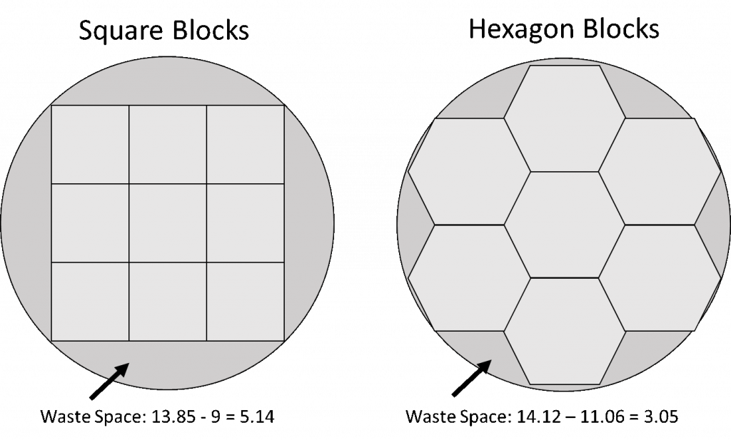
But what if we are wrong using square blocks? Squares and rectangles are very efficient shapes for humans. We put things in square boxes, read square books, live in square rooms and build square houses. However, nothing in nature is square. Rivers wind, hills rolls and mountains come to peaks. As it relates to urban-planning, human expansion is not square; therefore, cities should not be either. Cities are circular. Square boxes are great if filling up a square closet, but are square blocks really great for filling a circular city? To compare, I packed a circle with unit squares* (I found the optimal radius for this circle to be 2.12). I then packed the same circle with hexagons. The square blocks wasted ~5 units of space, while the hexagons wasted only ~3 units.

*Note: this is not the optimal way to pack a circle.

This gave me a thought: what if city blocks were not squares, but rather hexagons? From above, the city would look like the board from Settlers of Catan. Streets would follow a honeycomb pattern (bees are very efficient creatures).

To test the efficiency of hexagon blocks versus square blocks, I need to make a few assumptions. In my test, each city block will have the same amount of departure and arrival points (called nodes). There are no nodes on the corners or intersections. (There may be a store on the corner, but people depart from the edge of the store). Both shapes have the same number of nodes: blocks have three nodes on each side (3 nodes X 4 sides) while hexagons have 2 nodes on each side (2 nodes X 6 sides). Lastly, the area of both hexagons and blocks is the same, exactly 1.

Total Nodes: 108; Total Blocks 9; Block Size: 1; Total Area: 9

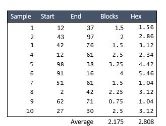
Running a simulation with 10 samples on my small 9 block city, it appears that square blocks have the advantage. While this was surprising to me, it does make sense. Despite the same area, my hexagon city is both taller and wider than my block city; therefore, it takes longer to travel from point to point. I would be curious to run this on a larger scale with more city blocks packed into a circle in a different pattern. Perhaps I would get different results if I included every node within a certain radius of my city’s center.

In addition to longer distances, another obvious disadvantage to the hexagon blocks is that turning right and left all the time would make going in a straight line annoying. However, hexagon blocks lend themselves well to the addition of major thorough-fares or highways. On-ramps and off-ramps are already built in.

There is at least one other advantage to hexagon blocks to consider. Three-way intersections are quite a bit faster than 4-way intersections. Vehicles turning right would not need to stop and could have the right of way. Vehicles turning left would have to yield to cars turning right. This would mean a decrease in time waiting at lights.

It looks like a few forward-thinking city planners have already been experimenting with this pattern. I am excited to see urban designs in the future.