| By Dylan Fontaine |
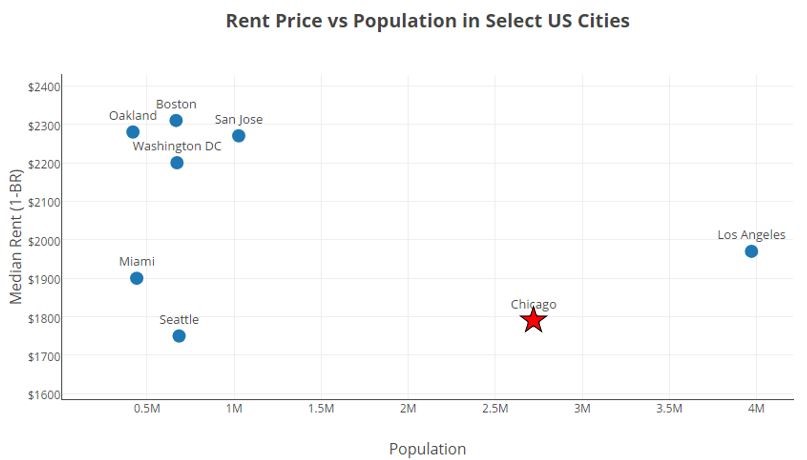
When creating a data visualization, it is often necessary to emphasize certain points so that they stand out from their surroundings. Doing so can help the author communicate their intended message to the viewer quickly and clearly. For example, I made the point for Chicago a red star on the scatterplot below to highlight Chicago’s relatively low rent prices and large population compared to other major US cities.
In my data visualization class, I learned that the emphasis placed on certain points of a graph is called “popout”. Popout is a fitting name, because emphasized points do just that… they “popout” to the viewer. A variety of visual channels can be used to make points popout from their surroundings. They can be colored more brightly, given a unique shape, increased in size, etc. Sometimes a combination of visual channels is used to make points popout.
The method that a chart designer uses to make points popout is very important. The human eye responds much more quickly to some cues than others, so a viewer may quickly see points emphasized with an effective method of popout, while taking longer to see points emphasized with a less effective method of popout. Speed is not everything when it comes to making a good data visualization, as the entire design and impression made on the viewer must also be considered, but I wanted to investigate and quantify the speed at which a viewer can react to various visual channels.
I created a web-application using D3.js to help with my investigation. The application, which you can interact with below, presents the user with a 10 by 10 grid of points. After clicking start, the points are shuffled and the user must count (as fast as they can) the number of points that are emphasized according to the criteria described below the plot window. A timer runs as the user counts the points and it is only stopped when the user inputs the correct number into the textbox and clicks the Submit button. There are three modes on the app that use different visual channels to emphasize points: “Color”, “Shape”, and “Both”. Try each mode below and see how your times compare.
See the Pen V8 by Dylan Fontaine (@dyfontaine) on CodePen.
If you would like to see the HTML, CSS, and JavaScript code I used to create this app, click on the tabs at the top of the embedded CodePen.
Does color, shape, or a combination of the two “popout” fastest?
In order to investigate which visual channel makes points popout to viewers the fastest, I had 10 friends test the app. I had them each complete 5 trials on each mode and I recorded their completion times. While my study was not completely scientific, I did take some steps to ensure that the results were not biased. I gave each user the same set of instructions and I let them all practice a few runs beforehand to get comfortable with the user interface. I made the same selection in the dropdown lists for each trial (red for color and/or circle for shape). Also, I randomly assigned each user an order to complete the 3 levels in. (For example, some users completed the “Shape” level, then the “Both” level, then the “Color” level). I compiled the results and plotted the completion times for each level.
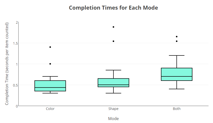
The results show that participants generally recognized points that popout due to “Color” the quickest, followed by “Shape” and then “Both”. It is worth noting that each user had a relatively low variance among their 3 completion times (i.e. a user who was quick on one level was typically quick on the other 2 levels). The outliers on the high end arose from participants miscounting on their first try, then recounting the emphasized points from scratch while the clock was still running.
It makes sense that the “Both” category was the most challenging for the participants, given that it requires points to be identified using two criteria instead of one. This illustrates an important tenet of data visualization—keep things as simple as possible. While adding multiple visual channels to a chart can allow you to show more information at once, only do so when it is a necessary component of the story you are trying to share with your audience.
Which color pops out the fastest?
While the above result was somewhat predictable (at least according to my intuition before completing the experiment), I did not have a strong feeling about which color would popout to viewers the fastest. I completed a similar experiment to the one described above, but this time only used the color mode on the app. I had each participant complete 5 trials with each color setting and recorded their completion times. See the results below. It is important to note that HSL colors were used on the app — each color had the same saturation and lightness value, just different hue values. This ensured that only the color (hue), and not brightness, would affect popout speed.
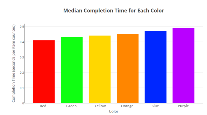
As you can see, red and green points were counted the fastest, purple points were counted the slowest. However, the difference between the fastest and slowest colors was not very large. I did some research to see if my results aligned with any academic studies and was pleased with my findings. While none of the studies I found tested the exact set of colors that I did, Psychologists in India [1] found that red and green stimuli prompted faster reaction times than yellow stimuli and researchers in Japan [2] found that red stimuli prompted faster reaction times than blue stimuli.
Which shape pops out the fastest?
The goal of the last experiment I conducted was to determine which shape pops out to users the fastest. The procedure for this experiment was identical to the color experiment, except the shape mode on the app was used. Participants had to count points emphasized with a different shape rather than a different color. I was not sure before completing the experiment how times for each shape (circles, crosses, diamonds, stars, and triangles) would compare. See the results below.

Stars were counted the fastest and circles were the counted the slowest. After seeing this result, I thought about why this could be. I realized that since the control points (the points not counted) were all squares, the shapes that look very different than squares should stand out the most. The 5-pointed stars look very different than squares, but the circles can easily be mistaken for squares at a quick glance. Thus, the stars popout more than circles do when amongst an array of squares.
Conclusion
When creating data visualizations, many may choose colors and shapes based on personal preference and attitudes. In some use cases, such as advertising, speed and ease of understanding are crucial. One should consider this when designing a visualization and be aware of how the colors and shapes they use can affect interpretation speed. I hope this study has given you a new perspective on some simple but often overlooked components of great visualization.
[1] G. Balakrishnan, G. Uppinakudru, G. G. Singh, S. Bangera, A. D. Raghavendra, and D. Thangavel. “A Comparative Study on Visual Choice Reaction Time for Different Colors in Females”. Neurology Research International. 2014.
[2] M. Shibasaki and N. Masataka. “The color red distorts time perception for men, but not for women” Scientific Reports 4, Article number: 5899. 2014.
No Comments