| By Aditya “Adi” Tyagi, Xiaohan (Aria) Wang, Mengyang (Doris) Cao |
1. Introduction
The COVID-19 pandemic has led to a drastic increase in food insecurity. The U.S. Department of Agriculture (USDA) defines food Insecurity as “a lack of consistent access to enough food for an active, healthy life.” It is measured via the following two questions (Link to source) posed to respondents:
- “We worried whether our food would run out before we got money to buy more.” Was that often true, sometimes true, or never true for your household in the last 12 months?
- “The food we bought just didn’t last, and we didn’t have money to get more.” Was that often true, sometimes true, or never true for your household in the last 12 months?
A response of “often true” or “sometimes true” to either question implies the presence of food insecurity.
The national food insecurity rate in April 2020 was predicted to be 10.1% following the historical trend. However, the actual national food insecurity rate reached 22.8% in April 2020, according to the COVID Impact Survey (Schanzenbach and Pitts, 2020). The food insecurity situation is even more severe for vulnerable populations across the country. Schanzenbach and Pitts (2020) reported that food insecurity rates in the U.S. tripled in April 2020 for families with children, as compared to the level from just a month earlier.
2. Project overview
This project was conducted to provide the City of Evanston and its many partner organizations with a greater understanding of the structural factors of community food insecurity as well as how the COVID-19 pandemic has affected food insecurity in Evanston.
Some of the contributions of our project are:
- Help the City of Evanston Food COVID-19 Food Insecurity task force make more informed decisions about how food assistance is currently occurring in Evanston
- Identify areas with high-impact opportunities of investments of tax and philanthropic dollars
- Enhance partner collaboration and potentially optimize the use of local food supplies.
- Provide a reproducible framework for other city governments looking to use data analytics to drive change in their communities.
In fact, our work was recognized by the Alliance to End Hunger, where we presented our findings as part of the Alliance’s Hunger Free Communities Summit 2020, which took place on November 18-19, 2020.
Thanks to Professor Karen Smilowitz, Professor of Industrial Engineering and Management Science at Northwestern University, we were introduced to this project led by Maura Shea, former VP of Innovation at Feeding America. We collaborated with the food security task force at the City of Evanston on this project.
Evanston is an affluent suburb of Chicago, located on the North Shore of Lake Michigan. It is famous for being the home of Northwestern University, as well as the headquarters for the National Merit Scholarship. It is a diverse but predominantly white population with a history of racial segregation and progressive politics. It has a generally older population, with a strong student/youth presence due to Northwestern University. Recently, Alderman for the 5th ward, Robin Rue Simmons, is leading a reparations program for slavery and red-lining. The objective is to channel up to $10M/10 years from marijuana sales tax revenue into the program. On the surface, Evanston appears to be a low risk area for food insecurity; however, it is suspected that there are pockets of the city where food insecurity is prevalent.
We created a constellation of datasets (proprietary and free/online). We then conducted data analysis, developed some initial concepts for data visualization, drafted a collective impact toolkit framework and provided recommendations on future data collection and management. Through this project, we aim to help the city and the task force to better understand the needs of our food insecure neighbors and food assistance providers, inform how the system of food assistance works in the city of Evanston and help each stakeholder to participate from a more informed position. Availability of this information can help each participant to make more informed decisions within the charitable food system in Evanston.
3. Methodology
With the help of our partners, we collected a number of different datasets from various sources. Below are the data that we used in this project:
- 2020 Food insecurity rates by census tracts and ZIP Codes in Cook County from Feeding America (Data: https://www.feedingamerica.org/research/map-the-meal-gap/by-county – 2018)
- Food capacity breakdown and information about distributions for the food providers in Evanston (Data: Proprietary from the City of Evanston)
- Measures of food access by census tracts in Evanston from the Economic Research Service (Data: https://www.ers.usda.gov/data-products/food-access-research-atlas/ – 2015)
- Free & Reduced Lunch program eligibility for schools in Evanston from Illinois State Board of Education (Data: https://www.isbe.net/Pages/Nutrition-Data-Analytics-Maps.aspx – 2020)
- Various demographic and geographical data by census tracts in Evanston (Data: PolicyMap’s https://www.policymap.com/maps)
- The monthly number of individuals/households receiving Supplemental Nutrition Assistance Program (SNAP) benefits by ZIP Codes in Cook County from the Greater Chicago Food Depository (July 2018 – June 2020)
- Proprietary data from each Producemobile distribution (2016-2018), a pantry partner of the Greater Chicago Food Depository (Data: Proprietary from https://www.cityofevanston.org/Home/Components/Calendar/Event/11993/250?curm=5&cury=2019)
- COVID Impact Survey data for Chicago-Naperville-Elgin, Illinois-Indiana-Wisconsin (Wozniak et al., 2020), supplied by the National Opinion Research Center at the University of Chicago.
Using these data, we analyzed food insecurity rates both in Cook County and in Evanston, and created prototypes for an interactive map, a Chatbot tool and a prediction model for food distributions, which the city could consider for further development in the future. Our suite of analytical tools involved:
- Hypothesis testing (t-test) of differences in geo-characteristics between high food security and low food security areas.
- Time Series Analysis (Holt-Winters Forecasting, decomposition) of various aspects of Producemobile’s operations
- Inferential Modelling (Random Forests, Linear, Logistic Regression) to better understand the relationship between various background characteristics and food insecurity at various granularities and scopes.
The goal of each type of analysis was to better understand what background variables are associated with food insecurity at various temporal, geographical levels, and at different granularities.
3.1. Data analysis
In carrying out the data analysis, our basic philosophy was “not to predict, but to infer.” We sought to first understand the factors affecting food insecurity in our community, rather than use them to predict food insecurity outright. This informed our choice of model and approach, in favor of simple and highly interpretable models.
Secondly, our guiding rationale behind modelling food insecurity in Evanston was to break down factors into two types:
- Structural Factors: Structural factors are those that were previously present and stem from are a function of Evanston’s historic social and economic policies before the pandemic started.
- COVID-19 Impact Factors: COVID-19 Impact factors are those that have now come into focus after the onset of the pandemic into the Evanston community.
The rationale behind following this two-tier approach is that it gives decision makers a framework to understand food insecurity in their communities.
To understand structural factors, we limited our time scope to 2014-2018 data and built:
- Cook County ZIP Code model
- Evanston Census Tract model
- Evanston Census Tract Hypothesis Testing
To understand the COVID-19 impact factors, we analyzed data from April to August 2020:
- SNAP Benefit Distribution in Cook County at ZIP Code Level
- ProduceMobile Food Distribution at Evanston location
- COVID-19 Impact Data
3.1.1. Inference of structural food insecurity
The goal of digging into the structural food insecurity is to identify the underlying influential geographical or demographic factors that may explain the variation in food insecurity for different locations. With Feeding America’s data about the food insecurity population size for each geographical location in 2018, we applied predictive models (multivariate linear regression and Random Forest) on (1) the ZIP Code level in Cook County and (2) the Census Tract level in Evanston. With the first approach we aimed to get a complete view of the food insecurity situation in Cook County. The second approach allowed us to identify the factors that differentiate food secure tracts from food insecure tracts in Evanston. Our rationale behind using these two approaches was to get a complete view of the food insecurity situation in Cook County and at the same time find out the factors that differentiate Evanston from other cities in the county. We also ran independent hypothesis tests (two-sample unpaired t-test) comparing the most food insecure zones and the least food insecure zones of Evanston to identify risk factors.
A. Random Forest model on food insecurity population size by ZIP Code in Cook county
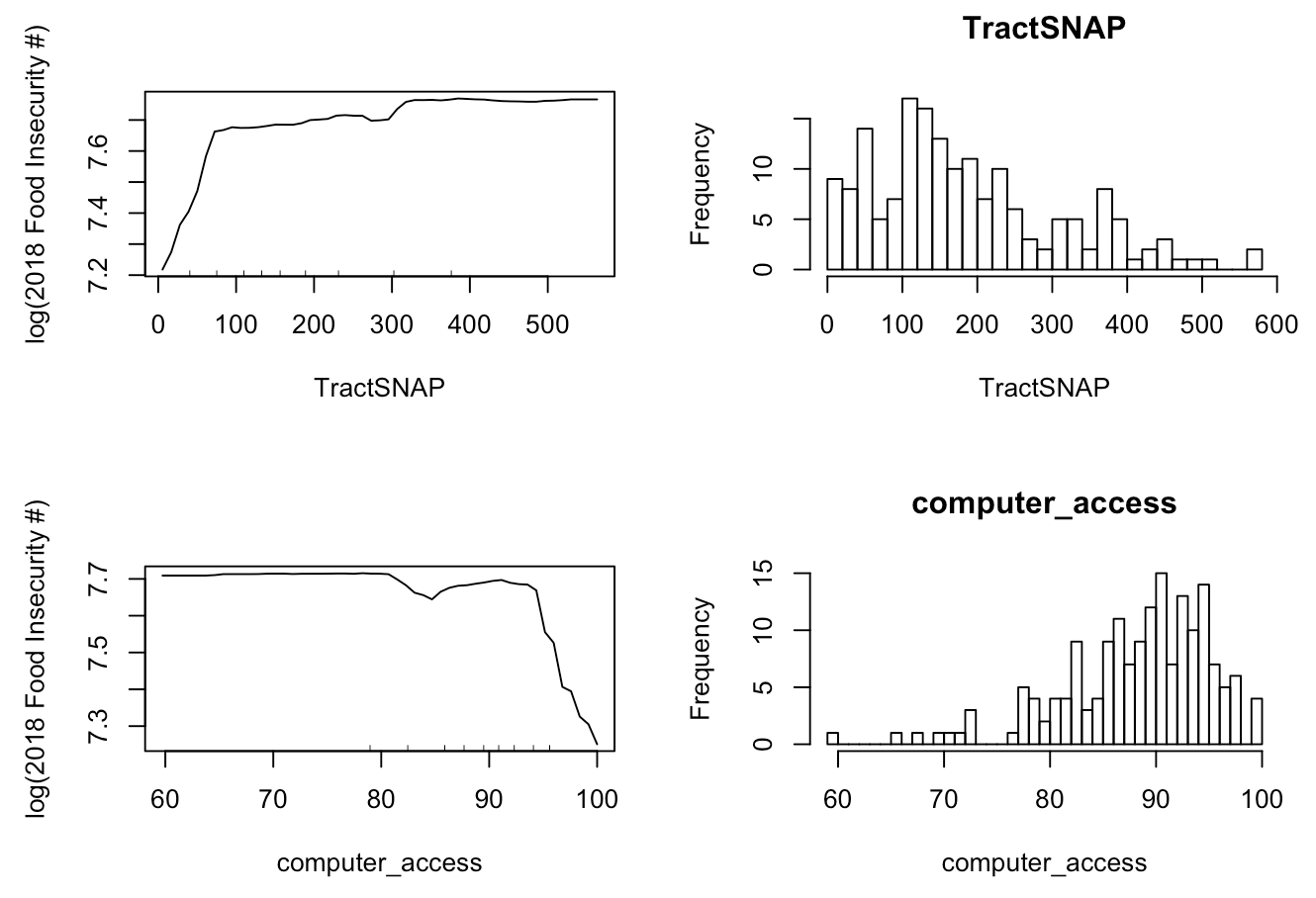
The key factors according to the Random Forest model are median household income, the percentage of families in poverty, life expectancy, the number of households receiving SNAP benefits, percentage of households with any type of computer and # of households without a vehicle.
As shown in Figure 1 below, lower median household income or higher percentage of families in poverty corresponds to a larger food insecurity in the ZIP Code area. These two variables can both be taken as indicators of the economic condition for the location. As the model results show, wealthier neighborhoods have relatively less severe issues of food insecurity.

According to Figure 2, areas with life expectancy around 70 tend to have a larger food insecure community than any other areas. For ZIP Codes with life expectancy larger than 70, a higher number that people expect to live in the location corresponds to a smaller food insecure population.

From Figure 3, we can see that ZIP Codes where more households have access to computers and a vehicle have relatively less people in food insecurity. These two factors can be interpreted as people’s access to food. Households with vehicles are able to access grocery stores that are farther from them, and therefore they have more choices of where and how to get food. Households with computers have more access to information and opportunities. If they are food insecure or at the risk of being food insecure, households with computers are able to learn about the support provided by the local organizations, and thus it is easier for them to get out of the food insecure condition.
B. Multivariate linear regression model on food insecurity population size by Census Tract in Evanston
To understand the factors affecting food insecurity in Evanston in a simple and intuitive way, we built a multiple regression model. Each observation represented a census tract in Evanston. The dependent variable was the number of food insecure persons for each census tract in 2018. Factors covered included demographics, property values, etc. from the pre-pandemic era. The final dataset was formed by joining the PolicyMap dataset and the Feeding America food insecurity data on census tract. Mean/Median value imputation was carried out to address missing values.
Tracts with larger numbers of food insecure persons have:
- A younger median age
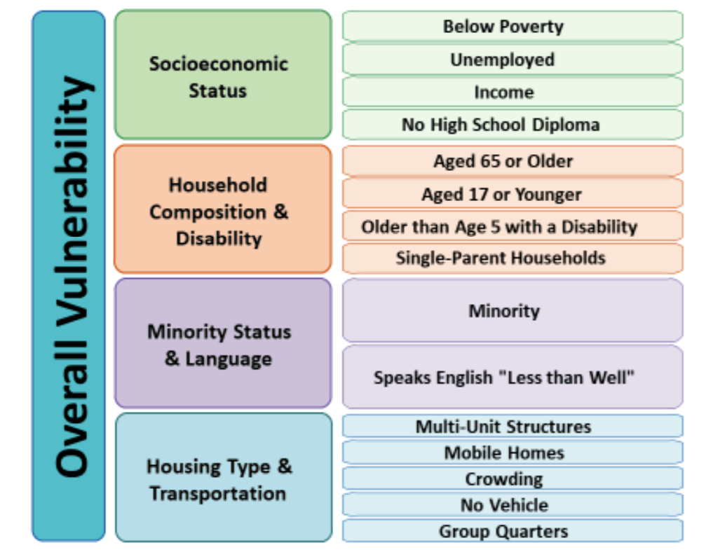
- A higher level of social vulnerability
- The CDC Social Vulnerability Index measures a community’s resilience (at the census tract level) when confronted by external stresses on human health, stresses such as natural or human-caused disasters, or disease outbreaks.
- A lower level of racial segregation
- The Thiel Racial Segregation Index measures a community’s level of racial segregation. Higher Index values imply higher levels of racial segregation.
For further details, the following variables feed into the CDC Social Vulnerability Index:
- Below poverty
- Unemployed
- Income
- No High School Diploma
- Aged 65 or Older
- Aged 17 or Younger
- Civilian with a Disability
- Single-Parent Households
- Minority
- Speaks English “Less than Well”
- Multi-Unit Structures
- Mobile Homes
- Crowding
- No Vehicle
- Group Quarters
Figure 4 below shows the 15 component factors of the Social Vulnerability Index grouped into four themes:
C. Two-sample unpaired t-test on the most vs. least food secure tracts in Evanston
To provide another perspective on food insecurity at the census tract level in Evanston, we decided to apply a hypothesis testing approach. We compared the top five food secure tracts (hereafter, referred to as “high food security tracts”) with the bottom five least food secure tracts (hereafter, referred to as “low food security tracts” in Evanston across a range of factors. In Figure 5 below, we have depicted this division by coloring high food security tracts as GREEN, and low food security tracts as RED.
We used a two-sample (unpaired) t-test since the population standard deviation was unknown. Most of the data came from PolicyMaps between 2014 and 2018. For all hypotheses, we used a significance level of 10%; however, for a few hypotheses, we used a significance level of 15%.
Compared to high food security tracts, low food security tracts in Evanston have/are:
- a lower household income
- a lower age
- more socially vulnerable
- lower median home loan amount
- lower median home value
- more nonwhite in general
- greater non-English speaking proportion
- higher hispanic population
- less racial segregated
- lower proportions of people with bachelor’s degrees
- lower computer access
- lower average travel times to work
In addition to finding differences, we also noted similarities between the two sets. In the statistical testing terminology, these would be factors for which we failed to reject the Null Hypothesis (i.e. that the two sets of tracts are similar with respect to the concerned variable). However, high food security and low food security tracts in Evanston are similar when it comes to:
- proportion of families in poverty
- number of jobs
- number of housing units
- life expectancy
- proportion of students in public school
- median leverage ratios
- proportion of disabled people
- average household size
- proportion of men

3.1.2. Impact of COVID-19 on food insecurity
Besides learning about the underlying factors to long-term food insecurity, we also hope to capture the short-term impact of COVID-19 on food insecurity. There was some difficulty for us to collect the data related to COVID-19’s impact. Our desired dataset should be updated on a regular basis and at a granular geographical level, whereas most public and reliable sources have data that either are collected only once every year or capture the food insecurity for the entire Cook County as a whole. However, thanks to the Greater Chicago Food Depository and Producemobile, we got access to the monthly data about individuals/households receiving SNAP benefits by ZIP Codes in Cook County and the data about each Producemobile distribution. By analyzing the time trend in these data, we aimed to get an idea of the food insecurity situation during the COVID-19 pandemic. In order to understand the food insecure population during the pandemic, we also did predictive modeling (multivariate logistic regression models) using the data from the COVID Impact Survey.
A. The population receiving SNAP benefits by ZIP Code in Cook County over time
As is shown in Figures 6,7,8 below, there are similar trends in the average number of households/individuals receiving SNAP benefits and the average allocated funding in all ZIP Codes in Cook County. They all have a very large increase since April 2020. The average number of people and the average allocated funding across ZIP Codes in Cook County have increased significantly and suddenly, reflecting the social isolation practices of closing businesses and their economic effects of laying off workers.

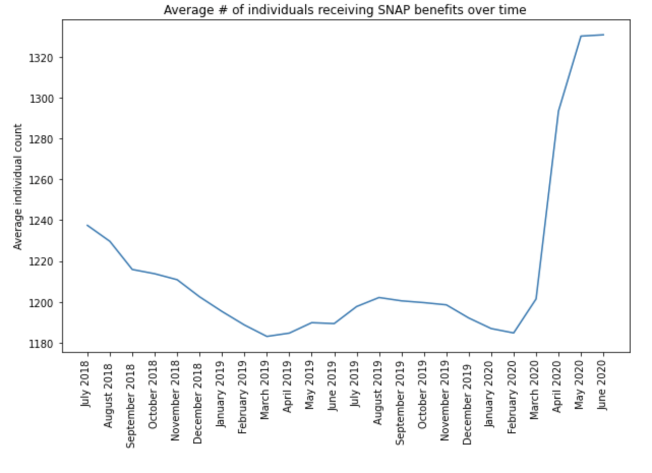

The trend also shows up in Evanston ZIP codes for the number of households/individuals receiving SNAP and the allocated funding (Figure 9). This indicates that COVID-19 has led to more people/households receiving SNAP benefits and more people facing food insecurity.

Compared with the level in March 2020, the number of individuals receiving SNAP in April this year increased by 7% on average across ZIP Codes in Cook County. As for the ZIP Codes in Evanston, the highest increase rate is 13.38% in 60203, and the lowest increase rate is 5.26% in 60204. This is depicted in Figure 10 below.

The data shows that there is a large increase in the number of people in need of SNAP due to the pandemic, and there should be potentially even more people experiencing or at the risk, since SNAP does not support families to the full extent of their monthly food needs. Meanwhile, among the people supported by SNAP, there is a gap between their entire households’ food purchasing needs and the actual amount they receive from SNAP. There is a gap between the households who are food insecure or at risk of food insecurity and the households who actually received SNAP benefits. Unfortunately, there is currently no data about how wide the gaps are and whether they got wider or narrower due to COVID-19. Further work is needed to understand the nature of these “SNAP Gaps”, and how city governments may best identify and serve them.
B. The population served by Producemobile distributions over time
According to the data provided by Producemobile, there is a drastic increase in the number of participants at distributions in April and June this year. Before the pandemic (except for March – September 2019), Producemobile distributed food once a month, but since April 2020, once the pandemic’s social distancing measures were put in place, the organization started to distribute food to people in need twice per month. Before April 2020, except for the period between March and September last year, the number of guests signed in at the distribution every month was relatively stable between 200 and 300. The increase in the unemployment rate has led to more people turning to Producemobile distributions for food assistance.
Similar to the gap of needs unfulfilled by the SNAP program, distributions by food providers, such asProducemobile could not serve all the needs of the entire food insecure population. Further studies are necessary for us to truly understand the actual needs of our food insecure neighbors across the city of Evanston and beyond what is provided by Producemobile. However, the data, visualized in Figure 11, allows us to take a peek into the situation.

C. COVID-19 Impact Model on Food Insecurity
To get an idea of the risk factors associated with food insecurity during this volatile COVID-19 pandemic timeframe, we used the latest data from the COVID-19 Impact Survey. This survey is conducted nationally once a week for three weeks, three times during the height of the pandemic in the United States. The survey is managed by the National Opinion Research Center (NORC) at the University of Chicago, and it is sponsored by the Data Foundation. The NORC also produces representative samples for various metropolitan areas in the United States, one of which is the Chicago MSA (metropolitan statistical area). The Chicago MSA includes participants in the area informally known as Chicagoland and includes Evanston within its boundaries. In the survey, various questions were asked pertaining to economics, social life, physical health, healthcare situation, demographics, and food insecurity. Though we recognized that the dynamics of food insecurity may be different from Chicago compared to Evanston, this is the best available approach we have to understand the risk factors during the pandemic.
Our basic approach aims to infer the relevant risk factors and their effect on food insecurity. The tool we use to do that is a logistic regression model, postulated on the probability of a “food insecure response” from a survey participant. To build the model, we used a backward feature elimination process. The following risk factors associated with food insecurity were identified:
Conclusive Risk Factors:
- Not applying/receiving Supplemental Social Security in the past seven days
- Not being covered by a health insurance policy from your employer/union
- Not being covered by Medicaid, Medical Assistance/other form of government assistance plans for low-incomes/disability
- Not being covered by any health insurance plan at all
- Being elderly (age bracket 65-74+)
- Being Black (non-Hispanic), Hispanic, an other Non Hispanic,
- Being Hispanic
- An annual household income of between $10,000 to $20,000 (i.e. low household income)
- Having children in the household aged 6-12
Risk Factors where the researchers suspect a strong presence of lurking/confounding variables:
There were some factors where we suspected the presence of lurking/confounding variables. Confounding variables are essentially hidden (i.e. lurking) variables that simultaneously affect two other observable variables, and hence lead researchers to the spurious conclusion that the two observable variables are related. For example, in 2013, researchers noted that countries with higher per capita chocolate consumption won more Nobel prizes. This dynamic is depicted in Figure 12 below. However, this conclusion is fallacious. A competing reason why countries with more chocolate consumption tend to win more Nobel prizes is that they are in general wealthier, and hence are able to spend more money on advanced scientific research and development, which are often necessary to win Nobels. The researchers suspect a similar dynamic in some of our findings, as visualized in Figure 12.

- Those who communicate electronically with friends/family a few times a week have a lower risk of food insecurity as compared to those who communicate with friends/families everyday (lurking variable: unemployment)
- More number of hours worked per week prior to COVID-19 start (lurking variable: working many jobs)
- Increased expectation of being employed 30 days from now (implicit: present unemployment)
- Increased expectation of being employed 3 months from now (implicit: present unemployment)
3.2. Interactive map
We also built an interactive map prototype with multiple layers using Kepler.gl. The objective of this tool is to make food assistance information more visible. Its target audience are food insecure individuals within the Evanston community, food providers, and the City of Evanston. From the map, neighbors in need and service providers can know:
- What food services are available and where
- What additional capacity a provider might have
- Where there are gaps in service compared to level of need and what additional investments might be needed
Data being used for map toolkit is mainly generated from the Evanston Food Resources, Meals Capacity Breakdown and Free Reduced Lunch files.
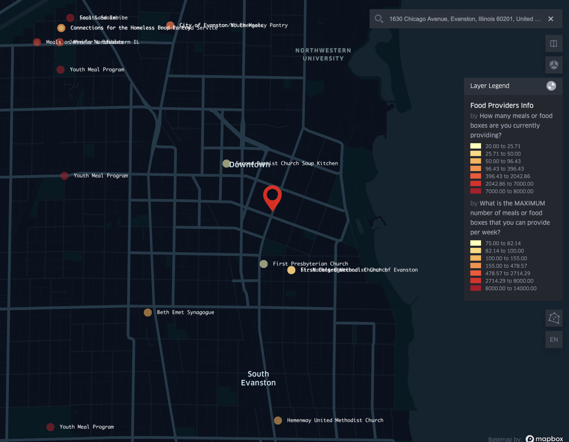
There are three layers in the current map (Map can be expanded to include additional functionality if necessary):
- The first layer (Figures 13,14) shows distribution of food providers in Evanston.
- Each dot on the map represents a provider, while color or the dot and color of outline of the dot represent the number of meals that are currently being provided at each location per week and maximum capacity of meals respectively. This helps to identify which provider has relatively higher/lower resources used and could potentially provide more if needed.
- On clicking the dot, an information box with more detailed information (provider’s contact info, food providing type, food providing frequency, etc.) about each provider will pop up.
- Another functionality in this layer is “Geocoder.” After a user types an address into the search box at the top right corner, a red icon will appear on the map which represents the location of the user. This functionality is added for the user to easily get a sense of relative distance between his/her location to a food provider and support the user to make better informed decisions when choosing the provider that best serves his/her needs.

- The second layer (Figure 15) shows existing connections among providers. Each dot on the plot represents the location of a provider. If two dots are connected by a line, then it indicates that those two providers are currently connected.
- The third layer (Figure 16) shows the Free & Reduced Lunch (FRL) eligibility rate in each school district (D65) in Evanston. The goal is to use free reduced lunch eligibility rate in school districts as an indicator of food insecurity rate in the close neighborhoods and help to understand whether the needs of food insecurity people are well served or not.
- Each dot in the map represents an elementary school or a high school in Evanston. Color of dot indicates the free reduced lunch eligibility rate, darker color corresponds with higher rate.

-
- The bottom part of Evanston (Dawes and Oakton school districts) has relatively higher FRL eligibility rate compared to other regions.

3.3. Chatbot
Besides the interactive maps, a chatbot tool (Figure 17) has been developed in Azure QnAmaker so that our neighbors in need can receive recommendations based on their needs. It follows a simple decision tree structure (Figure 19). Users can easily start the chatbot service by typing “Hi” in the text box. Then there will be a set of questions asked:
- Information about SNAP application
- Preference for grocery items or prepared meals
- Identification of need and priority for delivery
One question will be asked at a time with options that users can click on. Eventually there will be an information box (Figure 18) that shows all the details on the food providers that best match with users’ needs.
Right now, English is the only language supported in chatbot service, but more languages can be easily added to meet the requirements. One potential functionality to be added in the future is the “alert” function which allows service providers to contact each other if they have extra resources to share.


3.4. Producemobile: A Mini-Case Study
A brief spotlight on the Evanston Producemobile operation is presented in this section. This is an example of how data mindfulness can lead to effective community responses to food insecurity.
3.4.1. Organization Description
Producemobile is a collaboration by the Interfaith Action Committee of Evanston and the Greater Chicago Food Depository (GCFD). It operates at two locations in the city. The food truck (fresh fruits, vegetables, a selection of meats, milk/dairy products) is provided by the GCFD, while the volunteers are provided by the Interfaith Action Committee. The frequency of operation is on the second Tuesday of each month.
3.4.2. Data Collection & Management Best Practices
At each Producemobile operation, there is a rigorous and disciplined approach to Data Management. For instance, the following variables in Table 1 are conscientiously recorded at each distribution.

3.4.3. The Operational Problem & Present Solution
The key problem faced by Producemobile was a planning one: “How to plan how much food to bring to a given distribution location to minimize excess and shortages?” This step requires prior knowledge about how many individuals will show up to a particular Producemobile food distribution, which is a classic problem faced by many retailers.
To address this problem, Shawn Iles, a veteran volunteer in charge of the operation, essentially uses a combination of guesswork and intuition built over a long time working at the site location. However, Shawn recognizes that there are numerous inefficiencies to this:
- For one, the operation is highly dependent on him and his intuition.
- Secondly, various trends that are beyond human detection are left unexplored.
- This is especially problematic in the volatile COVID-19 era.
3.4.4. A Potential Data-Driven Solution
One of the big advantages of Producemobile is the wealth of data it collects about each distribution from 2016 to present. From a data management perspective, the following two characteristics followed by Producemobile are key:
- Consistently formatted and disciplined data collection at each distribution event
- Data storage in an easily accessible location (For Producemobile, this took the form of simple Excel sheets)
With marginal effort, this procedure allows a data driven solution to a classic business problem: forecasting via a time series analysis. Through simple time-series methods, we can detect things the following in the data:
- Trend over time
- Seasonal effects
- Latent cyclic behavior
Using this knowledge, forecasting the number of attendees at a particular Producemobile distribution becomes possible. This advanced knowledge allows Producemobile to better serve its community by ensuring that shortages and excesses are avoided.
However, the real power of disciplined data collection and management lies beyond solely forecasting demand at a particular location: a virtuous cycle occurs that simultaneously improves Producemobile’s forecasting models and also enhances its ability to better serve its constituents. With each data collection, model parameters can be updated based on the divergence of their forecast from the actual number of attendees that arrived at that distribution. Over time, the forecasting model becomes stronger and so does Producemobile’s ability to meet demand at its location. Such a scientifically sound approach also makes Producemobile’s case stronger when requesting food from GCFD or funding from other agencies. The approach can also be applied to other aspects of Producemobile’s operations such as requisitioning volunteers and so on.
3.4.5 Forecasting in Action
To illustrate the actionability of the above recommendation, our team at Everybody Eats built a time-series based forecasting model. The data we used consisted of 12 measurements (one per month) for each year from 2016 to August 2020. The model used was a Holt-Winters model. Seasonal decomposition and linear interpolation were used to impute null values.
We analyzed the following three key aspects of Producemobile’s operations:
- Number of individuals served at each distribution
- Amount of food received from Greater Chicago Food Depository (GCFD) for each distribution
- Number of volunteers expected to arrive at each distribution
Here are some key insights:
- For number of individuals served at each distribution:
- Tends to peak during: March, May, September, November
- Tends to fall during: January, February, April, October, December
- For the amount of food received from GCFD for each distribution:
- Tends to peak during: January, March, May, July, September, November
- Tends to fall during: February, April, June, October, December
- For the number of volunteers at each distribution:
- Tends to peak during: January, February, March, April, September, November
- Tends to fall during: May, June, July, August, October, December
Figures 20, 21, 22 below visualize our predictions for the above three metrics till the end of the year:


Some Key Takeaways from the above forecasts:
- The number of individuals is expected to rise till the end of 2020 (December)
- The amount of food received from GCFD is expected to stay level till the end of 2020
- The number of volunteers attending is expected to fall till the end of 2020.
The key implication of the above is that there is a shortage of volunteers expected that coincides with an increase in the number of individuals attending Producemobile’s distributions, and a concurrent leveling of food arriving from GCFD.
Finally, we can have a look at the decomposition (Figures 23, 24, 25) of the three time series from 2016 to present (August 2020). This allows us to get a sense of the trend, and the seasonality of the time series.
1. Number of Individuals Arriving at distributions from 2016-August 2020

Food Distributions (2016-2020)
2. Amount of food received from GCFD at each distribution from 2016 – August 2020


3. Number of volunteers attending at each distribution from 2016 – August 2020
4. Potential Improvements & Further Steps
4.1. Food insecurity survey for Evanston residents
One of the major obstacles in this project was to collect data that can help us understand the food insecurity situation in a dynamic and granular way. As it is mentioned earlier, most of the public and reliable datasets are either updated very infrequently (US Census every 10 years), or not collected at the appropriate level of granularity (ZIP Codes or Census Tracts), such as the COVID Impact Survey. Data collected on a regular basis at granular levels is helpful for the city and organizations to understand the food insecurity in Evanston in a dynamic way, which is key to providing more efficient and prompt assistance to our food insecurity neighbors. In order to achieve this goal, we suggest the city to conduct a food insecurity survey among Evanston residents. To design this survey, we used a mix of questions from the COVID Impact Survey and our own Evanston-specific questions. Through the data collection and analysis, we hope the city can better understand the food insecure community, predict the future needs more accurately and get fully prepared. A sample survey draft is provided here.
4.2. Distribution cost survey for food pantries and organizations
During one of our meetings with the Evanston COVID-19 Task Force, we learned that it is important for the city to figure out how much funding should be allocated to each family. Therefore, we designed a cost analysis survey for food pantries and organizations. This survey aimed to help the city understand the distribution cost at each food provider and make more data-driven decisions on the funding.
4.3. Recommendations for data management
We identified the following areas where significant improvement can occur in the City of Evanston’s data strategy:
- Lack of data-driven awareness: We learned that food pantries and the City of Evanston do not collect demographic or geographical information about the community related to food insecurity,
- Extensive Information Siloing: Organizations do not work collaboratively on food distributions, which makes it difficult for:
- The city and organizations to remain informed of the fast-changing situation during this pandemic
- How they should deliver assistance in response to the increasing food insecurity.
Organizations might have different rules to collect personal and sensitive information from the community in food insecurity. However, we think that key organizations and food providers should aim to build a connected and shared database among to better serve the community. Therefore, we listed some of our recommendations for data management for the city and organizations. These recommendations are accessible here.
5. Conclusion
By using data analytics tools, we looked into the underlying factors that might determine the structural food insecurity or lead to higher risks of food insecurity during the pandemic in Evanston. We also created prototypes for the toolkit that would be applicable and helpful in delivering better food assistance to our food insecure neighbors. With the constraints of limited available public data, we set examples of how organizations can apply the analytics and make more informed decisions.
References
Abigail Wozniak, Joe Willey, Jennifer Benz, and Nick Hart. COVID Impact Survey: Version # [dataset]. Chicago, IL: National Opinion Research Center, 2020.
Economic Research Service (ERS), U.S. Department of Agriculture (USDA). Food Access Research Atlas, https://www.ers.usda.gov/data-products/food-access-research-atlas/
PolicyMap. https://www.policymap.com/maps
Schanzenbach, D. W., & A. Pitts. 2020. Estimates of food insecurity during the COVID-19 crisis:
Results from the COVID Impact Survey, Week 1 (April 20–26, 2020). Institute for Policy Research Rapid Research Report. https://www.ipr.northwestern.edu/news/2020/food-insecurity-triples-for-families-during-covid.html
Acknowledgments:
We would like to pay our thanks to Maura Shea, former VP Innovation at Feeding America, and Prof. Amy Smilowitz, James N. and Margie M. Krebs Professor in IEMS, Co-Director, Center for Engineering and Health. Both their domain knowledge, advice, and mentorship were invaluable in bringing this project to fruition. We also would like to thank Rita Bailey, Shawn Iles for extending their cooperation to us during this project. They were our contacts at the Producemobile and graciously provided us with the relevant data. Finally, we would like to acknowledge the help and support of our research facilitator, Dr. Borchuluun Yadamsuren. She patiently and carefully read our drafts, and was instrumental in producing a high quality final output.