
Unpacking the Black Box of “Complex Math”!
As a computational biologist that studies circadian rhythms, often times I am found analyzing time series data. Mainly, I might be looking at the expression of a gene or biomarker over the course of the day, such as melatonin levels seen in the image below. Often, it is useful to quantify different aspects of a given circadian marker such as the frequency, period, and amplitude of the signals oscillation. While in the image below it might be easy to read these measurements by eye, in reality, I am working with 11,000-20,000 makers at once. Naturally, things become a bit more complicated and far too time consuming to do by hand.

My research has thus brought me to learn some math that allows these amplitude, frequency, and period measurements to be computed automatically using a computer. One of the potential solutions that I am going to explain today comes in the form of a type of math known as Fourier Transforms.
While Fourier Transforms were originally developed to solve problems related to heat transfer within the field of physics; the math behind it has found many uses in biology, robotics, finance, and even the music industry! Basically, I think Fourier Transforms are an incredibly cool and useful form of mathematics, so my goal in this post will be to share with you what I find so fascinating in a way that I hope is comprehensible and helps develop an intuition for how they work.
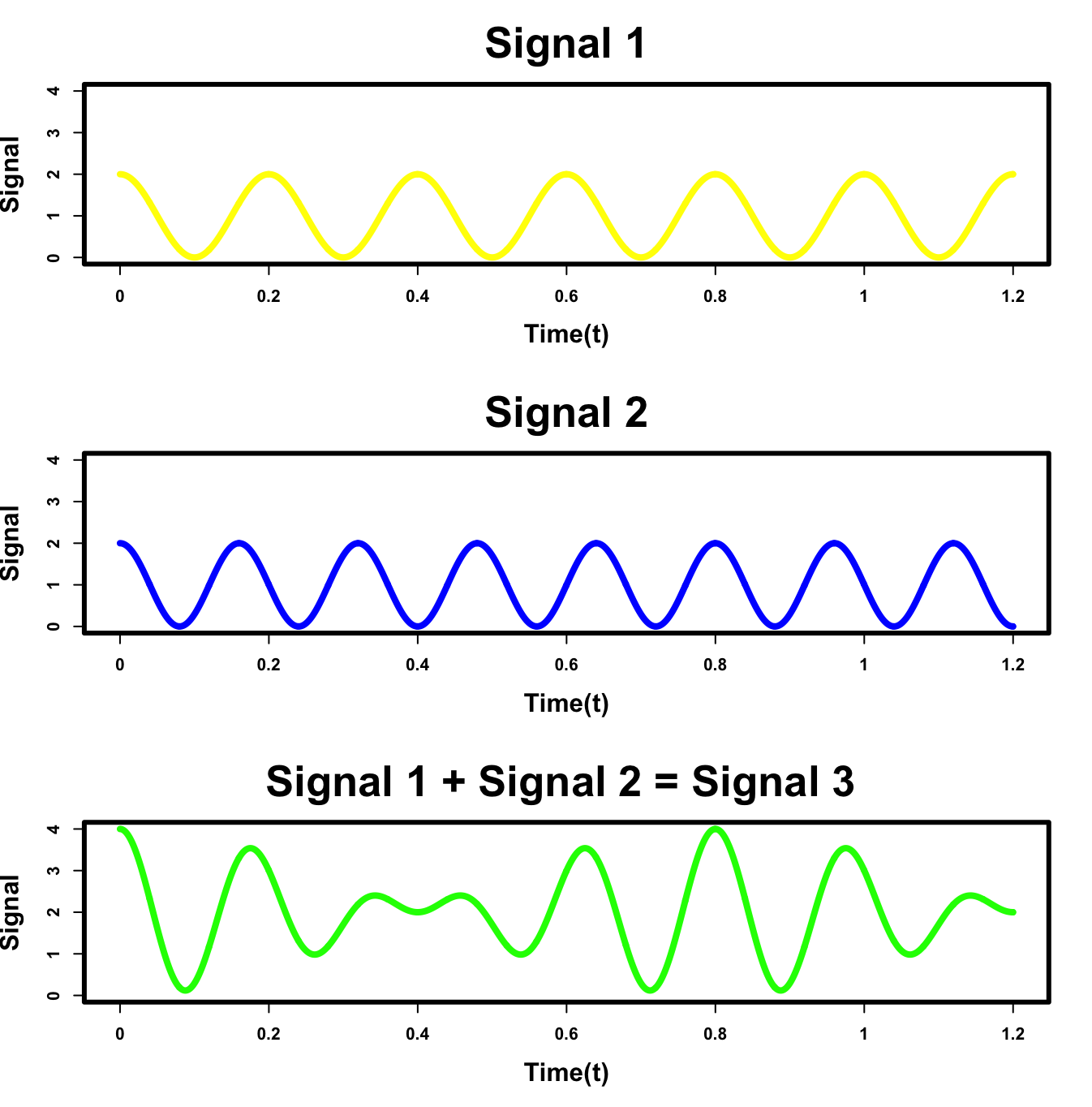
I’ll start out by presenting a quick analogy. Let’s say your favorite bucket of green paint is almost empty. Naturally wanting more of it, you wonder which colors were originally mixed together to create it. This might seem trivial since most people know that yellow and blue make green, but you still might not know the correct ratio of blue to yellow to add in order to recreate the exact green color. Moreover, what if you were bored of the green paint and wanted to make a beige, magenta, or even salmon colored paint. What colors would you mix and how much of each? Not as easy anymore is it? This problem of determining the components of a mixed paint color is analogous to a fundamental problem in signal processing. For instance, if we add the yellow signal below to the blue signal, we produce the green signal. However, in signal processing we are just given the green signal and need to discover the yellow and blue in order to extract useful information such as signal frequency, amplitude, and period. This unmixing problem is what Fourier Transforms will try to solve.
A potential solution to our mixed signal problem would be to create a sort of mathematical “signal sifter” to pull out each individual signal from our mixed signal. While coming up with how to build this machine in a mathematical framework is not trivial, fortunately, a solution was created in the 1820’s by a French Mathematician/Physicist by the name of Joseph Fourier in his seminal work: Théorie analytique de la chaleur (The Analytical Theory of Heat). Within the manuscript, Fourier details his “signal sifter” using the following equation:

At first glance, and as any biologist can tell you, the math looks overly complicated and downright scary! And while Σ and π might be the only greek letters, there is definitely grounds for glossing over the above equation and saying “It’s all in Greek to me…“. But in all seriousness, if we break it down and visualize how this expression manipulates the data, seemingly complex expression can actually become quite intuitive!
Before I jump into the math explanation, a high level overview of where we are going in english might be helpful. The Fourier Transform equation is essentially a measurement of the energy (i.e. strength of prevalence) of a particular frequency within a signal. In practice, we can use this notion to sweep over a range of frequencies, and quantify how dominant each particular frequency is within the original signal. Thus, based on the measure, we can actually identify which frequencies of oscillations were used to construct our original signal! While this might not make sense yet, if you bear with me to the end of the post, it will hopefully become more clear. So without further ado, let’s learn some cool math!
REDEFINING THE SIGNAL
The first step to attaining the measure of energy at a particular frequency will be to redraw our signal from a linear framework into a circular one. I promise it will become clear later on why this transformation is useful, but for now let’s visualize part of the Fourier expression:

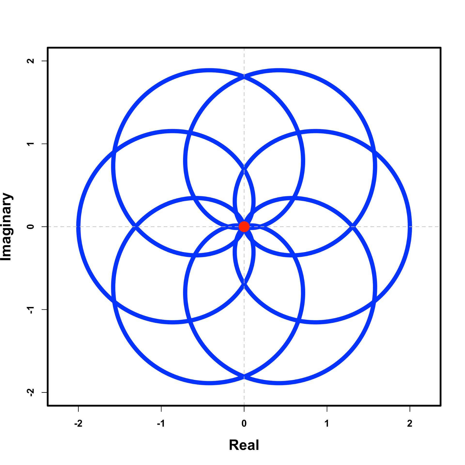
As a starting point, you need to just trust me that this expression forms a circle with radius 1 when plotted in the complex plane – where the x-axis is real numbers and the y-axis is imaginary. The underlying math, for why this works, is somewhat beyond this post, but if you are interested here is a great video explanation. For now, I will say this expression is famously derived from Euler’s formula, which tells us that if you take e to power of a number times i, you will move that number of unit around a circle with radius 1. Since a circle’s perimeter is 2π in length, it takes t = 1 second to move around the 2π circle. Below we see the final result of plotting the expression in the complex plane. As we increase t, the original signal forms a circle rotating in the clockwise direction (if we removed the negative sign it would move counter clockwise).

Voila! Using Euler’s theorem, we have moved our signal into a circular framework! Building off the previous expression, let’s add in another term to define the cycling frequency f (also known as the winding frequency).

The value of f will be used to control the amount of time it takes to complete a rotation around the circle. Let’s set the value of f = 1/0.24 ≈ 4.17 . This means we will complete ∼4.17 cycles in 1 second, thus each cycle takes 0.24 seconds to complete (i.e. 1 cycle / 0.24 second ≈ 4.17 cycles/second). We would thus say 0.24 seconds is the signal’s period and ∼4.17 cycles/second is the signal’s frequency. This can be illustrated by the grey dotted lines appearing every full rotation. If you count the number lines that appear after t = 0 to t = 1 on the x-axis, you’ll see we completing around ∼4.17 cycles. Thus by scaling our frequency term up and down, we can speed up and slow down the amount of time it takes to travel around the circle.

Let’s now throw in another term to our expression, g(t), which defines our signal. In this case, I have defined g(t) = cos(2πt/5)+1.

Rather than focusing on the cosine expression, think of the value of the function g(t) as the height of the orange bar in the animation. By introducing this new term, the rotating complex number is scaled up and down according to the value of g(t). When g(t) is large, the rotating complex number is far from the origin. When g(t) is small, the rotating complex number is close to the origin.

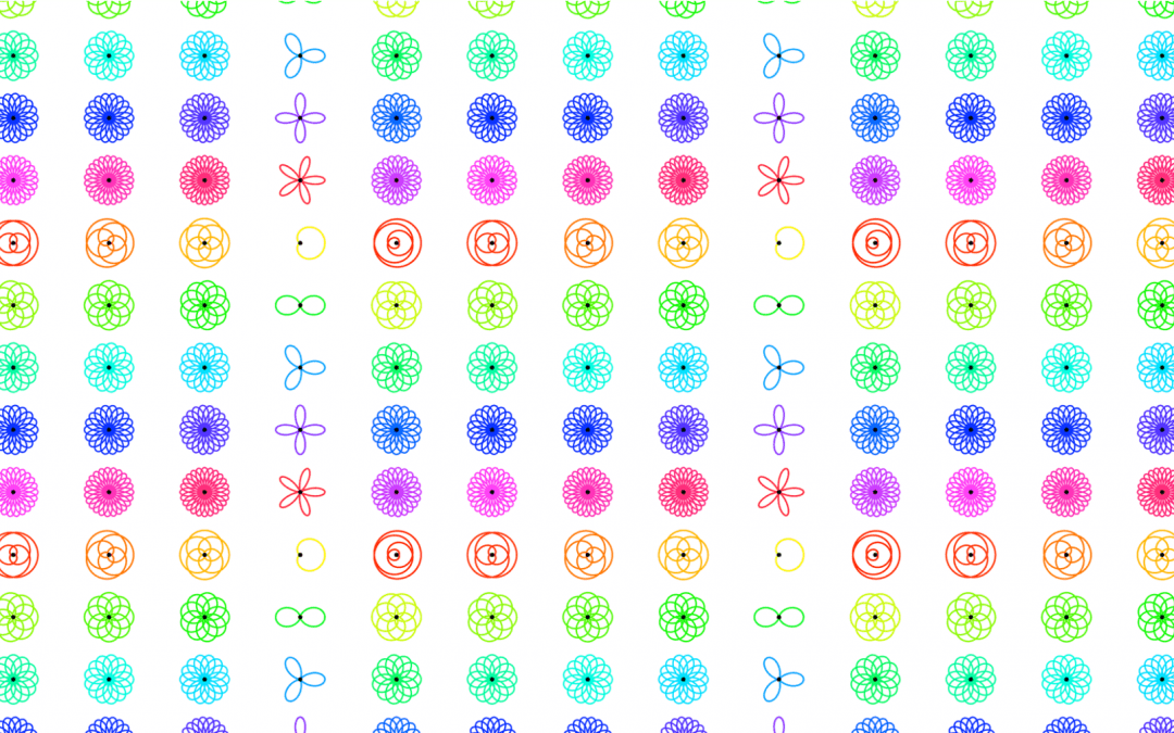
Essentially, you can think of the rotating vector, with its changing length, as drawing the function wound up to a particular frequency (the cycling frequency f). While this not only makes for a super beautiful spiral, it also is an elegant way to define our signal in such a way that new properties emerge that can be utilized to define an energy that is associated with the particular cycling frequency.
DEFINING THE ENERGY OF THE SIGNAL AT A PARTICULAR FREQUENCY
As stated earlier, our goal is to define a metric that can be used to help assess the prevalence of a particular frequency in our signal. This is achieved through the last step of the Fourier Transform with the summation and normalization step. In this case we are adding up all the points along the signal (k = 1 to k= N) and dividing though by the total number of points (N). This is equivalent to finding the average value across all the points on our wound up graph.

Thus, the energy at a particular frequency can be thought of as the center of mass of our wound up signal. In the figure below, I have depicted the center of mass of the signal by the red dot. For illustration purposes, the red dot moves as you continuously add up all the points along the wound up graph.

Looking at the final summation in the figure below, the energy of our signal at the particular frequency of ∼4.17 cycles/second is equal to 0 (the coordinates of the point in the complex plane is (0, 0), so the vector length is 0). Ultimately, this means the frequency of ∼4.17 cycles/second is not prevalent in our signal.
PUTTING IT ALL TOGETHER
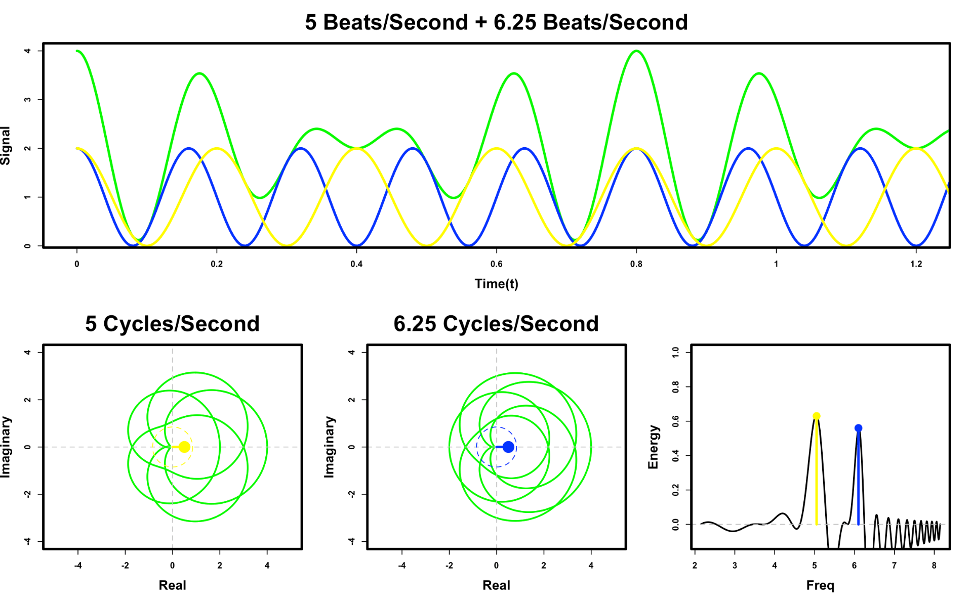
Now that we have established a procedure for defining the energy of a signal at a particular frequency, we can try and determine which frequencies seems to dominate our signal. Below I simulate the same procedure as above, but rather than using a single frequency of ∼4.17 cycles/ second, I sweep through a range of frequencies, and plot the Fourier Transform results in a frequency versus energy plot on the lower right.

You will notice that for the most part the energy plot hovers around 0 for the majority of the frequencies. Amazingly however, when the winding frequency approaches 5 cycles/second, which corresponds to the frequency of our signal, we see something special happen. There is a spike in the energy, which means a frequency of 5 cycles/second is prevalent in our signal! Below, we can see why this spike occurs.

At 5 cycles/second, the signal frequency and winding frequency are aligned. This means all the high points of our signal happen on the right side of our circle; while all the low points are on the left. As a result, the center of mass of our wound signal is significantly skewed to the right, resulting in a non-zero energy! BOOM, we discovered the frequency that composed our signal!
While this is clear to us by counting the peaks in our signal that is was beating at 5 cycles/second, that would not be immediately obvious to a computer. Moreover, we could have further complicated the process by adding in a range of frequencies that would be too hard for a human to analyze by eye, such as the mixed green signal below. Amazingly, the property of the skewed shift still persists with this mixed signal and Fourier Transform can still pull out the energy of the different frequencies!
Fourier Transform’s robustness to be able to extract mixed frequency is actually the basis for how music visualizers work. In the youtube video below, the visualization labeled natural is a plot of the binned frequencies versus energy plot, similar to the one in the plot above. See if you can see the low frequency bass versus the higher frequency clap in the music by watching the plot.
CONCLUSIONS
So there you have it! Hopefully I was able to share with you how Fourier Transforms work in a digestible manner and why they are so cool and useful. As a closing thought, I will try and summarize the math one more time to hopefully drive the point home. Ultimately, Fourier Transform builds a mathematical framework that treat frequencies that are prevalent to the signal differently from frequencies that are not prevalent. Through this post, breaking down the once complex expression, we hopefully now have developed an intuitive understanding for how Fourier Transforms work that can essentially be stated as follows:

If you liked this post and would like to learn more! Here is one of the best explanations of Fourier Transforms I’ve seen by 3Blue1Brown.
Feedback is always appreciated, so please leave comments, ask questions, and feel free to reach out!
Great post Elan! The live figures were both fascinating and helpful!
Thanks Kennen! Hope it brought an appreciation and understanding for the computational framework!
Great Elan! Makes me wonder whether the organization of a particular atom or matter, in general, has to do with temporal frequency in the way Schrodinger defined it. Your post set me thinking about Time-Space unification!
This was enlightening, helped me understand the concept really well. Thanks!
Really clear and enlightening post. thanks so much!
I’ve been trying to understand Fourier Transforms all day and you broke it down so clearly that I finally have my eureka moment. Thank you so much for being the GOAT at explaining Fourier Transforms.
Excellent article! Really liked how you broke down the formula into neat sequence of steps. I have couple of questions – 1. Why clockwise rotation is chosen instead of anti clockwise rotation? 2. What is the insight behind choosing average of the points. Why the average of the points at a frequency correspond to the amplitude of the signal at the winding frequency? Can you help to clarify on these points?
thank you,
it was an excellent explanation and also enjoyable.