| By Macon McLean |
With intense rivalries and unparalleled upsets, college football is a sport like no other. As an avowed fan, I find each Saturday is more exciting than the last, as the postseason picture becomes clearer with each passing week. All teams are fighting for bowl games, and for the especially talented schools, a national championship is the ultimate goal. But not every school can vie for a title: only the schools ranked in the top four at season’s end can compete in the College Football Playoff. This simple fact weighs on the minds of coaches, players, and fans every single Saturday.
After the season’s halfway point, while coordinators and coaches spend Mondays discussing game plans and debating tactics, there’s a wider-ranging discussion going on among another group of football geeks: the College Football Playoff Selection Committee. Each Tuesday in the second half of the season, the Selection Committee faces the impossible task of ranking the top teams in college football. This is the sole charge of these arbiters of the gridiron, who number among them former university athletic directors, head ball coaches, and even a Secretary of State (Condoleezza Rice is a voting member). After each of their weekly meetings, the Committee issues official rankings that determine placement in postseason games, including the vaunted Playoff itself.
Creating these rankings is far from simple. Given the nature of the sport, establishing a college football hierarchy turns out to be a uniquely challenging problem. A school’s record often belies its true ability: an undefeated team from a weaker athletic conference might be propped up by a softer strength of schedule; a squad with two close defeats at the hands of powerhouses (think Michigan and Ohio State) might be better than some teams with fewer losses. Turnover luck, injuries, and significant variance in scheme all make this feel like a difficult and seemingly arbitrary judgment. The most significant challenge, however, is independent of on-field performance: there are 128 teams to evaluate.
Apart from the logistical issues of watching every team in the country, having this many teams makes it hard to compare them directly. Unlike professional football, top-level college football teams play only a small fraction of their possible opponents. In the NFL’s regular season, a team will play thirteen of thirty-one candidate opponents; in college football, this number is, at most, fourteen of 127. This makes it very hard to compare many pairs of teams, as common points of comparison are few and frequently nonexistent. And due to schools’ membership in athletic conferences, the pool of possible opponents to fill the already small schedule is significantly restricted in size; all ten members of the Big 12 conference, for example, play 75% of their yearly regular season games against each other.
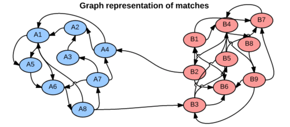
We can think of head-to-head matchups as a way of connecting teams in a graph, a mathematical and visual representation of a network. Each school is a node and each game serves as an edge connecting two nodes. College football graphs are often like this picture below, with dense clusters (conferences) each having a few connections to other dense clusters. This illustrates the problem – the graph is not particularly well-connected, making human application of the transitive property unreliable, and sometimes, impossible. Eventually all the clusters link up, but it’s not as densely connected as the NFL, and has far fewer data points for comparing teams across conferences.
So how does the Selection Committee even approach this problem of comparing teams across conferences? They base their rankings on the “eye test,” i.e., estimating how talented they believe a squad to be simply by watching them play, independent of any and all advanced metrics. Though they take into consideration other factors like strength of schedule, head-to-head results, and conference championships, what they see in the “eye test” is the primary evidence. If this all sounds a bit questionable to you, you’re not alone; the webpage on Selection Committee Protocol begins with “Ranking football teams is an art, not a science.”
Recognizing the difficulty of this task, some enthusiasts have developed more analytically-oriented approaches to ranking teams. A commonly referenced system is the S&P+ rankings, which use play-level and drive-level data from all college football games to measure four factors: efficiency, explosiveness, field position, and finishing drives. However, the Selection Committee is loath to integrate systems like the S&P+ into their proceedings too formally: the Playoff Committee is the immediate successor to the BCS rankings system, an oft-maligned combination of polls and computer rankings whose inscrutability was, in part, the author of its demise.
So, how could the Selection Committee rank teams in a way that is simple, connected, and not overly dependent on a team’s record? One possible approach is based on margin of victory (MoV), the extent to which one team beats another as measured in points (e.g., when Northwestern beats Michigan State by a score of 54-40, Northwestern’s margin of victory is 14, while Michigan State’s is -14). The key is that such a system should establish a “points added” number for each team, which roughly represents how many points it adds to a given matchup, or rather, how much better or worse it is than the average team.
Consider our Northwestern vs. Michigan State example. If, going into the game, Northwestern’s “points added” number was 9, such that it is approximately 9 points better than the average team, and Michigan State’s was -2, then we would predict that the matchup would result in an 11 point Northwestern win (we subtract these “points added” numbers to calculate the prediction – we want teams with very close ranks to have very close games).
After the game occurs, we notice that the difference in the teams’ performances was larger than expected (a 14 point Northwestern victory as opposed to the predicted 11). This data point is then used to more accurately estimate each team’s “points added” ranking the next week.
This approach to quantifying team strength is . The underlying math is just a system of linear equations – recalling some algebra, if we have two distinct equations each containing two unknown variables, we can solve for both unknowns. The idea behind the SRS is to expand these equations to each team in the country, such that each equation represents a single team’s games, and each unknown represents a team’s “points added” value. With each passing week, the college football graph shown above gets more connected, and there are more data points with which to estimate rankings.
One of the major benefits of the SRS is that it can meaningfully differentiate between close wins and blowouts, which might have prevented the 2014 Florida State debacle. To recap, FSU won its conference championship in 2014, going 13-0 with a total margin of victory of 153. Ignoring wins over lower-division opponents, FSU’s average margin of victory was 10.66 points per game, with one victory coming in overtime. While that may seem good, several wins came over struggling squads, many of which failed to make a bowl game. While the media was quick to bestow accolades on undefeated FSU, others were concerned that so many of their games had been close, and against pretty questionable opponents at that.
FSU was chosen to play in that season’s Rose Bowl as part of the College Football Playoff semifinal against 12-1 Oregon, champion of the Pac-12 conference. Ignoring lower-division wins, Oregon’s average margin of victory was 21.75 points, despite an early loss to Arizona. Coincidentally, Oregon crushed FSU by 39 in the Rose Bowl. In short, this example shows that, even without adjusting for strength of schedule, margin of victory might be better than overall record at representing team quality.
In addition, the SRS can mitigate the effects of strength of schedule on wins and losses. Teams with a difficult matchup are rewarded for performing above expectations even if they lose. Let’s say that the University of Houston’s “points added” value is 20, and Southern Methodist University’s is -15. The two teams play, resulting in a Houston victory, 42-21 – a 21 point margin, much less than the predicted 35. According to the SRS, this game doesn’t reflect favorably on the Houston Cougars – instead, SMU should receive a rankings boost for keeping the game two touchdowns closer than expected!
Conversely, teams with really easy schedules have their “points added” impacted negatively – if a team consistently plays below-average opponents, then its margins of victory in these games are consistently deflated by the negative “points added” values of its opponents. Returning to the above example, a 21-point win is usually cause for celebration, but Houston should not be impressed with its victory – it really should have performed better.
As the SRS is based on simultaneous equations, each team’s ranking is estimated at the same time, leveraging all the connections in the graph and making the rankings truly holistic. This system can evaluate each team’s true effect on margin of victory in an analytical manner, creating an evaluation metric not found in the “eye test.”
To demonstrate this system, we must first understand its mathematical basis. Let’s say that Northwestern’s impact on margin of victory, its “points added,” is a number XNW. Each matchup is a data point for identifying what this number is. The aforementioned Northwestern-Michigan State game is a piece of evidence in itself, in the form of an equation:
![]()
Taking this approach, we can then imagine a team’s games to date as a single equation, with data points from each different matchup. We can make this equation by adding together all its games (“points added” variables of NU and its opponent) on one side and each game’s margins of victory on the other, giving us a representation of the team’s season so far. After twelve games, Northwestern’s simplified season equation is as follows:
![]()
But we don’t want to just know about Northwestern – we want to learn the “true ranking” of every team in big-time college football. Expanding this representation, we can create such a “season equation” for every other team, with ranking variables showing up in multiple equations – for example, Michigan State’s season equation features ![]() , since those two teams played each other. This connectedness allows for the rankings to be estimated simultaneously – 128 distinct equations with 128 distinct unknowns.
, since those two teams played each other. This connectedness allows for the rankings to be estimated simultaneously – 128 distinct equations with 128 distinct unknowns.
Of course, this is merely the abstract framework. For it to be meaningful, data is necessary. After some web scraping and formatting, it’s easy to come up with the new and improved Top 10 through Week 13, the end of the regular season:

(Northwestern clocks in at #30, in case you were wondering.)
As the SRS rankings provide a predicted margin of victory, this makes them perfect for evaluating against the point spread, the number of points by which the favored team is supposed to beat the underdog as determined by sportsbooks. The point spread is constructed so that the market determines that either side of the spread is equally likely. So if Northwestern is scheduled to play Pittsburgh and is favored by 3.5 points, then the market believes that Northwestern is equally likely to either a) win by 4 or more points, or b) win the game by 3 or fewer points, or lose the game altogether.
To validate this system, I decided to calculate rankings through the season’s Week 12 and then test them on the results from Week 13. I evaluated each of the top ten teams’ Week 13 matchups relative to the point spread. I used the rankings to predict a margin of victory for each matchup (Pred. MoV). I then compared this to the existing point spread (also known as the “Line”) to make predictions against the spread (Prediction ATS), i.e. picking the side of the line you believe to be correct. After, I compared to the final score, which will tell us what the outcome of the game was relative to the line (Result ATS). A good performance against the spread would be indicative of the SRS’s capabilities – correctly predicting these 50-50 propositions, what point spreads are designed to be, is a difficult task.
The results are below:

For example, the predicted outcome of Ohio State vs. Michigan (per SRS) is a 2.45-point Ohio State victory. This is less than the point spread, which predicts a 3.5-point victory for OSU. Therefore, SRS predicts that the Michigan side of the line is more likely. The final score was that Ohio State won by less than 3.5 points, meaning that the SRS’s prediction was correct.
I repeated this analysis for several other matchups, limiting it to the top 10 teams for brevity, and because distinguishing between the top teams in America is the challenge that the College Football Playoff Selection Committee really faces. As you can see, the SRS went 6-1 against the oddsmakers, an impressive performance. That’s like correctly guessing the flip of a coin six times out of seven!
Notably, the Wisconsin vs Minnesota matchup resulted in a “push”, which is when the outcome is the exact same as the point spread – neither side wins. The SRS had predicted Minnesota to either win the game or lose by less than 14 points. This outcome arguably gives more evidence of the system’s accuracy: Minnesota led for most of the game, but gave up three touchdowns in the fourth quarter.

Above is a brief look at the comparison of the predicted and actual margins of victory. All the win/loss predictions were correct, apart from a huge whiff on Louisville (which nobody really saw coming).
There are some other interesting tweaks one could make, including time discounting (assuming recent games mean more than games further in the past) or adjusting for blowouts, which have been omitted for simplicity’s sake.
I have posted code to my Github account containing all the scraping and ranking tools.
No Comments