(co-authored with Tom Ogorzalek)
One curious result from the crowded field of mayoral candidates in Chicago’s February 26 election is that the two top finishers received support from similar parts of the city. Lori Lightfoot and Toni Preckwinkle, who will face each other in the April 2 run-off election, both did well in the historically reform-minded areas around Hyde Park and on the lakefront wards of the North Side. In the 11 wards where Lightfoot won a plurality of votes, Preckwinkle finished second in eight.1 In the six wards where Preckwinkle won a plurality, Lightfoot finished second in four.2
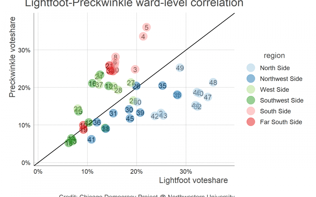
The positive correlation between Lightfoot and Preckwinkle’s vote shares persists across the city’s 50 wards, as Figure 1 below shows.3 This differs dramatically from previous competitive mayoral elections. The vote totals of leading electoral rivals are usually negatively correlated, in part because voting is a zero-sum game that forces electoral rivals to draw from different bases, or steer into different electoral “lanes.” In a divided field like this, Preckwinkle and Lightfoot were sharing a lane, and were able to win because that lane was is made up of some of the most politically engaged parts of the city—turnout was generally higher in the areas where they did well.4
Figure 1 also reveals some of the differences in where the two candidates drew their strongest support. Preckwinkle did better in west and south side wards, especially in the wards near Hyde Park and the 5th ward (where she served as alderman from 1991 to 2010). Lightfoot did better on the north side, especially in lakefront neighborhoods on the far north side such as Edgewater and Uptown.
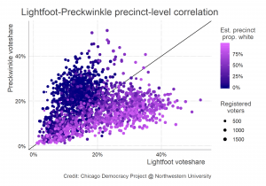
To investigate the candidates’ overlapping bases further, we zoomed in to the precinct level. As Figure 2 shows, the correlation between the two candidates’ decreases slightly but remains positive at this more granular level.5 To investigate whether Lightfoot’s apparent stronger support in the city’s whiter north side neighborhoods holds on the precinct level, we estimated the proportion of each precinct’s population that is non-Hispanic white using data from the Census Bureau.6
As the figure shows, the precincts in which Lightfoot outperformed Preckwinkle tend to have whiter populations. Conversely, Preckwinkle did better in places with fewer whites, especially on the south and west sides. Those west and south side precincts where Lightfoot outperformed Preckwinkle tend to be whiter than others in their regions. However, there were lots of areas of the city, with all kinds of demographic mixes, where neither did particularly well.
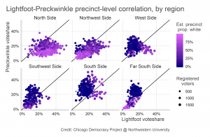
Figure 3 breaks down the precinct-level data shown in Figure 2 by region.7 The correlation between the two candidates’ voteshares remains positive in each region of the city, but the figure underlines some of the racial and regional variation discussed above. Both candidates did poorly in portions of the city’s west, southwest, and far south sides. Preckwinkle dominated on the south side and portions of the far south side, and Lightfoot did well in portions of the north and northwest sides.
These analyses underscore a few important lessons that we can draw from the February election. First, a crowded field can enable two candidates who share an ideological identification (both candidates style themselves as progressives) and draw support from similar parts of the city to proceed to a run-off. This is in stark contrast to the first-round election in 2015, where Rahm Emanuel and Chuy Garcia drew their support from different parts of the city. Second, the analyses show Preckwinkle and Lightfoot’s bases do vary across the twin divisions of Chicago politics, race and geography. Lightfoot outperformed Preckwinkle in whiter parts of the city on the north side, and Preckwinkle outperformed Lightfoot on the city’s less white neighborhoods on the south side. Third, the election’s historic outcome does not mean that race no longer matters in the city’s electoral politics. Race moderately divides the bases of the two candidates heading into the run-off, and there continues to be a strong support on the precinct-level for candidates with shared racial identities. For instance, total support for all the white candidates was about 36 percent points higher on average in homogeneous white precincts than in places with very few white residents.8 Although this relationship is much weaker than it was in the starkly polarized elections of the 1980s, plenty of the city’s whitest neighborhoods voted in large numbers for Bill Daley and Jerry Joyce.
What does this all mean for the run-off election in April? A run-off between two candidates whose bases overlap will certainly look different than the only other mayoral run-off in Chicago history, which took place in 2015 between Rahm Emanuel and Chuy Garcia. It remains to be seen whether and how Preckwinkle and Lightfoot’s campaigns persuade and mobilize voters in regions where they both did poorly.
Related: Read the CDP analysis of what factors might be important for mobilization in the second round.
- These are the 1st, 33rd, 35th, 40th, 46th, 47th, 48th, and 49th wards. Daley came in second in the 32nd and 44th wards, and Mendoza came in second in the 25th. ↩
- These are the 3rd, 4th, 5th, and 26th wards. Wilson came in second in the 8th and 27th wards. ↩
- Pearson’s r correlation = 0.28 ↩
- Precinct-level turnout and combined voteshare for Preckwinkle/Lightfoot exhibit a Pearson’s r correlation of 0.29. ↩
- Pearson’s r correlation = 0.19 ↩
- We used 5-year estimates from the 2012-17 American Community Survey. Because Census geography and electoral precincts do not match, estimating precinct demography involve some data processing. To make these estimates, we collected ACS data for Block Groups (BGs) and used a GIS Intersect function to create a new terrain of block-group-precinct fragments across the city. The ACS count for each measure (eg. total population, or non-hispanic white persons) was divided among each BG’s fragments according to its proportion of the BG’s overall area. Then these proportionate counts were added up according to which precinct they were in, and the estimated percentages (eg. percent non-hispanic white) were created based these newly estimated precinct counts. The key underlying assumption of this procedure is that persons in the categories of interest are evenly distributed within the BG. Because BGs are small (less than half a square mile on average in Chicago), the error potentially introduced by this procedure is outweighed by the advantage of being able to compare election results to demographic characteristics. ↩
- Region was classified on the ward level. ↩
- This number is based on a precinct-level bivariate least squares linear regression of percent of the vote for all white candidates combined on area percent non-Hispanic white population. Similarly, combined support for the seven African American candidates was about 46 percentage points higher in heavily black areas; and support for Latinx candidates was about 36 percent higher in largely Hispanic areas. Chicago’s high levels of ethnic and racial segregation mean that for each of these groups, the actual precinct estimates range from 0 to 100 percent. ↩


You must be logged in to post a comment.