Pan American World Airways
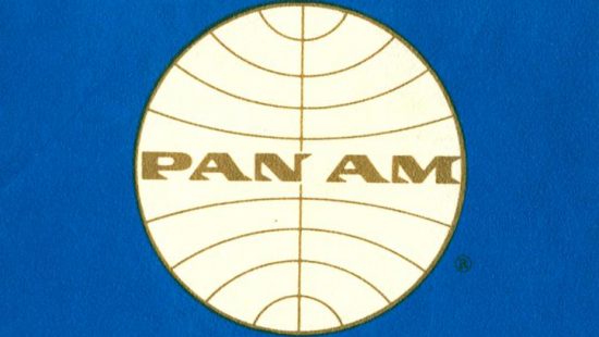
Pan Am, in operation from 1927 to 1991, is remembered in the popular imagination for creating an image that today is synonymous with the jet age. Indeed, Pan Am ushered in commercial jet aviation in the United States with the delivery of the first Boeing 707 on August 15, 1958. That same year, the airline hired the team of Edward L. Barnes and Charles Forberg as design consultants, tasked with creating a modernization of the Pan American World Airways brand. The designers retained the central image that the airline had built over the previous decades but with updates in keeping with the jet age. They refreshed and simplified the airline’s globe logo, which had been previously been set alongside stylized wings, introduced a lighter shade of blue throughout the company’s branding, updated the windswept font already in use by the airline, and proposed adopting the name that was already common in popular use: rather than “PAA” or “Pan American World Airways,” the designers recommended using the abbreviated “Pan Am.”
It wasn’t until several years later, however, at the recommendation of the design firm Chermayeff and Geismar, that the airline officially changed its name to Pan Am. At the same time, the logo was rendered in a new wordmark using the Helvetica typeface in both upper- and lower-case letters, though it was applied inconsistently, as represented in the materials shown here. Pan Am shut down in 1991, but the airline’s iconic blue globe can be seen today in Pan Am Railways, a regional railway system that operates in New England and which absorbed the Boston & Maine Railroad in 1983.
More Information
Items in the exhibit are housed at Northwestern University’s Transportation Library. Email transportationlibrary@northwestern.edu with questions, or to schedule an appointment.


