American Airlines
Passenger air travel in the United States was in its infancy in 1930 when American Airways (renamed American Airlines in 1934) was formed from the consolidation of several small operators—themselves the product of the merger of some 85 airlines and air mail carriers from across the United States.
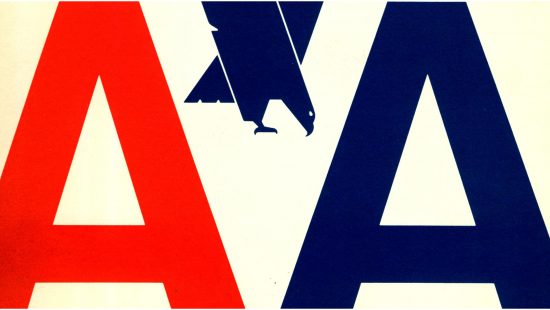
A company-sponsored design contest was conducted to choose a logo for the airline in 1931. The winning design, from divisional traffic manager Goodrich Murphy, featured an eagle flanked by the company’s initials on either side. Versions of this logo would be used for next three decades.
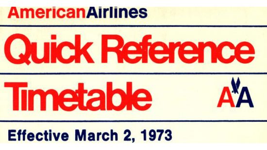
Massimo Vignelli’s 1967 redesign, shown here, was initially simply two As in the Helvetica typeface, one red and one blue. The airline insisted on the inclusion of the eagle, which had become a central part of the company’s identity; pilots even threatened to strike over the issue. But Vignelli refused, believing that an abstracted eagle design was undignified, and the airline eventually had the office of Henry Dreyfuss add it to Vignelli’s AA.
The logo remained in use for 45 years.
More Information
Items in the exhibit are housed at Northwestern University’s Transportation Library. Email transportationlibrary@northwestern.edu with questions, or to schedule an appointment.

