
The choice of color(s) has a strong impact on the message that is conveyed in a scientific figure. It is therefore extremely important to think carefully about the color scheme you choose for your images and plots. A good choice in color scheme can draw a viewer directly to the most import pieces of information and guide them through the result. A poor choice in color can make a figure overly confusing and can sometimes be misleading. In this blog post, I will provide suggestions for best practices in using color within your scientific figures.
When to use color
In a word: sparingly. There is a great temptation to use color for every figure, and to use lots of colors in every figure because you think it will draw the eye. But please fight this urge! Many figures are best left in grayscale (and you’ll understand better why that is as you read on). Nonetheless, color can be effectively used if you think carefully about it.
Perhaps the most powerful use of color in a figure is to draw attention to the most important region(s) or data point(s) on a plot or image. For example, try creating a grayscale figure and then coloring your most important result in a different color.
You may also want to use color to help separate different data sets and/or to define a range of values (e.g., while using a colormap). Regardless of how you use color, it is often important to use an additional method along with color (known as “multiple encoding”), rather than using color alone. For instance, you can use color AND symbol (or fill or line) type to differentiate between data sets.
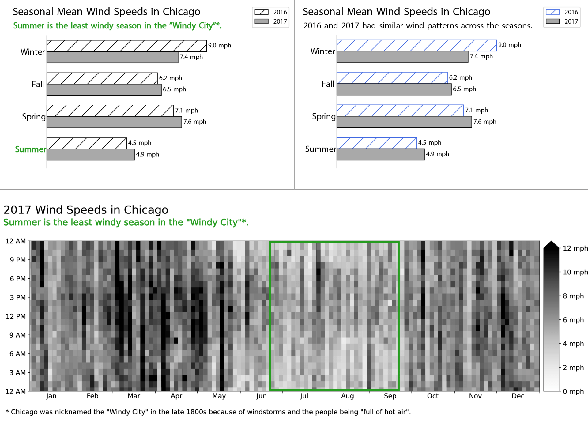
Figure 1: Three different views of wind speeds in Chicago. (top left) Color is used sparingly and to draw the eye to the message that summer is the least windy season in Chicago. (top right) Color is used instead to help distinguish between the different years, in order to emphasize the message that both years follow a similar pattern across the seasons. 2016 is doubly encoded, with both hatches and a blue color. (bottom) 2017 wind speeds are plotted using a “heatmap” representation, showing the continuous variable (wind speed) with a grayscale color map. Green is used as in the top-left panel to emphasize summer. Data for all panels in this figure come from the Chicago Data Portal.
Accessibility considerations
A primary reason why multiple encodings are important is that not everyone sees color in the same way. There are many different color-based vision deficiencies, which are often referred to as a group by the term “color blindness”. Color vision deficiency (CVD) affects about 8% (1 in 12) of men and 0.5% (1 in 200) of women. Therefore, you probably know someone who has CVD, and almost definitely someone with CVD will be viewing your figure.
One way to ensure that your figure is CVD-friendly is to simply use grayscale.
If you choose to use color, consider using a CVD-friendly color palette. Colorbrewer is a classic website for choosing CVD-friendly colors, and I provide multiple additional links at the end of this post that can help. Adding a second encoding (e.g., a different line style) will enable anyone to see the visual distinctions, without relying only on color.
I also recommend that you test your final figure to see if it is accessible to people with CVD. One method is to simply convert your figure to grayscale and see if you can still interpret the plot as effectively as when it had color. Another method is to use an online converter that can simulate different types of CVD, for instance the COBLIS website.
Choosing colors
OK, so you’ve decided you absolutely have to use color. Here’s how you should choose. The goal is to choose colors that have high contrast and are CVD-friendly. You have three variables to work with: hue, saturation and lightness (HSL). To choose hues, a good practice is to pick from opposite sides of the color wheel (or to evenly space the colors around the color wheel). However, note that red and green are not CVD-friendly. You can also adjust the saturation and lightness to create distinction (even between the same base color, or hue). Coolors is one of my favorite color picker websites, and I provide other examples in the links at the bottom.
There are also many ready-made colormaps that you can work with. For instance, look at the colormaps within Python’s matplotlib package. However, not all colormaps are appropriate for all data types and many can be misleading. The main problem is that certain colormaps have differing perceived steps in color (HSL) for the same step in value. The rainbow colormap (or jet) is notorious in this regard; the transition to yellow in the middle of the colormap provides a huge perceived color change over a very small change in value. To remedy this situation, there are “perceptually uniform” colormaps (e.g., “viridis”) that do provide the same perceived color change over the same change in value. A good way to visually test this is to examine a given colormap in grayscale (e.g., see the bottom of the matplotlib webpage I linked above).
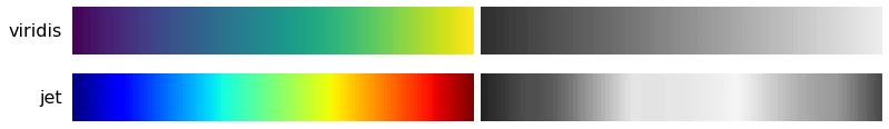
Figure 2: Comparing the perceptually uniform viridis colormap (top) against the egregiously terrible jet (or rainbow) colormap (bottom). On the right each colormap is shown in the corresponding grayscale. Note that viridis has a smooth transition from dark to light, while jet has strong spikes in lightness in the middle of the colormap. For this reason, I strongly discourage use of the jet (or rainbow) colormap, and encourage you to choose instead a perceptually uniform colormap like viridis. These colormaps were taken from Python’s matplotlib library.
Whether you’re choosing individual colors on your own, or drawing from a colormap, the type of data should dictate the type of colors you choose.
- Categorical (or qualitative) data can be divided into groups. For example, if you gathered data about Chicago’s weather over time you could divide the data into separate categories. For the Figure 1 (above), I separated the data by year and then created a grouped bar chart using color and bar fill style to indicate the year. For this type of data, it is often appropriate to choose colors individually from the color wheel to ensure maximum contrast (as opposed to picking from a predefined colormap).
- Sequential data follows a well-defined numerical scale that one expects to increase in a given direction. For instance, in the above example, wind speed is sequential (see the bottom panel of Figure 1). With sequential data, it is advisable to use a (perceptually uniform) sequential colormap. For any figure using a colormap to represent data values, you should include a colorbar that specifies the relationship between color and value (in this case wind speed).
- Diverging data also follow a numerical scale but have a meaningful middle point, typically at zero. Daily temperature is a good example of a diverging data set; we expect the temperature (in Fahrenheit or Celsius) to go below and above zero over the course of a year. There are many ready-made diverging colormaps to choose from, often with white in the middle. (And again, one should include a colorbar along with any figure using a colormap to represent data values.)
Common pitfalls
- Rainbow (or jet) colormap: This is (unfortunately) a very widely used colormap but is egregiously bad. First, it uses both red and green, which cannot be distinguished by people with many forms of CVD. Second, the transition to yellow in the middle of the colormap can introduce a very stark perceived change in data when none actually exists (which misrepresents your data). On the other hand, the very minor perceived color changes from blue to cyan over the bottom third of the colormap can hide contrast in your data that does truly exist. For more information, please see this excellent Nature article lambasting the rainbow colormap.
- Too many different colors: It can be tempting to choose many colors or even multiple colormaps to try to encode lots of additional meaning into one figure. However, this will invariably be confusing to the viewer and often very hard to interpret. Consider using fewer colors; perhaps you can represent most of your data in gray scale and then highlight the most important part in (one) color. You may also benefit from creating multiple different figures (each with minimal colors) rather than trying to show too much information in one single figure.
- Colors encoding the wrong meaning: Colors carry intrinsic cultural meaning. For instance, in the US, many people would associate green with good and red with bad. If you have both in a plot (which again, is not CVD-friendly) many people will interpret the red points as bad; this can be helpful, for instance if you are plotting results from a survey where people rank satisfaction from good to bad, but in other circumstances it can be misleading. And also note that other cultures attach different meanings to different colors.
I hope that has at least given you some food for thought, and that the next time you create a scientific figure you think carefully about your choice in color. Also remember that though color is a good starting point, accessibility requires far more than just an informed color choice.
As usual, if you have a project in mind or have any other data visualization need, I’d be happy to work with you. Please click here to submit a consult request.
Useful Links for choosing and understanding CVD-friendly colormaps
- https://colorbrewer2.org/
- https://projects.susielu.com/viz-palette
- https://davidmathlogic.com/colorblind
- https://colorpicker.me/
- https://coolors.co/generate
- https://www.color-blindness.com/coblis-color-blindness-simulator/
- https://www.toptal.com/designers/colorfilter
- https://github.com/oftheheadland/Colorblindly