
I love using, creating and teaching people about interactive figures. They can be incredibly useful tools for investigating your data and for sharing your data and research results with others. I recently went on a deep dive into the interactive plotting ecosystem of Python, and in this blog post I’m going to share my personal opinions on what works and what doesn’t within the most popular Python interactive packages available now. I’ll endeavor to answer the question posted in the blog title at the end of this post, so please read on.
I decided to look at COVID-19 data from the World Health Organization (WHO). (Yes, I know we’ve all had enough of COVID-19, but it’s a great dataset!) This dataset contains COVID-19 cases and deaths over time for 237 countries. My goal was to create the same interactive plot using a variety of different plotting packages in Python, that ideally allow me to:
- create a plot of COVID-19 cases vs. time (while displaying the date correctly)
- zoom and pan on the plot,
- create customizable tooltips to show the data values when the mouse hovers over the plot,
- create a dropdown menu to choose the country,
- create a set of buttons to choose which columns I want to plot (for a given country), and
- export directly to a .html file for use on a personal website (without needing any other service).
After scouring the internet for the most popular Python interactive plotting packages, I decided to test this set of tools:
You can view the code that I wrote to create the figures for each of the tools on my GitHub repo in this Jupyter notebook. I encourage you to look at that notebook to see the different syntax and code length required to create figures with each tool. If you download and run the notebook on your computer, you can generate the interactive figures for your own exploration. I will also include some interactive figures below for you to test out within this blog post.
In general, each plotting tool requires some version of the following workflow:
- Read in the data.
- Create the initial figure using one country (e.g., USA) and one particular column of data (e.g., Daily Cases).
- Create the buttons and dropdown menu. When the value of either of these changes, the tool uses a “callback” function to change the data shown in the plot.
- Format the “tooltips” to show information when you hover over the data in the plot.
The table below summarizes my ability to achieve the goals I listed above with each of the tools.

Bokeh, Plotly and Altair all were able to fulfill each of my criteria. mpld3, matplotlib + ipywidgets and Streamlit fulfilled most of my criteria. Pygal and bqplot did not fair as well (though I suppose they were not designed to do exactly what I had in mind). Below I provide a bit more detail for each tool.
Bokeh
Bokeh has typically been my “go to” for creating interactive figures in Python due to its versatility and good documentation. I also like that Bokeh is fully open source and has a really nice gallery with code examples. I haven’t yet found a use case that I couldn’t make work in Bokeh (though it can be a bit slow with very large data sets). The figure below is interactive; please click on the buttons and hover over the line to try it out.
Pros |
Cons |
|
|
Plotly
Plotly is a cross-language utility that can be written in Python, R or Javascript, and there is also a web-based plot creation tool. There appears to be a big development team behind Plotly (and there are also some attempts at monetizing the tool, e.g., using their Dash package). It’s a bit of a toss-up for me on whether to use Plotly or Bokeh for a given project, though I personally lean towards Bokeh. I’m including an interactive figure below to compare with Bokeh; please click on the buttons and hover over the line to try it out.
Pros |
Cons |
|
|
Altair
Altair is new to me, but I am quickly growing to really like it. Altair is a “declarative statistical visualization library” that uses the Vega visualization grammar, and this shows in the code syntax. I was particularly impressed by how little code was required to produce a usable figure meeting all the criteria I set.
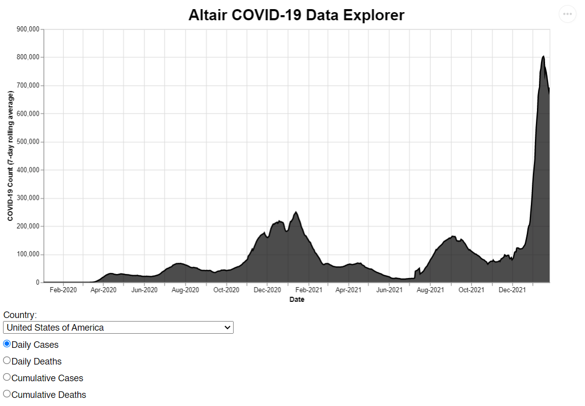
(^^ This is a static image because the .html file was too large for GitHub = 60MB. )
Pros |
Cons |
|
|
mpld3
I love the D3 Javascript library, so I was happy to see that there is a mash-up between matplotlib and D3 called mpld3. This tool was able to do nearly everything that I wanted. The only thing it’s missing is the ability to pan and zoom in a Jupyter notebook. On the other hand, mpld3 does not have the same level of documentation as Bokeh, Plotly or Altair, and therefore I would not recommend it for beginners (or for anyone who doesn’t know Javascript).
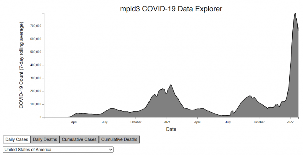
(^^ This is a static image because the .html file was too large for GitHub = 110MB. )
Pros |
Cons |
|
|
Matplotlib + ipywidgets
This is admittedly a bit of a cheat because I’m combining two tools, but the result is pretty good! If you’re using Python, you probably already know matplotlib. Ipywidgets are easy to use widgets that enable further interaction within a standard matplotlib figure.
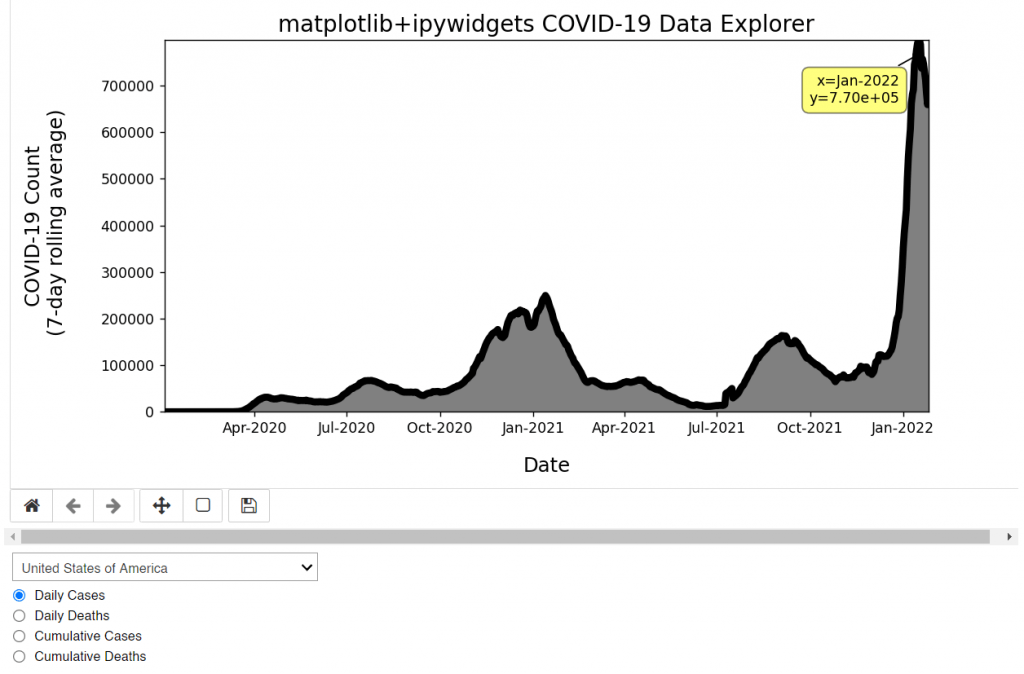
(^^ This is a static image because there is no easy way to export to a .html file directly.)
Pros |
Cons |
|
|
Streamlit
Streamlit is a really slick package that is very easy to use. It is essentially a wrapper for other plotting utilities (e.g., Plotly, Bokeh and Altair). Streamlit simplifies some of the plotting syntax to enable a minimal amount of code while still producing something usable and good looking; if you’re willing to write a longer code, the interface can be more customizable. There are a few other similar “wrapper” codes that I’ll list at the end of this blog post, but I found Streamlit to be the most straightforward and easy to get started using.
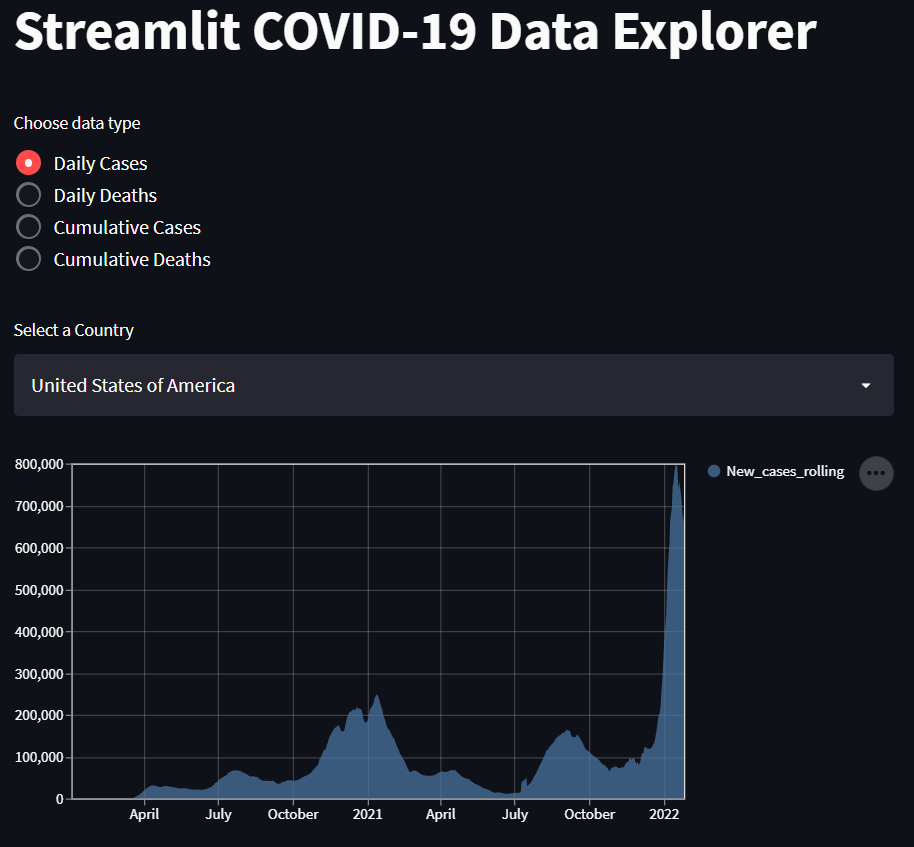
(^^ This is a static image because there is no easy way to export to a .html file directly.)
Pros |
Cons |
|
|
pygal
Pygal was built to generate SVG graphics with Python, and it does this well enough. It can include tooltips and an interactive legend that allows you to toggle data sets on and off. For this test, pygal turned out not to be an appropriate tool. I’m including an interactive figure below to compare with Bokeh and Plotly; please click on the boxes in the legend and hover over the lines to try it out. I chose to plot two different columns from the data here in order to test the interactive legend; each has it’s own y axis range.
Pros |
Cons |
|
|
bqplot
I’ve seen bqplot in various spots on the internet for a little while now, so I thought I should check it out. It is a plotting tool that allows for various selections on data, tooltips and animations. For this test, bqplot turned out not to be an appropriate tool.
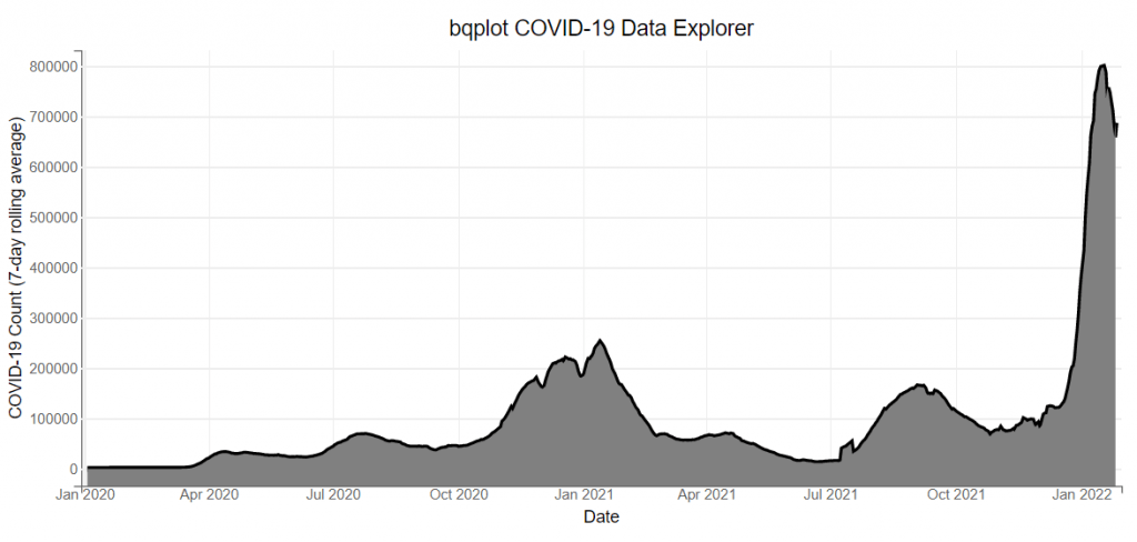
(^^ This is a static image because there is no easy way to export to a .html file directly.)
Pros |
Cons |
|
|
And the winner is…
Let’s call it a three-way tie between Bokeh, Plotly and Altair. They each have their advantages and disadvantages, but you would benefit from learning any of these packages. My personal favorite is still Bokeh, though Plotly and Altair are very close behind. If you want a purely Python coding experience that enables exporting to a .html file, then you should choose between Plotly and Altair. For this test, Altair required the least amount of coding to get the job done. Streamlit is a close runner up, and I personally look forward to exploring that package more in the future. The other tools that I listed are also worth looking into for specific purposes.
Additional packages worth considering
If you are looking to create a dashboard and want additional tools to explore, you may enjoy looking into the following “wrapper” packages that fall into a similar category as Streamlit:
- HoloViz and Panel: typically for use with with Bokeh and Plotly
- Dash: for use with Plotly
- Datapane: for use with a variety of plotting tools
Nov. 2023 update: There is now Shiny for Python! If you are interested, please read my other blog post.
If you have a project in mind or want help developing an interactive figure (or have any other data visualization need), I’d be happy to work with you. Please click here to submit a consult request.