It’s In Our Genes: Baseball and the Traveling Salesman Problem

Eric Lundquist

As winter fades to spring here at Northwestern I look forward to warmer weather, longer days, and the return of baseball. I’m certainly interested in the mechanics of the game itself: earned runs, home runs, box scores and the pennant race. However, there’s a deeper and harder to describe feeling found in walking out the tunnel to see the field for the first time each spring, or in catching a game with an old friend on a summer afternoon. A certain fictional character may have said it best; while baseball may no longer be our most popular sport, it remains unquestionably the national pastime.

So, what better way to explore America and tap into our collective unconscious this summer than to make a pilgrimage to our nation’s green cathedrals: all 30 MLB stadiums. I keep this goal in mind whenever life takes me to a new city, and try to the catch the games when I can. However, the size of the league and the geography of the country it spans make this a difficult proposition indeed. For someone seeking to complete the journey in a single epic cross-country road trip, planning an efficient route is of paramount importance.

The task at hand can be conceptualized as an instance of the Traveling Salesman Problem. Easy to understand but hard (NP-Hard to be exact) to solve, the TSP is one of the most studied problems in optimization and theoretical computer science. It’s often used as a benchmark to test new algorithms and optimization techniques developed over time. The problem has spawned thousands of academic books, articles, and conference presentations, a great XKCD, and a terrible dramatic film. With even a modest list of cities to visit, the number of possible route permutations, or tours, becomes enormous. Brute force approaches are computationally inviable and no efficient polynomial-time exact solutions have yet been discovered.

In an attempt to tackle difficult problems like the TSP, researchers over the years have developed a wide variety of heuristic approaches. While not guaranteed to reach a global optimum, these techniques will return a near-optimal result with a limited amount of available time and resources. One of these heuristics, genetic algorithms, models problems as a biological evolutionary process. The algorithm iteratively generates new candidate solutions using the principals of natural selection, crossover/recombination, and genetic mutation first identified by Charles Darwin back in 1859.

Genetic algorithms have been successfully applied to a wide variety of contexts including engineering design, scheduling/routing, encryption, and, (fittingly) gene expression profiling. As a powerful problem-solving technique and a fascinating blend of real life and artificial intelligence, I wanted to see whether I could successfully implement a genetic algorithm to solve my own personal TSP: an efficient road trip to all of the MLB stadiums.

Natural selection requires a measure of quality or fitness[i] with which to evaluate candidate solutions, so the first step was figuring out how to calculate the total distance traveled for any given tour/route. Having the GPS coordinates of each stadium isn’t sufficient; roads between stadiums rarely travel in straight lines and the actual driving distance is more relevant for our journey. To that end, I used the Google Maps API to automatically calculate all 435 pairwise driving distances to within one meter of accuracy. This made it possible to sum up the total distance traveled, or assess the fitness, of any possible tour returned by the algorithm.

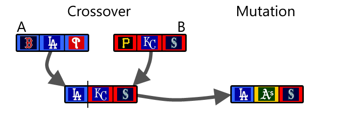
The process begins by creating an initial population[ii] of random trips. Parents[iii] for the next generation are then stochastically sampled (weighted by fitness) from the current population. To create new children[iv] from the selected parent tours I experimented with a number of genetic crossover strategies, but ultimately chose the edge recombination operator. To prevent the algorithm from getting trapped in a local minimum I introduced new genetic diversity by randomly mutating[v] a small proportion of the children in each generation. Finally, breaking faith with biology, I allowed the best solution from the current generation to pass unaltered into the next one, thus ensuring that solution quality could only improve over time. In other words: heroes get remembered, but legends never die.

crossover_mutation

After a bit of tinkering, the algorithm started to converge to near-optimal solutions with alarming speed. After roughly 100 generations the best solution was within 4% of the best global route found over the course of multiple longer runs with several different combinations of tuning parameters[vi]. To reach the best-known solution typically took around 1,000 iterations and just under 2 minutes of run-time. For the sake of context, enumerating and testing all 4.42e30 possible permutations would take roughly 1.19e19 years using my current laptop[vii], which is much longer than the current age of the universe (1.38e10).

Looking at the algorithm’s results in each generation, there’s a quick initial drop in both the average and minimum path distance. After that, interesting spikes in average population distance emerge as the algorithm progresses over time. Perhaps certain deleterious random mutations ripple through the population very quickly and it takes a long time for those effects to be fully reversed. Overall performance seems to be a trade-off between fitness and diversity: sample freely (high diversity) and the algorithm may not progress to better solutions; sample narrowly (low diversity) and the algorithm may converge to a suboptimal solution and never traverse large regions of the solution space.

IterativeResults

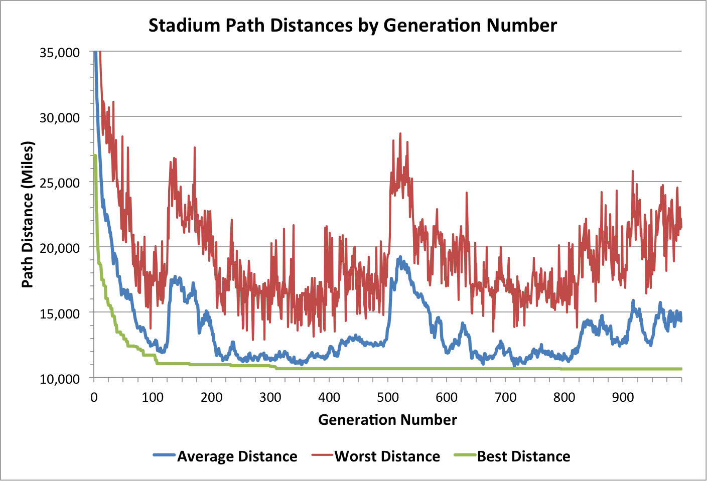
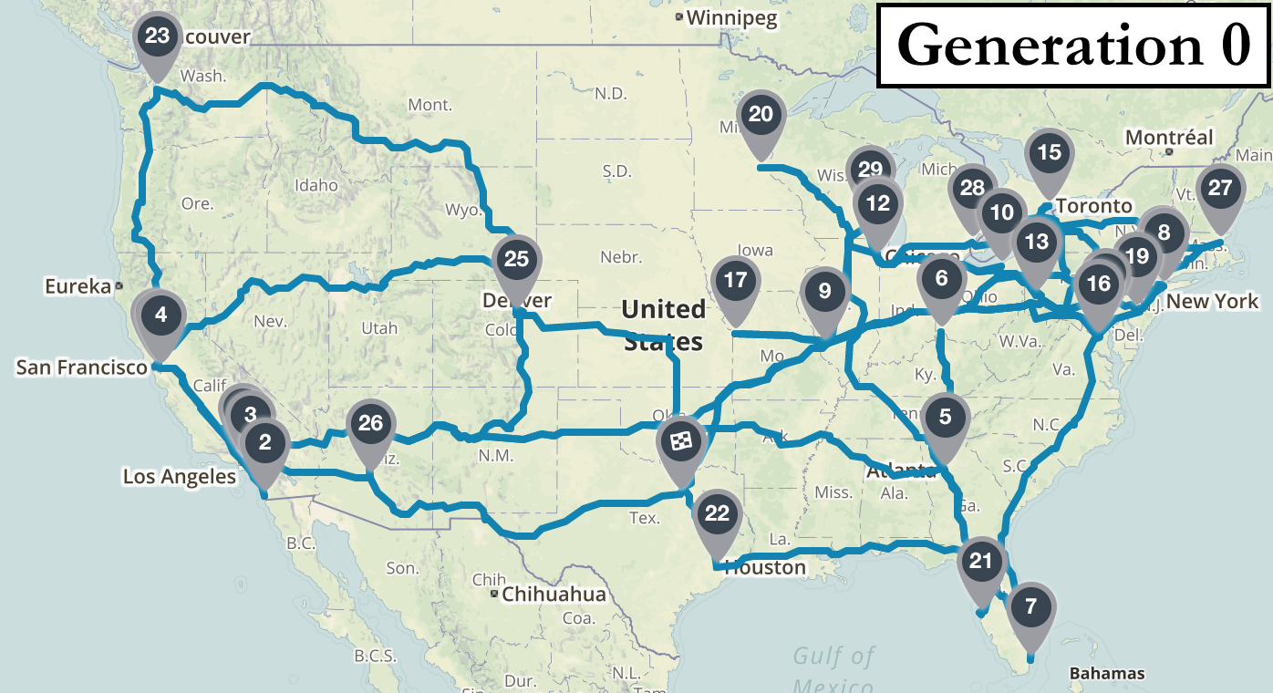
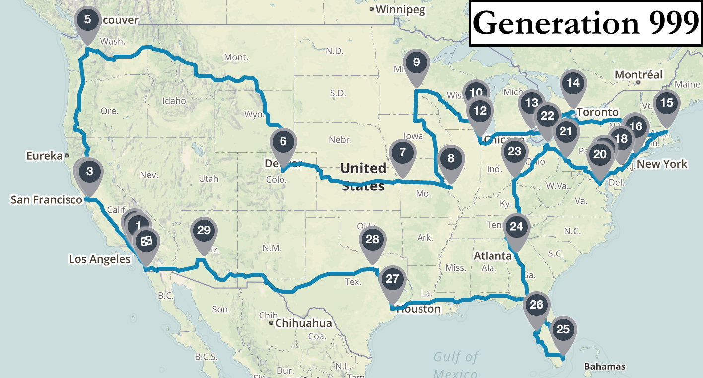
It’s perhaps more intuitive to visualize the algorithm’s progress by looking at the actual route maps identified in a few sample generations. The first map is a disaster: starting in Dallas it heads west to Los Angeles and then crosses the country to visit Atlanta without bothering to stop in Seattle, Denver, Kansas City, or St. Louis along the way. After 10 generations there are definite signs of progress: all west coast cities are visited before traveling to the northeast and then south in a rough regional order. After 100 iterations the route starts to look quite logical, with only a few short missteps (e.g. backtracking after Cincinnati and Boston). By iteration 1000 the algorithm is finding better routes than I could plan myself. As is the case with all search heuristics, I can’t prove that the algorithm’s best result is the global optimum. But looking at the final map it certainly passes the eye test for me.

Gen0Gen9Gen99Gen999


According to experts, genetic algorithms tend to perform best in problem domains with complex solution landscapes (lots of local optima) where few context-specific shortcuts can be incorporated into the search. That seems to describe the actual biological processes of natural selection and evolution quite aptly as well. I’m sure I’ll be thinking about the intersection between life and artificial intelligence far into my own future. But for now, I’m just glad the algorithm found me a good route to all the stadiums so I can go watch some baseball!

I’ve posted all code, data, and images associated with this project to my GitHub account for those whose interest runs a bit deeper. Feel free to use and/or modify my algorithms to tackle your own optimization problems, or plan your own road trips, wherever they may lead.


[i] I defined the fitness function as the difference between the total distance of a tour and the maximum total distance with respect to all tours in the current population. Higher fitness values are better, and the same tour may receive different fitness scores in different generations depending on the rest of the population in each generation

[ii] An initial population of 100 random tours was generated to start the algorithm. Through replacement sampling and child generation the size of the population was held constant at 100 individuals in each generation throughout the algorithm’s run

[iii] Parents were sampled with replacement using a stochastic acceptance algorithm where individuals were randomly selected, but only accepted with probability = fitness/max(fitness) until the appropriate population size was reached

[iv] The edge recombination operator works by creating an edge list of connected nodes from both parents, and then iteratively selecting the nodes with the fewest connected edges themselves. I suggest heading over to Wikipedia to look at some pseudo-code if you’re interested in learning more

[v] I applied the displacement mutation operator to 5 percent of children in each generation, which means extracting a random-length sub-tour from a given child solution and inserting it back into a new random position within the tour.

[vi] I tested all combinations of two different crossover and two different mutation operators with varying population sizes and mutation rates to tune the algorithm

[vii] The symmetric TSP has (n-1)!/2 possible permutations. I ran a profiling test of how long my laptop took to enumerate and test 100,000 random tours, and then extrapolated out from there to get the estimate presented in the main text

Why Context Matters: Lessons from the Chicago Marathon

Valentinos Constantinou

Chicago Marathon

The term “big data” has been a staple of corporate executives and analytics strategists in recent years, and with good reason. The use of big data has resulted in numerous innovative uses of analytics, including Google’s use of big data to predict flu outbreaks days in advance of the CDC using search queries. Yet the presence of large amounts of data alone is not always a sure path toward valuable insights and positive impact due to the inherent messiness of big data. Forms of data collection not associated with big data can still be highly relevant, even in the interconnected and data-driven world we live in today.

Observational data can still have a significant impact towards guiding strategy or assisting in research, even in the presence of ever greater emphasis on big data. During the Chicago Marathon, a participating runner’s health information is recorded whenever he or she has an injury, whether it be as minor as a blister or as major as a heart attack. This field data is important to race organizers and operations researchers that are seeking to enhance the safety of the event through course optimization, and to health professionals who use the marathon as a proxy towards understanding rapid-response health care in disaster relief scenarios. However, this data is recorded by hand, increasing the likelihood of human error and the possibility of making incorrect inferences.

In contrast, in big data schemes, the information is usually collected in a regular manner, with consistent formatting from one time period to the next. A user’s clicks will always be collected in the same way, as will trading transactions on Wall Street, as these actions are recorded automatically by computers. This is rarely the case with field data. In the case of the Chicago Marathon, the variables of data collected differ from year to year, but may be trying to capture the same information. What’s more, variables that align from year to year may have different formats of data, often with similar but still distinct classes of categories. This presents a unique challenge to researchers that are seeking to compare the data across time or within a specific variable. The method of overcoming this challenge is to understand the context of how and why the data is collected in a particular way, not only when conducting analysis but also prior to data cleansing and aggregation.

As an example, two of the variables collected during a patient visit at the Chicago Marathon are check in time and check out time. These variables are used to indicate the time an injured runner entered an aid station for care and when the same runner was released from the aid station after treatment. As researchers, we may be interested in knowing the total visit time of each runner visiting an aid station, and hypothesize that the severity of an injury is positively correlated with the visit time. A runner can be treated more quickly if his or her injury is simply a blister, as opposed to knee pain or a laceration resulting from a fall.

However, pursuing this hypothesis naively would result in misinformation and false analyses. We know from speaking with medical professionals on site that once injuries reach a certain level of severity, these runners are transferred almost immediately to a local area hospital. In addition, the check out time of severe injuries is often incorrectly recorded as a result of the medical professional’s focus on the patient, sometimes resulting in a high value for visit time.

Another issue to consider is when a bottleneck exists at the medical tent. If multiple injured runners are waiting for treatment, the visit time can be non-representative of their true treatment time. Without this contextual information, we may have asserted that severely injured runners would spend the most amount of time at an aid station or that the visit time is directly correlated with treatment time. Yet, we know from information provided by medical volunteers at the Marathon that the more severe cases of injury usually result in a visit time that is on or below average since these injuries usually result in transference to a local area hospital. In this case, context has provided us with the knowledge needed to quickly identify outliers in the data, understand how the data is collected, and take the appropriate action when conducting analyses.

Another example from the Chicago Marathon concerns the patient’s chief complaint when entering an aid station for treatment. Some prominent chief complaints include knee pain, blisters, and muscle cramps, among others, as shown in the graph below.

Word cloud of complaints
This word cloud shows combinations of chief complaints by frequency from injured runners of the Chicago Marathon. The size of the chief complaint corresponds to the frequency, and color is added for ease of interpretation.

From 2012 through 2014, this data is collected in an organized fashion and in the form of categorical responses. However, the 2011 data is free-form text and varies dramatically. While the 2011 data contains text that would fall into one or more of the categorical responses in the data from 2012 through 2014, there is no direct match between the two data fields. Here, context provided by a medical professional is incredibly important. By speaking with health professionals who were on site and with health professionals familiar with chief complaints resulting from running activity, the 2011 data was properly transformed into categories consistent with the remainder of the data and that have a sound basis medically.

In the case of the Chicago Marathon, context is key toward understanding the data and applying appropriate methodologies towards data cleansing and aggregation, and also towards analysis. The lessons from the Chicago Marathon explained above illustrate that without proper context of how the data is collected, researchers may make incorrect assumptions or present misguided insights. Context is important in data analysis and data cleaning for any data source, but is especially crucial when understanding and working with field data.

The Anatomy of a Pitch

Theodore Feder

A tactic in Major League Baseball that has become wildly popular in recent years has been the defensive shift. Teams shift by adjusting the positioning of their infielders to maximize the likelihood that a batted ball is converted into an out. While teams used fewer than 2,500 shifts in total in 2011, they deployed over 13,000 in 2014, with more expected in the years to come.

Teams are increasingly using infield shifts to convert more batted balls into outs. (Courtesy of bronxbaseballdaily.com.)
A Right-Leaning Shift. Teams are increasingly using infield shifts to convert more batted balls into outs. (Courtesy of bronxbaseballdaily.com.)

The rationale behind this tactic can be explained using a sabermetric called BABIP (batting average on balls in plays). BABIP is the proportion of balls hit into play (either by a certain batter or against a certain pitcher) that become hits. Historically, most pitchers’ BABIP has remained close to 0.300 (30%) over long periods of time (i.e., multiple years). In other words, pitchers have exhibited surprisingly little ability to consistently outperform the average rate that balls in play become outs.[1]

Given that around two-thirds of plate appearances result in a ball in play, progressive teams realized that there would be a huge benefit if they could find a way to systematically achieve a lower BABIP for their pitchers – that is, regularly convert a larger portion of balls in play into outs. As mentioned above, the most successful strategy to date has been the shift.[2] But, is there perhaps something pitchers could do to systematically reduce their own BABIP? Specifically, are there any kinds of pitches that they are under- or over-utilizing?

To explore this question, I gathered PITCHF/x data on pitches resulting in batted balls from the last two months of the 2015 season, which amounted to data on over 800 games and 40,000 pitches.[3] I then ran a logistic regression to determine which attributes of a pitch contribute most to the likelihood of a batted ball becoming an out. While my model included several variables, I will focus here on some of the most notable findings.

In looking at the speed of a pitch, I found the ball’s straight-line velocity has a rather large effect on the likelihood of an out. Specifically, one extra mile-per-hour on a pitch increases the odds of an out by 8%, which translates to nearly a 15-point drop in expected BABIP. This means that faster pitches make it more difficult for hitters to make hard contact and drive the ball away from defenders.

While harder pitches leading to lower BABIP makes intuitive sense, I was surprised to find a stark contrast between the impact of a pitch’s horizontal (side-to-side) and vertical (up-and-down) movement. For example, the ball’s vertical velocity and final vertical position have two of the largest effects on the chances of an out. A pitch that is an inch lower when crossing the plate results in nearly a 25-point lower BABIP than average.[4] This translates to to one fewer hit per 40 balls in play, which sounds low but would have a major impact over the course of an entire season! In contrast, the side-to-side movement of a pitch – as measured by horizontal velocity and final horizontal position – has a statistically significant, but minor effect on the likelihood of an out. An inch movement in the ball’s position (in either horizontal direction) only improves the odds of an out by 1.5%.

Batted balls become outs more often when the pitch crosses the plate lower in the strike zone, particularly against left-handed hitters. Horizontal movement has a minimal effect on the likelihood of an out. (Plots from the perspective of the catcher.)

Relatedly, I found that the spin rate of the ball (measured in rotations per second) has a meaningful effect on the outcome of a play.[5] For instance, a pitch with a spin rate of 36 rps (the average is 31 rps) would shave approximately seven points off of the expected BABIP.

These discoveries are important, but they view each pitch in isolation. Suppose we want to understand the effect of one pitch on the subsequent pitch (e.g., when a changeup follows a fastball)? When I incorporated the difference between the speed, horizontal location, and vertical location of two pitches, the results were quite modest: a large change in speed or vertical position does reduce BABIP in the data, but the effect is not significant. (A large change in horizontal position actually increases BABIP slightly.) I would venture to guess that these results understate the importance of pitch sequencing, as it may take more than one pitch to “set up” a hitter and there are likely other important interactions not considered here.

What do all of these findings mean? For one, it is an indication that pitchers can influence BABIP on a pitch-by-pitch basis through careful pitch selection. While it is certainly not feasible for pitchers to overhaul their entire repertoire or to throw only one or two types of pitches, it would beneficial for them to include more fast pitches with downward movement (e.g., two-seam fastballs and splitters) and fewer slow pitches that move horizontally (e.g., sliders and some cutters). By doing so, pitchers could complement the shift while being less at the whim of lady luck when a hitter gets his bat on the ball.

[1] This means that the only outcomes that are exclusively determined by the pitcher and batter – and not the defense – are a walk, strikeout, or home run. These are referred to as the “three true outcomes” of baseball.

[2] Travis Sawchik’s book Big Data Baseball gives an excellent (albeit non-technical) overview of how the 2013 Pittsburgh Pirates relied on shifts to break their 20-year streak of losing seasons.

[3] Carson Sievert’s R package pitchRx is quite useful for downloading PITCHF/x data.

[4] Note that the strike zone is just under two feet tall.

[5] Counter to intuition, spin rate is not highly correlated with velocity. Curveballs, for example, have very high spin rates but low velocities.

My Summer as a Schneider Intern

Reposted from A Slice of Orange 

By Ahsan Rehman | Aug 31, 2015Ahsan Rehman in Chicago

Interns. Some companies view them as nothing more than coffee fetchers, but Schneider blew away my expectations of a summer internship. I’m a Master’s student at Northwestern with research experience at IBM, and this summer I gained some incredible real-world analytics experience. Hopefully my story can inspire you to consider pursuing an internship with Schneider.

How ‘Big Data’ brought me from Pakistan to the United States

During my time as a student at the National University of Sciences and Technology in Pakistan, I developed a deep appreciation of the importance of data in guiding decisions. I recognized the value of using science not only to analyze and explain observations from the past, but also to make better decisions in the future.

It boils down to this: Without data, you are just another person with an opinion.

My curiosity about the many domains of real-world data analysis led me to pursue a research opportunity at IBM’s Linux Competency Center in business intelligence and advanced analytics. Later, when it came to applying my interests professionally, I secured a full-time offer from IBM’s Advanced Analytics and Big Data group to perform churn prediction and behavioral segmentation for a well-known telecommunications company.

During my tenure at IBM, I worked on some other key assignments involving extensive unstructured data for operational analytics. My core focus throughout these projects remained in-depth data analysis for better pre-processing and using optimized predictive modeling and text-analytics techniques to improve overall model accuracy.

Data needs a context

All this research and work experience nurtured my passion for data science, leading me to enroll in Northwestern University’s Master of Science in Analytics program and move to the United States. This professional degree program has allowed me to acquire the necessary skills to identify and assess opportunities, needs and constraints of data usage within an organizational context.

Furthermore, I learned how to integrate information technology and data science in order to maximize the value of data while also designing innovative and creative data analytics solutions. I have also been able to polish my skills in communicating clearly and persuasively to a variety of audiences while leading analytics teams and projects.

Real impact as a Schneider intern

For the summer quarter of my graduate studies, I am working as an intern with the Engineering team at Schneider, where I design machine learning and analytics solutions to solve business problems. I am currently working with Schneider Transportation Management (STM) to build a cost prediction model that will be used to help explain different cost factors and ultimately influence pricing for the entirety of STM’s network. This model will be integral to driving margin and net revenue for the enterprise.

Overall, I believe Schneider is on the right track to determine the best ways for using analytical data techniques to improve current operations, increase efficiencies and identify new opportunities for the business. The Engineering team at Schneider builds solutions that significantly impact not only profitability but also people’s lives, and I am excited to contribute to this mission. In addition, the culture at Schneider promotes innovation, and with the era of Big Data, people here are finding ways to analyze and optimize data to continue to keep ahead of the competition.

MSiA Graduates and MSiA Director Collaborate with Anders Drachen on: Analyzing Auctions: The Case of Glitch

Analyzing Auctions: The Case of Glitch

Link to the Original Post by Anders Drachen.

(This post is a collaborative effort by Shawna Baskin (Blizzard, MSiA Alum ’13), Joesph Riley (Pandora, MSiA Alum ’13), Anders Drachen (GameAnalytics), and Diego Klabjan (Prof. at Northwestern University, Director of MSiA).

Glitch

Glitch

When scientists want to understand the specifics of genetics, they usually avoid studying humans, as it takes 30 years to reach a new generation. Instead they focus on fruit flies, which are born, mature and die on the same day. This allows for studying the causes and effects of changes occurring from one generation to the next.

The above is a loose rewording of The Innovators Dilemma, and it is a good description of the kind of rapid, iterative analysis that can be performed on populations of players of particular games. As churn rates in most games are exceptionally high, this allows analysts to examine and manipulate successive “generations” of users.

This is also the case for the graphically charming and endearing browser-based MMORPG Glitch. It survived for 14 months, but within that timespan it saw thousands of players successively enter and leave the game at varied rates, and exhibiting different types of behaviours while playing.

In this post we focus on just one aspect of Glitch: the in-game economic system, with an emphasis on the auction house and NPC vendors, which formed the nerve centre of the game’s economy. But first, a few words about the game itself.

Glitch: A Game of Giant Imagination

Glitch: A Game of Giant Imagination

The Game

Glitch was a browser based MMO developed by a San Francisco based start up, Tiny Speck. It ran from November 14th, 2011 to December 9th, 2012, with the majority of its lifetime spent in beta. The core gameplay revolved around crafting, resource gathering, trading and social elements, all taking place in an open-ended world. The main objective was to build the world and create mini-games within.

Glitch operated with an in-game soft currency – Currants. Players could obtain the currency by questing, grinding/harvesting, or selling items to other players. Similar to other MMOs, players could post any quantity of an item in an auction house. Postings expired after 3 days, and Tiny Speck would claim a small fee for each of these items. Auctioning however, was not the only means of game transactions. Players could also trade privately with one another, completely bypassing the auction house.

The Data

We based the analysis of Glitch’s auction house activity on telemetry data that covers auction activity, other virtual economy activities, as well as general forum discussions and friend networks. This includes the key areas of auction sales data, item street prices, forum conversations, and in-game friendship networks. As in this post we will focus mainly on the way in which in-game parameters changed throughout the lifetime of the game, not all this data was included in the analysis presented here. Moreover, since friendship data and street prices changed little over the course of the game, we’ll leave them out of our discussion.

Over the course of 14 months, Glitch’s players performed approximately 3 million auctions. For every auction posted, we’ve collected the following data: player id, timestamp, action expiration date, item name, item category, item quantity, tool uses, tool capacity, and the final outcome of the auction (sold, expired, or deleted).

The Economy

At its peak, Glitch had 8357 Daily Active Users (DAU), viewed on a monthly average, number that gradually decreased to 67 DAU towards the game’s last month of existence. To better understand the game’s health in terms of player activity, we focused on studying the auction sales and forum postings, for both of which data was extracted from the game.

Distribution of Daily Activity

Distribution of Daily Activity

Auctions

Of the 3 million auctions carried out by the players, about 20,000 unique players listed 679 unique products across 41 unique categories. The number of in-game auctions dropped rapidly in the first month of the game, then stabilised until its final drop in the last month of the game.

Distribution of daily auction activity

Distribution of daily auction activity

The players that used the game’s auction functionality did so with great success: 85% of auction postings resulted in a sale. On a player level this figure changed slightly: there was a 35% success rate per player who posted in the auction. Despite this, the majority of players used the auction house rather infrequently.

The bulk of auction sales were for a small subset of items. 80% of all auction sales took place in the 10 main categories of products. Furthermore, 62% of auctions came from the top 5 categories, 28% of total auctions were for the top 10 products, and the most popular auction item was responsible for 8% of auctions.

Histogram of Item Auction Success as measured by proportion of auctions sold above the vendor price.

Histogram of Item Auction Success as measured by proportion of auctions sold above the vendor price.

Street prices

In addition to the option of selling their items at the auction, players in Glitch could go to the vendor and receive 70% of the street price for their items in currants. Tiny Speck would periodically update these street prices. Overall, street prices skewed to the right, largely because of the outliers. For example, hooch (from the drink category), was the 3rd most popular item in the auctions, periodically sold for 1 million currants, although its regular price was 9 currants.

Auction Success Ration Valuation for all Items sold (relative to whether the item was sold above street vendor prices).

Auction Success Ration Valuation for all Items sold (relative to whether the item was sold above street vendor prices).

40% of items depreciated in value, especially during the last 4 weeks of the game’s lifespan. This made us wonder how frequently an item would sell for less than 70% of its street value prices, i.e. the amount a vendor would pay for this item. In such a case, the auction becomes of no value to players. We called this proportion of this figure to sales a success rate.

From our analysis, we found that 59.1% of items would sell above street price 50% of the time, making auction more lucrative than other channels. However, many of the most frequently sold items, such as meat, butterfly milk and hooch, had success rates below 50%. Meat, for example, sold above vendor price only 25% of the time. These results highlight the importance of monitoring and regulating sales channels in MMORPGs.

Glitch artwork: Tiny Speck recently released all art assets from the game to the public domain.

Glitch artwork: Tiny Speck recently released all art assets from the game to the public domain.

The Behaviour

We also looked into variations in player behaviour, in terms of their use of the auction house and other economic factors, over the entire lifetime of the game. Using monthly bins combined with clustering (an unsupervised method in machine learning), we identified four consistent high-level clusters of behaviors in the player community: casual players, moderate players, forum posters and hardcore players.

Players did not remain in one single cluster over the duration of their lifetime with Glitch. For example, players who were active in Glitch’s economy for over 7 months (half of the game’s lifespan), moved between 4.4 clusters in their lifetime.

We will write more about the clusters and how players migrated between them in a future post, but in brief, each category exhibited a unique set of behaviours. Two of the most interesting categories were the unduly titled casual players and hardcore players:

Casual Players
Players were most likely to enter and leave the game as a casual player. Looking at the distribution of casual players in any given month showed a lack of players near the end-game months. We can speculate that players first get accustomed to the auction system as a casual player, and as their interests in the game fades, they return to a casual status.

Hardcore Players
In contrast to the casual players, hardcore players are more likely to remain hardcore players in the preceding and proceeding months. In fact, about 50% of hardcore players did so. Hardcore players are also the least likely to leave the game. Especially in the early month of data tracking, hardcore auction users and forum posters were most likely to stick with the game until the end. To qualify this a bit more, let’s briefly take a look at the numbers. Hardcore players remained in the game for 5.2 months on average, forum posters for 7.4 months, while casual users only stayed for 3.2 months.

The observation in the difference between the casual and hardcore players in Glitch leads to the well-known requirement for monitoring user engagement, which underpins any mature analytics practice. By inference, it also means that it is important to have the tools to track engagement metrics, e.g. to be able to identify whether a specific player is moving from a high-engagement, low-churn rate profile to a low-engagement, high-churn rate profile, so preemptive action can be taken to prevent player departure.

Conclusions

To summarise, a few of the conclusions made based on Glitch’s economy include:

  • Just a few items drove the in-game economy in Glitch: identify the core drivers of the game’s economy and make sure they stay balanced;
  • A fraction of the players are incredibly active drivers of in-game economies: identify them and watch for changes in their behaviour;
  • If players think a game is at risk of shutting down, or changing, the in-game market becomes highly volatile: always consider the effect of news on the in-game population;
  • Players change their behaviour over time: make sure behavioural analyses are time-sensitive.