| By Chris Rozolis |
I should start by saying I have absolutely no long-distance training experience and have never completed a marathon, half-marathon, or even a 5K in my life — that being said, I have experience in running marathons…or at least simulating the running of them using Python. Over the past 8 months I have had the pleasure of working with Dr. Karen Smilowitz and with a team of computer science undergraduates to develop and deploy a data visualization system that aids marathon organizers real-time on event day.
Background
Large marathons such as the Bank of America Chicago Marathon have followed an operations plan known as the “Chicago Model” since 2009. This operations plan treats an entire race as a mass casualty event, as the number of medical treatments at course aid stations and medical tents historically reach one to two thousand. This model is used because marathons are resource intensive, but predictable as so because there are expected runner injuries/aid requests. This Chicago Model unifies operations staff in one location on race day with the race organizers (Chicago Event Management), Chicago Police Department, Chicago Fire Department, Department of Homeland Security, American Red Cross, and many other organizations coexisting in one physical place. All represented groups in this Unified Command center have one common question: how is the race progressing?
Runner tracking data necessary information in order to answer one simple question for every mile segment of the Chicago Marathon: how many runners are in this segment right now? While the answer to this question can help many different stakeholders within the Unified Command center, the answer is also needed in the event of an emergency. Should anything occur on race day that would trigger emergency responses, the “Chicago Model” may dictate runners shelter in place or move to shelter locations. This requires accurate estimates of the number of runners present at each mile segment at any given minute for the correct resources to be dispatched proportionally in the event of an emergency.
One might think the Data Visualization System (DVS) could simply display real-time numbers of actual runners and map them to their correct mile segments. Well…this is where things get tricky.
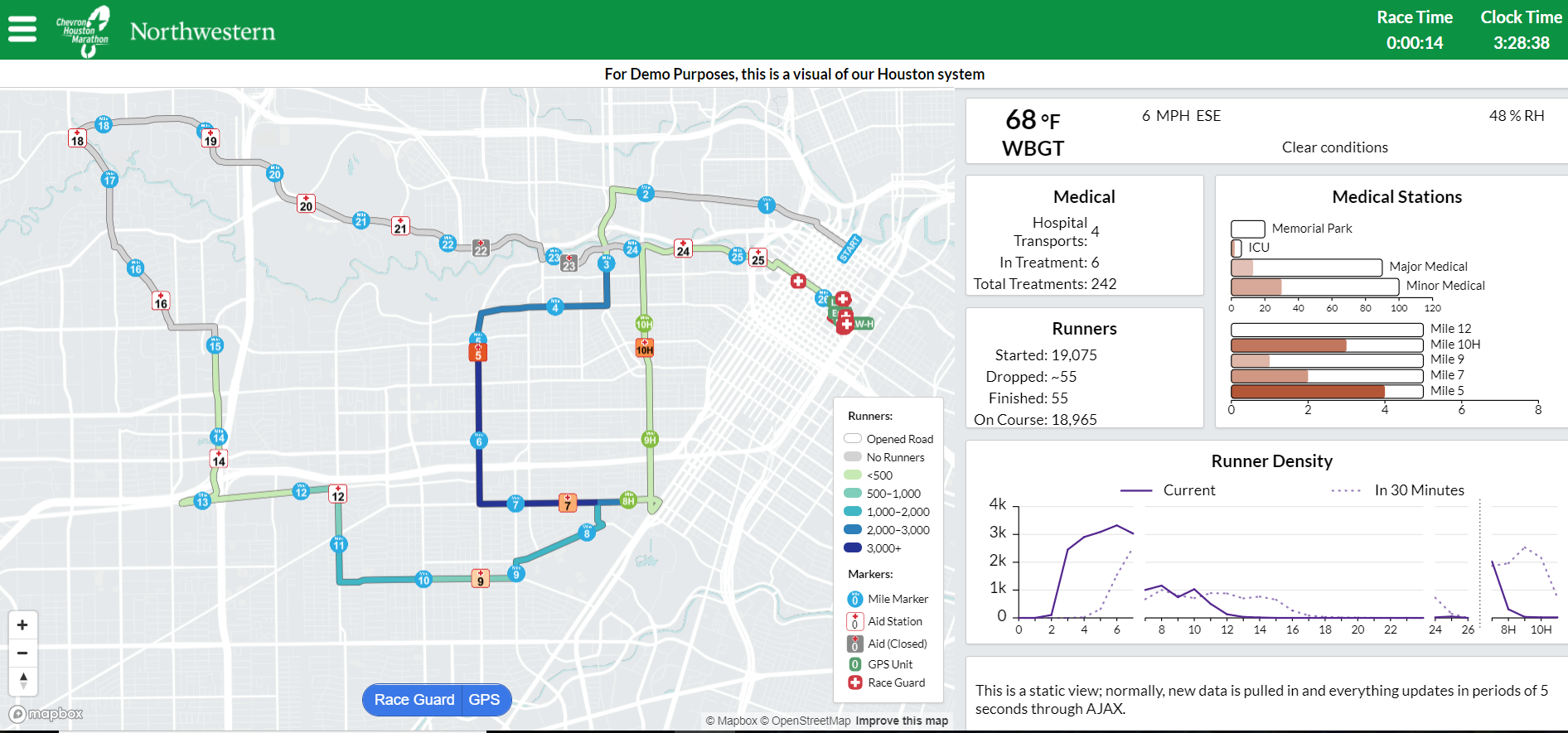 Figure 1: Snapshot of the DVS deployed for the Houston Marathon/Half Marathon Event
The Problem
Runner tracking feeds can be inconsistent. The marathon tracking mats that determine runner results and track how fast runner splits are between each 5K markers are fantastic pieces of technology, however, they are best used for post-race results. During the race the mat-tracked numbers are manually adjusted for various reasons. Additionally, these mat-tracked runner numbers are split by 5K distances instead of by mile marker. Information at the mile-level is a necessity for contingency planning. Using these feeds real-time does not enable the granular level of information needed for emergency planning and preparedness.
The Solution
Due to real-time data issues, the original DVS team decided to build a marathon simulation. The idea is simple: create a bunch of Python objects to represent a group of runners and have them “run” a marathon. Over the past five years, the simulation has steadily improved. Initially the simulated runners had distances logged every 10 minutes of their race, meaning the simulation could give runner density counts in ten minute intervals within the Unified Command center. Later iterations updated runner speed estimates from interpolation to piecewise regression models. Estimates narrowed down to the 2 minute level, but still left room for improvement to predict better numbers for contingency planning.
Today, I can simulate every single minute of the Chicago Marathon at every mile marker, and can map 10,000 simulated runners to 46,000 real marathon runners. This allows the DVS team to achieve the desired level of granularity needed for accurate runner locations and emergency preparedness. This recent iteration is the result of a major overhaul I implemented that now accounts for a large portion of the predictive and prescriptive power the DVS system has to assist marathon organizers.
Predicting a Marathon Runner’s Speed
One of my goals when redesigning the simulation was to have a grounded analytical approach to predicting runner speeds during the race. From historic runner results, I was able to build a multiple linear regression model that accurately predicted a runner’s speed given their starting assignments, their location on course, and the course weather conditions. Marathon runners are assigned to “corrals” for when they start a race. These corrals are essentially groupings of runners by expected pace. For example, the Elite corral pace is about a marathon under 2 hours and 45ish minutes. However, these corral paces are just expected means, there is a lot of variability in runner speeds. This variability is what the simulation aims to capture and mimic.
I started by scraping a decade’s worth of race data from official websites with posted marathon results using Python and the BeautifulSoup4 library. Like any data science project, the scraped data was messy and required a lot of cleaning. One of the key components of cleaning the data was to identify what runner corral someone belonged to as this would help determine their expected pace. I used unsupervised methods like K-Means Clustering and Gaussian Mixture Models to achieve this and I was able to cluster historic runner data into corral groups before building a predictive model.

Figure 2: Runner corral historic average speeds and variances
Exploratory analysis confirmed runner grouping differences in speed and variance of speeds based on corrals (Figure 2), which I was able to account for when simulating a runner population. Because of the grouping differences, a runner’s corral became a feature along with temperature, humidity, and course position in the multiple regression with runner speed as the response. I then performed 15 replicates of 10-fold Cross-validation which returned promising values ranging from 0.75 to 0.85 (Houston analysis returned 0.8462 and 0.8253).
The trained model also provided intuitive results that matched real-world expectations. For example, the highest predicted speeds belonged to Elite runners, and the regression coefficients for distance into the race indicated that runner speeds decrease the further a runner progresses on the course. These coefficients also backed one of my ground assumptions: runners get a final adrenaline push at the very end. I found that for all runners, regardless of corral, being on the last 1.5 miles of the course leads to an increase in speed that had otherwise been gradually falling throughout the progression of the race (Figure 3).
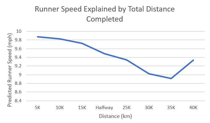
Figure 3: An Elite runner’s predicted speed as a function of distance (holding all other parameters constant)
With a meaningful regression as input, the simulation mimics the various speeds runners may maintain during the race and also injects the appropriate variance based on the runner pacing distribution. One would expect that an Elite runner who can run a marathon in a little over two hours should not be simulated the same way that I can run a marathon (probably in 5 hours if I’m being generous). I performed an exploratory analysis on historic Chicago Marathon data and found runner speed variances had different spreads based on the corral of a runner. These become inputs when predicting speeds, and a combination of dynamic temperature and humidity estimates, runner variances, and runner distances are used to simulate the real-word distribution of runners. While runner speed variance is expected to be different based on runner type (Elite vs. 5-hour pace), it is also expected that probability of dropout is not consistent for every single runner. One of the current ideas to improve the simulation and expand its capabilities is to calculate “survival probabilities” based on a runner’s type and race position to determine if they will dropout.
One of the fun characteristics of this project was combining my growing machine learning knowledge with my industrial engineering simulation knowledge. Some argue simulation itself is machine learning, but as I’ve learned, people will call anything machine learning to make it sound glamorous…and while my code is well commented and documented, it’s far from glamorous. Given all of the relevant inputs and the regression model trained on historic data, I can simulate the Chicago Marathon in 45 seconds and deliver accurate runner estimates to the Unified Command center on raceday. The speed of the simulation allows for rapid re-modeling in the event of inclement weather, some runners failing to show up, or any other unforeseeable circumstances during the race.
When my model and simulation were implemented at the Bank of America 2017 Chicago Marathon, we had highly positive results. At the end of the day the predicted finishers were only off by 30 runners… a 0.04% error for the 45,000+ runner population. Consistently throughout the day, the simulation and regression model was fairly accurate in predicting speeds, and was off by only 1,000-1,500 runners at any given 5K marker at any given time (which corresponds to 3.5% of the runner population). The opposite side of that accuracy corresponds to 96.5% of the runner population accurately matched to their locations—close to ideal when it comes to situational awareness.
Exploratory Work
Among the bells and whistles I have added to the updated simulation is the ability to input runner corral start times for the race event so that I not only mimic different runner speeds, but I also mimic when different runners begin the race. This feature unintentionally enabled me to look into “runners on course” distribution smoothing and how a race comes to a close at the finish line overall. Large marathons with upwards of 46,000 runners presumably have runners consistently finishing throughout the day however, the way runners are released on course in the morning significantly impacts how the pack of runners approach the finish line at the end of the day. Originally, I updated the simulation to inject more predictive power. Consequently, I now also have a prescriptive and visualization tool that can better inform race organizers when planning race-day logistics.
For example, the 46,000 runners in the 2017 Chicago Marathon started in three waves, releasing at 7:30 AM, 8:00 AM, and 8:35 AM. Previous marathons released in 2-wave systems. I simulated 2-wave and 3-wave release systems and compared the cumulative number of runners finishing the race compared to the time of day. The newly implemented system appears to do a better job of spreading out runners at the finish line (indicated by the smoother dark blue curve in Figure 4).
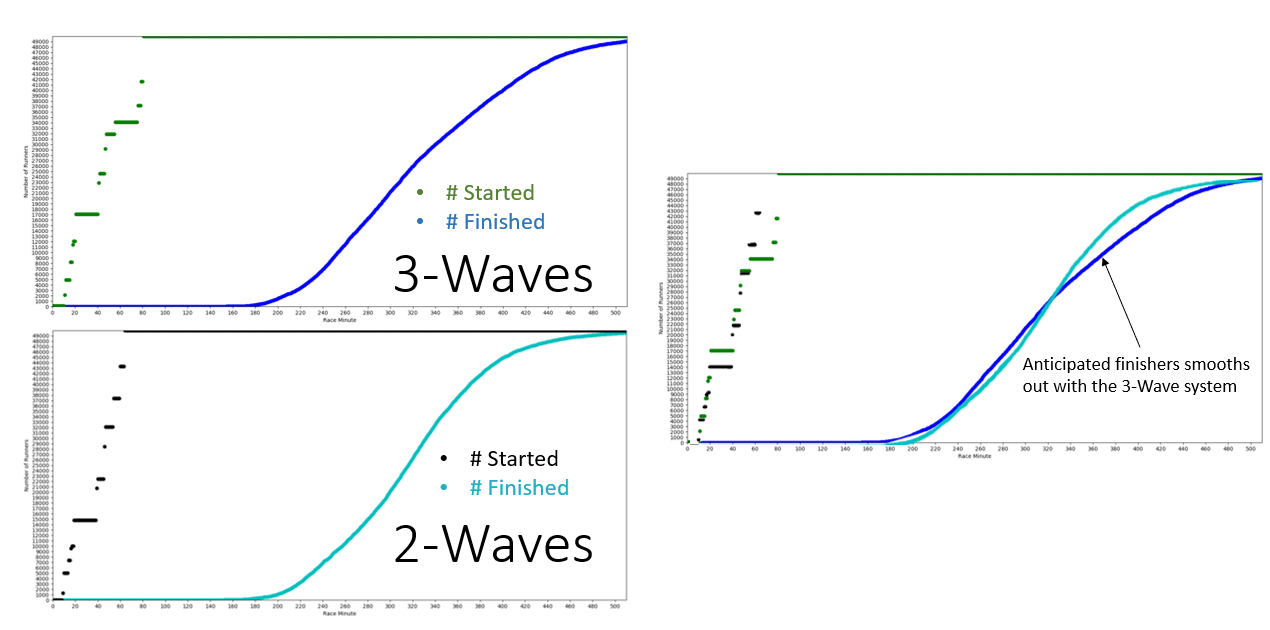
Figure 4: Start and finish line cumulative distributions for the 2-Wave and 3-Wave start models
This result of a “smoother finish line” prompted me to look into how runners approached various mile markers on course and to see how the 3 waves of runners ultimately smooth as they approach the finish line. This curiosity led to a unique visualization that helped to answer a common question in Unified Command: “where is the highest number of runners, like the bell of a curve?”. Figure 5 shows the number of runners that pass the starting line or respective mile markers at a given point in time. These clearly show how runners start the race in 3 packs, and by providing this visualization when I answer: “which bell curve are you asking about?” I’m not met with blank stares and confused looks.
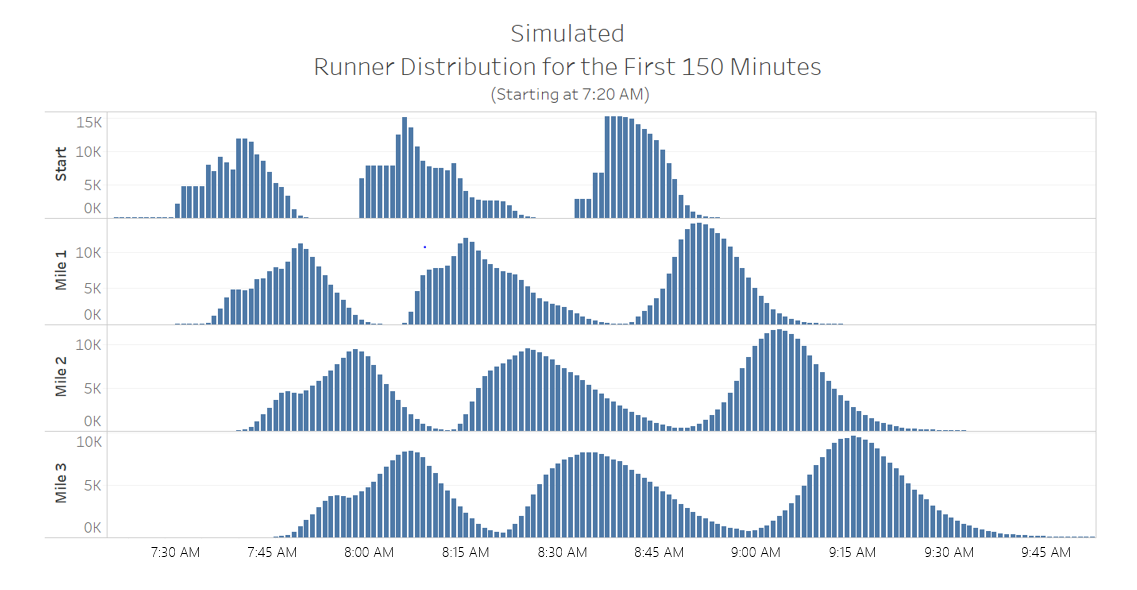
Figure 5: Simulated Runner Distributions (across time)
These same distribution plots were generated for the race midpoint mile markers to see how simulated runner speeds (with the anticipated corral variance found from the historic EDA) would change the distribution of runners on course. Although these are snapshots of specific mile markers, each individual distribution compared to another can be interpreted as how the runner population is moving and changing as runners continue to race.
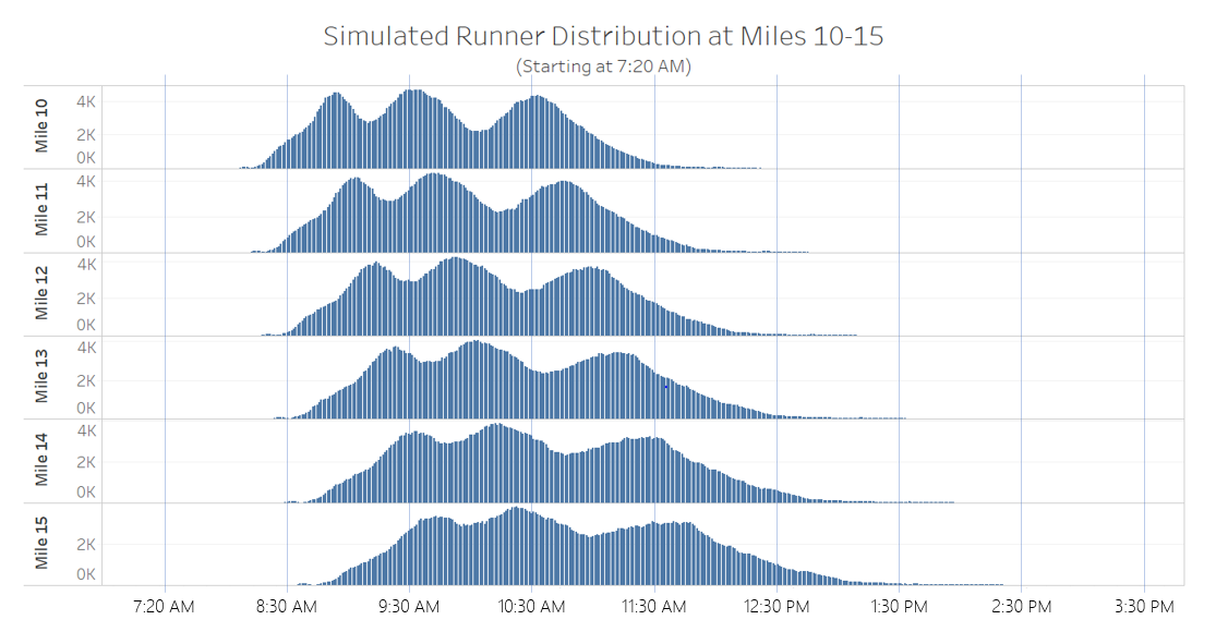
Figure 6: Halfway mile markers
As depicted in Figure 6, the tri-modal runner distribution that started the race ends up flattening into a clunkier distribution with wider spread when passing key midpoint mile markers. This completely changed the “where is the bell curve?” question and helped our DVS team to decide we should start providing median runner numbers to race organizers interested in halfway points of runners. We also provide information about where the bulk of runners or these peaks are because the common “bell” or mean value may be misleading or simply unhelpful. Putting these distributions all on one plot fully illuminates just how much a runner population spreads.
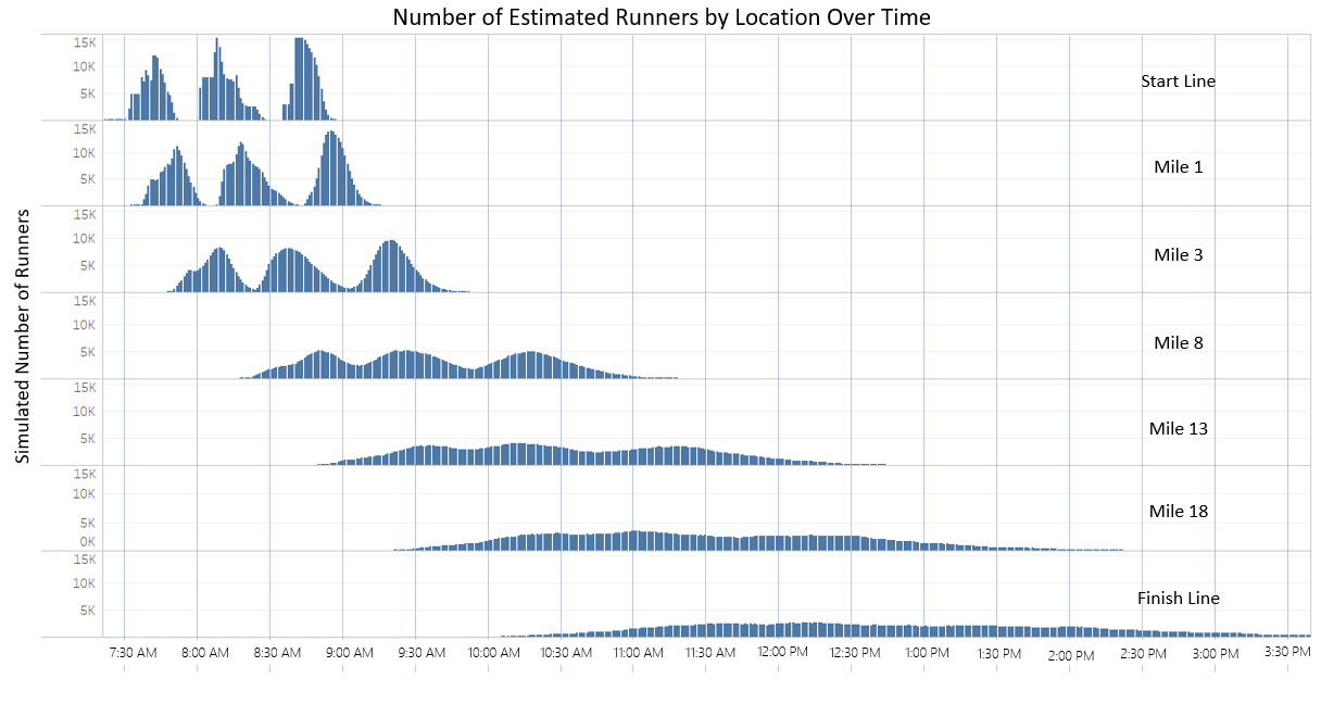
Figure 7: Runner distribution by time at various mile markers on course
Conclusion
Visualizations like the distributions seen above came from the simple structure and output of the simulation. They can be used to estimate number of runners an aid station may see at a certain time, or to determine where the median runner is. This type of marathon modelling is an untapped field with the potential for many analytic projects. Modelling anticipated resource usage such as water cups or blister tape needed throughout the day at aid stations would be one direct-impact example. Other projects such as modelling different start-line procedures and evaluating their impact on the whole course are now possible too. Within my role in the research group, I am now beginning to investigate the Houston Marathon’s start-line system to evaluate the impact on the finish line and their operations.
Throughout this project, I learned marathons require training. Whether it’s training data or waking up every morning at the crack of dawn and running 10 miles, it takes time. It took me 3 months of “training” over the summer, but the work paid off: I improved my running time from 18 minutes to a personal best of 45 seconds. *
*runtime is computational and unfortunately not superhuman physical speed
** This work recently was a finalist for, and won first place in the 2018 INFORMS Innovative Applications in Analytics Award
I’d like to thank Dr. Smilowitz for her help and mentorship in this project. I’d also like to thank the DVS team for seamlessly integrating the analytics and simulation into the real-time system. Additionally, I’d like to thank Dr. Barry Nelson, whose advice was crucial in decreasing simulation runtime and expanding the analytic capabilities of the system. Finally I’d like to thank all who provided inputs and edits to this post!
This research has been supported by grants 1640736 PFI:AIR – TT: SAFE (Situational Awareness for Events): A Data Visualization System and 1405231 GOALI: Improving Medical Preparedness, Public Safety and Security at Mass Events from the National Science Foundation