
You can change the look and feel of your site at any time by selecting one of over 200 themes. If you’re looking for some recommendations, check out this list.
When choosing a theme, it is strongly encouraged that you select a mobile-friendly (i.e., “responsive”) theme. A responsive theme is important as it will ensure that your site is viewable to visitors using mobile devices, as well as help search engine ranking.
Choosing A Theme
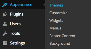
- Visit the “Appearance” tab in the admin side-menu and select “Themes.”
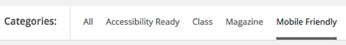
- Choose “Mobile Friendly” in the sub-menu near the top of the page to show only mobile friendly themes.
- In the theme gallery, hover over the theme and select “Live Preview” to see what your site will look like with the selected theme.
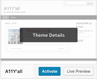
- Click “Activate” to enable the selected theme.
The Northwestern Branded Theme
 If you require a site with Northwestern University branding, you can use the Northwestern (Global) theme. This theme aligns with the branding guidelines set by the Northwestern University department of Global Marketing and Communications, and provides a number of customization tools for making each site a unique Northwestern online experience.
Features of this theme include:
- Fully Responsive Design
- Display of Posts Using Photo Feature and Feature Box Modules
- Dropdown Menu Support
- PlanIt Purple Events Widget
- Easy Configuration Using the Customizer
- Visual Page Builder (requires Divi Builder plugin)
Custom or Third-Party Themes
Beyond the limited customization options each pre-approved theme may provide, NUsites does not support custom or third-party themes. This is to ensure that site design and functionality are not affected by routine upgrades to the WordPress platform.
If your site requires a custom theme, WordPress.org recommends several affordable hosting solutions that support custom development.